Activity Feed › Forums › Sign Making Discussions › General Sign Topics › Signs, "Hall Of Shame"….
-
Signs, "Hall Of Shame"….
Posted by Robert Lambie on November 3, 2006 at 8:24 pmI want to make this post in the hope some folk out there are as much an anorak as me when it comes to signs.
Everyone has a Gripe about the “Cowboy down the road” they produce poorly made signs, with bad layouts and design or colours used.
however… some of the big firms get it wrong too! (Well I think so anyway)
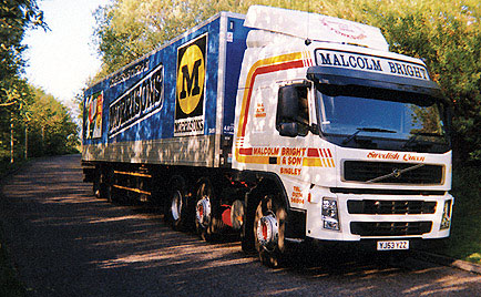
I have a couple off the top of my head that I dislike and would like to add them to the for the “Hall of Shame” for BIG Companies with poor signs and designs.1, Morrison’s
2, Carpet Wise (big flexface yellow signs with Tick)I will add more as and when submitted or if I think of anymore… I have a few.
I will make an official “Hall of Shame Gallery” for large companies with poorly designed/made signs. The gallery will grow as long as people contribute to it…
Sooo… if you have a gripe, let us know by replying here, or via email. admin@uksignboards.comIt would also be good (not compulsory though) to hear “why” you think the design or how sign has been manufactured or fitted is poor.
Thanks in advance…
Attachments:
 Brian Maher replied 17 years, 6 months ago 21 Members · 52 Replies
 -
52 Replies
-

I have always thought morrisons signs were rubbish, but then again, if I had the contract, would I care, Or as Cathreen Tate would say, "am I bovvered"
peter
-

I think its back to the sign firm to be honest peter…
It’s not my thing but i recon if left with the director for a while talking about his so called corporate image… i could change his mind.
(no im not going into all that with you lot :lol1: but you know what i mean?)
Morrisons not only have a crap image, their signage appears cheap, bad colour schemes, designs etc the trucks/vehicles are a joke! -

fab topic rob… 😀
will have to put my thinking cap on, even though i see thousands of lorrys wizz past me everyday 😀 (yes i even sit somedays and check them out, and im not an anorak im a kagool) 😮
nik
-

Morrisons……. 🙁 🙁
I have often thought about the design and I believe it must be deliberate….everthing….
the signs in the car park….the products…… the vehicles…advertising
the way the logo on the back of the vehicles does not contain a true black it’s dark purple – magenta while the sides use black….
Our Safeway [only supermarket in the town] changed to Morrisons 2 years ago…I’ve been in once…but that’s because there’s too many people I know and no working "less than 10 items" queue.
😉
-
whished ud mentioned this earlier in the week rob….my minds a blank only cause its on the spot and friday night and its dark outside…or i would have went outside to jog my memory :lol1: :lol1:
nik
-
have to agree there andrew…the cheesiest of the cheesiest eh 😀
but sad to say cheesy sells 😕
nik
-

Maybe it would be more productive to post a bad example along with your version of what it should look like.
Personally, I don’t think it’s a very tastefull post. What if someone that has designed for one of these companies is a visitor/member to this site? I would feel pretty crappy if someone was posting my work on here just to tear it apart and point fingers at it.
That’s just my opinion though.
-Marek -
scs i cant see very well but i agree on the bed shed… i did a big box truck for them many moons ago… hated it, had loads of ripples and rivettes.
i have noticed the "logo" has changed recently "for the the better" but not sure about the rest. good call though 😉 :lol1: :lol1: :lol1: -
quote Marekdlux:Maybe it would be more productive to post a bad example along with your version of what it should look like.
Personally, I don’t think it’s a very tasteful post. What if someone that has designed for one of these companies is a visitor/member to this site? I would feel pretty crappy if someone was posting my work on here just to tear it apart and point fingers at it.
That’s just my opinion though.
-Mareki agree, but ill be honest marek…
we are talking BIG companies here… not Joe bloggs the builder.
firms like Morrison’s are worth like half a billion… yet their image is cak!
if a sign firm is being paid hundreds of thousands of pounds per year and producing crap… why shouldn’t the smaller sign firms be allowed to voice their opinion? -

It’s worth remembering that some of these bigger companies aint stupid. Morrison’s for example. I had never heard of them 10 years ago, but look at them now. I agree that their image is poor but down here they are a supermarket for dole scroungers and they know it. Same with Aldi, rotten logo, raking in the cash. Point is, I reckon it’s deliberate half the time. They project the right image for the market they are after.
-
There are not any representatives from the bigger firms here?
I know what you are saying though.
I just think it would be more productive to post a solution with the examples.
-Marek -
That’s true Andy.
Also, most of the biggest firms have a very simple logo. FedEx is a good example. It’s really simple text, but you recognize it. I guess when you have brand recognition, the beauty of it doesn’t matter as much. Smaller firms might need a nicer logo to attract the customers in the first place.
-Marek -
i agree Andy, that maybe also where Andy b was coming from mate… 😕 :lol1: makes sense in one way but hell… in my view you can always look good but still sell crap…
marek… long established firms with signage/logos etc stands up for itself… by that i mean they are big enough and spend stupid money on getting this right "for them". (you would think anyway)
if small sign firms can poke holes in their designs or see bad workmanship why shouldn’t they be allowed to voice their opinion?
this is about signs yes, but just our opinions on thier image or workmanship…
its not like we plan changing thier design/image tomorrow is it? -
I like Aldi….FedEx etc….I don’t like the Morrisons logo[type] and I don’t believe there’s any harm mentioning here……………
BTW I also don’t like Bed Shed or SCS….. WTF 😀 😀
-

oooooohhhhhhh . the Bed Shed has got to be the worst!!!! 😮 Appalling logo. looks like a beginner has designed that one.
that wins it hands down for me 😕
-
Another common observation is that the best signs in terms of quality tend to be made by smaller businesses, probably because we can spend a bit more time and take a bit more pride in our work. Whaddya reckon?
A good example is a pub near me. One of those Wetherspoon’s places. The sign had deteriorated so badly after 6 months that it was replaced because of peeling paint! Another pub round the corner had the signmaker ringing me to help them out because the Acrylic letters were falling off the building after a month! 3 feet high, 25mm thick acrylic held on with 3 nylon locators.
-
marek… this is a feeble example of a test post… too many ways for you to cheat when using the net… but… put asside all that has been said or what you may learn about the company via google…
as an outsider:
how about you sum up your view on their corporate branding, how it appeals to what they offer their customers…. at a glance what their image sells you and why?im not being funny… just spinning the table mate….
dont confer with spectators now! :lol1:

-
Rob,
I totally get what you are saying. Is Morrison’s a grocery store? I think I went to one in Sommerset last time I was there.
Now is the truck part of their design or just the trailer? Is their logo just the "M" part? If this is just the logo (No googling here) then by itself I don’t think it’s much different than a lot of other corporations. It’s not great, but it’s not total crap either. Sometimes it isn’t how fantastic it is, it’s how well you remember it.
-Marek -
 quote Marekdlux:Sometimes it isn’t how fantastic it is, it’s how well you remember it.
-MarekI agree with that Marek. Plenty of signs round here that are pretty poor in terms of design, from my point of view anyway, but these businesses are also pretty well know in the markets they persue.
Coming from a marketing and PR background, I can tell you in all seriousness, that if you are trying to attract the ‘dole blugger’ into your store, as Andy G suggests, you don’t make the signage too flash. Most flash signage, people, in their own minds, associate with more expensive. I’d be surprised Rob, if your sign example was not actually planned that way.
Point is, market research comes up with some pretty way out findings, and if you are brave enough to invest in the advice and follow it to the letter, you may get pleasantly surprised.
Colours play an important element in signage too. Most fast food shops use yellow and red because they promote hunger.
Aldi use a simple logo that is based on blues (here at least) Market research would probably show you that their logo projects an uncomplicated store (blue = comfortable and pleasant and the simple logo would reinforce the uncomplicated thought)
Sorry to be so pedantic on this, but I don’t think the biggest companies would consider their image unimportant. I’d believe it would be a graphic designer that interpret the research. The sign co, whoever it is, would just be following the rules laid down by the graphic people.
Unless your market is very different to ours, I don’t know too many sign shops here that would actually be called in to design a corporate image. They may work with a design company on materials, but all the corporate stuff I’ve done – has all been answerable to a design team, not a sign company.
That said, the bed shed looks like someone from the owners family has doodled on publisher and decided it looked just the thing. ScS is the same.
I had a company come to me some time back and want the letter K back to front in the sign. I protested that it would look stupid, and they decided to go to another shop that didn’t care if it looked stupid or not. The company insisted that they wanted the sign to have an error so people would notice it. My concern was that people would want to know who the idiot that signed it was, and they’d say me!
Just my 2c anyway….
-

For me, it’s not just the design and layout. Other things come into it like cost, logistics and practicality.
Some years ago we did work for two similar sized competing companies, in the lift and escalator business as it happens, but that’s not important. Oh sod it, let’s name names – Otis Elevators and Kone Lifts. In my opinion both their vans had an equally good design and and had equal impact and road presence, but one cost three times the price of the other. They were both running similar sized fleets, about five hundred vans as I recall, so we’re talking a fair amount of money here, and I couldn’t understand why one would willingly saddle themselves up with more overheads than a firm they were trying to compete with. Anyway, you can imagine which one I had more respect for.
Logistics, because vehicle downtime is important and expensive. We have lots of vans here that by the time the racking is installed, together with alarms, trackers, livery and about ten grands worth of boiler parts, for example, have a rolling value well in excess of £30,000. Add to that something like £300.00 per day cost of the driver and you can see why vans do not want to be off the road for any longer than necessary. In the example above, the expensive van took three days, although only six hours actual work, but the other could be whacked out in less than two hours apiece with a bit of practice.
Finally, practicality. To my mind a design is no good unless the graphics can be replaced by someone with the skill levels found in the average bodyshop. We have one current client where this is not the case and what happens is that the repairers can’t do the work, the insurance company will pay for the livery repair, but not for us to run around the country, so often the vans go back on the road with incomplete graphics – complete white panels! In my opinion this looks worse than a poor design.
-
 quote Robert Lambie:I think its back to the sign firm to be honest peter…
It’s not my thing but i recon if left with the director for a while talking about his so called corporate image… i could change his mind.
(no im not going into all that with you lot :lol1: but you know what i mean?)
Morrisons not only have a crap image, their signage appears cheap, bad colour schemes, designs etc the trucks/vehicles are a joke!I don’t think the fault lies with the sign companies here. Most of the bigger companies employ "designers" who design this cr4p for a nice large fee. Now if you went into the directors office and told him you thought the general branding concept was cr4p and it should be done like this (bearing in mind he has already spent tens of thousands to his "designer") I think you would have to be careful that his door didn’t hit you on the back of your head on the way out. I worked for NatWest Bank for 20 years and they had a corporate image book that had to be followed to the letter. i.e. "If an apostrophe is used at the end of a line of text, no further apostrophe’s can be used at the end of a line for the next seven lines". Their manual was 350 pages long and they had paid some 4reshole megabucks to produce it. It’s all down to the designers and corporate image companies where the buck stops. How many times have we been stumped when you are told that the sign writing on a van has to be Pantone blah blah blah! and you just know IT AIN’T AVAILABLE! One step I have taken with this is to give any designers who end up my way, a swatch of some of vinyl colours available and tell them to pick a colour then match the Ruddy pantone to that. Another way we could sort them out is to line the bar stewards up and shoot them!
-
quote Nicola Rowlands:geez this is mental 😀
:lol1: :lol1: :lol1: :lol1:
-
quote Dave Lowery:How many times have we been stumped when you are told that the sign writing on a van has to be Pantone blah blah blah! and you just know IT AIN’T AVAILABLE!
…. or they use a font that costs $600 and is from some obscure font site 👿
-

Nicola
Your description of it is too kind. I count, 3 words, 2 spaces, 4 colours, 4 fonts, all in 1 line!! That for a "expletive" claiming to be a professional! We have a similar "graphic design expert" in a neighbouring town. She actually manages to do a lot of ads for people in the local newspaper. Everything done with a single effect from Powerpoint. And all use Times New Roman with a soft shadow. Every one of them!
A sign without a design is NOT a sign – its information on a surface (like a toilet wall…) Materials cost the same, irrespective of the quality of design, workmanship etc. At least I’m in a fortunate position: most our clients do not even have a structured corporate image, so it is usually up to me to give them "something nice" I don’t even charge Artwork and Design – I give our clients 1 hour of my time for every N$ 2000 (appx 200 Euro) they spend. Gratis and for Free. That way I dont have to produce signs with the company name in Brush Script, UPPERCASE!
-
quote Shane Drew:quote Dave Lowery:How many times have we been stumped when you are told that the sign writing on a van has to be Pantone blah blah blah! and you just know IT AIN’T AVAILABLE!
…. or they use a font that costs $600 and is from some obscure font site 👿
ALL DESIGNERS ARE AR$HOLES 👿
-
quote Dave Lowery:quote Shane Drew:quote Dave Lowery:How many times have we been stumped when you are told that the sign writing on a van has to be Pantone blah blah blah! and you just know IT AIN’T AVAILABLE!
…. or they use a font that costs $600 and is from some obscure font site 👿
ALL DESIGNERS ARE AR$HOLES 👿
😮 careful mate, I think you mean designers that are not members here, don’t you 😉
-
 quote Nicola Rowlands:geez this is mental 😀
Nic, 😮 tell me you made that up as a joke, pleeeese.
Anyone who buys signs from people, companies who can’t come up with any respecatable layout/design are being conned.
I know we’ve been here before, but I can’t uderstand why anyone with no design sense at all (& there seem to be plenty out there) would even contenplate getting into signs, unless they employ the services of someone with sufficient talent to do it for them.
These peolpe are our competetion which I find incredible.
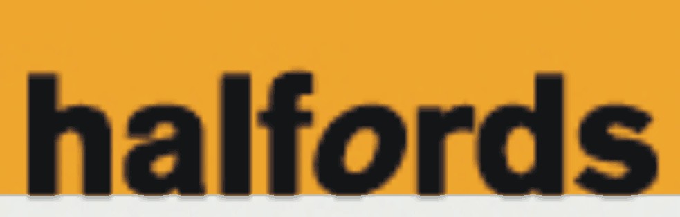
As for large co’s with naff logos I think Halfords takes some beating
Attachments:
-
Designers are A-holes!! Yep. I Agree!! I never know what to call myself: Designer, Lay-out artist, Desk Top Publishing Guru, Signwriter… I do all of the above.And more. Must be a Signwriter, then!! The moment a Certificated, "Qualified" graphic designer / artist walks into our office, I want to , oops, censored, the , uhm., censored, censored out of the , censored, censored whatshisname. Is true!
They all use AppleMac computers, while EVERYONE doing the work, flies PC. Why that? ….. Must be cost, I hear them say.. ban them from all future civilised conversation! A prime example of wasted public spending on higher education.
My apologies to the few examples of the above breed who are actually dedicated, HUMBLE, professionals.
-
quote GERT DU PREEZ:They all use AppleMac computers, while EVERYONE doing the work, flies PC. Why that?
Wrong. 😀
But we won’t go into why. I think we’ve done that subject to death before.
-
For all you folks who haven’t got it …………….. Nik made that one up!!!!!!
It’s my company name (well almost, there’s no ‘s’ on design or sign 😉 ) she was pretending that was my logo …. :lol1:IT’S NOT REAL! 😮 :lol1:
-
quote Marcella:she was pretending that was my logo …. :lol1:
IT’S NOT REAL! 😮 :lol1:no…. i scanned it from your lettering heading 😀
nik
-

No one has mentioned the RAC yet. What were they thinking when they went with that design.
-
i am going to reply on this thread… but had a Few beers today, so ill let it go till tomorrow… :lol1:
Paul, thanks for the reply you just jogged my memory on number 3 from me…
3, The NEW AA vehicle livery!
-
quote GERT DU PREEZ:Designers are A-holes!! Yep. I Agree!! I never know what to call myself: Designer, Lay-out artist, Desk Top Publishing Guru, Signwriter… I do all of the above.And more. Must be a Signwriter, then!! The moment a Certificated, “Qualified” graphic designer / artist walks into our office, I want to , oops, censored, the , uhm., censored, censored out of the , censored, censored whatshisname. Is true!
They all use AppleMac computers, while EVERYONE doing the work, flies PC. Why that? ….. Must be cost, I hear them say.. ban them from all future civilised conversation! A prime example of wasted public spending on higher education.
My apologies to the few examples of the above breed who are actually dedicated, HUMBLE, professionals.
now now, calm your passions 🙂
In my experience speaking from the perspective of a graphic designer, all directors are AR5EH0LES at least all of the ones I’ve worked for have been. It’s a bit prejudiced to judge everyone the same but hey if you’s are throwing about I’ll join in, director bashing!!! and also I use pc 😀
Susan (& Garrie)
-
[quote="Garrie"] all directors are AR5EH0LES at least all of the ones I’ve worked for have been. It’s a bit prejudiced to judge everyone the same but hey if you’s are throwing about I’ll join in, director bashing!!! and also I use pc 😀
quote]Suppose it is a bit late to tell you that I’m the Managing Director of my company….. 🙁 🙁
-

hmm good topic Rob …..but you just know sooner or later theres gona be somebody on here that has designed the logo from start to Finnish 😀 then there will be a lot of tears before bedtime .Ive often wondered how advertising agencies get away with it …im not just talking about the signs but everything in connection with promoting a companies product . i mean take Kellogg’s for instance …i can just see the board of directors all sitting round the table waiting on the ad "nerd "arriving with his catch phrase to promote there "frostys" range ….well man ….out with it what you got for us ….come on …come on !! we’ve waited all week for this …what you got ………well eh …eh here it is ……Frostys there gggrrrreeeaat!!!!…hmmm see what i mean wondered how much he got for that 😀
-

I’ve been reading this thread with interest and have to agree that the Morrison’s signage is a pile of cack but having spent 6 months trying to prise the contract away from the incumbent supplier have to say something in the defence of the signage contractors responsible.
The chairman of Morrison’s was/is adamant that the design is left as it is and none of the suggestions that were made by us, the incumbent or any of the other sign companies pitching for the work was taken on board.
Bad sign design on the scale discussed here is not usually the signage contractors fault, we all have a pretty good idea of what looks good & what looks bad but by the time a signage company is asked to look at the project a designer has – usually – been paid a kings ransom to come up with the new look for the business and any comment we make tends to fall on deaf ears.
The RAC has been mentioned and is a project I can speak knowledgeably about as it was my sale when I was at Pearce Signs. By the time I was asked to meet the designer to talk signage they had already sold the design to the RAC, designed the new letterheads, vans & uniforms – there was no way that they were going to change everything at that stage.
We told both the designers & the RAC that illuminating dark blue was a bad idea but we were just told to make it work. Whatever people may think of the style of the logo the actual signage itself was a feat of engineering & manufacture, 4.5 metre high fully illuminated built up acrylic letters installed in a ladder frame 200 feet above the M4/M5 was some project to be involved with.
On the other hand however the CarpetRight logo is bastardised on a daily basis by the sign companies used by the client and I have to admit that it does look blooming awful!
-
Having read the various replies I think they are relevant in their own way but I think we maybe steering off track from what the thread was initially started for but keep opinions coming please, just remember we are “looking for entries” not just discussing.
I do agree that lots of issues come into play with regards to a big firm’s identity/branding but I also think their issues are irrelevant. Bad is bad, “we are not looking for ways to excuse them”, just submitting what we personally think is a poor look for a large wealthy firm.My personal opinion of a company’s logo/image etc is that it should always be “consistent.” If it is, we will become familiar with it quicker and remember it at a glance time and time again. Coupled with a good advertising campaign and its money well spent.
I think Multimillion pound Companies like Morrison’s fall flat on their face when it comes to their image… Their vehicles liveries are dated, inconsistent, badly laid out and their colour scheme is terrible. I doubt anyone without any prior knowledge the company would look at one of their trucks and think, “Hmmm Appealing, Clean, Fresh Grocery Store”… “Clean and Fresh” being two words that should come into play today with any connection to “food”.
Again, this is only my opinion and to be honest I think most with a bit of knowledge/eye for design probably thinks same.Marek, We are giving our own opinions, nothing more…
If the sign company that did any of the work we are knocking sees this thread. I am sure they will pipe up and defend themselves. (if they created/originated the design that is)
If they dont reply, they will at least take note… I doubt very much they will be a small sign outfit doing the type of work we are discussing… that being the case, they are being paid too, and should know better.Once this thread dies, ill create a Poll to vote on the worst 10
So please keep them coming please… 😀 -

interesting comments here,.,,,
i think morrisons is a difficult company to work with, a previous company i was in used to make large sized tv advertising screens and software, thats all dead now but months of negitations with Morrison to come to nothing, they are not a company (back then) that liked change.
Our business has really only conventrated on Brand advertising for the last two years, we now have a team working on this and have transformed some companies. One of our biggest sides to our company is brand advertising but doing it from a sign makers and print perspective. It’s all about taking time and thinking about how to project an image.
-

Halfords head office is very close to us.
The person who designed that logo, sold it to the management, along the lines of the slanted ‘ O ‘ is like a wheel moving the company forward. GENIUS !!!
Although it is a shocker that looks like it was created on paint it was well sold -

A slight digression, but it is truely amazing that ‘designers’ can scam huge nationals for silly money for NOT redesigning their logos.
Heard this story many years ago – classics (may be legends) are TESCO and Rentokil. They requested an image update from the same design house – after much humming and hawwing they were presented with guess what… red underlines under the same old logo.
Tesco got the ~~~~~ and Rentokil got ________. Reasoning that it was an established identity that simply needed ‘underlining’ to emphasise it. Think in the region of £30k a pop….
-
BBC changed their slanted logo to a staight one and it cost US £5,000,000 👿
-
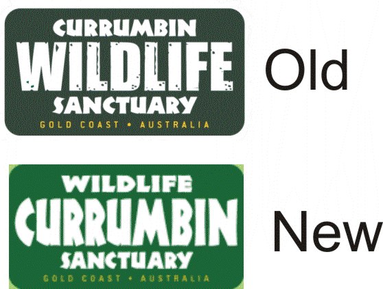
I know what you mean david.
CWS decided they needed a new design to reflect a new image.
This is what the designers changed their old one to. The green background is actually the same colour green
Attachments:
-
 quote David Rogers:A slight digression, but it is truely amazing that ‘designers’ can scam huge nationals for silly money for NOT redesigning their logos.
Heard this story many years ago – classics (may be legends) are TESCO and Rentokil. They requested an image update from the same design house – after much humming and hawwing they were presented with guess what… red underlines under the same old logo.
Tesco got the ~~~~~ and Rentokil got ________. Reasoning that it was an established identity that simply needed ‘underlining’ to emphasise it. Think in the region of £30k a pop….
😮 you gotta hand it to ’em…. they have some nerve..
imagine going to a customer and charging them silly money for a lovely red line under their name….all in the name of a "re-design"
(must order red vinyl now) 😉


Log in to reply.
