Activity Feed › Forums › Sign Making Discussions › Gallery › Signs: Petfood Supplies
-
Signs: Petfood Supplies
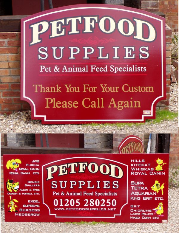
Posted by Steve Broughton on July 21, 2004 at 1:48 pmPart of a large job of 15 signs, these 2 are a mixture of paint, vinyl and gold leaf.
Attachments:
 John Singh replied 19 years, 5 months ago 17 Members · 27 Replies
 -
27 Replies
-

Pretty Snazzy Stephen!
I like the toons on the second one!
Love….Jill -

Excellent looking work Steve ,very nice 😀
Really like the toons on the second one, they are great little images :thumbup2:
Carrie :cheer:
-

they look realy smart Steve 🙂
what material did u use for the board if u dont mind me asking?
-

very smart mate.. great stuff as always..
i like the cartoons also… nice touch 😉
only gripe.. 😕
is the text in the second one, on the right hand different sized from all the rest?great work mate, thanks for taking the time to post your work. 😉
-

Great stuff Steve
I like the way that you have shaped the boards
Adds to the traditional lookJohn
-

Should Royal Canin be on twice under the dog section !
other than that nice job -

They look great, one day that could be me…………… 😥
Looking at them does remind me of a question that I keep meaning to post here, on the right hand side at the bottom corner there looks like a small sticker/label of yours.
Is that what it is?? and if so could you or someone else point me in the direction of a printers for these, and a best guess on cost?
Are they transparent and are they nice and sticky….?
Do most people ‘sign’ their work like this, I would find vinyl to fiddly for a small (2″x1″) label.
cheers….
John -

lovely work as always steve 😉 wats the story with the roal canin (?)
-
😀 Thought I’d leave it till someone notices 😉 seriously they are busy doing some building work there and the signs haven’t gone up yet so I’ll do it then, still have more to ad to this job so keep yer eyes peeled, you OK then Eddie mate?
John I usually tack these on the end of any digital jobs that I do, got bloody hundreds now, bewtter not change phone numbers had I :lol1:
-
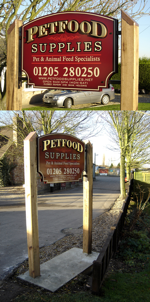
Heres the finished panels for the post sign on the main road, background medite, painted and vinyl, the main text 19mm foam ( I proffed a bit at the sign show 😛 ) then gilded with 23k gold leaf.
The attached othe drawing is how the sign will look when complete, it may be a while before I can post the finished job as the customer is fitting it not me, the panels are attached to a steel hanger that is fixed between the 2 6×6 9ft oak posts, anyone ever shifted any oak this size? well its bloody heavy, each post weighs around 10 stone.
Attachments:

-
looks great mate.. the completed work should look brilliant once in place.
thanks for taking the time to post mate… keep em coming 😉 -
Really cool signs, I like the posts thing, as has been said, the completed work will be cool 😀
Unlike me, I see you’ve spelt whiskas correctly 😳 😳 I still have to fix that 😳 😳
Cheers, Dewi
-
right folks this is it completed, customer fitted them himself i just gave instruction (didn’t want to pay fitting costs but its taken them 4 months to do it) went round today and inspected the fitting, didn’t want them to have made a cock-up of it.
Attachments:

-
Hi Steve, all I can see is two little red crosses.
Mark
-

I got the pictures to show by right clicking and “show picture”. Threw the page formatting out all over the place though. Seems to be happening a lot lately.
Anyway, sign looks brillopads Steve. I think I’d have recognised it as one of yours if I saw it. (Not saying your stuff all looks the same, you know what I mean.) Would look better if they chucked some gravel over the concrete though.
-
not sure if this will make any difference, but i noticed we have just peaked our max storage space for file uploads, by 200kb.
this is not a problem, i can up this myself in admin area and just have by another 200 megabytes. im hoping maybe this is the reason recent crosses have appeared in huge images being uploaded. but again ide be interested in any problems occuring, so please keep me posted and ill get the tech guy to have a look into it.anyway, i cant see the images eithere which is a pain but ive been having this bother with “some” pics in various forums. 😕
niks been a great hand on advice here, cheers nik 😉 -

lovely sign Steve, I must do something like that for my ‘showroom’ and try to ‘sell’ some class to the locals.
How did you fix the steel brackets to the medite, is it in a routed slot?
Cheers
Dave
-

Top job mate, real nice. Did you spray the edges with a darker red or black? Or are mine eyes goin mental? Nice look to it and colour scheme is great for the subject, raised letters work great mate. Bet the customer was over the moon, specially as the finished job is even better than the visuals and they were very good!
Beej
-

that’s very…………. nicely done steve!! 😛
i just love the overall concept & results!! 😛
Nik
-
That’s real purty, Steve.
Nice rich colors and a clean layout.
Love…..Jill -
Yet another beauty Steve
Like the length you go to present the original drawing
John

Log in to reply.
