-
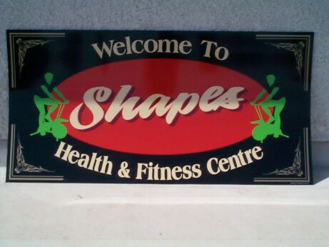
Sign, Foamex : Shapes
did this one a few weeks ago, it went up beside the entrance to our local pool, 5mm foamex as well, laminated in black vinyl & dry as well grey 😉 i got first hand training from tasmanias leading sign company
on my kitchen table
Attachments:
Log in to reply.
