-
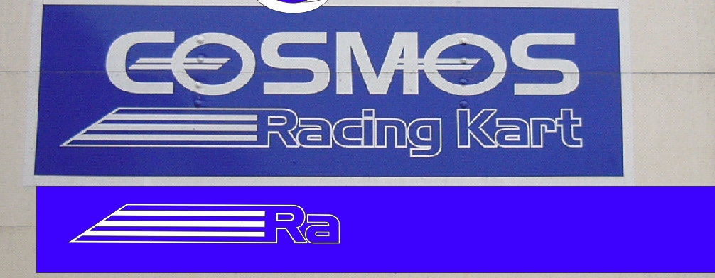
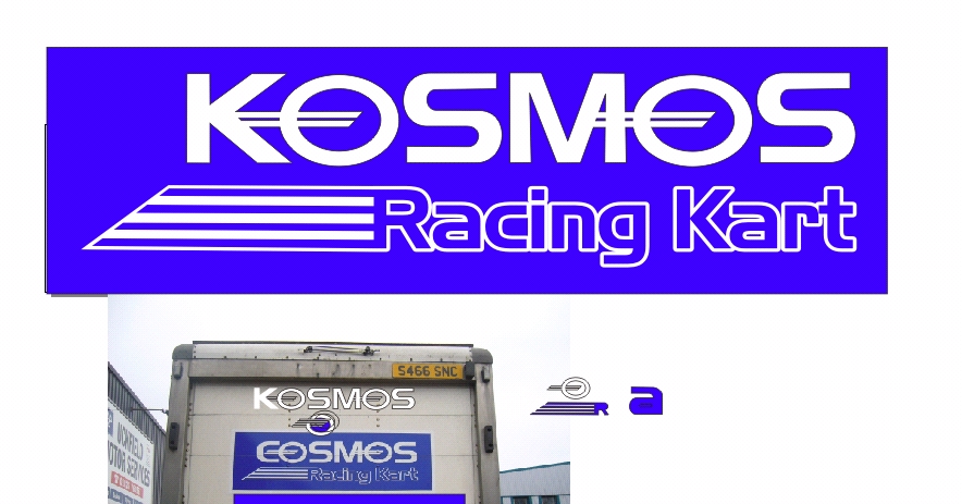
sigh…. need font help again !
sorry folks, twice in as many days !
i’m currently re-drawing this one the hard way, i’m getting thru it but really wwould prefer the proper font, i spent ages looking for it before setting out on my tedious task, customer has wanted mod’s and changes in the original sign, which was ok as it looks like custome lettering in the first place, but this one !
any ideas please ? would like to get this job nailed today !
thanks
Attachments:
Log in to reply.
