Activity Feed › Forums › Sign Making Discussions › Graphic Design Help › should i lose or keep the stripes on my logo?
-
should i lose or keep the stripes on my logo?
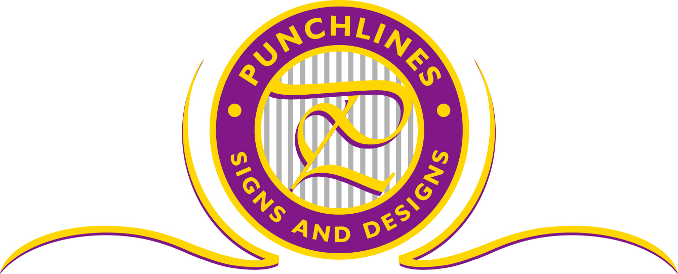
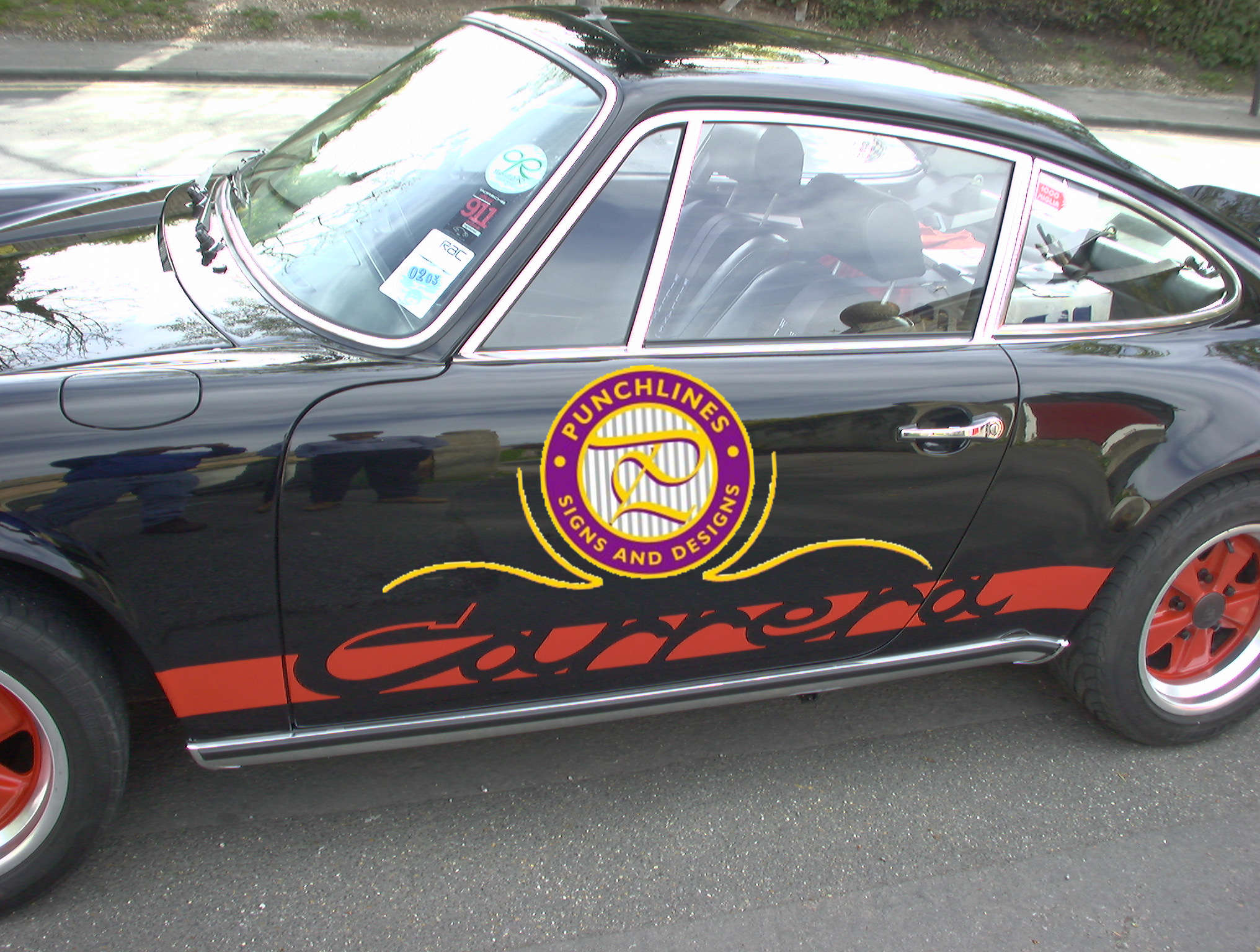
Posted by Paul Meadows meadows on November 1, 2005 at 4:24 pmI’ve been playing around with this design for a while now but before I cut it and stick it on me motor(with a phone number). I would value peoples opinions (I think I can take it!)
Paul Meadows meadows replied 18 years, 6 months ago 8 Members · 17 Replies -
17 Replies
-
i like it alot as a letterhead but i dont think it has enough punch for the car – i think it will draw work but not your bread & butter stuff too nice for them
chris
-
nice design paul i like it too 😀
i have to agree with chris though, it would look a bit lost on a car, i would emphasis your company name a bit more too 😀
nik
-
I like the design as well Paul, but agree with Chris and Nik…. I’m sure you could modify it and make the name more predominant for your vehicle. I’d stick with the concept, it’s nice.
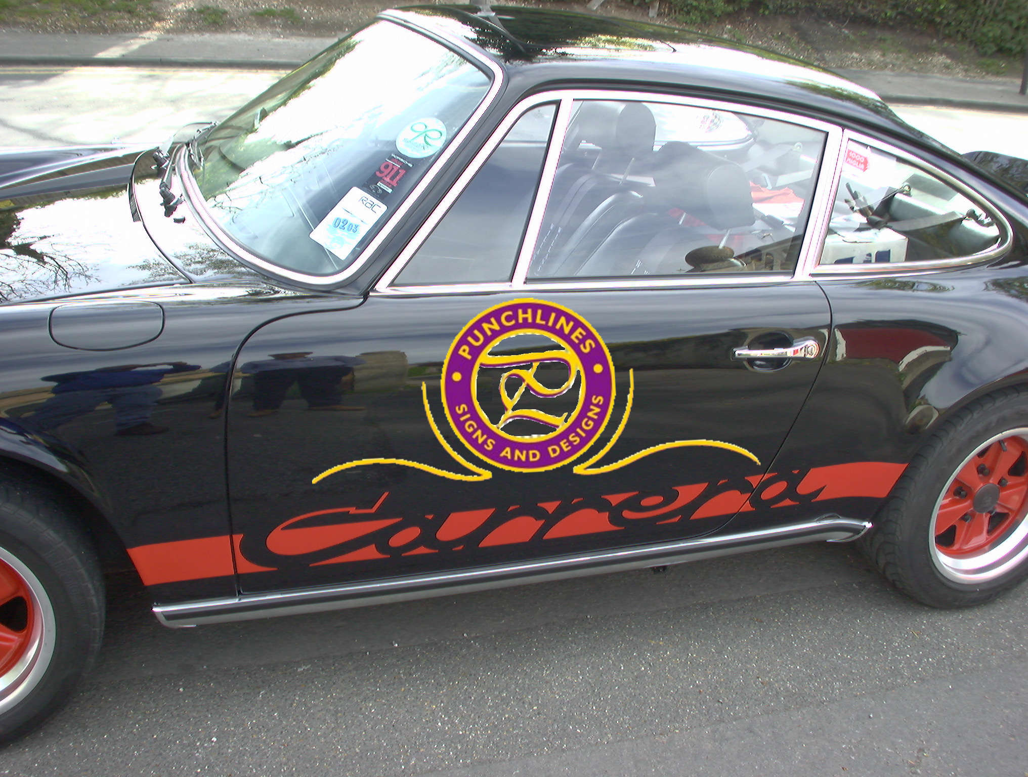
If you’re talking about the grey stripes, I vote no stripes..
steve
-
Thanks both….interesting comments, that’s what I like about these boards other people seeing things that you can’t. excellent thanks again.
Paul -
Thank you Steve, I wasn’t really sure about them myself.
Paul -
Hi Lynn,
I’ve haven’t worked out what can be done with an A4 cutter regarding size. With a circle it will be hard to achieve a reasonable size without doing it in sections and I don’t really think that’s an option. So a max diameter of 20 Cm’s I guess.
Paul -
Thanks for sticking it on a Porsche Pete, I don’t think I’d get much business though, people in this country don’t like it if they perceive you are doing well, exactly this opposite in the States I believe. I’ll try it on a beat up ole cortina!!
-
Paul, forget the beat up classic Cortina. Old porsches arn’t that expensive.
Most are far cheaper than a modern van. Boost your ego, buy a toy!
Peter -
Had a Lotus Esprit Turbo for a while Peter, started getting abuse from the younger generation and found it hard to get in and out of, plus of course it broke down a lot.!
-
Well Paul,
what do you expect from a ready built kit car 😀Ps I now what you mean about getting in and out, I have to think about how i will get up, before risking laying down!!
Peter -
Definitely different Paul:
Agree with Steve about the stripes
Is it going on a van or pick up truck?
Otherwise a cool design -
All I see is a P…..
With such a cool name, surely this opens many possibilities.
While what you have is classy, you might opt for a play on the name.
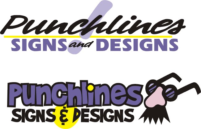
I couldn’t find any Punch & Judy clip art, but I did do these real quick.
Over here, with “lines” in the name, it would imply that you also offered custom pinstriping.
Love…..Jill -
Very Nice layout Jill 😀
I could see either of these on the side of a van
Clever play on words there too 😀Thinking back Paul: Your design is great but will it project the right image
of the creative designer. I think folks like to see a splash of colour and a freedom stroke -
-
Thanks everybody, I think your right about the image! I’ll probably work OK as a letterhead but perhaps a little too traditional for vehicles. Jill, how do you find the time to create so many designs?, every time i see a posting here you contribute something completely different and original. I’m impressed.
Paul
Log in to reply.


