Activity Feed › Forums › Sign Making Discussions › Gallery › shop signage: moonlight indian takeaway
-
shop signage: moonlight indian takeaway
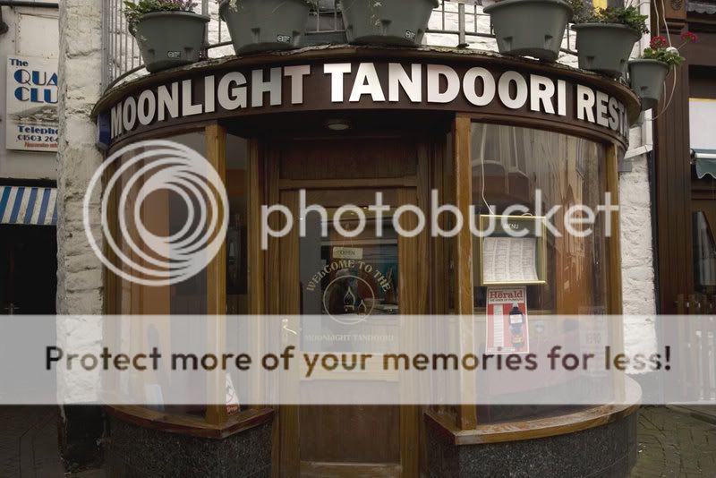
Posted by Steve Underhill on March 2, 2008 at 7:04 pmHeres one I fitted this morning, (yes on a Sunday)
Brushed ali dibond letters, on plastic locator’s, 250mm high.
Sanded the ply backing board back to the wood, filled all the screw holes kindly left by he crap carpenter, and applied 2 coats of mahogany sadolin extreme protection woodstain.There is actually a 45mm gap between the top and bottom of the board/letters but cant really see in the photo, customer wanted the letters as big as possible, so had a 5.5 metre long sign.
Had lots of nice comments on it from passers by so guess the letters aren’t too big, I wanted to make them a bit smaller but at the end of the day the customer is paying to get what he wants.
I have lights to add now as well, but dont have much room to work with so will have to use something projecting up and out.
I also suggested he re stained the rest of the woodwork to match the staining I did behind the letters, and now I have a painting job to do so tthats a bonus.
 David_Evans replied 16 years, 2 months ago 8 Members · 17 Replies
 -
17 Replies
-

That’s alright that!
Wouldn’t like to guess on a cost of replacing those windows though! Oooh!
-

looks good to me Stev, as a suggestion for the lighting, would it fix to the railings above?
Peter
-

Honest opinion Steve……….sounds like you’ve given the customer what they wanted but personally I think they’ve missed a trick.
I don’t think that font suits the situation……there’s loads of elegant fonts out there that I think would have looked much better.
I just think it looks too big and bold rather than elegant and classy
sorry
-

I went in for a meal and took a list of printed out fonts superimposed as letters on the fascia, he picked out franklin gothic, its very difficult to persuade this guy any other way is right but his way, I personally chose a much thinner font, but he is like a magpie, he even wanted me to get him one of those tacky flashing led signs, I persuaded him to have edge lit instead.
My hands were pretty much tied on font and sizing, I even had to have westcountry security out top move a burglar alarm so the letters could be bigger and bolder. 😕
I tried to have him use "Moonlight Tandoori" and drop the restaurant part so I could use a better font but not a chance, it was franklin gothic heavy, and no mistake guvnor!
Also with the sign being only about 7 feet high, a thinner font may have shown the locators from the side which would have been ugly, this font certainly hides them! 😛I actually quite like it and people in the street who saw us putting it up came out with nice comments, and most importantly the customer loves it, as I mentioned it doesn’t do it much justice in the pictures it was overcast and a bit grey, it does actually look nicer in the flesh.
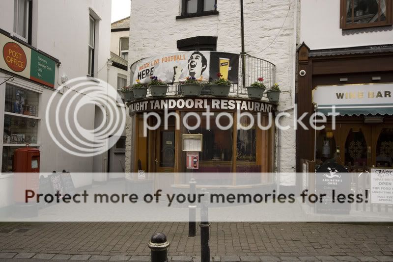
And Gareth, the windows (being an Indian and in a busy street with massive summer intake of drunken hooligans & locals) that have replaced one on the end, it was over 2 grand for glass, its now acrylic, and getting quite scratched.
Good idea on the lighting Peter, I will have to find out if we can fix to those as Its somones balcony, but the Indian owns the lease on the bar upstairs also so shouldnt be a problem,
nice one. -
Yes, its going to be quite a bit of work in the end, the finishing on the place leaves a lot to be desired, how the "tradesmen" who put the fascia up, and whoever left unevenly cut lead flashing and unpainted wood there sleep at night is beyond me, so I guess Ill quote for repairing all that too.
Its a good advert for the work though right in a busy main street, (opposite the Chinese who has plastic letters falling off his 15 year old sign) :lol1: -

Some classy and low key foliage work along the top of the glass windows would be nice on that Steve….might help to soften the lettering. I presume he will replace the gold window decals with silver?……. as the whole frontage is crying out to be ‘tied in’. I would try and talk him into doing something with the grey plant containers…they dominate everything.
Well fitted job……any tips for applying to the curve?
-
I originally fitted white lettering on that window, as it showed up day and night, its hardly visible in some lights he asked for it to be taken off and done in gold, edge to edge, in those exact fonts etc, the guy is very very immovable when he likes something, he is like a magpie, the shinier and more blingy the better so I think the gold will stay, but the flower boxes will be full of nice flowers in summer I think so will be a little less domineering, but will suggest maybe silver etch instead of the gold vinyl to him, that will add some class.
As for fitting Harry, we just taped the template on, (5.5 metres it was)
got it all level and measured even and started drilling for the locators and fitted as we would a flat sign, there was no curving of the letters at all due to their size, it was all done in 2 hours start to finish. -
Its also right opposite our "other sign makers" office window
you know the type of "sign maker" mentioned in another thread? :lol1: -
Thanks for all the nice coments folks, appreciated.
Tell them that in Chamonix Dave,
could do with one of those jobs a week and I can do the rest of the season out there in a luxury chalet. :lol1:
2 jobs and I may be able to afford a meal up the mountain or a pint of lager over in the alps too.
4 hours work on monday, snowboarding the rest of the week, sounds fine to me. -

Might need more than 1 a week if you wanna eat on the mountain and stay in luxury!
My avatar was taken a few summers ago at the top of the aiguille midi, not long now mate!! -
In 1 weeks time I will be probably just coming home from one of chamonix many fine lager emporiums.
No drinking Pelforth on draft this time though, 6.5 % beer is not good in the mornings -
Yeah know that stuff well and Mutzig!! Think there’s a real good micro brewery/bar there now. Anyway bit off topic again dont want another tellin off
-
Mutzig?
I printed a couple of T shirts for a guy who taught snowboarding in Meribel that said Mutzig on them.But yes, a few jobs like that a week would be lovely, was well paid.
-
Mutzig very strong lager from alsace the missus wont drink anything else
Log in to reply.
