Activity Feed › Forums › Sign Making Discussions › Gallery › shop signage: fresh coffee
-
shop signage: fresh coffee
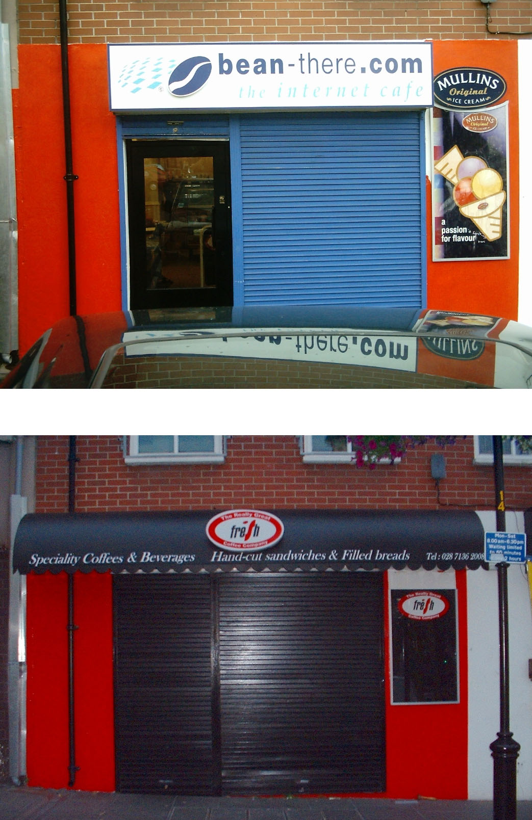
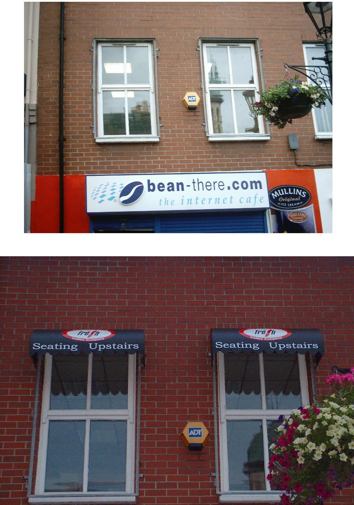
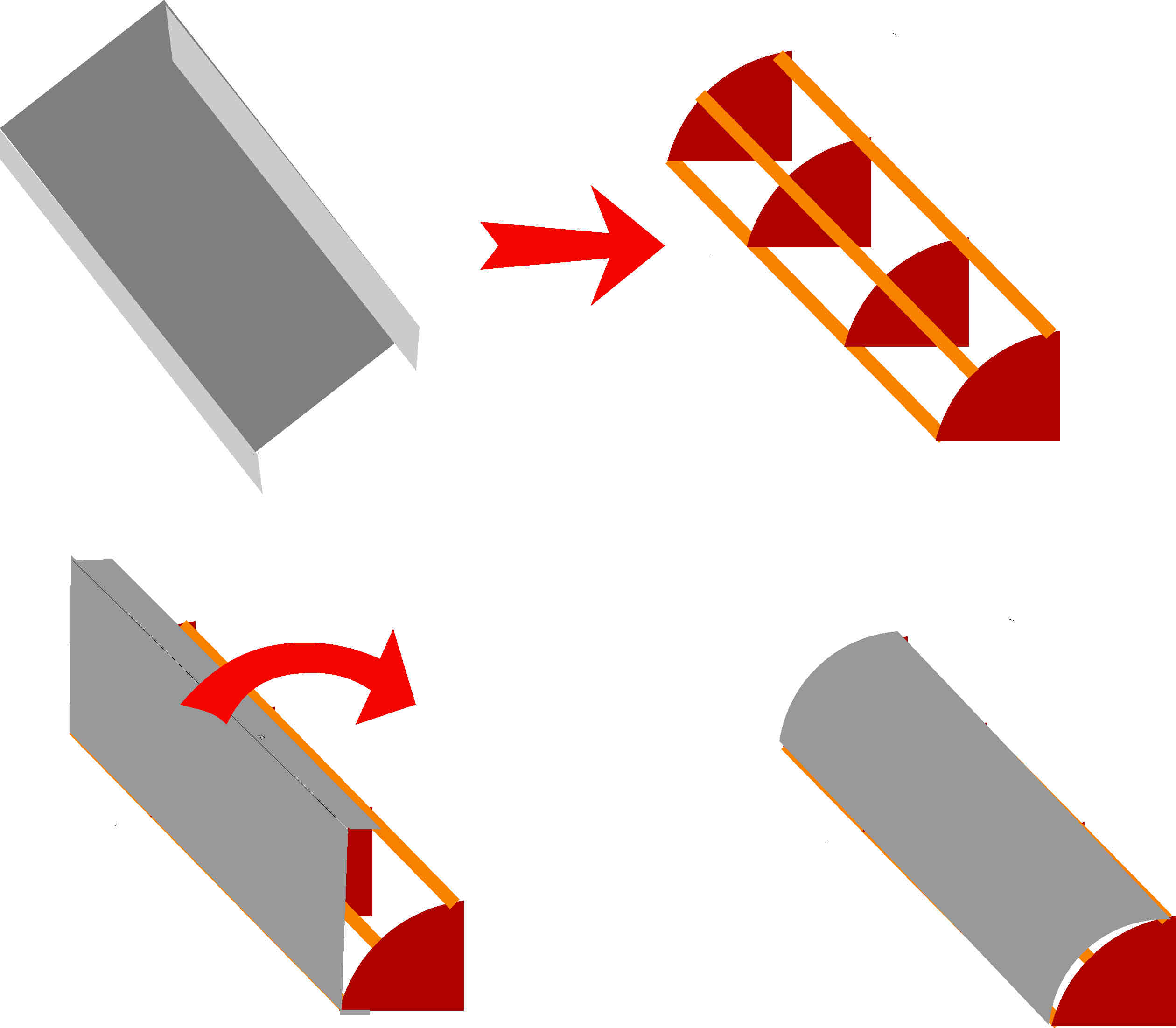
Posted by Patrick Donaghey on October 4, 2005 at 4:23 pmthis was a Coffee shop i have just finished . the owner wanted to have a canopy type sign. I had never done it before but as he was one of my best customers he wanted me to go ahead as he was always pleased with my work before. The canopy is 16ft long and 33″ x33″ i used 3mm sheet aluminum as it was easily curved and held shape well it is covered in Matt vinyl. The sign in the middle lights up (he already had this and wanted to use it I wanted something bigger). I Also made 2 smaller canopy’s for up stairs as this allowed people to see that there was seating upstairs
Attachments:
 Nicola McIntosh replied 18 years, 7 months ago 13 Members · 15 Replies
 -
15 Replies
-

That looks fantastic
You should do a demo on those mate
I bet the client was well pleased
paul r
sorry, using jules’ comp
-

nice job dude, i’m assuming the ends are fitted seperately to the rolled (curved) section, did you rivet them or Tig weld ?
i like the idea of the canopys though, they give a nice dimensional finish to what could otherwise be left as a flat sign, !
-

this is how it was made using exterior ply and 3″x1″1/2 timber
The reason being the shutter was external and the wood was cut to fit over the shutter
Attachments:
-
i see ! good plan !
i was just thinking back to my old days as a trainee industrial ventilation bloke, we would get asked to bend or make all manner of things, we used to curve flat sheet and then put the edges theu a machine that folded them in a special way, then the ends had a lip which slotted into the fold and the first fold was them flattened over the end of the lip, securing it all and making it stiff, certainly stiff enough for the smaller ones to be supported, i was wondering if the same could be applied here… hmmmm ! more little brain lights are switching on !
thanks
-

Nice work … the canopies look great :thumbup2:
Good of you to show us your stuff …. always nice to see other members work.
😀
-

Brilliant idea matey. The canopies look real smart. The main one really does make the place look much bigger. Thanks for showing.
-

Looks like you have done a good job with it well done. Did you look at fitting a proper canopy or did the customer want something this solid?
Only other comment might be to do with colours, don’t know if you looked at using light colours but these would have helped to make the place look bigger. -

What a transformation, Well done. That has certainly added a lot of impact to their frontage. Much more than I would have imagined was possible. You should be a builder instead of a signmaker 😀
-
thanks for all the positive comments. The only reason i used so many supports was because the sign was made in two half’s and the was another sheet under neat the canopy with holes cut in it for surface mounted spot lights. so i was able to screw the bottom of it to the wood. I wanted to use a bright red but you know hat customers are like!!
P4trick
-

I like that Patrick, when faced with a poser you came up with areally good solution i may borrow your idea at some time and i think you are right red would have been more striking, but black is more sedate nice job.
Lynn -

Super job Patrick……its totally transformed the shop front……well done !
Cheryl 🙂
-

Very Good!! 😀
We have just ordered our canopy from a company called White Villa I think?? 😕
Also we found the canopys could be quite expensive, but they look great!! 😀
Cheers
Chris 😀
-

nice work patrick..great idea with the canopies turned out really nice 😀
my only const. crits i would have brought the words ‘seating upstairs’ in together a bit…as there is too much space in the middle and does look a tad tight to the edges, and avoided squashing the letter down 😀 other than that a real good transformation done 😉
nik
Log in to reply.
