Activity Feed › Forums › Sign Making Discussions › Gallery › Shop Front: Coopers
-
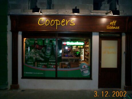
Shop Front: Coopers
Posted by eddie cotter on January 21, 2003 at 5:36 pmhear is one i did beofore christmas, 19mm raised foamex sprayed yellow
customer supplied the design, 1 hour to fit,eddie
Attachments:
 Robert Lambie replied 21 years, 3 months ago 6 Members · 10 Replies
 -
10 Replies
-

Eddie, did you cut the letters yourself by hand or did you get someone to router them for you? Did the customer repaint the facia himself or was this part of the job?
Lastly did you do the lights or were they there already?
Sorry about all the questions!! -

hi martin, as i have no workshop just yet, i got the job done on a gerber sabre, the back ground was already painted by the decorators,
the shop is new & scrach built from the ground up, if you look closely at the picture you can see the second storey isnt even finnished & has no windows in, didnt fit the lights, just the letters eddie -

Nice, simple and effective job there, pity those lights dont give it the light it needs though…
-

nice work mate… 😉
constructive critisism:
i guess you will already be aware of this mate.. but ill say it anyway. the reason i am is one of our guys did this yesterday also. so your not alone and he’s been designing for about 5 years now..
anyway, the “P” in coopers, the leg is gonna hit the bottom of the sign if you centre it on the fascia. so i see you have moved it up a little to componsate for it.. if ever designing in future for this type of thing. always try and make sure you are centring the text with the capital rather than the group of text including the tail of the “P”. its a very easy mistake and makes all the difference in the finished job…
one last thing eddie, ( shut up rob i here you say 😆 ) the font mate.. im not sure if your using there own font. or if the guy picked this one. but i would try use somthing a little more traditional for a pub. somthing like plantin bold or clarendon bold.. heavy print & with serifs, that type of thing.now ive said that i sound like im knocking your work… 😕 im not, its a good peice of work especially as you are not directly involved in this area of signage yet. well done mate 😉
-

Hows about a flying session in Eddies off licence cum pub Gray… you up for it matey?
regards Steve the drummer boy Eddie what is the Trad Music scene like in old Tipperery? -
gray! its a long way to Tipperary is it not? 😆 😆 😆
-
 quote robert:if ever designing in future for this type of thing. always try and make sure you are centring the text with the capital rather than the group of text including the tail of the “P”.
That’s a useful tip Rob. I had this same problem today and agonised for ages about how high to place the lettering I was working on – do I centre the entire group including the tails? or do I centre the lower case lettering? On reflection, your advice to centre the capitals is correct. I ended up centering my lettering by eye – but I should have centered the upper case lettering to make it look right. Thanks for clarifying that for me 😀
-
nice designs gray, & thanks rob for the input!
now the font is bradley hand, the customer gave me an a4 with it
& wanted it exactly the same, in yellow, when i gave the design to the company to do the job they felt that as the letters were so thin
it would not be advisable as the studs on the back of the letters would be seen, i went back to my pc & did a few different layouts, including
the one i thaugt would be nice, brewers bold, a lovely font,
i took the designs back to the client & he didnt want any of them
(:) bloody pain! eddie -
enough said eddie! we all have had our fair share of that type of customer.. they pay for what they want no problem but havent a clue when it comes to the design… 😡 😡
a bit like buying a bmw but wanting it with lada engine 😆 😆
-
you know gray you may just be right… im agreeing with you but somthings saying no! 😕 😕
(maybe me not wanting to admit ive yet again embarressed myself.. 😆 😆 ) 😉
no… you are right and im wrong! 😮 😮
i think i know why i have said it but not going to say untill i post a picture of the sign we did and made the mistake it will explain why i said this.. 😕 well i hope anyway, im sinking fast here! 😆 😆 now where is my camera (?)
Log in to reply.
