Activity Feed › Forums › Sign Making Discussions › General Sign Topics › Shop front colour help
-
Shop front colour help
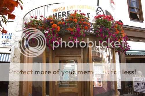
Posted by Steve Underhill on November 27, 2007 at 3:03 pmHi all.
Font not decided yet, colour is brushed stainless letters, size is about 170mm
the back board is ply and about 200mm
customer wants to change the colour of the back board so the letters stand out more, Im thinking dibond wrapped round the building but unsure of colour, only colour I can seem to make work is black, and I’m still unsure of that.
its going to be 27 letters in total in a semicircle round the top of the building.
So far the only thing I can decide on is the finish of the letters and customer is in a rush as Its an Indian restaurant.
I have a few font ideas, but its the back board colour I need to sort.
Any suggestions?
 Steve Underhill replied 16 years, 5 months ago 9 Members · 24 Replies
 -
24 Replies
-

I would pick up on the burgundy(ish) of the seating that you can see inside.
Black would be ok but a bit dull.
Burgundy of the right shade looks really good with natural wood colours.And I don’t like the font! 😀 😀 😀 😀 😀 😀
-

You have a point harry, Ive never noticed the burgundy as Ive always had a skinful when Im in there.
Can you even get burgundy dibond?
Flood coating its not a problem but its 5 metres long and very thin
The font is perfect, even tho I haven’t chosen one, leave it alone. :lol1: -

don’t think you can get burgundy dibond 😕 If you don’t want to flood coat, then how about dark green? Would look nice with those plants too 😀 You get green dibond ……. don’t you?
-
I did think green but the last sheet I bought was quite a wierd shade of green, so was a bit dubious.
Now its winter all the plants are gone, i forgot to say.
I would say stain the whole shop front a darker shade and put the letters right on that, but I dont think he would want to do that. -

Obviously a darker colour will give maximum contrast but I did one with brushed and it actually looked good, customer insisted on this background colour as he painted it, I told him it would not stand out too much but was pleasantly surprised at how ell it does 😕
-
Yes that looks nice, nice and clean.
dont think I better put white thee though, Ill just take a load of offcuts with me tomorrow and stick them by the wood see what goes.
Can always take the swatch with me in case I end up flood coating.
Im sure if he Had his way it would be shiny gold dibond behind there he likes gold. -
 quote Marcella:don’t think you can get burgundy dibond 😕 If you don’t want to flood coat, then how about dark green? Would look nice with those plants too 😀 You get green dibond ……. don’t you?
Thought you would be offering some off cuts of your over-ordered Europoint blue vinyl to flood coat .. :lol1: :lol1:
-
Ill just paint it with a 4" brush, thats what Ive been doing for the past 2 days, painting signs, none of that vinyl and dibond nonsense.
Almost ready for the top coat now the primer and undercoating is out the way -

Hey Steve. I think I’m a little confused which part is going to be painted and copy re-set? Is it the part on top that says, "Watch Live Football Here!"?
-

I think it would look best as it is, with the letters straight onto the wood. Is there a reason for putting up a board other than changing the colour? Whatever you do will be a board stuck onto a very nice shop front and I think the brushed steel would look nice as is.
Gavin
-
Sorry, its not being painted, I was joking about the 4" brush as Ive been painting signs for 2 days.
Its the top bit above the door, the semi circular bit of plywood.
we need to cover it in dibond or similar and then attach the stainless letters to that.
The football banner is to do with the pub upstairs who is having a different sign later on.Gavin, I think you are right, I said to the owner about tidying up the ply behind it and making good what the chippy had left as its not very well finished, but you cant see it so well in the picture, its 6mm ply wood and I would have a few screw holes to fill etc but put some wood stopper in there and re stain it I think it would look very nice.
I will suggest it to him again as the cost of the dibond can be offset against me tidying up the shop front. -
Cool. Just wanted to make sure. I had a buddy of mine that was a manager and head cook of an Indian restaurant in college. Here are a few fonts that I just scrounged up from my collection. I’m not sure of the name because I can’t read it on the photo. I just used the name of one that I like here in Atlanta in place. Now that I know where it goes, I might play around with it a little later on the photo with some different colors. Ok I’ve just noticed that it won’t let me attach a photo on this post. Is there a reason I can attach photos in some posts and not others?
-
Im not sure about attaching the pics, one thing though the font we use has to be cut from 2mm stainless, that’s not too bad for any font really but just a heads up, not like the limitations you get on built ups.
Have a play, see what you like to see up there.
It has to be a bit conservative and easy to read as its in the main street. -
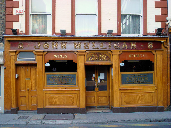
If you are going to stain it make it darker as I think the restaurant would benefit from a frame……especially as there is a competing business upstairs. (competing for attention I mean) This is what I mean
This could almost be burgundy too.
btw if you are ever in Dublin seek this place out, its city centre and has the best Guinness on the planet as well as being a beautiful ‘real pub’ (not many left!)
-
I agree with what Harry said (nice link btw). Making it a darker stain (or even a burgundy as others suggested) would probably help. Especially if the upstairs is a different establishment. You could probably get away with a brushed brass and make it look nice instead of gold if you had to.
-
I think I see what you mean, contrast the dark stain with the existing to make the top bit stand out?
That pub looks nice, and Ive never had real Guinness, only the stuff you get here, now I want one and I cant as I have to go and take plasterboard down at home.
Incidentally the Indian owner owns the pub upstairs anyway, but leases it out, he gets enough business from the customers coming down the stairs directly into his take away, me being one of them. 😛
-

here is a job i did last year in brushed steel letters on a burgundy background

-
THAT looks very nice.
Burgundy goes well with stainless eh.
I shall have to take some burgundy vinyl round and see how it goes with the rest, or just stain it a burgundy type colour.
theres at least a few options available to me, good ideas all keep em coming. I like em. -
Ok let me see if I can get a link to a photo on Flickr to work. Since it won’t let me post directly.
-
I think 9, and 13 would be most suitable, but would need to know how thin they go as gluing locators on might cause problems, if they were too thin in places. couldnt really use the script lettering due to the curve of the building.
nice fonts though. -
If you want to let me know what copy you want set. I can set it in those two fonts and then covert to outline and then send the eps. You can then play around with them to see if they’ll work or not. Just let me know if you want me to or not. Cheers
-

Steve from the pic the wood looked ok a dark mahogany would look good as well
Lynn
-
I agree, I am going in there tomorrow and will see if hes up for some staining, its what I already mentioned to him earlier and all he seemed worried about was that dibond was quoted and may not be used.
Labour on the staining will be more than the dibond cost anyway.

Log in to reply.
