Activity Feed › Forums › Sign Making Discussions › Gallery › Shop Front: animal kingdom
-
Shop Front: animal kingdom
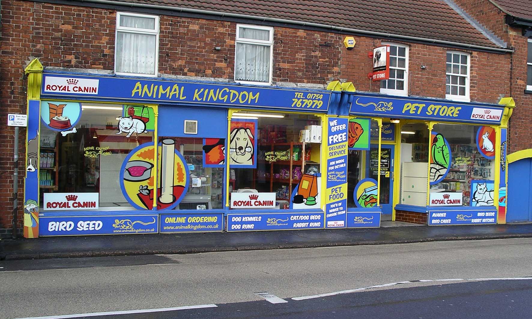
Posted by Pryam Carter on January 12, 2006 at 10:12 pmThis was a nice little job to do.
Attachments:
 Pryam Carter replied 18 years, 3 months ago 9 Members · 11 Replies
 -
11 Replies
-

Love it!
Sorry better say why. original and so much to look at without being busy
Peter -

nice job done billy 😀
my only const. crits….i would have left the pillars and along the bottoms solid blue….no lettering, and used only one (royal canine) and incorporated the wording more on the windows, along side the pet images….and also used the same font for animal kingdom & pet store sorry…it just looks scrambled too me 😕
nik
-

That’s brilliant that is. It will certainly catch peoples’ attention.
Except you’ve mis-spelt “aviaries” 😛
-

Well done Andy, now every one is playing spot the “AV ARIES” 😀
-
 quote :my only const. crits….i would have left the pillars and along the bottoms solid blue….no lettering, and used only one (royal canine) and incorporated the wording more on the windows, along side the pet images….and also used the same font for animal kingdom & pet store sorry…it just looks scrambled too me
The customer wanted plenty of info of the stuff he’s selling inside, my concern was that it might get a bit messy but i personally don’t think it’s too bad.
I agree with the lettering on the fascia but he wanted to use the same fonts as his logo.
As far as Royal Canine goes, they paid for it so we did well to get them to limit to that believe me!! 😀
-

Look’s really great..I assume the window graphics are on the inside..
how do you get on lining up the colours etc..well done mate..
Jon
😀
-
quote :how do you get on lining up the colours etc..
It all went pretty well on the day. Did it all dry so it went on easily.
-

wow looks great so much going on but makes you want to read further
nice job mate
rich -

Yes it’s great, just on the edge of being busy but your on the right side. The clip art is all the same style which ties it together well. Where did you get the clip art or did you sketch them yourself? I know sponsors want their name plastered everywhere!
-
quote :The clip art is all the same style which ties it together well. Where did you get the clip art or did you sketch them yourself? I know sponsors want their name plastered everywhere!
Clip art is from Corel. I used all the same style to tie it all in.
Royal Canin were pretty good but we did have to put our foot down a little to limit it to this. Mind you, when they are paying you can’t argue too hard!!
Log in to reply.
