Activity Feed › Forums › Sign Making Discussions › Gallery › Shop Fascia Sign
-
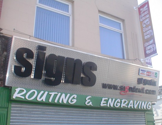
Shop Fascia Sign
Posted by signdevil on February 21, 2004 at 3:20 pmThis is how a sunny Saturday morning should be spent – working on your own signs coz there aint’ enough time during the week.
This is one of the signs at one of our outlets (I’m talking about the main bit only) We spent the christmas building the chequer plate boxes and have only just got round to signing one of them.
We made everything you see and we’re pretty pleased with the outcome even though the pics don’t actually do the job justice. What d’ya think?
Attachments:

 signdevil replied 20 years, 2 months ago 7 Members · 8 Replies
 -
8 Replies
-

Looks brilliant mate. Well done! 😀
Are those letters backlit?
My only feeling and this maybe just me but. “Routing” may not mean anything to Joe public. I know lots know what it is but will the public that the sign is targeting know?
Will you be keeping the green shop front below now the new sign is up? A charcoal front or something to tie it together would be nice.
Anyway. I think the whole thing is very smart. I particularly like the little red devil letter in the URL, nice touch. 😉
-
Great Stuff..
I like the mix of materials and colours
Simon
-

I like it – certainly looks really striking and I’m sure it stands out really well in the street. As kev says, it would look fab with halo illumination on the built-ups – don’t know if you have any illumination or not ?
well done anyway,
Nigel
-
Well you swanky beggar!!! 😀 😉 Fantastic sign that says it all. Really like the chequered plate with the huge SIGNS, what an impact! And the Signdevil web address, really effective as well. You’ve got to be pleased as punch with this one, makes my shop sign look as if it was designed in medievil times!!! 😉
Cheers, Dewi
-

Cheers for that guys. That one sign has been a long time in the making but you know how it is when it comes to working on your own stuff. There is an old saying which goes, ‘The cobblers son has no shoes’ and I think that is quite appropriate for loads of sign companies.
Just gotta get rid of all that naff green now which was the original scheme 3 years ago. Going to go with black paintwork me thinks.
-

looks great mate.. i agree with ridding the green. maybe a dark grey like kev says.. black can sometimes be very bland.
do you plan to over light it or are the letters halo lit? -
No, it aint’ halo lit. The job was taking too long as it was and I just wanted it finished. We intend to run a black trough light the full length and set it out a good distance so as not to create too much of a shadow on the letters.
If a customer asked us to recreate this sign for them I think they’d drop dead at the price. What with the matl’s man hours and everything else it has been a big project, the building of the chequer plate box being the biggest. Oh, and that is just sign 1, there is another one around the corner.
Well worth the hard work though. There are a few other sign companies in our town and they are not that friendly. You know how good it feels to show your competitors what you can do, right !
Log in to reply.
