Activity Feed › Forums › Sign Making Discussions › Gallery › Rogers – various Work (III)
-
Rogers – various Work (III)
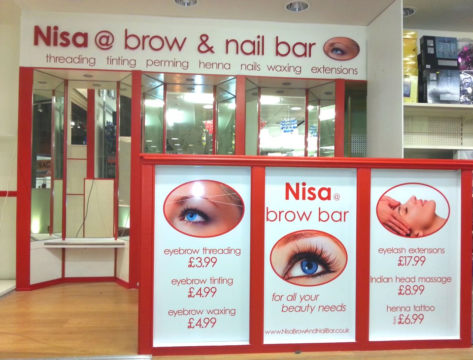
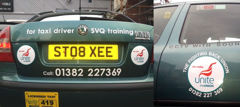
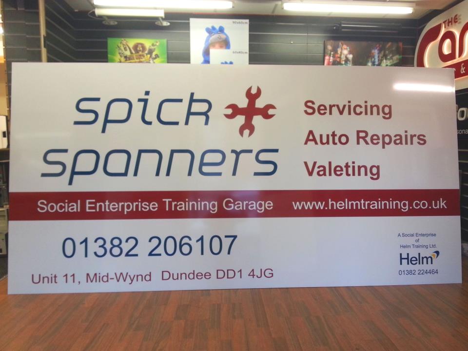
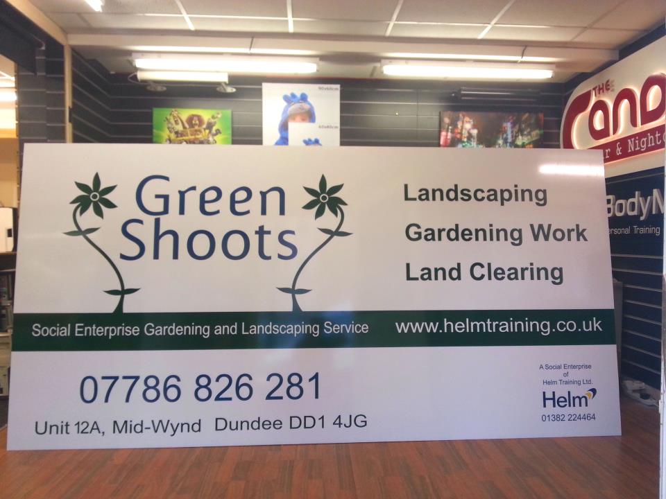
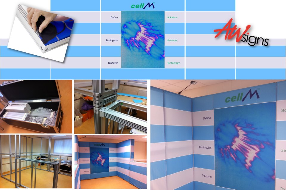
Posted by David Rogers on February 24, 2013 at 12:30 amBelow are a few of our recent projects.
Attachments:

 Colin Bland replied 11 years, 3 months ago 7 Members · 8 Replies
 -
8 Replies
-

really great work david thanks for taking the time to show us :thumbup2: 🙂
-

Excellent work David – clean, imaginative, unique – just the biz!
-

Glad to see you’ve been busy.
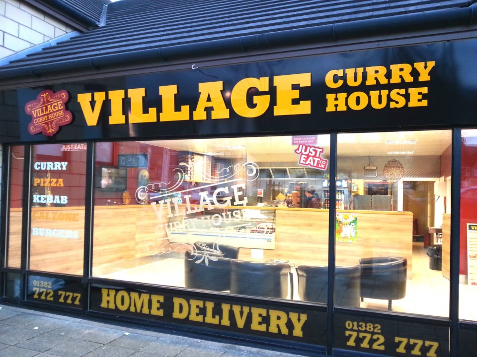
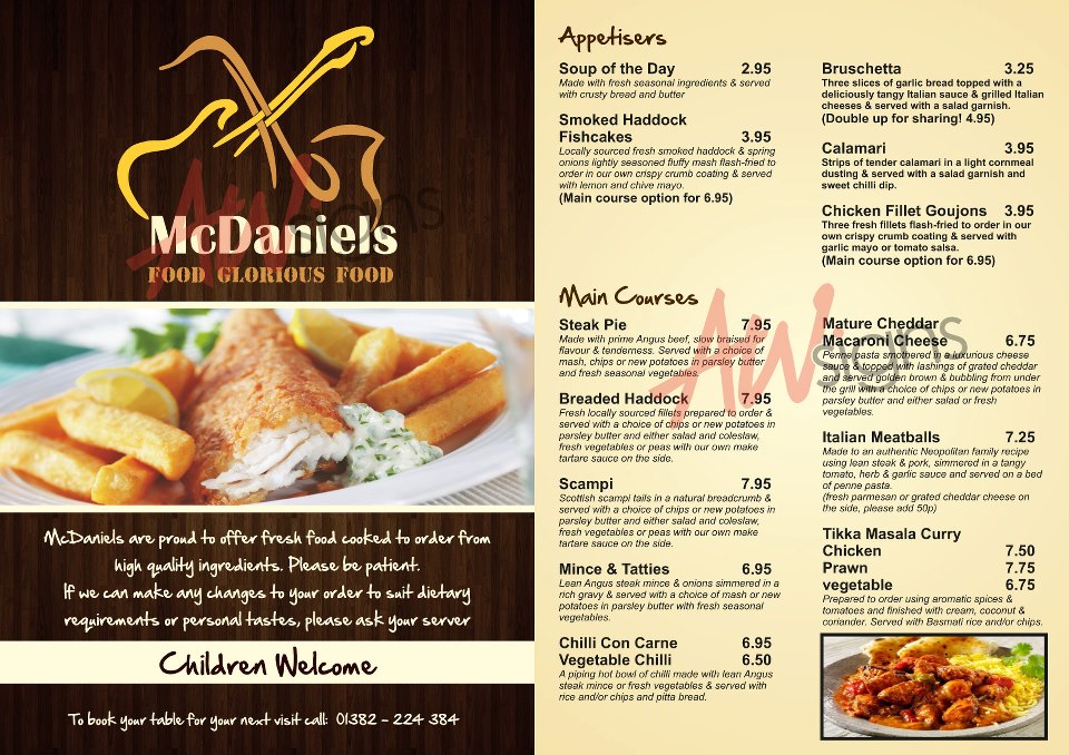
My fave is the curry house. I’m partial to Pittsburgh colors.
🙂
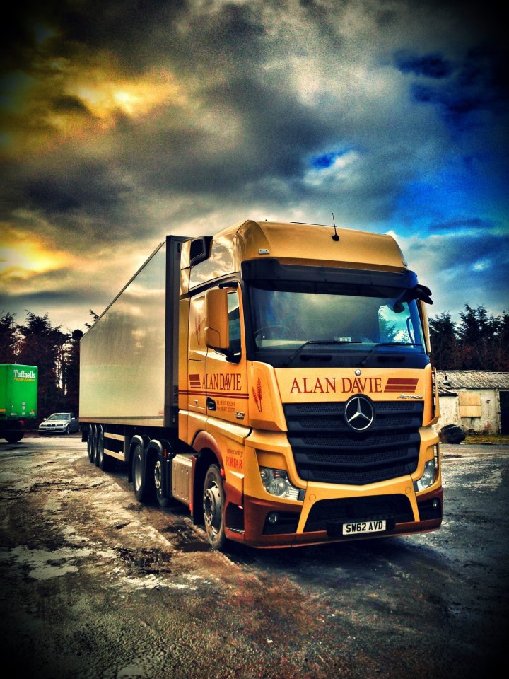
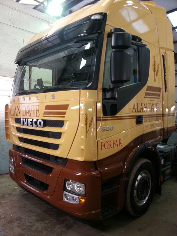
Also love the Forfar truck, nice subtle colors.
Love….Jill -

Great selection of work David!!
This is proof of why this profession we find ourselves in is rarely boring.
Curry House is prob my fav and prooves why its worth spending money on some descent signage it looks very welcoming.
-

CURRY HOUSE is also my favourite out of the bunch too.
classic clean looks – a far cry from the clients original ideas. Glad we talked him into this.
Internally we’re doing some flip/rotate style (like mcdonald’s) lightbox menus to complete the job.
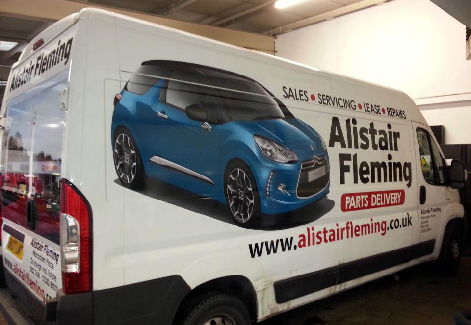
I’d been doing the Alan Davie trucks for years then I left my last place and didn’t go touting my old client list…they came looking for me and found me after nearly 2 years. Basically they’ve disliked every other attempt by other sign companies to match my look and accuracy whilst following the same format they’ve have for years…simple things like getting the lines running straight and not a wavy line.
The exhibition stand was a mission in itself with VERY exacting specs on the artwork. I figured there was no way the client would go for it at the price we had to charge (it’s REALLY not a cheap system)…but due to me bigging it up and getting some small samples…and exuding confidence he went for it. A few small issues between us and Tecna in terms of damaged goods and their initial unwillingness to send a test print of the fabric before I dropped nearly £4k…it also becomes evident that they do a LOT of drop-shipping of the parts as it all arrives separate. But on the whole good guys and REALLY good customer service.
-

great work as usual david
nice clean fresh designs
7.03 in the morning and i fancy a curry
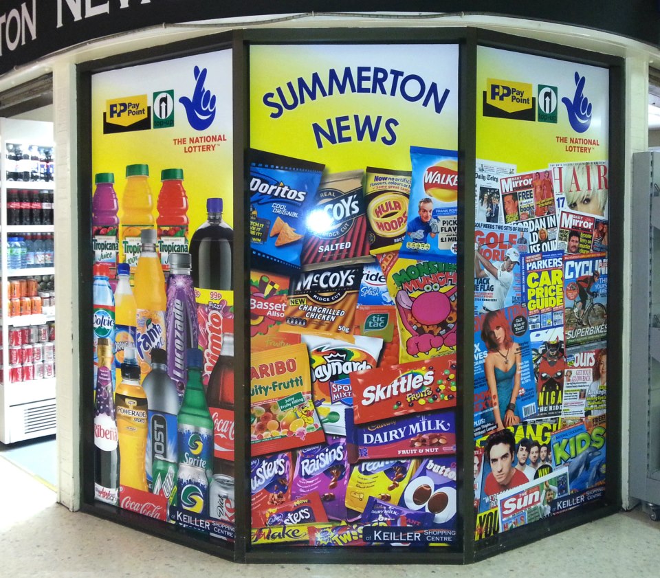
what materiels did you use for the summerton news facia
got something similar to quote on and that looks realy vibrantthanks for posting
derek
-
quote Derek Heron:great work as usual david
nice clean fresh designs
7.03 in the morning and i fancy a curry
what materiels did you use for the summerton news facia
got something similar to quote on and that looks realy vibrantthanks for posting
derek
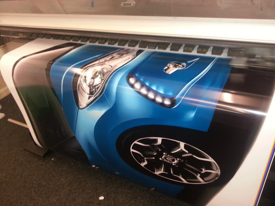
Summerton. We printed on Soyang with matching laminate. Images are all HIGH resolution ‘press release renders’ and NOT photos…we gave up on photos a LONG time ago as they are always washed out, poor reflections & lighting and a nightmare to composite into a layered image.
I normally design in RGB in photoshop (more vibrant on screen and better for filters), save out as JPGs and print. Looks more vibrant than CMYK efforts in the final output (I find it more noticeable with mid blues, greens and reds).
Dave
-
Some great stuff there well done
We have a similar project to the summerton news where did you get those images from we cant find branded images anywhere and they look so goodColin
Log in to reply.
