Activity Feed › Forums › Sign Making Discussions › Graphic Design Help › redoing my logo, some guidance needed i think…. take 2
-
redoing my logo, some guidance needed i think…. take 2
Posted by Hugh Potter on April 15, 2010 at 1:53 pmHey Guys n Gals,
some time ago, about 8 months ago actually, some of you may recall this thread… https://www.uksignboards.com/viewtopic.p … sc&start=0
I was looking to improve a few things and re-do my own logo and vehicle, I took a fair bit on board as a result of that and have since altered the business name and updated the logo a fair bit. Now that my website is almost finished, I was considering trying to incorporate the website look onto the vehicle. while i’ve not done a huge amount, it’s been at the back of my mind since, so…
still not using a van so the Previa is the target, the plan was – some time ago- to wrap it black (reflective) and use an optically transluscent red film for the dragon, plan being that the dragon would light up as the black reflected white at night and, look iridescent during the day but, as the website is predominantly white, i reckon a rethink is in order, now considering the colour change to white with lam’d white contravision over the tinted rear windows and then applying whatever on top.
re black or white… cost, do a degree, isn’t a major concern, was looking to wrap (as suggested by a mate) with hexis HX20000 ultra conformable cast, if i go black then i have to re-tint the windows heavily(the original tint was clearly not designed to be scratch proof or sign resistant!) so tint or contra, much of a muchness.
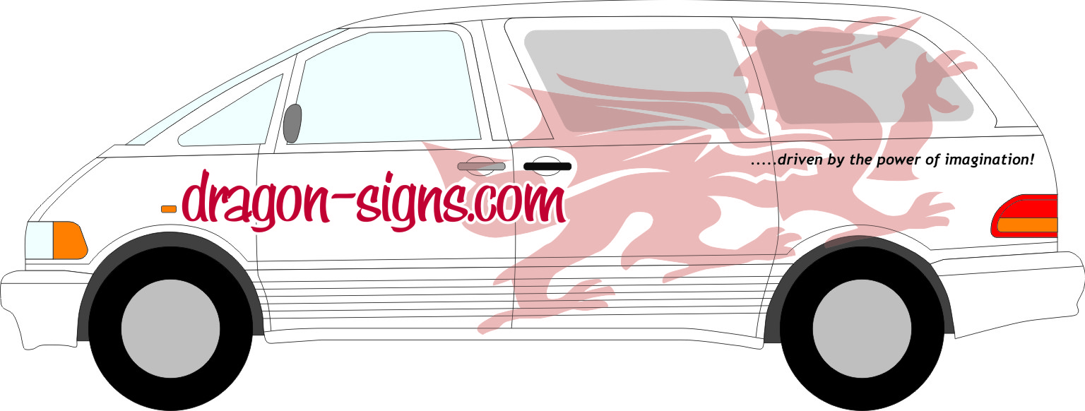
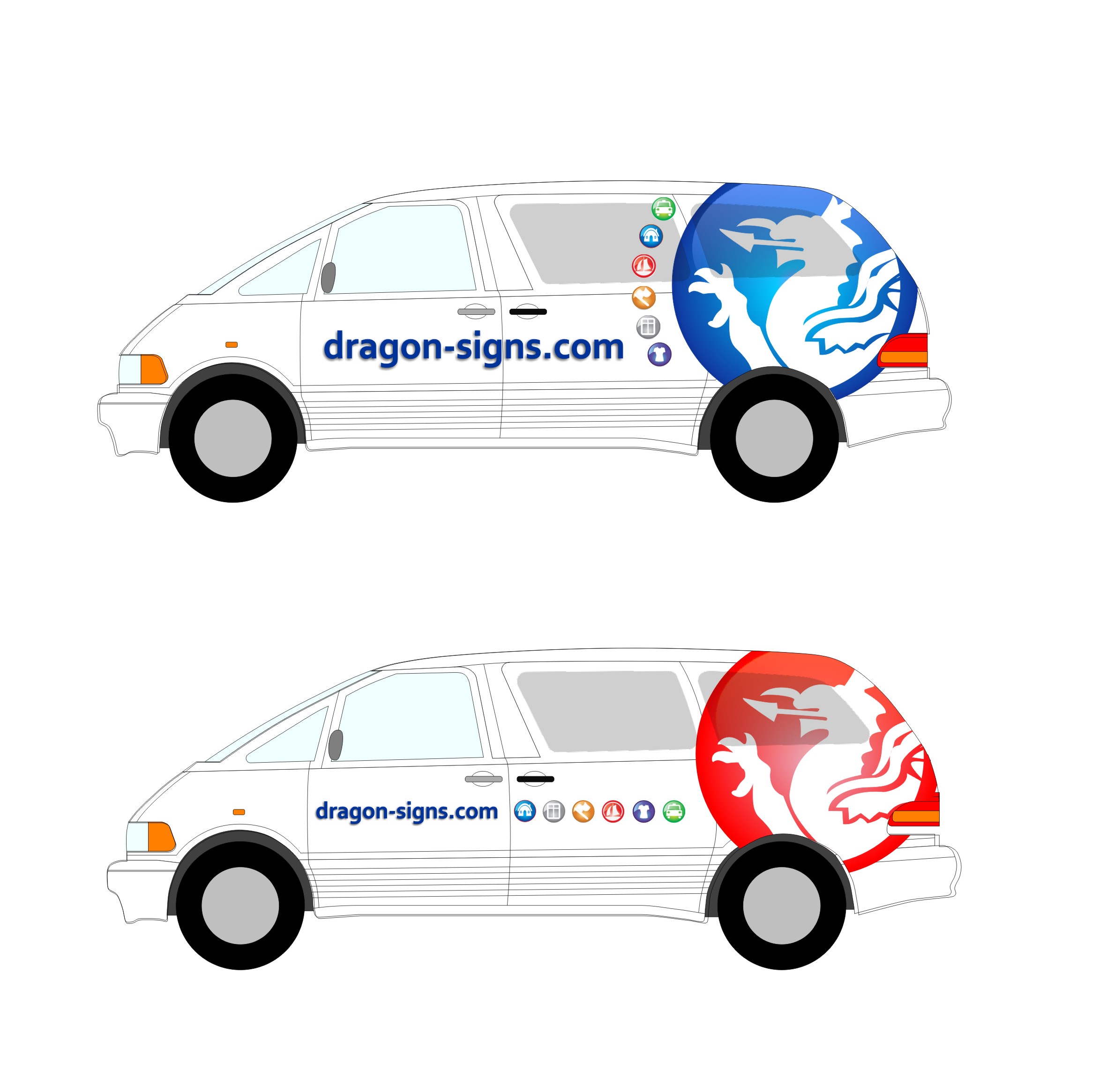
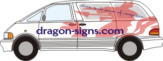
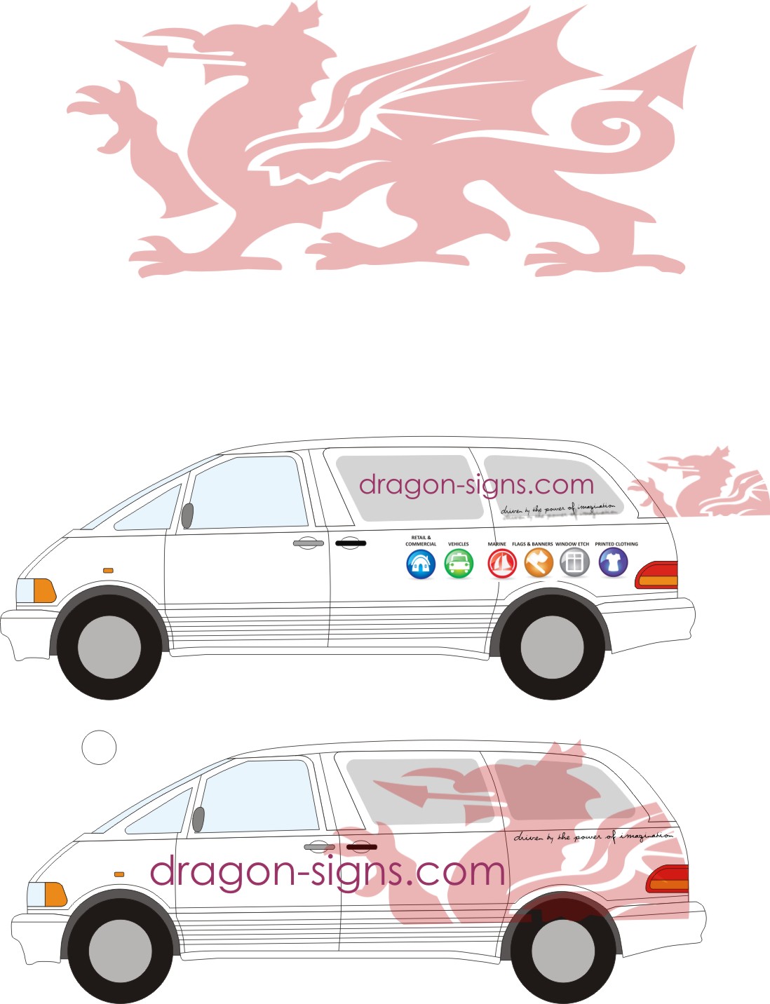
i’ve attached a jpeg with the original idea (top), same idea transferred onto white (middle), and another, along the lines of the website (below that) and then another which i just can’t seem to make headway on.
the dragon was dropped for the website as i just couldn’t get it to work with everything else, i would like to incorporate it on the vehicle though.
not overly sure this web – vehicle thing works amazingly well which is beginning to frustrate me and i’m now getting a headache! i’m now at a stage where i just want to get ‘something’ on the vehicle but, don’t want bodge it.
there were a couple of really good ideas in the last thread, Glenn, i think, did a very vibrant design on page 5 which my newly open eyes see’s much more favourably, just not sure how it could be used.
any and all suggestions appreciated, please feel free to play about with it, have ony attached cdr as my ai file seems huge, perhaps someone else could convert?
regards,
Hughcdr contains only top and bottom layouts due to file size upload constraints.. these are what i’d like to work on if poss.. have also removed the translucency effect, would like it faded but open to suggestion.
looking at it again (to check the right file uploaded), i’m wondering if the bottom layout should be left as is, wrap white, dragon at back, webby and No, nice n clean… jobbed! ?
i hate doing my own stuff. have had two out of three quoted layouts accepted this am, i doubt there’s two hours design work between them, why can’t i just accept something i do for myself? lol.
Hugh Potter replied 13 years, 11 months ago 20 Members · 75 Replies -
75 Replies

-

The third one down does have potential, but I would worry that it has been overdone a bit.
Here’s one of ours, and we have another couple of customers using similar.
Attachments:
-

Hi John,
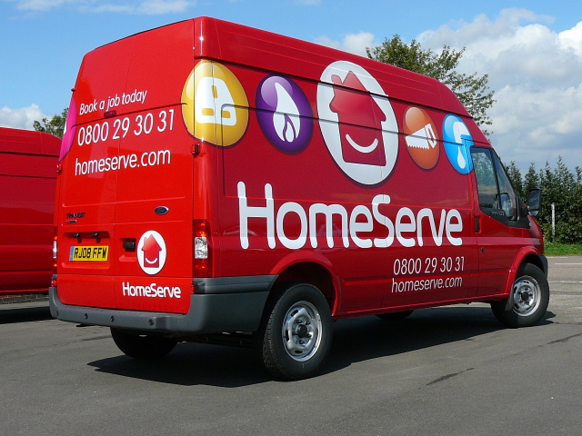
i think you’re right, had only seen one other vehicle done like it (homeserve funnily enough) but, i’ve seen two othrs today alone!
think i’m drawn to the bottom one!
-

Hugh I really like the icons and as john has said could work ,but I done think they go with the way you have created Drag on signs.
-

I thought the bottom one just looked more like an advert for Wales 😳
It certainly doesn’t shout out ‘signs’ to me
I quite like the icons put I’d play them down a touch and maybe try to fit the dragon into a larger sphere
If any of that makes sense
-

It reminds me of a butch Mary Kay or Avon van for some reason.
😀
I already suggested stuff in the old post. Too lazy to draw anything.
I do like the idea of using a dragon though.Is the dragon named because of drag racing?
Or because it can be such a drag working with customers?
Certainly not dressing in drag.
Just pulling your chain a bit. -

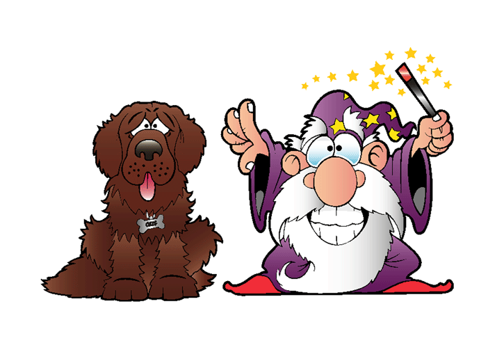
Ever thought about something like this Hugh? http://www.elfwood.com/~kevinp/Welsh-Dr … 06204.html
If so you could try contacting the artist or even get your own done by John Deaton at toon factory, he drew this for me for my photo wizard shop logo.
Attachments:
-

Hugh…just my 2d input….I like the bottom one…nicely clean, simple and the dragon is eyecatching. Just for me I would have the phone number in there somewhere and maybe where your business is. It makes potential clients notice more if they see you are local and want to keep a bit of ‘local loyalty’.
-
quote Rich Urquhart:Hugh I really like the icons and as john has said could work ,but I done think they go with the way you have created Drag on signs.
i know what you mean, should now be just Dragon Signs, the big O was just a transitional thing to get customers used to seeing it without the hyphen i guess (i’ll stick with that excuse if ok!), not sure of the best way to tie it all together though!
quote Graeme Dingwall:😀not a million miles away! quite like the simplicity of the bottom one somehow.
quote Glenn Sharp:I thought the bottom one just looked more like an advert for Wales 😳It certainly doesn’t shout out ‘signs’ to me
I quite like the icons put I’d play them down a touch and maybe try to fit the dragon into a larger sphere
If any of that makes sense
know what ya mean about a Wales advert, not really what i want it to say but, i’d like to incorporate it if possible, it’s always been lurking in designs but, just never been sure how best to use it!
i’m not certain i know what you mean about "using the dragon in a bigger sphere" though,
quote Jillbeans:It reminds me of a butch Mary Kay or Avon van for some reason.
😀
I already suggested stuff in the old post. Too lazy to draw anything.
I do like the idea of using a dragon though.Is the dragon named because of drag racing?
Or because it can be such a drag working with customers?
Certainly not dressing in drag.
Just pulling your chain a bit.I’ve re-read your previous posts and do appreciate your input (as always), just think that i’d rather the dragon be more subtle / traditional dragon, maybe faded like above.
DragOn was born from drag racing yes, kind of a cross between me being half Welsh and the racing. the dressing up bit only happens on friday nights! It has just become Dragon signs in name now (to all but some of my original customers anyways).
-
quote Neil Speirs:Ever thought about something like this Hugh? http://www.elfwood.com/~kevinp/Welsh-Dr … 06204.html
If so you could try contacting the artist or even get your own done by John Deaton at toon factory, he drew this for me for my photo wizard shop logo.
HI Neil,
I’m unsure as to whether a cartoony dragon is what I want, i’d considered using John (toonfactory)as he did a cracking job for me once before, just wasn’t sure where i wanted to take things. that said, i’m sure he could draw me a superb dragon based on what i’m using, just liven it up a bit and make it more ‘mine’.quote Roger Clements:Hugh…just my 2d input….I like the bottom one…nicely clean, simple and the dragon is eyecatching. Just for me I would have the phone number in there somewhere and maybe where your business is. It makes potential clients notice more if they see you are local and want to keep a bit of ‘local loyalty’.Thanks Roger, seems that by leaving the bottom on as a blank canvas, that I may have accidentally stumbled upon something i like, I would like to develop that idea I think, as you say, nice and simple, clean, hyst unsure as to whether or not to make the dragon jump out or subtly fade into the background,
perhaps it’s possible to use the optically translucent red ontop of white reflective (or just print reflective!), be nice to have something that’s equally as eye catching at night! i’m not sure how printing onto reflective works out, if the ink stays transluscent it could work well.
not sure about the specific location as that can also have the effect of tying you down / alienating you from other towns etc, phone number will go on though, maybe generalise areas covered somehow,
-
hmmm, not sure i’m getting anywhere with my efforts, i’ve conflicting thoughts all the time!
i’m off out for the morning now, will try and think on it while out, i’m still now wondering if the ‘less is more’ philosophy applies here and that the bottom one is the way to go?
thanks all,
Hugh -
quote Hugh Potter:had only seen one other vehicle done like it (homeserve funnily enough)
You might only have seen one Homeserve van Hugh. But there’s thousands of the buggers out there. Honest. Ask Matty. 😀
Still, that’s not a valid reason for you not to use the concept, just try to get a different twist on it. 😀
Just one thing though, you have text above them specifying the individual product or service. I think that’s a bad idea because the icon should be doing that for you. That text should be superfluous. And it makes it look untidy.
-
I like the bottom ‘less is more’ design. The dragon seems to catch the eye very easily, then you quickly take in the name/web address 🙂
-

Hugh, I like the bottom one but not fussed on the fonts. this is my take anyway
Attachments:
-

Hugh, always followed the re-branding of this with interest considering my nationality and the links between drag racing etc. Wouldn’t it be better to move away from the Welsh style of dragon as it is quite National and the way people interpret it can be misleading sometimes. I would have thought you would have been better off going for a full on face view of a dragon. Someone on here as produced their van with the scottish flag blending into a face. I’m not saying to use the Welsh Flag but possibly approach the design of the dragon that way. It would certainly give it more detail and a stronger individual impact. If I have time later I will look through our stock art but I know that most of the work we have is a bit too caricature like. Maybe worth a look on istock???
Jason
-
What about a dragon like this?
http://www.istockphoto.com/stock-illust … n-head.php
I was also thinking of just evil looking reptilian eyes (a photo) but that might scare the kiddies.
Remember if something does have eyes I have been told it should be looking into the layout.<<<<that was for Shane.The istock dragon is in a circular format which might match the icons, but using icons for things we are familiar with may be like speaking a foreign language to people who see the van.
I liked this image too:
http://www.istockphoto.com/stock-photo- … sh-boy.php
but I would crop it to just the eyes and dragon. -

I’d comment on the dragon logo but I don’t think the welsh like me at this moment :lol1:
Neil Speirs can fill you in :lol1:
-
thanks for the comments people,
John, you’re right about the text with the icons but, as jill says, we’re familiar with or can easily work it out, can joe public? that is still very much an initial ‘throw the bits in the pot and see what we got’ type layout, would need masses of work to be anything like usable!
Niel, that’s how i’ve begun to see it, simple, quick to read and understand. would like to liven it up a bit but, not at the expense of simplicity, my own layouts have always been too busy, maybe that’s why i’ve never liked them or decided which to use, this one however, i’m liking!
Shane, thanks for having a stab at it, i think i’m leaning more towards a section of dragon rather than a complete one now, partially for the reasons i’ll explain to Jason in a moment!
I’m very open to suggestion on fonts, in the last image i’m simply using century gothic, clean and smart to my eyes but, something a little more "special" can replace it, heck, i might even parts with a few bob for the right font… spoil myself!
Jason,
Fully understand what you’re saying dude, the Welsh Dragon is just that, Welsh, which is why i chopped it down in the bottom layout, as proud of the dragon & my welsh insides as I am, i have to remember that i don’t live in Wales and it’s probably not really appropriate down here but, the ‘cut’ dragon (to most people) could be any old dragon!as for the drag racing, it’s a distant memory now, i’ve not even been to a track in over 2yrs now, no reference needs to remain, I’m thankful that it gave me the beginnings of the modest little set up i now have but, thats about it!
as i said to Neil above, i’m definitely considering waking the dragon up if it can be done in a subtle way.
Hi Jill,
just had a look at your website, very nice! like the way you have an ‘about me’ page with a more personal touch to it, the photo is very louise Brooks’esque!anyways… i’m not certain what i want to do with the dragon, sci-fi, mythical / traditional, bio-mech geiger style, not sure what would wake it up for me, love the geiger styles but, can be very expensive to reproduce if he’s done one and if he hasn’t, there’s no way i could do it! fairly certain i don’t want cartoon though,
as it is now, it’s fairly understated yet still draws the eye, if he’s awakened it’d need to be something that makes people ‘wow’ when they see it, cartoony would make people smile but, maybe not give a serious statement? ,
aarrrgh, which way to go ? I ask myself….
-
quote John Wilson:I’d comment on the dragon logo but I don’t think the welsh like me at this moment :lol1:
Neil Speirs can fill you in :lol1:
you didn’t bring up the drubbing we gave you in the last 20mins back in the 6 nations did you? 😀
-
quote John Wilson:I’d comment on the dragon logo but I don’t think the welsh like me at this moment :lol1:
Neil Speirs can fill you in :lol1:
I’m surprised you didn’t get filled in (bully)
& can I just say ‘I love the Welsh no matter where they stay’ :wave:
-
quote Hugh Potter:quote John Wilson:I’d comment on the dragon logo but I don’t think the welsh like me at this moment :lol1:
Neil Speirs can fill you in :lol1:
you didn’t bring up the drubbing we gave you in the last 20mins back in the 6 nations did you? 😀
Na lets just say I insulted her sister 😮 It was funny though :lol1: :lol1: :lol1:
-

If there was a 6 Nations for disliking…..Wilson would have the Grand Slam! 😀 😀
-
quote Neil Speirs:quote John Wilson:I’d comment on the dragon logo but I don’t think the welsh like me at this moment :lol1:
Neil Speirs can fill you in :lol1:
I’m surprised you didn’t get filled in (bully)
& can I just say ‘I love the Welsh no matter where they stay’ :wave:
oh & Mr Lambie loves them too, no matter what age :peek:
-
quote Neil Speirs:quote Neil Speirs:quote John Wilson:I’d comment on the dragon logo but I don’t think the welsh like me at this moment :lol1:
Neil Speirs can fill you in :lol1:
I’m surprised you didn’t get filled in (bully)
& can I just say ‘I love the Welsh no matter where they stay’ :wave:
oh & Mr Lambie loves them too, no matter what age :peek:
:lol1: :lol1: :lol1: :lol1: :lol1:
-
My last name is Welsh.
I mean it is Welsh.
It came from my great-great grandfather born in Ireland.
😕
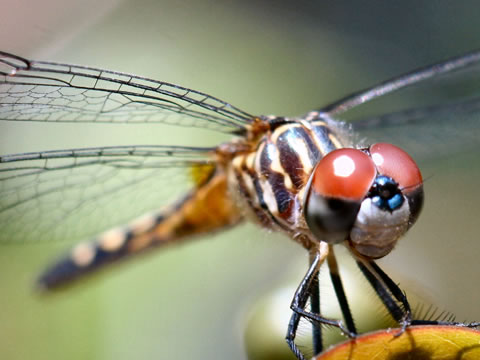
And yeah, Hugh, I need to grow back my hair, that picture actually looks much better than I do. And I also need "hates Brush Script" on the About Me page. hahahaCould the dragon ever be a dragon fly?
Attachments:
-
lol Jill, i’d grow my hair back too if nature wasn’t so cruel! lol
re dragon, if there’s one on there, it needs to be a dragon, I just haven’t any photo’s of them!!
-
Hugh,
I’m not totally convinced by this but this is what I had in mind when I was suggesting to put the dragon into a larger sphere, icon hoojar.
Usual story but I’m stuck for fonts at home so I’ve just put something simple in
Attachments:
-
at quick glance that reminded me of the vauxhall griffin logo lol, a different dragon would look better imo as the welsh dragon is ………well too welsh (if that makes sense) and could be seen as a welsh based company.
-
quote Richard Martin:at quick glance that reminded me of the vauxhall griffin logo lol, a different dragon would look better imo as the welsh dragon is ………well too welsh (if that makes sense) and could be seen as a welsh based company.
That’s what I saw at first glance, Vauxhall.
-
what about a tribal type dragon, clean lines??
Attachments:

-
Its a very similar image with a circle, would probably work with a different dragon image.
-
Now I am in the mood for this:
http://www.youtube.com/watch?v=Wik2uc69WbUSurely there has to be a good dragon image somewhere that’s not too Welsh or too cute.
-
quote Richard Martin:at quick glance that reminded me of the vauxhall griffin logo
:yes1: me too. Sorry Glenn.
-
quote Jillbeans:Now I am in the mood for this:
http://www.youtube.com/watch?v=Wik2uc69WbUSurely there has to be a good dragon image somewhere that’s not too Welsh or too cute.
lol! Love that song, my uncle Sulwyn use to play and sing it to us as kids when we used to stay!
Glenn. Looks vauxhall to me too, sorry! I like the idea though, works well.
Tribal dragons don’t really appeal to me, too fast and furious rice burner looking IMHO. Sorry. I’ll have a search for dragons over the weekend. I’ve seen a couple on google but both only work with black, maybe glenns icon idea could then work?
Cheers, Hugh
-
I wasn’t sure if the tribal style would be your theme but I know what you are saying about too fast too furious lol
-
quote Glenn Sharp:Hugh,
I’m not totally convinced by this but this is what I had in mind when I was suggesting to put the dragon into a larger sphere, icon hoojar.
Usual story but I’m stuck for fonts at home so I’ve just put something simple in
Hi Glenn,
i think this has some promise, im still not 100% convinced that the icons would give a layman all the info but it certainly has something appealing about it,
maybe now i could consider different looking dragons, i’ve said i don’t want anything too cartoony but i guess it’s either an illustrated or cartoony (but not too corny?) dragon that pops out of the icon or, stay in the style of the icons and have a flat dragon outline or transparent image,
more to think about again!
-
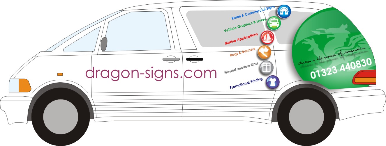
HI chaps and chapesses,
have had a bit of a play this morning, i’m not sure on whether the icons on their own are enough, possibly colour code wording with them like below? maybe drop the window etch icon? was thinking of dropping the marine too but, i do a fair bit of that mail order (and local with 3 big marinas within 30mins drive).
the dragon can still be replaced for a different one if i can find the right one,
crits? ideas? all welcome!
oh yeah, what to do about the font? using century for now but not sure what to go for, can’t seem to find anything i reeeeeally like!
tia,
Hugh
-
Here’s one using a new free font called Big Blunt
http://www.fontspace.com/the-fontry/arb … unt-mar-50
A 1950s Alf Becker typeface.
I re-arranged your icons so they fit better with the name and checked the capitalization. I think I screwed up the slant though.
make sure your tagline has the same slant as the icon text.
I like this last layout of yours the best, it looks clean and modern. -
for me the icons with the small text dont work especially next to your large logo. Could you not have them on the rear of the car that way they’ll be read by drivers behind you or peeps stuck at the lights?
-
 quote Neil Speirs:to busyquote Hugh Potter:In what way please, Neil?
Rushing about everywhere, dropping the kids off at school, doing the dishes the washing and the ironing – never get any time to myself these days 😕
-
here’s my take on it Hugh but I still prefer your own layout with the very large dragon, name & number
-
quote Jillbeans:Here’s one using a new free font called Big Blunt
http://www.fontspace.com/the-fontry/arb … unt-mar-50
A 1950s Alf Becker typeface.
I re-arranged your icons so they fit better with the name and checked the capitalization. I think I screwed up the slant though.
make sure your tagline has the same slant as the icon text.
I like this last layout of yours the best, it looks clean and modern.Hi Jill,
the icons look better arranged for sure, I think i’m going to try as Neil says below though, see what it looks like without the smaller icons / text, or maybe just lose the text on the sides.not sure i like the font you used on the tag line but, the other one is pretty good, different. i see what you mean about the tag line slant too, i’ll remember that!
thank you.quote Neil Speirs:for me the icons with the small text dont work especially next to your large logo. Could you not have them on the rear of the car that way they’ll be read by drivers behind you or peeps stuck at the lights?so just the big icon on the sides and small ones on the rear? that would work i think,, brb!
quote Phill:quote Neil Speirs:to busyquote Hugh Potter:In what way please, Neil?Rushing about everywhere, dropping the kids off at school, doing the dishes the washing and the ironing – never get any time to myself these days 😕
don’t joke about that Phill,
my day is quite often more that of a housewife than of a signmaker! luckily i can print my own pinafores to save on extra expenditure!ok, how am i doing? getting somewhere?
-
Hi Neil,
is that a cdr12? i can see the thumbnail image on the file but it won’t open, just blank? wierd!
hugh
-
ah, any chance of saving as 12 if you get 5mins? i’m still in the dark ages mate!
regards,
Hugh -
Hugh….Those are both good looking and ‘simples’ IMO.
The rear view looks particularly good. It’s clear, informative and has all the info needed to see what you offer and how to contact you…..and it is eyecatching.
-
think that should be it
-
thanks Roger! always a learning curve when trying to push one’s ideas further!
Neil, thank you, i think the back looks better than mine but, i’m concerned that a straight column of icons looks odd on the curved tailgate, i’ll have a play later or morro,
kids need feeding so time to get the pinny on again!
thanks,
Hugh -
quote Hugh Potter:kids need feeding so time to get the pinny on again!
Hugh
You need one of these Hugh…..

-
I like Hugh’s last back one and Neil’s side one (except for the curvy phone number)
I really like just the circular dragon thingie with the icons only on the back.
Glad Neil can recognise a nice script.
😀
I don’t like the one you used, Hugh, and feel the drop shadow is too extreme.
I was just trying out the Becker font because I think it’s cool and it was also free. -
quote Jillbeans:(except for the curvy phone number)
😥 that was my favorite bit 😥
😉
-
… I bet you wanted to use Brush Script for that tagline too dintcha?
😀 😮 :lol1: -
quote Jillbeans:… I bet you wanted to use Brush Script for that tagline too dintcha?
😀 😮 :lol1:I did consider doing an all caps brush script layout but, i figured that i’d hear your cursing from here and, being all naive and innocent, i wouldn’t want to hear that!!
-

Hugh, I didn’t read through the whole thread, so probably way off the mark. but just read the title and had a dabble. 🙁
just add colour
Attachments:

-
quote :i figured that i’d hear your cursing from here
Now now Hugh, I am a veritable nun, I’d never curse.
fuck shit -
quote Martin Cole:Hugh, I didn’t read through the whole thread, so probably way off the mark. but just read the title and had a dabble. 🙁
just add colour
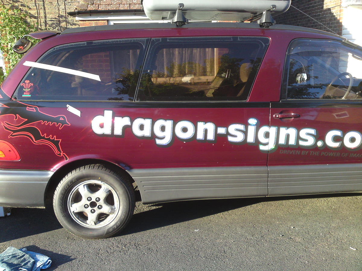
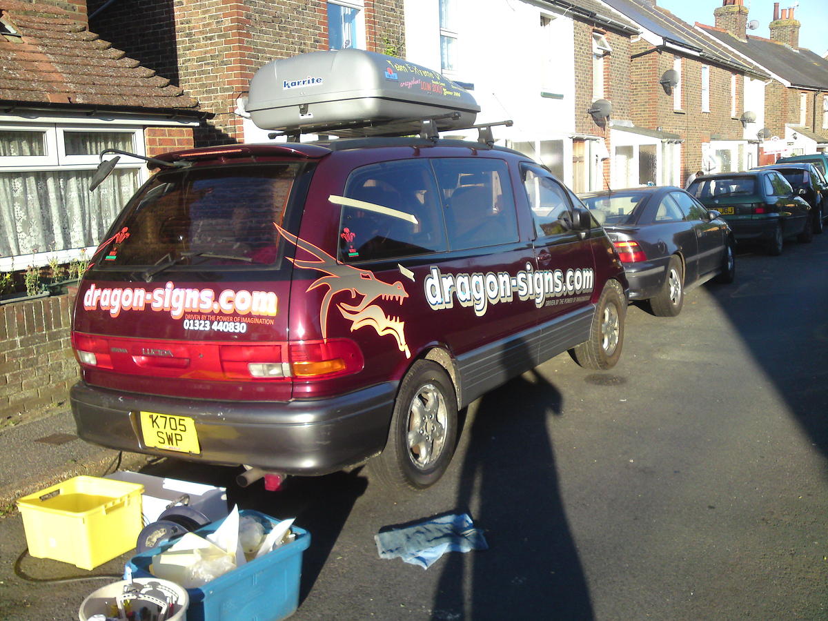
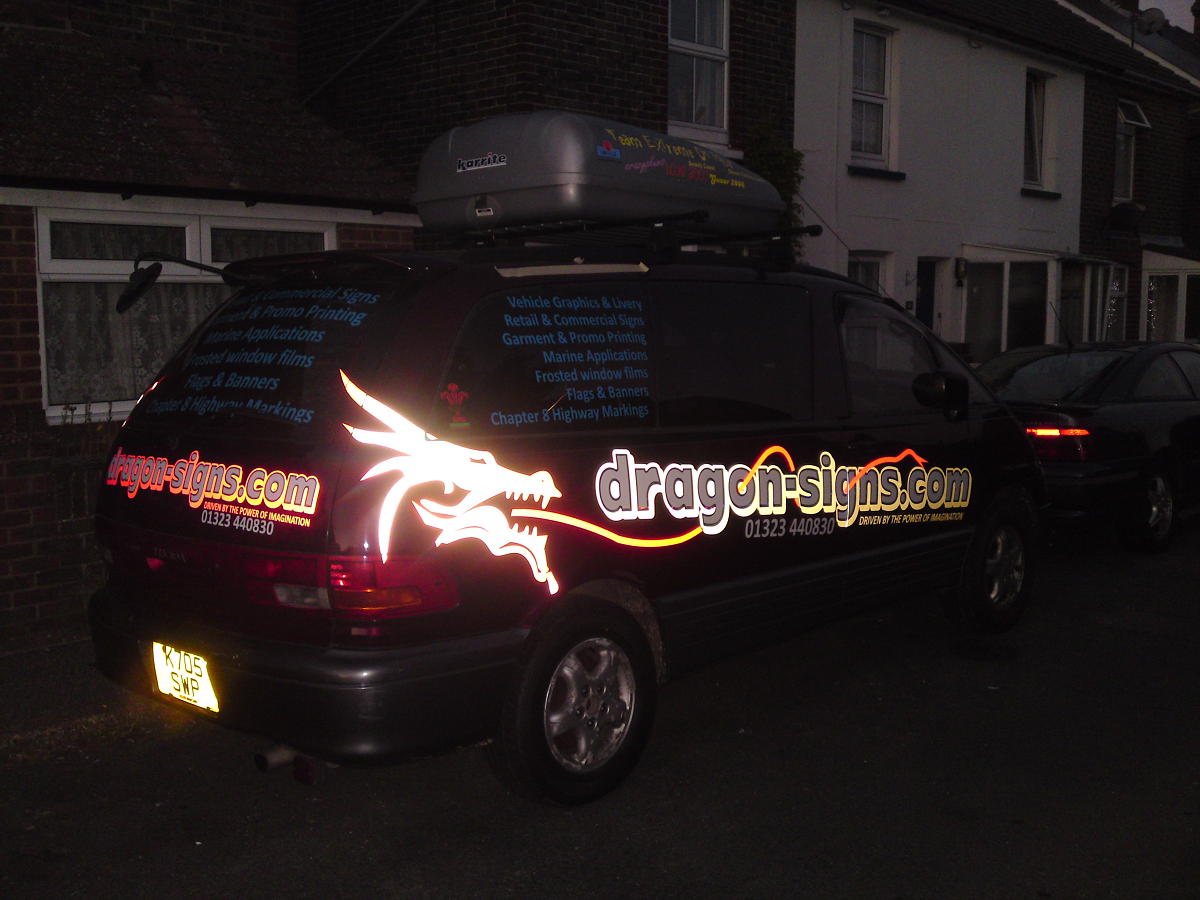
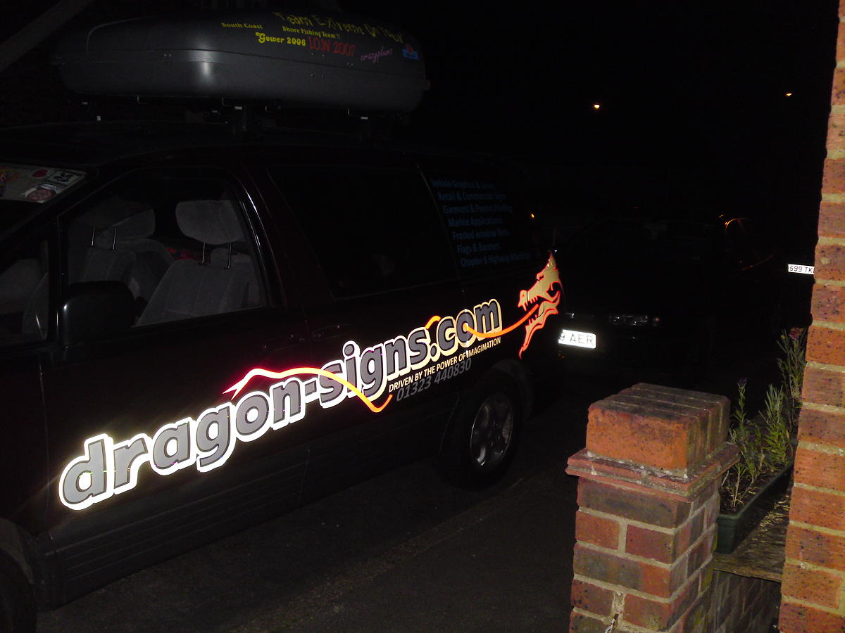
only just spotted that dragon this am Martin, was just what i needed, decided at 7am today to do the car, it’s been naked for far far too long,
I decided to do it all in cut vinyl as i’m planning on getting a van when the right one comes along, i couldn’t make the ideas earlier in this thread work in cut vinyl so needed another dragon and a different look at it, by midday (yes.. about 4hrs!) i’d got the layout how i wanted it (still got the scale wrong though!) and by 4pm all was cut and pre-layered on the bench (sod lining up 2.4m text on the side of a car!).
the heat today made things more of a pain than normal so i’m glad i did do the layering in the workshop, was about 10° cooler inside!
anyways, lots of black reflective for the shadows/outlines and dragons, red reflective on the rear and around the dragons, and dragons tongue,
the chromey stuff is Hexis bubble rainbow chrome stuff (forget proper name), and i did an internal contour of a few mm inside that to produce what the white text is made from.
looks awesome in the sun, all kinds of colours flashing about and at the right angle (sun behind you) the whole lot lights up a treat! fairly subtle when unlit, definitely needs sun or light for the full effect but it’ll do until i get the van!
thanks to all for the help given.
Hugh
ps, forgive the roofbox! off on hols to south Wales next week and decided to fit it early!
Attachments:

-

looks brill Hugh, how did you do the other side?
Peter -

Looks real good Hugh given me inspiration to get my car done now
Colin
-
thanks Colin,
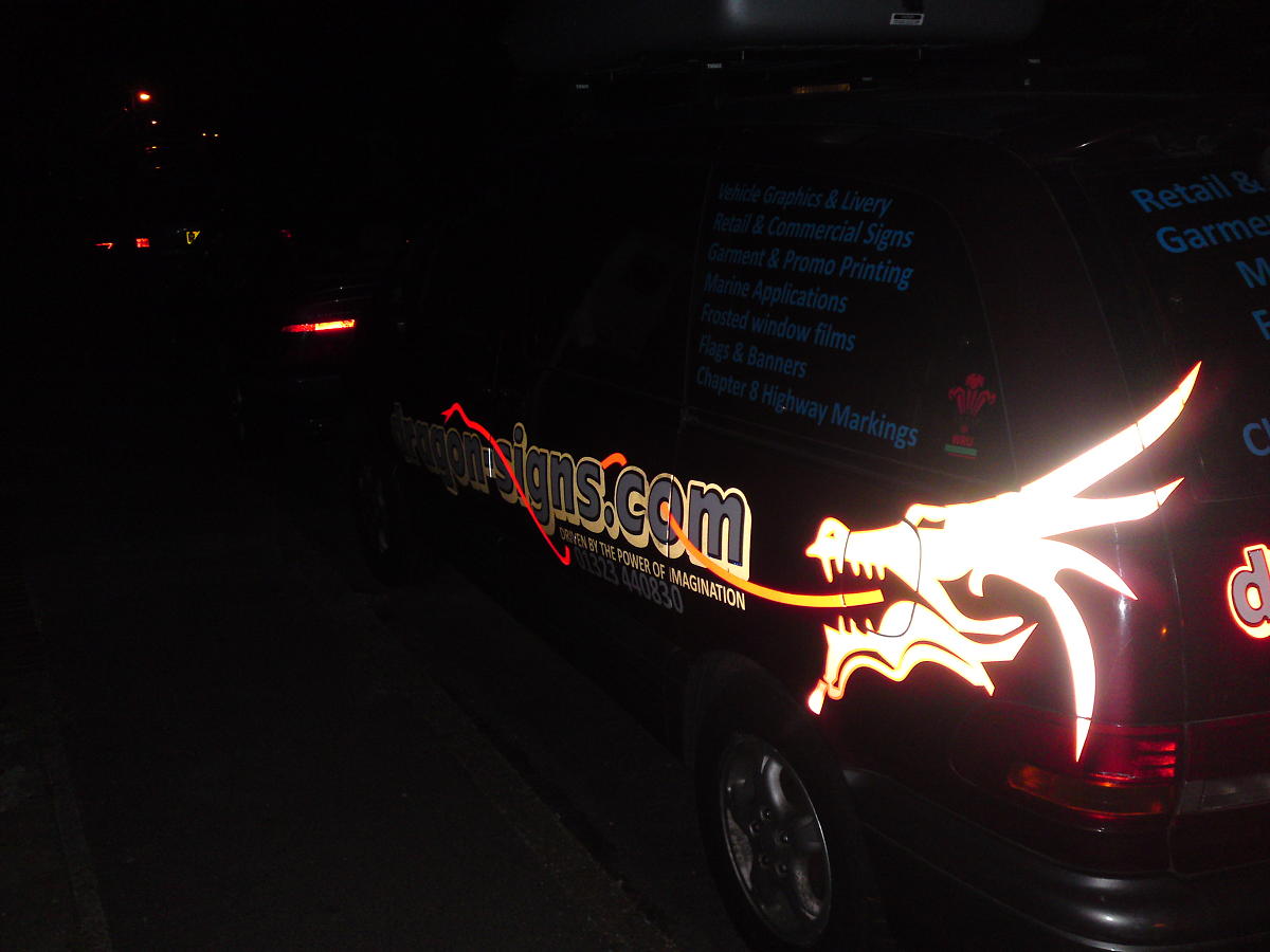
did it on a budget as i’m hoping a new van will turn up sometime in the coming months, decided i just had to put something on it! seems to have turned out ok.quote Peter Normington:looks brill Hugh, how did you do the other side?
PeterCheers Peter,
did the near side first, it was the side i mocked up, scaling was slightly out (despite measuring things!) so the number isn’t dead right and the dragon is more on the corner of the car but, seem to have got away with it!
Attachments:
-

Looks great that does, Hugh.
Reminds me that my car needs redoing! I’m going to do something reflecty now.
-
Geez it took you long enough.
:lol1:
It turned out nice.
I think the laundry list on all sides is a bit much, and the Window Films part has some missing caps.
But I like everything else. -
thanks Andy & Andrew,
not so sure about original… the dragon & tongue idea was prompted by Martin Cole and the Font was Jills suggestion! still, got a lot of attention today while we did a car boot sale in the sun, people obviously like the bling factor when the sun is shining on it and took pllenty of cards / enquiries (not really why i was there but…!)
Cheers Jill and, thanks for pointing out about the caps, i was thinking of re-doing the lists anyways, prob same size etc but a more subtle colour, maybe a burgundy like the car, readable but not ‘in yer face’.
ta.
Hugh
-
Hi mate I like it, but I think you should have put a curve on the text and logo on the rear due to the curve on the glass and tailgate. I always do this when doing bonnets of say a Transit as I think it makes the text sit better and corrects the curve effect, just my thoughts
Rich . -
That looks amazing Hugh – well done. :thumbsup:
I’ve never used reflective black before (in fact I wasn’t even sure if there was such a material) but that has worked a great dramatic effect.
You’ll be looking forward to the winter with the shorter daylight hours so that more people can see the effect.
Excellent work 😀
-
Looks really good Hugh…the night time effect is brilliant and will certainly get you noticed
Just a personal preference thing but I think I would gone with the text horizontal rather than on the angle
looks great though
-
quote Richard Urquhart:Hi mate I like it, but I think you should have put a curve on the text and logo on the rear due to the curve on the glass and tailgate. I always do this when doing bonnets of say a Transit as I think it makes the text sit better and corrects the curve effect, just my thoughts
Rich .hi Rich,
cheers dude, I did curve the bonnet but not on the tailgate panel, think the panel is ok, you’re right on the glass though!
Thanks for all the compliments ( and crits), obviously better than I initially thought! More I see it the more I like it, it’s not perfect registration etc but only we would notice that!
Hugh
-

Great use of different vinyl effects Hugh,
should get you a lot of attention.I think the overall impression though would be huge if
you reduced the size of the shopping list.
To me it fights for too much attention when it should be
secondary too your business name.Enjoy your holiday, been beautiful here the past few days 😎
-
quote Neil Davey:Great use of different vinyl effects Hugh,
should get you a lot of attention.I think the overall impression though would be huge if
you reduced the size of the shopping list.
To me it fights for too much attention when it should be
secondary too your business name.Enjoy your holiday, been beautiful here the past few days cool:
cheers Neil,
I’m gonna re-do the services list this morning, just reduce size, change colour and space it to suit, prob keep same layout though as it’s about the only place left that works!
Just seen weather and it’s getting colder this week, figures! Can’t wait to get away though!
Hugh


Log in to reply.
