Activity Feed › Forums › Sign Making Discussions › Gallery › Projecting Sign: Roy’s House of Chocolate
-
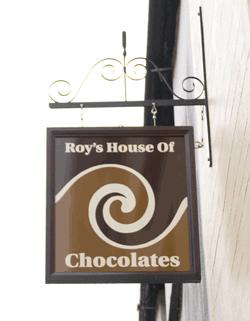
Projecting Sign: Roy’s House of Chocolate
Posted by Steve Underhill on December 8, 2007 at 8:09 pmHere’s one from last week.
Sign may look a little wonky, that’s because I live in a fishing village, and the building it’s attached to is probably 400 years old, sign either goes parallel to the building or hangs straight from the bracket, down the street there a sign on a building probably angled at 15 degrees, so I think mine will be fine.
Sign is oak framed, stained dark, with 2 sheets of cream dibond sandwiched together with 1mm foamex in between.
Bought the lengths of oak from Jag if anyone needs any 16 quid a 2.6m length (needed 2) screwed together & countersunk at the mitres 1 across one down, and wood stopper to hide holes, & restained.
The longest part of this job was the owner deciding how the swirl had to look, he could describe it but couldnt draw it or show me a picture of it, so had to keep drawing it to get it right.
Hes over the moon with it though
Attachments:
 Steve Underhill replied 16 years, 5 months ago 12 Members · 30 Replies
 -
30 Replies
-

Nice work. I like it.
I might be asking a daft question but whats the purpose of the 1mm Foamex??
Cheers
Gary
-

Well, the dibond was 3mm, the gap in the frame was 9mm, or meant to be, so I bought a 3mm piece of acrylic to stop everything rattling about, the gap turned out to be more like 8 mm so I put the 1mm in there just so there was no play and glued them all in place.
basically just to stop any movement, to be honest it was overkill but I had some spare from covering my workshop walls in it anyway so used it.
It fitted nice and snug and all was well. -
Oh I see. Amazing what 1mm foamex comes in for ain`t it lol
cheers
Gary
-
The idea behind the 1mm foamex is to fix it to my middle workshop and either, have a graffiti piece sprayed onto it with my company name & logo, or I am going to have a wrap on it, instead of wallpaper have printed vinyl but haven’t decided on a picture yet.
Possibilities are endless for that one. -

Nice job Steve, makes me wish I had a chocalate now actually 😛
-

nice job…would have made ‘roys house’ bigger …and the o of Of lower case….would have been seen better if you can attach as a jpeg 😀
nik
-
I did have it laid out different actually with exactly what you said there, Roy’s house was bigger, and I had the "of chocolates" at the bottom but they wanted it on one line in the end and chocolates on the bottom, I was a bit wary of making it too big but I agree could have made it a bit bigger looking at it there.
not capitalizing the of was pointed out before in another post on the same shop , and must agree it looks better, I will make sure I do it on the next one.
As for making it a jpeg I keep forgetting after i save for web in photoshop, it automatically saves as a gif, will change it next time
thanks for the positive coments all. -
That really looks like you’re shouting that too, looking at your avatar. :lol1:
-

That’s about 12 beers and a half bottle of Jameson. 😮
-
Oh forgot to say in the description, Oracal 751 in 2 colours not often seen except on chocolate shops:lol1:
-

nice work Steve I like that, sort of old fashioned but classy.
Lynn
-
Thanks all,
Your comments mean a lot.Did the title of the post change?
I don’t remember calling it that (hmm)
Its a better title now anyway -

Nice Steve
But is it just me, but the fonts just seem a bit flat, they just don’t go
Ian -
I posted the font before and a few people picked that font out without me saying which one I had chosen
out of a choice of maybe 12 fonts,
so might be just you yes. :lol1: -
I had a limited choice of fonts that did go with it actually, It was quite difficult choosing, there were a few others that looked ok, and they would have fitted, but the owner settled on that one in the end and I have to admit I like it, I know not everyone likes the same thing and as I always say, if everyone liked the same thing, there wouldn’t be enough to go round.
Incidentally, one font that I did put on it to make it look a bit "out there" when I was playing was the clockwork orange font, in orange with a black drop shadow, hard to picture but it looked quite different from the run of the mill, but too way out in a main street.
-

Nice work Steve, looks good mate. i like the graphic being the size it is as that’s will be doing the attention grabbing.
i cant see the fixings on the top, so not sure how its fixed. As a tip with swinging signs like this is to "try" and fix into the side at the top. this eliminates the constant downwards pull from the sign hanging/blowing in the wind. you can get "L" shaped brackets purposely for this reason. they allow you to fix into the top and side in one go, and have a hoop at the top for the chain to fix onto.
anyway… nice job! 😀
-
I fixed it by drilling through the frame from the outside into channel inside, then with a flat 1/2 inch wood bit, drilled from inside to make a recess for the bolts, fixed the bolts inside with Evo stick serious stuff, and screwed the hanging brackets in from the top, I then screwed the safety bracket onto the side and bonded that too, which is the cable you can see at the side with a separate bolt drilled into the wall, just a belt and braces type thing.
Seeing as only the bolts are glued into the sign, if it ever needs lowering or raising the bolts can just be screwed down or up a bit, just in case the building starts to lean any more, 😛
It may do if its full of repeat customers hahaIan
will try and post that pic tomorrow, its at work, probably nobody will like it Its just that I like things that are out of the ordinary, -
cool, i like thing to be different, not always right but different
ian -

did you get some chocs as a tip…yummy. sign looks chocolaty too, nice one, love the swirly whirleys.
-
steve, sorry mate, i actually meant to comment at the end of my post on the cable to the side being a good idea as it gives the sign the belt and braces approach. 😉
-
Ill tell you what, that shop is going to be DANGEROUS,
he gave me just a few of the chocolate buttons he uses, he has vanilla put into it at the plant, and has his own special recipe and has cocoa beans grown somewhere especially for him in South America or somewhere, he has a unique chocolate thats particular to him, I tasted some and all I can say is wow.
It didnt taste like dairy milk, or galaxy it was hard to describe, more "clean" tasting with no fatty taste like normal bars you get.
He has all these machines in there, with moulds and stuff, I went in the other day he gave me a dark choc with brandy in, I couldnt bloody drive after.
He’s onto a winner there come summer, a Swiss master chocolatier in a seaside town full of chocolate eating tourists.
Wish Id thought of it. -

nice job steve !!!
can you make me one…
ROY`S HOUSE OF BEER !!!!!! 😀
-
I can do that no problem, A lager coloured vinyl, with a bitter colour swirling into it, and the writing in a Chicken balti colour?
-
ding dong steve…although im more of a doner & spicy spuds man myself
roffs
-
In that case you would like the T shirt I have in my shop window.
Its a donor card same shape same colours etc, but spelled Doner,
saying "
I would like someone to help themselves to my kebab after my death"
Gets a lot of laughs on the way past from tourists
Log in to reply.
