Activity Feed › Forums › Sign Making Discussions › Gallery › Pop-art style raster graphics from vinyl
-
Pop-art style raster graphics from vinyl
Posted by image on October 14, 2003 at 2:16 pmHi folks
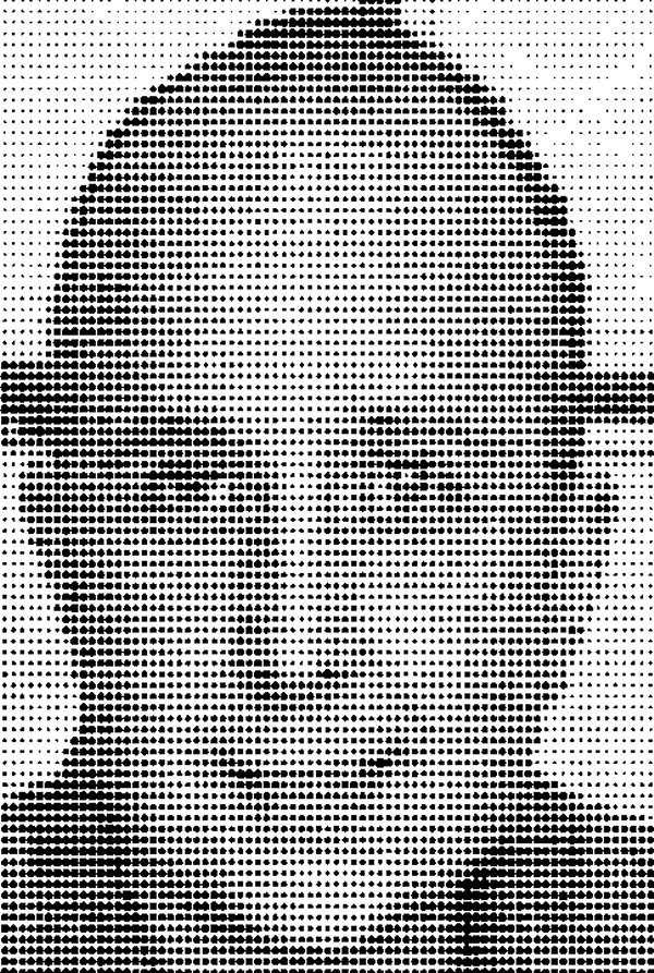
Unfortunately most of cutting and vector graphics softwares can’t make vector based raster-screen, therefore I developed a technique which makes it.At first I scale the original grayscale photo to 2-3 pixel/inch resolution. E.g. the width of this sample picture is only 100 pixels, but the final picture is 40 inches wide.
I convert the photo to a text file with Bgasci (free) software, then I import this text file to a new CorelDraw document and I apply an individual character set. This character set contains 16 different sized point. This points function as an offset printing raster (big point-dark area, small point-light area). With CorelDraw I can prepare the graphic to cut.
A few months ago I made this Dali portrait, and I think this method is usable to make e.g. an individual car wrapping or other similar work.
Attachments:
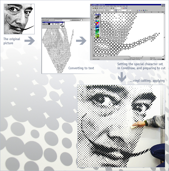 image replied 20 years, 6 months ago 17 Members · 39 Replies
 -
39 Replies
-

Hi Barnabus
Not sure I quite understand the process too well, but the final image looks great.
Is that image a plotted or is it printed?
Weeding must be a challenge!
Great stuff and show us more!
Regards
Alan
-

Hi Alan
It’s a plotted image from vinyl. Weeding is very easy, because all objects are rounded!Regards
Barnabas -

hi alan
great work mate.. very good of you to show us the process like that.
salvador dali.. (my favourite artist) (hot)
the dots work well and my first impression was it would have been a nightmare to weed, but your right.. all round shapes so not a problem. 😉
i look forward to seeing more of your work!
-

Hi Barnabus! 😉
Brilliant idea – but I too don’t quite follow how you do the bit in corel…if you have a minute could you advise what steps/menus/functions you use to do the conversion from image to dots…
cheers
…and I really like you website too – fabulous and very artistic!
more soon
mikethesign
-

Barnabus, You’re a dead set Legend…I’ve been wanting to try out this kind of cutting since I started. I just didn’t know how. I’m definately going to give this a go.
Cheers
Lee
-

I would like to learn more too..
How about an indepth demo 🙂 🙂
-
I’m having trouble opening up the text file in Coreldraw. Any advice Barnabus? I’m running version 10. I’m sure I’m just being dense.
Lee
-
Hi folks
I’ll write a step-by-step “user guide”. And I’ll upload the special font and the Bgascii too.
Coming soon 😆
-
hi mate
if you are going to do an indepth demo feel free.
may i suggest you send me it first and i can load it in our demo area and also, ill do a short news post for the home page like the others on the site.its your call.. i dont mind whatever way you choose to do it 😉
-

That’s excellent Barnabus. I managed to download a copy of bgascii after a web search (and figured out how to use it) but I couldn’t get even the examples to look like a proper picture, Presumably we need to use the special character set you mentioned. Any chance of posting this character set in the file swapping forum?
This would be a great way to put a picture on the side of a van for example (and would be real fun to take off again!! ) without using a digital printer.
Thanks for passing on your know how 😀
-
I’ve already figured that one out Phil,
Just lay up white first and then put on the dots. Time to come off…Just remove the white.
-

love it, i’m going to have a play at the weekend and see if I can work it out, if not I’ll have to wait for the demo 🙁
-
quote Leeroy:I’ve already figured that one out Phil,
Just lay up white first and then put on the dots. Time to come off…Just remove the white.
Cuh!!! How come I never thought of that!!!” 😀
-
Alone we are weak…Together we are strong… Grasshopper. 😀
-
Hi All
the full demo comming soon, but you can download the special character set, Bgasci and some sample file from my site:
http://www.imagegrafika.hu/sample.zipFirst copy the pottyos.ttf font into your windows/fonts folder.
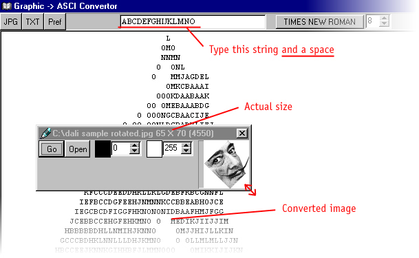
If you use Bgasci, type the next string into textbox: ABCDEFGHIJKLMNO and a space.
Then open your JPG image. For best results resize it by 50%. (By way of example original resolution: 130×140 pixel, now resize to 65×70 pixel.) You can resize image by resizing image window. You can read the actual size on the heading of this window.
Tip: If your directory structure is too long, you can’t read the actual size. The answer: copy your image into the parent directory (e.g. C:/)! (-)Press GO and the software converts your picture to a text file, then:
– click on text once
– press Control+A to select all
– press Control+C to copy text to clipboard
– open a new CorelDraw document, select the type tool, and click on the empty page
– press Control+V to paste text
– apply the special font called “pottyos” (Hungarian “dotted” 🙂 )Good luck! 😉
(Sorry for my poor english!)
Attachments:
-
No 😥
I am sorry but Bgasci and the specal character set runs only on Windows. -
So that’s how you do it Hastings 😆 😆
Great stuff Barna,
I can see the original photograph is crucial to the end result; the one I used was a bit iffy but I can see it working very well with a little practice and the right picture.
Thanks,
Alan
Attachments:
-

Barna
Great program and demo glad you shared it, having a few probs all dot sizes are same when i convert to the special ttf any clues 😡 Kevin -
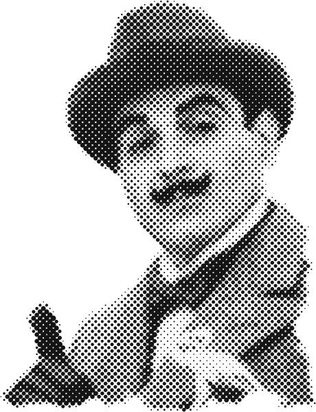
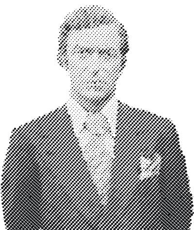
I’ve got it sussed as well, I think I might be using this techique a lot, lol
can you tell who it is ?
Attachments:
-
well seeing how everyone is having a go at this Barna. i can only think how many will enjoy your demo when its loaded.
thanks for a great beginning to your postings mate (hot) 😉 -

to many dots I think and it seems to have changed shape
need to practice more
I think this would look great on a window would it look act like contravisionthanks for the great post Barna
Attachments:
-
I’ve had a go with limited success!
When I zoom in some of the bigger dots overlap each other 😕 ?
When pasting into Corel, despite increasing the page size it loads file as 4 pages?
I seem to lose a lot more detail than examples shown so far?
Help! (hot)
-
Neil
It’s the line spacing that’s causing the distortion. I found that by reducing it to 79% in Corel worked for me. And use the 45 degree angle with the photo as Barna does, it makes all the difference.
Martin
The dots are supposed to overlap that gives you the darkest part of the image; they would need to be welded of cause before cutting.
Barna
I hope you realise what you’ve started here, everyone’s playing with this instead of getting on with their work. 😆 😆 😆
Alan
-
quote :The dots are supposed to overlap that gives you the darkest part of the image; they would need to be welded of cause before cutting.
Aha, I see now. Thanks Alan……Any answer to this one…
For some reason I can’t view the image in wireframe to check that it’s welded itself?
-
Alan
Your Poirot is great! I suppose so moustachioed people are good originals 😉Kevin
I think, maybe you typed wrong string to Bgasci. (ABCDEFGHIJKLMNO and a space)
The software must generate a text like on my screenshot.Neil
yes, you can use the line spacing to set original proportion.
I should think the rotated raster is better. It’s similar to offset printing. Like a photo in a newspaper.Martin
when you pasting into Corel, use the Artistic text tool (not the Paragraph text tool)!
…I seen you have more than 100 posts. As far as I know you can gain acces to demo area from Robert. (?)…but I still work on the demo.
Alan
Let’s go working! 😉 -
Hi Folks
…and there is a sample – you can make eye-catching car wrappings with this technique!
Attachments:

-
Great work !
So who’s going to be the first to use it on a commercial sign project lets see what interesting and divers ways we can apply this excellent technique
Cheers Barna
-
Barna
Congratulations I am absolutely blown away!
Thanks
Liam
-

Im trying to sell the effect to a few Clients. I’ll keep you all informed on the outcome. I rekon this type of pop art style will go down a treat with Nightclubs, what with pop art and the illustrative style being all the rage now-a-days.
________
HAWAII DISPENSARIES -
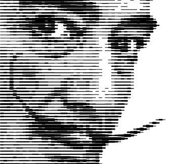
Ive also Seen a similar effect around that converts a photo into a series of lines to good effect. Does anyone know how this is done?
________
Mexico Hotels -
Hi
I tried it with lines too, but I don’t like it. 😕Download the csikos.ttf (hungarian “lined”) font from my site, and try it!
http://www.imagegrafika.hu/csikos.ttf(Don’t rotate the photo!)
If you can make fonts, you can convert photos into series of other shapes (-)
Attachments:
-
i prefer the dots one image…
converting to cuttable vector lines can be done in signlab pretty easily.i think the dots look more pop arty… 😉
-

Hi Barna,
I don’t think I can remember anyone causing such a stir as you’ve just done.
Welcome to the boards!
I had a look at your website – nice work.
I’m really looking forward to a demo for this effect you’ve introduced.
I’ve toyed with this in the past but could never get an effect as good as yours.
Also, is there a way to do it with colour? like using the four cymk colours in vinyl to produce a “colour” image if you like?
cheers
Joe -
Joe
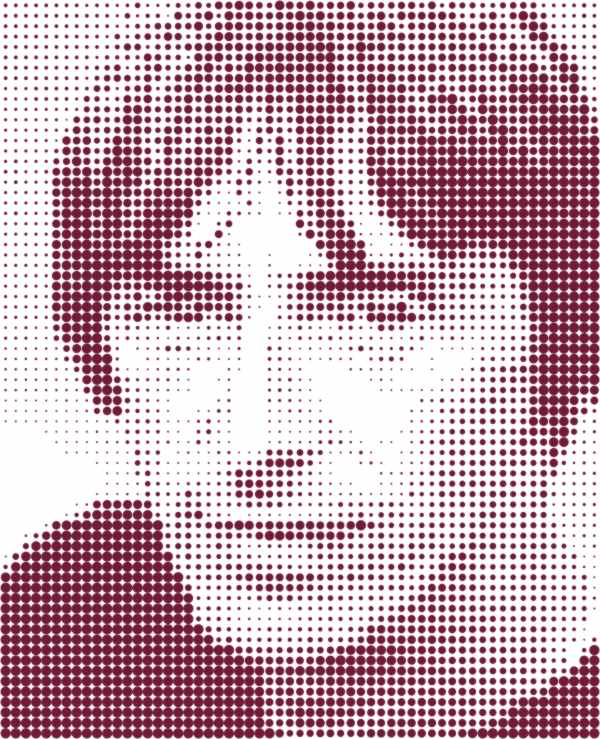
I should think the CMYK vinyl cutting is not impossible, if we can get very thin and transparent vinyl… like an ink on the printing press. But, i fear the too much vinyl layers. 😕I experiment with linear color blends.
😉
Log in to reply.
