-
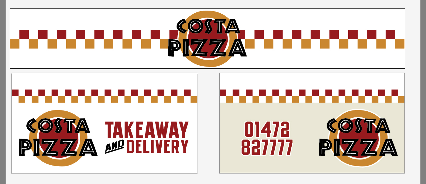
Pizza Shop Logo / Shop Front Design
Any thoughts / opinions? Never really posted my work up to the masses on here before!
Will be a door in between the 2 windows (Illustrator max artwork width wasn’t big enough to do the shop sign as long as it will be), and the right hand side window is to be covered in etch vinyl as the kitchen is that side.
Colours will be Avery 764 Yellow and 770 Red
Kyle
Attachments:
Log in to reply.
