Activity Feed › Forums › Sign Making Discussions › Gallery › P. Humble : Various Sign Work
-
P. Humble : Various Sign Work
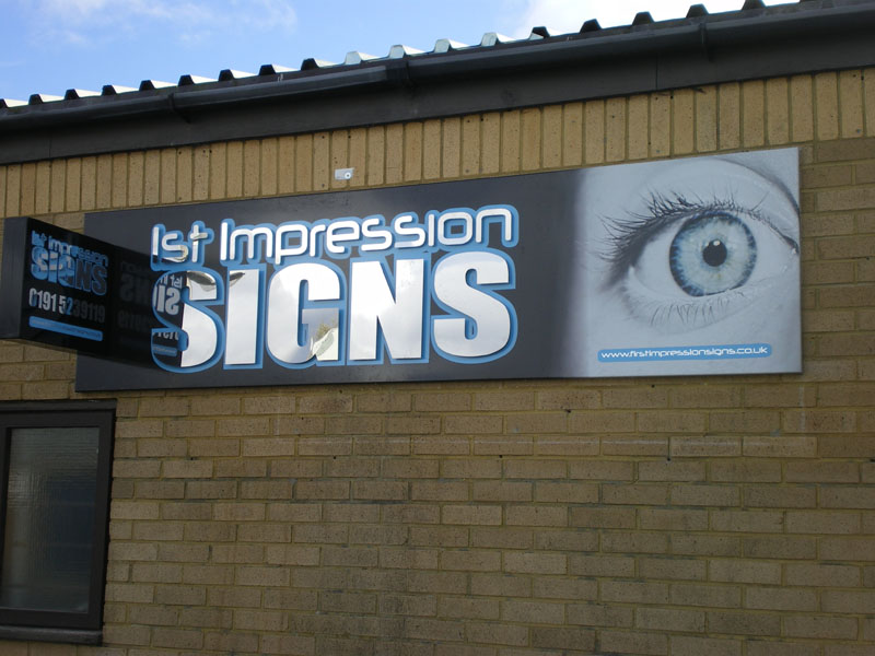
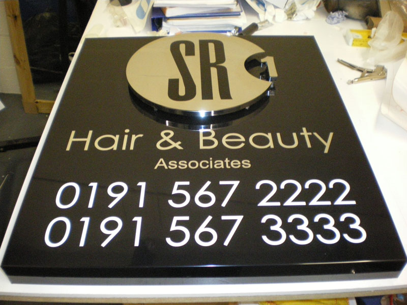
Posted by Paul Humble on December 11, 2009 at 1:44 pmJust a couple I have done since I moved to the new place. Lots booked in over coming few weeks so hopefully more pics soon.
Attachments:


 John Childs replied 14 years, 4 months ago 16 Members · 20 Replies
 -
20 Replies
-

Cheers guys, I was a bit nervous about posting to be honest lol!!
I was a bit miffed when the SR1 job owner told me he wanted some white flex poking through the top for a light though 🙁
-

very nice Paul, lovely work.
Just usual crit: always adjust your kerning on the 01 etc at beginning of phone numbers
-
Cheers Martin, never really thought about that.
Also only just noticed since I posted the pic that i had over tightened the bottom of the G on my sign. All sorted now!! lol
-
quote Paul Humble:Cheers Martin, never really thought about that.
Highly important in my book Paul, just one of my pet hates..once you have done it you will always remember to do it next time, 01 never types with correct spacing.
Your unit sign is very impressive btw
-

Very classy looking selection Paul.
No need to have been nervous over that lot.
-

Nice work there. My only crit is I don’t like the projecting sign coming out of the main fascia, just doesn’t look right?
-

Nice work Paul – new sign looks classy. 😀
Cheers John
-

Paul that’s great looking work mate, well done. 😀
-

Some great work there Paul, well done mate… really smart.
Paul, as way of constructive criticism mate, based purely on "my own self preference"… I would suggest "trying this" when your designing and finished. try selecting everything on your sign. not the sign blank, just graphics and down sizing by 15-20%, spread the graphics out a little to suit and produce. i am sure you will like the finished result as it will appear your giving your over all sign more room to breath…
taking one of those posted, the hair dressers, its a lovely sign, really nice and does the job. but the numbers in particular over power the rest of the info. the numbers should be at least secondary to the rest of the info. think of walking down those steps looking at the lovely sign…. the numbers jump out at you first! ide say much smaller and grey or at most cream to tie with the building colour.anyway… not knocking the work paul, i love it… just (personal preference) think each needs a bit more breathing space mate.
thanks for taking the time to post your work paul. very much appreciated mate.
-
Cheers again everyone. Ive not been going long and really appreciate any comments, especially ones that can help future jobs.
Rob, cheers for editing the title, but your spelling is shocking lol!!
-
quote Paul Humble:Rob, cheers for editing the title, but your spelling is shocking lol!!
OHHHHH…… how very dare you!!!!
how do you know it wasn’t NIK or ANDREW? 😮 :lol1:WOT IS IT, COULDNT I SPOKE PROPER ENGLAND OR SOMEONE? 😉 😳 :lol1:
Log in to reply.
