Activity Feed › Forums › Sign Making Discussions › Graphic Design Help › opinions please with customers logo?
-
opinions please with customers logo?
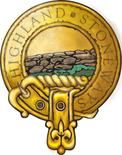
Posted by Gordon Forbes on December 12, 2003 at 2:37 amDid this for a customer (he hasn’t seen it yet) designed in vinyl first and then started playing with it in Photoshop ending up like this.
Just one some others to cast an eye over and give opinions
thanks Gordon.
Attachments:
 Gordon Forbes replied 20 years, 4 months ago 6 Members · 10 Replies
 -
10 Replies
-

great design mate but I did think the lettering is a bit indistinct, maybe bring it forward a bit ?
-
Reminds me of a celtic brooch, brilliant design Gordon! As Steve said, the lettering seems a little lost (unless that was the effect you were going for).
Cheers, Dewi
-

Looks great Forbie, well worth pursuing persisting with to finished artwork.
Get eveything polished off and I’m sure they’ll love it.In addition to the text, I’d pay particular attention to:
a) getting the balance right between the hand rendered and geometric portions of the logo
b) as already mentioned the text
c) the rings of the eyelets, ie the buckle eyelet is a lot thicker than the others.as a possible alternative you could try zooming in on the stone wall so all you get is an abstract impression of the wall with no field or sky.
-
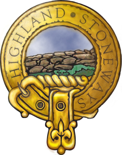
May I suggest that you add sky with perhaps a few fluffy whites.
(That large area the same colour as the belt bothers me)
I think you’ll find it gives immediate depth and will pop the stonewall right to the foreground.Alan
-

Thanks for the advice guys.
Steve, Magpie, I’m not really sure what you mean by bringing the text forward a bit do you mean making it darker and more bold or am I not reading right.
Alan I will try adding a little sky and post the result.
I took this in from a design I did in signlab with the black line originally done for vinyl work, any thanks for the comments all advice taken and thanks for the pointers.Gordon.
-
Updated and looking better the sky really makes a difference thanks Alan.
Attachments:
-
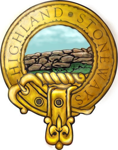
Try making the sky not so hot by using a ‘greener’ blue this will harmonise better with the gold, and keep the clouds small and high to give the appearance of space.
You could also make the grass a yellow green loosing that hint of blue and darken it under the wall and lighten it a tad in the foreground.Someone is going to tell me I’m talking rubbish in a minute (:) 😆 😆
Alan
Attachments:
-
Cheers Alan when you look at it mine is too blue.
I’ll take your comments on board. -

Lovely design Gordon,
Did you darken the text to bring it forward?? I can’t make up my mind if it’s the addition of the sky that brings it out more or if you have darkened it?
Would be interesting to see the original design for vinyl that you have adapted this from, Are you planning on it being a digital print or will you be getting the air brush out??
-
Lorraine the one above is Alans rendition. I have done changes just haven’t posted it yet I don’t want to post to much images on here in one thread. I’m going to rework the text completely and someone is looking at the original I think.
thanks anyway but I think the duller sky takes your eye away from it and you notice the text more. As for digital or airbrush I think digital purely because I may have multiple copies to do if he accepts it.
Log in to reply.
