Activity Feed › Forums › Sign Making Discussions › Graphic Design Help › Nursery sign – inspiration help please
-
Nursery sign – inspiration help please
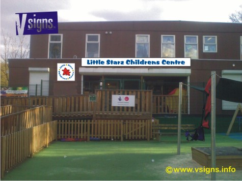
Posted by John Harding on April 27, 2010 at 8:10 amHi All
Did this design exactly to client spec and after a meeting they have decided a regular lightbox is too 1980s – given that the design shown is agreed (their logo/wording and font etc remain) how can I change the materials or sign design to give it a more modern feel 🙁
Thanks in advance for any thoughts
John
Attachments:
 Warren Beard replied 14 years ago 6 Members · 11 Replies
 -
11 Replies
-

Blue skies, nothing but blue skies……….? 😀
Attachments:
-

Thanks guys some interesting ideas to get me started 😀
-

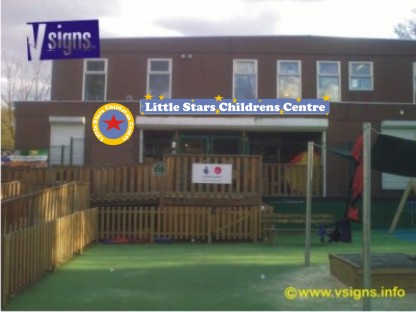
I think it needs some different colors.
Love….Jill
Attachments:
-

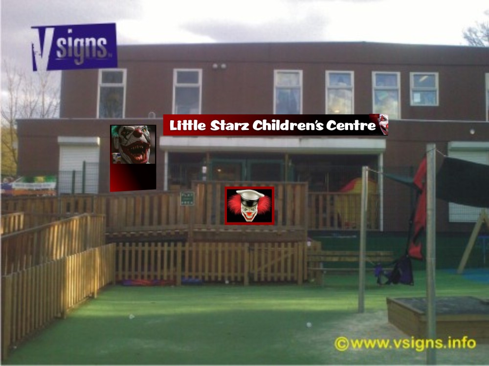
Jill – that’ll scare the little darlings to death :yikes:
-
Jill Very artistic yet frightening – I worry your not getting out enough 😀
Love John
I like the background colours BTW
-

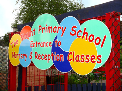
What about something like this one we did some years ago.
An Ashby contour cut panel with vinyl graphics.
Attachments:
-
Just mixing up the background a bit might help, like Harry suggested.
I like the idea of cut out lettering but the price would be much higher, maybe offer them two options.
Attachments:

-

You don’t need cut letters but definitely must be a shaped sign, every nice nursery sign I have seen has been shaped, the square and rectangular ones are dull 😉 (chat.)
-
Warren are you saying Jills rectangular sign is dull 😀
personally im liking the background ideas Jill – warren what shape would you do?
John
-
:nagnag: nooooooo, nice design but a shape is better, even the one with the stars on it but any shape will make it interesting, remember small children have enquiring and open minds so make it appeal to them too as they have to see it every day 🙄 :lol1:
I’ll try find some time to put an option together, I see things in my mind but can’t transfer them quickly :lol1:
Log in to reply.
