Activity Feed › Forums › Sign Making Discussions › Graphic Design Help › New Logo your thoughts
-
New Logo your thoughts
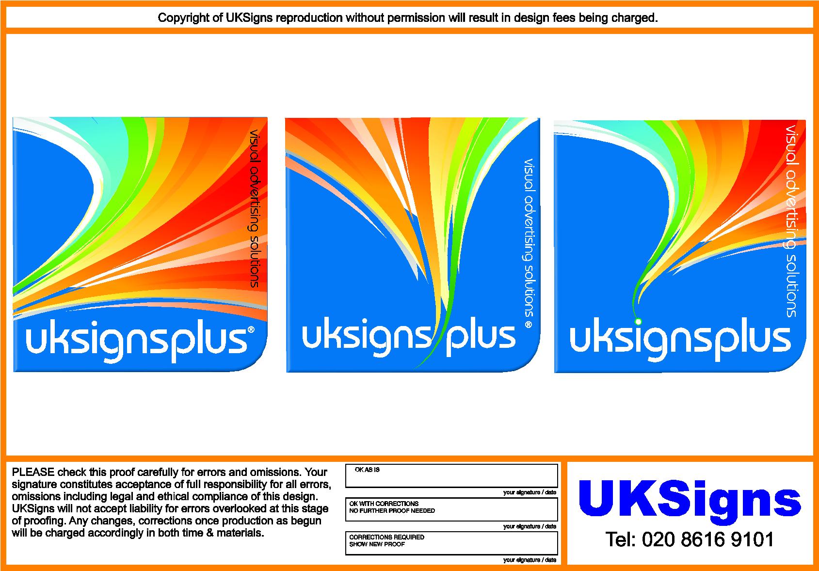
Posted by Kevin Flowers on June 1, 2010 at 2:21 pmOk was going to have a company name change due to certain influences in my local area but have now gone away from that & have been playing around with the attached logo and basically staying away from the union jack colours i used before. So any criticism or help will all be greatly recieved
Kev
Jill Marie Welsh replied 13 years, 11 months ago 12 Members · 20 Replies -
20 Replies
-
Hi Kev.
just wondered what the significance of the white swirl is or do you just like the shape.
What about color blending with say another shade of blue get them to twist into each other
also the shape itself if you were lets say going to put this on a van, the square shape might make it a bit of a challenge, -
-
where have i seen a similar logo, look top left…ahhhh i got it 😀 😀 😀
-
kev,
the ellipse doesn’t work for me. the bottom points have three elements rather than two, so not following any lines, it looks a bit disjointed.
I’m not sure about Jill’s + sign though, not sure if it would read plus to most of our builders and plumbers?Peter
-
Kev,
I think there’s too much taking your eye away from your name….for me the swoosh needlessly dominates the logo
I like swooshes and I like the background shape but all the elements seem to be fighting each other
If you really like it you could maybe make the swoosh a percentage of the background blue…maybe 60 or 70% so it makes the name stand out a bit more
-
Hi guys & girls
Jill
not my cup of Tea, but have never been 100% happy with what i have ever designed for myself either.Dave
not intentional UKSigns as been my company name for a very long time long before being a member. The reason for the now added plus is that in the near future i’m thinking of going LTD & UKSigns is not available
Secondly i’ll be opening up a 6 day a week trade outlet for board, print, cleaners etc in the very near future.Peter
can see what you mean never really noticed before & that’s one of the reasons i put it on the boards for criticism & suggestions even new ideas.Need to now get it sorted to move on with other business advancements
Kev
-
To be honest Kevin I like you idea! Good point made about the 3 broken off bits tho! (Right as always Peter!)
I’d ad some gradient to the logo to show that printings your strength, basically just bring it into 2010!
Sorry Jill but I think your idea looks like an emergency last minute sign service. (i.e. guy at home with plotter from ebay who will do your signage for £50). Again, sorry Jill, no offense meant!
Matt
-
Nah it’s OK.
I was just trying to get Kev to lose the swoosh.
And don’t feel bad, I was told last week on another forum that the guy’s 10 yr old could design better then me, and also again today.
😉 -
Don’t ever put yourself down! It too negative! Maybe the plus in brush script…..!
My 9 yr old does design at school and is pretty damn good but he can’t manufacture it or fit it!
😀 😀
-
quote Jillbeans:Nah it’s OK.
I was just trying to get Kev to lose the swoosh.
And don’t feel bad, I was told last week on another forum that the guy’s 10 yr old could design better then me, and also again today.
😉Must be a talented 10 year old!
Were is he! I may have some work for him! 🙄 -
im slowly liking that, i take it this logo will be incorporated onto all your advertising? im asking this because it does look like an eye catching logo but only for web applications, i cannot vision it elswhere ie: van or signage…but then again you could prove me wrong 😀
nik
-
I like the 3rd one on the proof best. Can see that on a van or a business card 🙂
-
1st and 3rd ones in that last proof look very good to me. Very eye catching and colourful but still very clean and uncluttered.
-
-
Martin
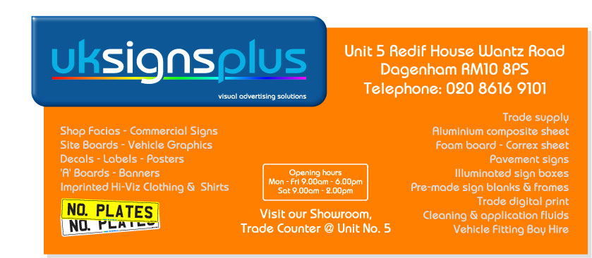
very nice design i have a preference for a more subtle corporate style. Hope you don’t mind i have used your design slightly modified & added to a possible sign it is only a quick mock up to see how it goes.
The plan for the main logo will be to use a 30mm foam with the edges routed round this will then be primed & painted in something like Ford Vision Blue metallic or possibly something more along of a Teal metallic now with vinyl graphics applied. The orange board may end the Ford ST orange metallic. These boards are going to be in your face.Kev
-
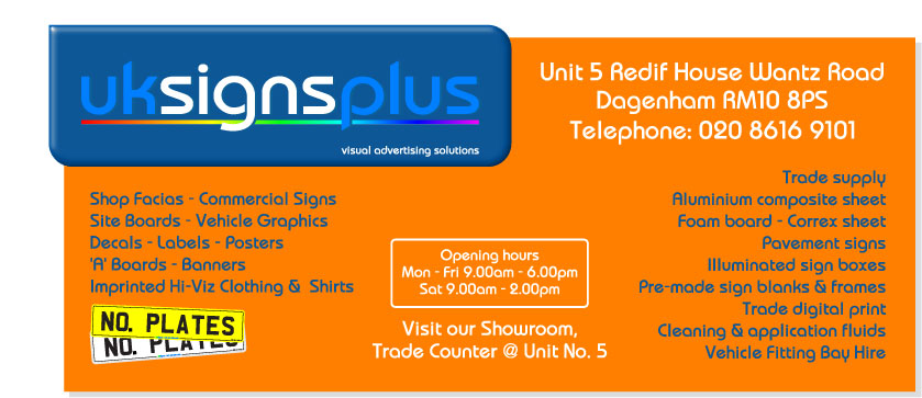
Kev on the others I liked the 3rd. one best on your last one I would stay with white text,on the orange, the grey doesn’t work for me. I have always liked blue and orange
Lynn
-
Lin
Yeah i agree looked better in Flexi but i have been known to change things after i have laid them up & then decided i don’t like it. Blue & Orange is a nice combination the two colours are known for there relaxing properties. So the Reflexology lady told me when i made her signs.Any slight change
-
Kev I would stick to white for the lists, the blue seems to get lost 🙄
Lynn
-
Really like what Martin did.
Yours looks a bit stretched to me.
I do like the burst rather than the swoosh.
And I agree 100% signs needs the emphasis.
Log in to reply.


