Activity Feed › Forums › Sign Making Discussions › General Sign Topics › New Google Logo, so what do you think?
-
New Google Logo, so what do you think?
Posted by Robert Lambie on September 1, 2015 at 4:33 pmGoogle has a new revised logo, what do you think?
Personally, I prefer it as i hated the old google font. Robert Lambie replied 8 years, 8 months ago 7 Members · 10 Replies
 -
10 Replies
-

my first thought too David, just looks so childish.. maybe that’s it appeal to / target audience!
-

Yes, my though exactly, doesn’t seem to look ‘business’ or ‘corporate’ focused, and I’d have thought that’s where they make their £££’s
-

If you want a good look at their target audience, go to you tube, go to the Mark Dice channel then watch the videos of people signing petitions. Enough said.
-

Whenever I see a change of logo I always think the company is in trouble, or somebody is on an ego trip.
Simon. -

I too think it looks childish…
but then i always have because of the use of the different coloured letters.
I have never liked the font, more so the embossed shadows applied to it which i thought did not work well with the sharp edged font. maybe just me, but it never felt right, felt like there was no meaning behind it, more someone at Google had found the bevel & emboss feature in their software. 😛when they switched to the flat colours only, i thought "finally"… now they have switched fonts too, so i have to say i do prefer it. even though when i look at it the "G" doesnt feel right, too open. or the "le" looks too tight… maybe i need to stop sniffing this Tipex! :yikes: 😉
The change in the logo has apparently came about because Google has changed its name from Google to Alphabet. well the umbrella company is now called Alphabet due to vast array of other businesses Google now has that has zero to do with the company as we know it.
Maybe just me… but as we all said, it looks childish, then with the parent company called "Alphabet" it is all looking a bit Sesame Street… 😀 -

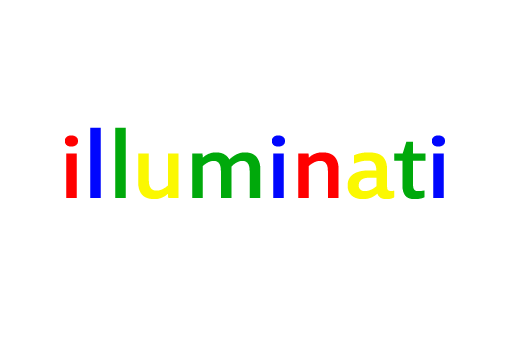
I think it’s just a nothing logo..basic & amateurish but I don’t think it matters as the brand is so big. The original with the shadows as Rob said was terrible
I have however had a play and come up with this.. a vast improvement , just a bit of re-jigging required….. 😀
Attachments:
-
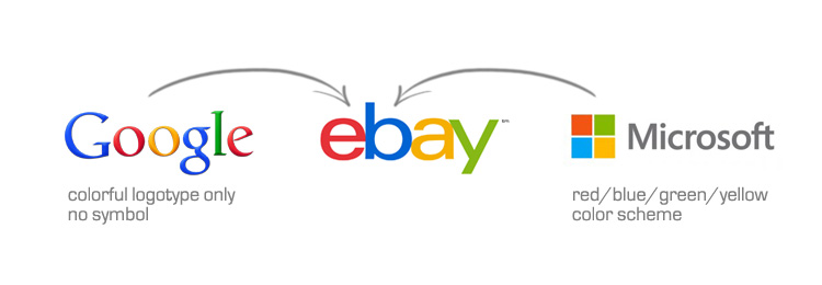
quote Jean Oakley:EBAY was my first thought
Funny you should say that Jean, i came across this earlier…
…or is there something going on? :yikes:
Log in to reply.
