Activity Feed › Forums › Sign Making Discussions › Graphic Design Help › New business logo design help – PhotoWizard
-
New business logo design help – PhotoWizard
Posted by Neil Speirs on June 8, 2008 at 3:06 pmHi all,
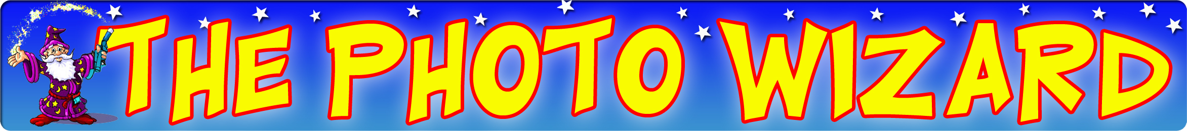
With being useless at graphic design 🙁 , I’m hoping you could help me out with a colorful logo for my new business "The Photo Wizard"
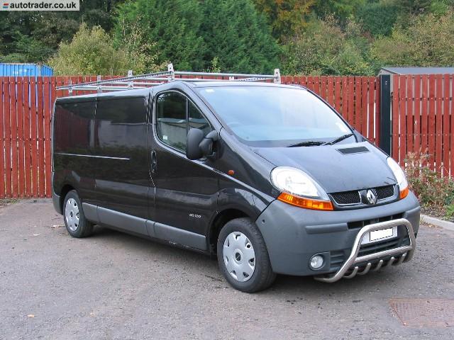
The logo will be used on my new shop (1m x 6m Sign), black lwb Renault traffic, shop uniform, stationery etc.
I would also like to incorporate a cartoon wizard into the logo and would appreciate pointers in the right direction to where I can get one created.
Thanks
Neil
Attachments:
 Robert Lambie replied 15 years, 10 months ago 10 Members · 22 Replies
 -
22 Replies
-

nice area then 😀
Neil you will receive more help if you put up your best design and the quite a few will help, we will not start it off for you,
ps cant take the van seriously cos its a Renault 😉Chris
-

OK if I must, please be gentle 😳
With not being a sign maker this was done in Photoshop as a flyer idea.
The wizard image shown cannot be used as It’s borrowed from some ones website until I get my own design done.
Attachments:
-
quote Chris Wool:ps cant take the van seriously cos its a Renault 😉
Chris
I suppose it could be worse, I could have the Vauxhall version. I heard GM had to remove the rust protection from the Vivaro to make it a proper Vauxhall 😉 😉
-

Neil, have you googled for any wizard clipart?
You might just find something you can use…..I’ve had a look and there’s a fair few there
It might be better if you could provide the wizard then it might give people something to work with.
I’m just thinking that the wizard image is such a variable I think it will be difficult to come with ideas without knowing what you like
-
quote Glenn:Neil, have you googled for any wizard clipart?
You might just find something you can use…..I’ve had a look and there’s a fair few there
It might be better if you could provide the wizard then it might give people something to work with.
I’m just thinking that the wizard image is such a variable I think it will be difficult to come with ideas without knowing what you like
I looked a while back but found nothing that really stood out, will have another search just now
-

seems to be plenty on istock photo, might have to pay a little for it, but at least it will be royalty free and legal.
http://www.istockphoto.com/file_search.php?text=wizard+cartoon&action=file
chris
-

I have to do a logo for a photographer this week, and she wanted a retro feel.
I bought some vectored Retro from this site:
http://www.retroclipart.com/
For under $10, delivered instantly and easy to use. They have some neat oddball stuff.
So I used it to mock up something for you.
The font I used was a freebie that I just love:
http://www.dafont.com/honey-script.fontI think using a cartoon font might make folks not take you seriously.
I think a really mystical wizard might be over the top as well, because people might think you are too "goth".
What I did might not be your cuppa, it’s just a suggestion.
That’s why I liked the guy with the camera, to whom I added a magic wand.
Love….Jill
Attachments:

-
quote chris stansfield:seems to be plenty on istock photo, might have to pay a little for it, but at least it will be royalty free and legal.
http://www.istockphoto.com/file_search.php?text=wizard+cartoon&action=file
chris
Thanks for the link Chris but nothing jumping out at me 🙁
-
quote Jillbeans:I have to do a logo for a photographer this week, and she wanted a retro feel.
I bought some vectored Retro from this site:
http://www.retroclipart.com/
For under $10, delivered instantly and easy to use. They have some neat oddball stuff.
So I used it to mock up something for you.
The font I used was a freebie that I just love:
http://www.dafont.com/honey-script.fontI think using a cartoon font might make folks not take you seriously.
I think a really mystical wizard might be over the top as well, because people might think you are too “goth”.
What I did might not be your cuppa, it’s just a suggestion.
That’s why I liked the guy with the camera, to whom I added a magic wand.
Love….JillLove the font Jill, I can see me using something like that 🙂
I know what you are saying about the wizard character, so that’s why I’m trying to get something cartoon like.
-
Finally managed to sit down and spend some time working on the new shop sign, thought I better seeing as I get the keys tomorrow 😕
I would appreciate any views, improvement tips & am I making any classic design mistakes here? As said in my first post I’ve never really done any design stuff before, I’m normally just sticking photos onto mugs, t-shirts & stuff 😳
neil
Attachments:

-

Good job with those Neil, I like the first one best.
Cheers
Warren
-
Lose the Hobo font, it’s extremely dated.
Gotta run!
Gonna storm here.
Love….Jill -
 quote Jillbeans:Lose the Hobo font, it’s extremely dated.
Gotta run!
Gonna storm here.
Love….Jillmaybe some added stars would be nice to the first but thats my opinion 🙄
-

bit of a differnt take on it… had a mess about and this is what i came up with…
[c]
 [/c]
[/c].
-

Google "wizard" and "wizard of oz" images and have a look at some of the fonts used in promotional items etc.
The fonts you have used don’t have any relation beyond ordinary styles to me.
The Wizard theme is obviously paramount to your designs so I would fall back on some tried and tested styles. -
quote Robert Lambie:bit of a differnt take on it… had a mess about and this is what i came up with…
[c]
[/c].
As Chris says, that is very classy Rob :thumbsup:
mmmmm…. you’ve throwing a spanner in the works now 🙄
-
quote Peter Dee:Google “wizard” and “wizard of oz” images and have a look at some of the fonts used in promotional items etc.
The fonts you have used don’t have any relation beyond ordinary styles to me.
The Wizard theme is obviously paramount to your designs so I would fall back on some tried and tested styles.Good points Peter, all taken on board 🙂
-
Take the short guy’s idea and run with it.
Looks very professional.
Love….Jill -
quote Jillbeans:Take the short guy’s idea and run with it.
Looks very professional.
Love….JillYeah, you can see his 38 years experience in that design 😉
-
 quote :‘it’s a kinda magic’!
Did you have your platform boots and sequins on when you came up with that? !!! 😀 😀
Great looking design Rob.
-
quote Harry Cleary:quote :‘it’s a kinda magic’!
Did you have your platform boots and sequins on when you came up with that? !!! 😀 😀
:lol1: :lol1: :lol1: nah… only wear them at the weekends when im letting my hair down. 😉
thanks for the comments folks…
Neil, I kinda went this route with your sign because i couldnt help lookinng at some of your designs and thinking it was a novelty type shop, almost fancy dress or haloween. i dont mean that in anyway bad, i just mean thats the general feeling it gave and its something we need to consider when passing traffic is taking a glance at it.
I know the idea behind the shop name, i didnt see a problem with that, but i think we can sometimes focus too much on the wrong words within the name when designing. "if that makes sense?"anyway, enough of my babbling… as i said, was looking at the thread and thought ide try putting a bit of a different spin on the layout. glad you liked it mate…
Log in to reply.
