Activity Feed › Forums › Sign Making Discussions › Gallery › New brochure cover
-
New brochure cover
Posted by Steve Underhill on October 8, 2007 at 10:40 pmI’m currently designing our new brochure cover, this is one of many.
Just thought Id post it to show you.
Before anyone says there’s no phone number on there, that’s the whole idea of not being too cluttered, all the contact details are in the brochure inside the cover.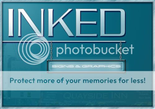 Steve Underhill replied 16 years, 7 months ago 8 Members · 20 Replies
 -
20 Replies
-

like the idea of having a sign as part of the design
-

I think I’d like the "Signs & Graphics" more prominant. Mainly because "INKED" doesn’t say what you do. "INKED" is a bit too overpowering, I reckon, and could be half the size it is.
-

Thats a 500 pixel image, the brochure cover is A5, so itll be plenty easy enough to read. plus the fact the rep takes them round and introduces them so what we do is immediately apparent.
The logo half that size looks totally lost and doesnt match up with any of the design.
If the glowing sign is any bigger it will cover the background, which isnt what I want,
Dont forget its a brochure not a sign.
The company name is what people need to remember as well as what we do, Its like the rule of 3rds in photography, theres something to catch your eye in all 3 sections of that image from top to bottom. -

I would have liked to see "Inked" in caps and lower case.
Or even all lower case.
I think it would read better.
I am not keen on the font you used for it, the spacing between the I-N-K part looks off.
I do like the colors and the concept.
Love….Jill -
Agree with the mix of upper/lower case, but all lower case looks awful I think.
-

I like the sort of monotone theme….
Although it might sound a bit trivial I really don’t like the chain…..I’m not even sure what else you could use…..(maybe just smaller links)…. but it just looks a bit ‘muckle’ in the scheme of things
-

With all the straight lines and the narrow "sign box" I don’t find the design flows. Perhaps the sign box could be narrower and deeper with the signs on top line, a nice big arty ampersand in the middle with graphics on the bottom line. The ampersand would overlap the signs and graphics.
This would give the whole image some depth with less emphasis on width and provide some "flow" down through the graphic. -

I like the chain, just think it’s prob out of proportion in relation to the panel and the pole.
Out of curiosity does this tie in with the rest of you print like business cards etc & your vehicle?
-
Neon signs are lots are hung with chains, you see them everywhere in bars & diners etc that’s the reason for that, they also look in proportion to the size of the sign, if you hung a sign that size on chains they would need to be that kind of size, I played about with size and that was what looked right.
quote :a nice big arty ampersand in the middle with graphics on the bottom line. The ampersand would overlap the signs and graphics.
This would give the whole image some depth with less emphasis on width and provide some “flow” down through the graphic.That’s completely what I’m NOT trying to do I just want a simple design that isn’t over the top, no arty big ampersands needed, I just want something plain and simple which is what I have done there, its not a real sign its a brochure cover, it says the company name & what we do, that’s all,
Basically it says what I want it to, and the customers who have looked at it so far like it so I achieved what I was after.also no it doesn’t tie in with business cards etc as mentioned previously I have done several of these designs, and haven’t decided on a final one yet, and generally do several different ones on the same sort of theme, especially business cards as I like variety, I’m not a huge corporation stuck with a worldwide brand so can vary my designs which I like to do.
What you will find is most people take the brochure and then turn the page to see inside so basically whatever goes on the front cover doesn’t get looked at as much as whats inside, keep it simple.
-
Steve…I’m not tying to be funny here but did you post this to show us what you are going with….. or were you after opinions on possible improvements?
-
quote Steve Underhill:What you will find is most people take the brochure and then turn the page to see inside so basically whatever goes on the front cover doesn’t get looked at as much as whats inside, keep it simple.
I thought it was common knowledge that people do indeed judge a book by its cover.
As far as keeping it simple, it appears that drop shadows, neon glow, bevels and semi translucent graphics have more in common with this design than basic layout imho. -
I also suggested a different font. The one that you have chosen, in my opinion, looks weak.
It does seem to me that you were not looking for critique.
Love….Jill
Attachments:

-
Just posted it to show people.
Opinions vary and you cant please everyone.
Its not the final design like I said just one of many to be decided upon.
As for judging a book by its cover, the people who have been shown it so far like it, including other sign makers,
Still if we all liked the same thing the world would be a boring place.
off back to work now where theres no internet so If im not replying im not being ignorant, just no adsl till thursdayNone of those fonts do anything for me Jill sorry except maybe the last one with a capital I to start.
Have a play if you want feel free, as I said theres going to be a while before I decide on final designs, I must have about 5 or 6 so far.
laters all -
I’ll bet it looks a cracker whatever.
You’ll never please everyone on a sign site that’s for sure.
Customers? What do they know??? -
quote :also no it doesn’t tie in with business cards etc as mentioned previously I have done several of these designs, and haven’t decided on a final one yet, and generally do several different ones on the same sort of theme, especially business cards as I like variety, I’m not a huge corporation stuck with a worldwide brand so can vary my designs which I like to do.
Just my 2p’s worth – But surely there is some logic in all printed matter tying in to look part of a set. Surely is it not part of your advertising and needs at least some consistency.
-

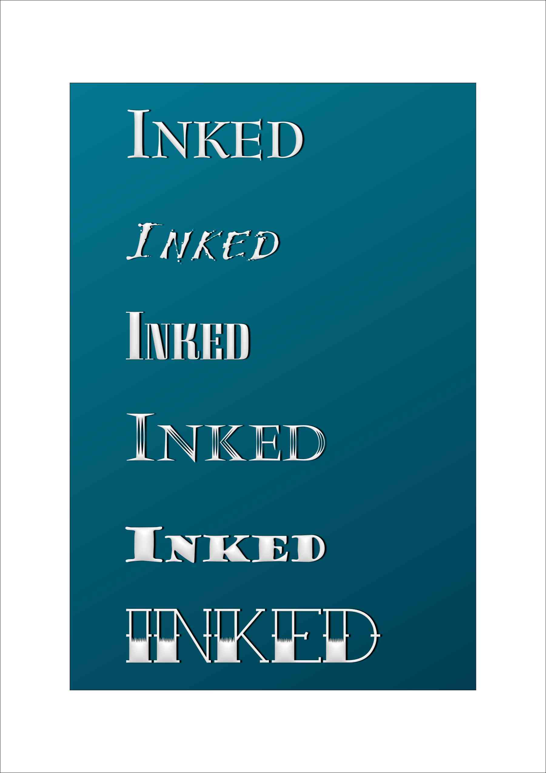
Hey Steve, Just a few more font ideas. To bad I don’t have more time as usual. Well back to drawing boring squares and rectangles with predictable fonts. 😀 I like the color choices you’ve made.
Attachments:
-
quote :Just my 2p’s worth – But surely there is some logic in all printed matter tying in to look part of a set. Surely is it not part of your advertising and needs at least some consistency
Yes it is a part of the advertising, but I wont be having whats on the brochure cover on my van or shop front for instance, The Van is white for a start, so is the shop, we are in a sort of conservation area so must be a little subtle with colour choices with the shop sign, will probably be silver/black on the sign van is undecided yet as I dont wrap.
As for the brochure design as I have said previously its not in any way a final design, the name of the company and the logo is what will be part of our final image and as yet that hasn’t been decided either.
But one thing I can tell you for certain the brochure wont be in black and white. 😛
I do appreciate the feedback, but like I say I will post more designs later that I have already done.
The one reason we dont have a uniform look for everything is because we do several different lines , IE edge lit signs, Electro luminescent signs, vinyl signs, etc etc and the cover of that brochure was going to be aimed at the people, we would target for the edge Lit/EL signs.
Hence the neon sign & the chains.I also noticed now I chose the wrong font on it, I meant to use Kubra, but that one is babylon 5 credits, so will change that and see what you all think.
Simon nice fonts, the tattoo style fonts I like especially as inked was originally for our clothing brand specializing in tattoo style clothing & designs, but now it has stuck and its what were known as, it still fits nicely because we print a lot of stuff and its a nice short word which I like.
As you can see by my avatar I like tattoos a little more than most.
Cheers for now :lol1:
-
Thanks, that’s a free one that I found that is called not surprisingly "Tattoo Ink". You could just do a Google search to find it. I’m working on another tattoo font that is partially done (it’s drawn but I haven’t set the metrics in FontLab yet). It’s more of a hand drawn one than the Tattoo Ink font. I worked in a Tattoo shop for about 2 years, so I’m really into that sort of style anyway. I noticed your sleeve in your photo, so I thought it might be up your alley. I don’t think you have to stick to exactly the same look throughout on your design anyway. You can always use some similar elements from each design to kind of tie them together without being to rigid. Would like to see what you come up with though. 😎
-
I have a very similar one called tattoo lettering, but I feel that although its a nice font it would be something I would only put on our clothign brochure, as there are still some people that associate tattos with thugs, they do here anwyay in the UK.
so will probably be just a nice bold font.
Going to be working on some more tonight so will post more on the bottom of this
Log in to reply.
