Activity Feed › Forums › Sign Making Discussions › Graphic Design Help › need some ideas please for this layout?
-
need some ideas please for this layout?
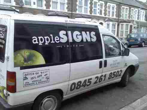
Posted by Jonathan McGovern on March 11, 2007 at 10:19 pmi done my van last week, took simple design from my letterhead, the word signs is in carbon fibre, looks good against black, the numbers are in dark metallic silver with black outline, its ok but the design lacks something, im not happy with it, any ideas, you lot seem to have a good eye.
happy signmaking
jof
Attachments:
 Jill Marie Welsh replied 17 years, 2 months ago 7 Members · 9 Replies
 -
9 Replies
-
 quote Jonathan McGovern:i really like the one andrew did, simple and very effective, i done my van last week, took simple design from my letterhead, the word signs is in carbon fibre, looks good against black, the numbers are in dark metallic silver with black outline, its ok but the design lacks something, im not happy with it, any ideas, you lot seem to have a good eye.
happy signmaking
jof
hi mate, I think there is too much black in the panel personally. I’d enlarge the apple considerably. Looks ‘lost’ in that design.
-

Carbon fibre? I always thought that was black? or thats all i have seen in vinyl, can I ask what make it is?
Peter
-
quote Peter Normington:Carbon fibre? I always thought that was black? or thats all i have seen in vinyl, can I ask what make it is?
Peter
I’ve seen a gray one here peter. Spandex used to sell it from memory.
-

Hi Jonathon
Welcome to the boards mate…Regarding your van…
I would say that your design needs tied together in some way.
You have things dotted here and there giving a dissociated feel to it.
If you can’t flood coat the large black panel white prior to lettering I would try using it in the design in some way. (Hard to explain without doing up some sort of draft)
As much as that big phone number will be seen from up here in Scotland, it’s not going to be the first thing the passer by needs to catch their eye. The idea is to tell them what you do, if they are interested they will look for that number whether it’s small on the door or huge like you have it.
I am not knocking your work mate, designing for your own van can be a nightmare, I know that’s how it feels to me… it’s not easy, but i do think it needs more work. -

Hi Jonathan
I like simple designs but it does need to work in the right way, I would make the tel no smaller and move it into the bottom right corner on the black area. Also I would enlarge the apple a bit and make it a really bright green fresh looking apple (it might be but the picture does not show it) get a really green apple that will be very bright and eye catching, but not fluorescent obviously)
Overall it is OK but keep working on it until you are happy with it, it is the hardest design you will ever do.
Warren
-

Thanks guys, its good when people are honest, where as friends just say its really nice, i like to have people straight to the point, the carbon fibre is silver and from victory. Ideally i would like a vehicle wrap in black but never done it and probably coudnt afford it as ive only just started! the apple is very fresh and green looking, its just the picture, i will work on it some more and let you see the outcome, any ideas would be appreciated!
happy signmaking!
Jof
-
robert the van panel is white, i fload coated it black as on my letterhead i have a black band at the top with the apple o the left and name on the right, do you think a white background would look nicer, you see i think it would look fresher and crisp but my other half is telling me too leave the black on there!
-

I think it is the over-large telephone no. which ruins what is quite a nice, simple design (the magnetic ‘offer of the week’ is another matter!)
I personally, until you can think of something even better, would remove the phone no., and like Warren, would make it much smaller and place in the bottom corner opposite the apple image, same colour as the word ‘apple’.
The apple could perhaps have been a little larger, but overall I think it is an OK design.
My opinion only, of course, and there are lots of far more experienced people than me here. -

I don’t mind the design.
But the phone number is HUGE, and the little square ad is totally lost.
I would remove both and leave the bottom plain.
Then cut the phone number in the same green as the apple and place it on the black part in the opposite bottom corner as the apple.
Love….Jill
Log in to reply.
