Activity Feed Forums Sign Making Discussions Graphic Design Help Need help with signage for our trailer.

  • Need help with signage for our trailer.

    Posted by John Cooper on September 7, 2008 at 10:46 pm

    You know, when I trawl through the posts in this section and the member’s portfolio I’m always amazed at the creativity of the designs.

    In this section I usually look at the pictures in the first post and think wow! I then move onto the replies and think wow wow. I just wish I had that creative ability.

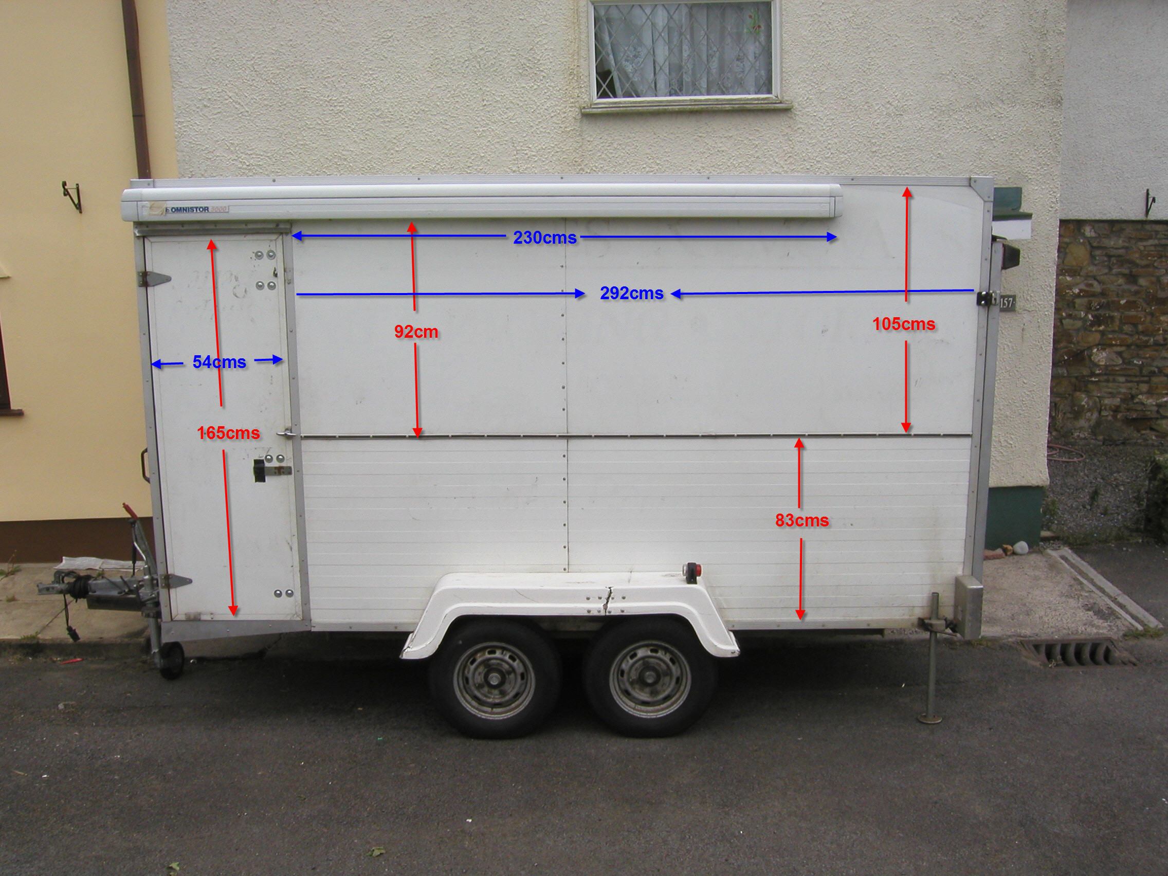
    I know this might be considered cheeky but I’d love some help with creating a design for the side of our trailer and something we could cary through the branding. At present it’s just plain boring white.

    Angie & I started an embroidery business two years ago and more recently started doing a few decals (Gerber Edge FX) and printed shirts etc. We just discovered we’ve been producing embroidered clothing for the designer of the McLaren F1!!

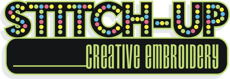
    I’m almost embarrassed to post a picture of our present logo, but here goes! We really are in need of an overhaul and maybe a new identity. We’ve traded under the name Stitch-Up Creative Embroidery and embroidery is still the mainstream for us.

    A few pics attached.

    We’re definitely in need of a makeover! We have toyed with the idea of going to a graphic design business for some ideas but at the moment we’re investing in equipment and Monopoly money is all we have left!

    If anyone has ideas we could use, I’d be ever so grateful.

    Cheers

    John


    Attachments:

    John Cooper replied 15 years, 8 months ago 8 Members · 15 Replies
  • 15 Replies
  • Harry Cleary

    Member
    September 8, 2008 at 3:14 pm

    Just a thought on the logo John.


    Attachments:

  • John Cooper

    Member
    September 8, 2008 at 3:22 pm

    Oh geez!

    That puts me to shame Harry!

    Just leaving work so will take a better look when I get home.

    Thanks very much.

    John

  • Peter Normington

    Member
    September 8, 2008 at 3:52 pm

    John, is that Rob’s old caravan? 😉

    Peter

  • John Cooper

    Member
    September 8, 2008 at 3:55 pm

    It could be Peter.

    I’m thinking of hiring it out to The Home Office to alleviate prison overcrowding.

    John

  • Martin Cole

    Member
    September 8, 2008 at 8:14 pm

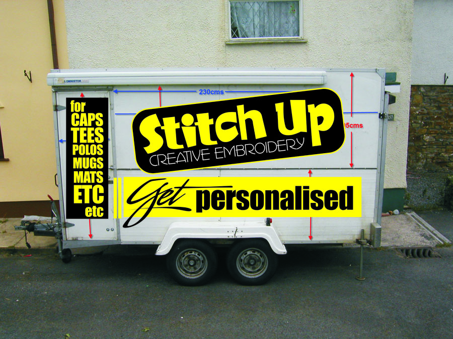
    I like Harry’s very much,

    Here’s another take on it.


    Attachments:

  • Chris Wool

    Member
    September 8, 2008 at 8:25 pm

    i think martin has got it totally right for the type of company and product.
    i was considering a scan of the words stitched as to use his new printer.

    chris

  • Kevin Flowers

    Member
    September 8, 2008 at 8:36 pm

    Depending on the embroidery software being used you can print a stitched version of a logo. The image is one i did for an embroidery company i was going to start.

    Kev


    Attachments:

  • John Cooper

    Member
    September 8, 2008 at 8:50 pm

    I like both logos but would probably choose Martins’ for the simple reason it looks more fun. Angie just took a look and prefers Harrys’.

    Thanks for your ideas and time, really inspiring.

  • Jill Marie Welsh

    Member
    September 8, 2008 at 8:53 pm

    I like this last one from Kevin a lot. It is plain, yet colorful and to the point.
    Only thing I’d change would be to make EMBROIDERY all-caps.

    With your own logo (first in this post) I think you are trying too hard.
    You want to show stitches, you want to show colors.
    I don’t blame you.
    But a nice snappy look and readability go a long way, like in Kevin’s example.
    Altho his is just initials and your name is longer.
    I like Martin’s font choice as well.
    Love….Jill

  • John Cooper

    Member
    September 8, 2008 at 9:11 pm

    I posted my reply before I saw Kevin’s offering. I do like the boldness of the design but this might get lost with more letters?

    I still like Martins. Would it be a good idea to incorporate contact information in the logo or seperate to it?

    Tel: 01656 728268
    (mod-edit)

    Would you use the same font/colour for contact info?

    I might be burning the midnight oil tonight 🙂

    Cheers

    John

  • Chris Wool

    Member
    September 8, 2008 at 9:21 pm

    i would suggest that the contact info is separate from the logo as it would be to congested.
    a easy font like helvectica med keep it simple let the logo work.

    chris

  • Jill Marie Welsh

    Member
    September 8, 2008 at 10:11 pm

    I typically do not put contact info into a logo. I keep them as separate mix & match pieces.
    Here’s something I’ve doodled up using free fonts from Larabie.
    http://larabiefonts.com/
    The main name font reminded me of tops of spools of thread.
    Love….Jill


    Attachments:

  • Terry Bull

    Member
    September 9, 2008 at 9:06 pm

    Ive played ,but don’t know your message

    Terry


    Attachments:

  • Jill Marie Welsh

    Member
    September 9, 2008 at 9:15 pm

    Darn it Terry now my idea looks like sh!t!
    😳
    hahaha
    I love how you made the name in a slanted box.
    Very clever use of space.
    Love….Jill

  • John Cooper

    Member
    September 11, 2008 at 9:39 pm

    Just wanna say thanks to all that replied and the ideas.

    I really am very grateful.

    I’ll post a picture of the trailer when I’ve stuck something on it 🙂

    John

Log in to reply.