Activity Feed › Forums › Sign Making Discussions › Graphic Design Help › Need help with my sign design please?
-
Need help with my sign design please?
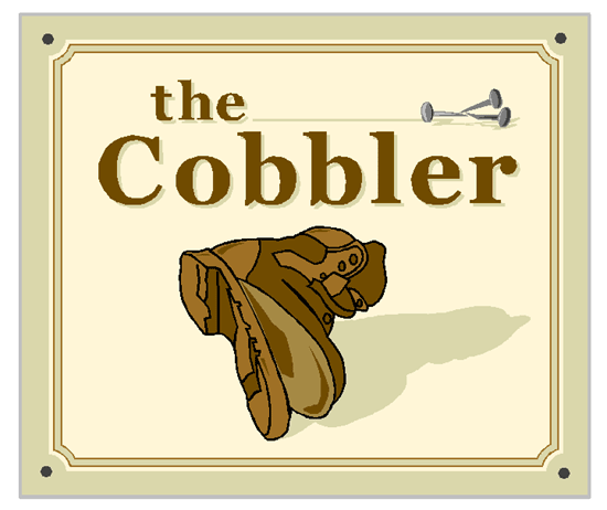
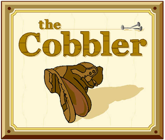
Posted by kev hoy graphics on January 11, 2004 at 8:54 pmHi gang
I am working on this projecting sign design & i am a little unhappy with it.
I like the overall layout just feel it lacks something.
I have decided to post it here for some fresh thoughts on it.Anyone? 🙄
Attachments:
 sign-on replied 20 years, 5 months ago 20 Members · 31 Replies
 -
31 Replies
-

i think your doing a damn good job on your own as it is mate…
ok im gonna sound daft here, but why the nails? should it not be some kind of stitching or glue?
ill keep having a look and see if i can think of anything that may help.. 🙄 -

I think it looks fine as it is, has a nice traditional feel to it.
One thing I did think was perhaps to introduce a darker shade on the top and one side (left? now I’m in Post Reply I can’t review the original image) to the pale line between the “frame” and the inline to give a feeling of three dimensionality to the sign. I’m sure there’s enough colours in the design to shuffle round a bit .
-

Kev everything is fine apart from the text.
It needs to look older with larger letters at the beginning of each word etc. Maybe colour them differently too with some nice shading etc. Otherwise, i think it`s great.
Rod
-

i think its great! (hot)
my comments would be the same as mcrods though.. 😉
-
i am gonna go with rod on this one also mate.. i think if you manage to make the text a bit older looking or different font.. “more tradional” it should finish it nicely. 😉
-
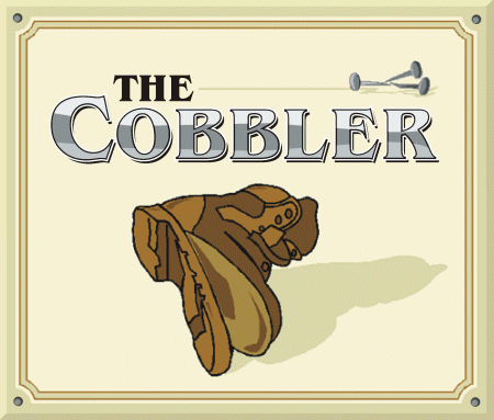
Great design. Humble opinion, but I’d add shading to the letters, or some sort of shaded border, just to add a bit more depth. The nails and the boot have some great shading.
Played around a little, not saying this is ideal, just an example of the different shadings and stuff 😀
Cheers, Dewi
Attachments:
-

Nice pic! Another Hot Scot!
I like the design. The only things I would change are:
Tighten up your kerning a wee bit on “Cobbler” and perhaps make the letters a darker brown.
“The” needs to come down just a tad. I would leave the line & nails as they are.
Rob, I worked at a cobbler’s for a while & they do use nails sometimes.
Love- JILL -
quote Robert Lambie:..
ok im gonna sound daft here, but why the nails? should it not be some kind of stitching or glue?No not daft just young 😆 go and ask yer dad, where do you think “Hobnail boots” come from, great design I really like it but like Jill says the kerning is too loose (Rob 😛 ) and how about a cobblers hammer with the nails too.
-

Yep, agree with Jill & Steve – kerning needs touching up 😀
Didn’t know they used nails in boots either – thought it was glue & stitch – or if you leave them out over night the fairy people mend them … sort of like the tooth fairy!! Am I showing my young age here 😆
-

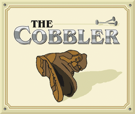
The only suggestion I have to add, is to make the exposed innersole darker to give
more form to the boot. Although this will ievitably mean either another colour of vinyl
or reaccessing those already used.Good luck.
Attachments:
-

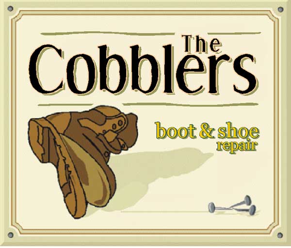
Here’s another slant on it….
Had to move a few things around to try to balance it a bit.
It’s a more traditional feel, in keeping with the trade it represents.
It would need a bit more work on general balance and colours, but it’s quittin’ time and I’m off home. 😆
Cheers
Joe
Attachments:
-
Magpie
Not sure if you have deleted your picture mate.. doesn’t seem to load.
If your having bother send me it and ill load it for you mate.quote :No not daft just young go and ask yer dad, where do you think “Hobnail boots” come from.Ok ok your one-up on me obeywan.. 😆 😆 😆 you wise old man you 😆 😉
oh yes and steve, em i agree with you and jill the kerning could be a bit tighter.. but not as tight as a scotsman eh 😉 😆 -

I can’t see it either (just a little red X) – maybe it’s in your cache of previously viewed pages Lorraine ? or maybe it’s some security setting i’ve got wrong at my end ??? who knows !
I like Joes by the way – not sure about the yellow colour for little text though.
Nigel
-

Can’t see nothing either
I like Joe’s vesion, except lose the yellow text.
-

spot on joe! like it and agree with nigel about the yellow text! cannot see magpies either!!
Nicola
-
The yellow text was an afterthought , just as I was going out the door.
Now that I look at again, the yellow dosen’t sit right.
Ah well, can’t be perfect all the time 😆 😥
Only joking, but I’m glad a couple of ye like it.
Cheers
Joe -
Hi all, I’ve reattatched the image and it appears to be back now.
Strange that, I wonder if the file got corrupted somehow?Ps I hope its worth the wait lol, here’s what I said originally…
quote magpie:The only suggestion I have to add, is to make the exposed innersole darker to give
more form to the boot. Although this will ievitably mean either another colour of vinyl
or reaccessing those already used.Good luck.
Attachments:

-

Now I better tread carefully with this one
Sorry if that sounded a little tackyI liked Joe’s rendering
A little more traditional and ye olde typeWould say more but I’m tied up at the moment and my tongue’s dry
I know what your saying: “Poor sole! Heel have to go! Give him the boot!”
Do you think I should see my Doctor, Martin?John
-

The name Dr Martin is a sore point round these ways since they laid off 850 people and bogged off to China with their work. (I must mention that the Cobblers have just won their way to an FA cup clash with Man Utd! Whahay)
Back to the sign, I just don’t like the boot. I know this isn’t very constructive. All the shoe repairers round here have stilletoes on their signs. Probably because thats what they spend all day repairing. I do like the more oldy worldy style lettering on Signjoe’s version though.
-

Well I guess all boot manufacturers are doing the same.
I noticed my nice new Timberlands ( Xmas present) are now made in Thailand they have always been made in the U.S.A.
trouble is we all want a bargain…….
-
I’ve always bought Dr martins footwear and haven’t minded paying the high prices because of the quality. No more though.
Sorry, off topic…. 😕
-
Hi gang
What can I say? I certainly didn’t expect all these replies. Brilliant. I mean that. 😉
I have not been online over the last week or so. I had some problems with my connection. I had someone in to look at it, so that hopefully shouldn’t be an issue anymore. 😀
I have taken onboard the comments and I agree! The text should be closer and the whole feel to it “a bit older”. Thank you dewi, magpie & signjoe for taking the time to explain using images. Brill! What a great forum this is!Well I am going to now go and see what I can come up with keeping in mind all the comments. Hopefully I should come up with a finished article today or tomorrow. 😛
-
ok had a play with this & took on all your suggestions.
what do you think now?
Attachments:
-
Hi Kev
Nice to see the progression.
1 final suggestion….
could you give the copy a black outline
to “tie it in” with the shoe?
(no pun intended)
Love-JILL
Good Job! 😉 -
I think you’ve got that sussed now Kev 😀 It looks great to me, how is it going to be made – what materials etc ?
Nigel
-
now that is smart! wish i could do that.
what software do you use kev? -
Nice one Kev 😀 Fantastic design. Echoing Sally really, what software do you use?
Cheers, Dewi
-
Thanks for the replies!
Jill I may do that when I finally get round to making this. Have to speak with customer first. Thanks!It’s going to be a projecting sign only, double sided. Main sign already done. The shop is a mixture of key cutting, shoe repairs that kind of thing. But wants to renew the cobbler projector.
It’s non-illuminated and will slide into an existing frame. Easy done.
The only thing that may need changed is the border. The design includes the border were that maybe overlapped by the existing frame or may not look right as it has a frame then the face shows a frame also?The software I use is signlab 5. Used it for some time now. The image shown is basically a build up of layers. None are welded yet, that’s why I didn’t upload the image “cut-file” as it’s all in bits at the moment. I don’t weld anything until i am happy with finished article.
I would recommend anyone to try it.Again thanks everyone. With the amount of replies I have got. I can see this forum being a great tool for everyone.
Well done rob! 😉
-
Excellent work kev. I know its cut vinyl but i would never have thought this sort of thing could be achieved.
Please, keeping showing us your work, i would love to see a demo on work like this. 😛
Log in to reply.
