Activity Feed › Forums › Sign Making Discussions › Off Topic Chat › Naff sign
-
Naff sign
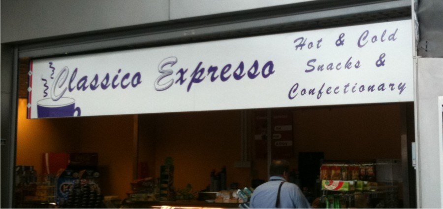
Posted by Martin Cole on November 4, 2010 at 8:33 pmWell here’s another classic,
This is in part of Stratford Station besides the Docklands railway and next to the new Olympic stadium so not exactly hidden away as it should be.
Shame on who ever creates such tat and worst of all convincing the customer this is good enough to put above their premises.
it looks far worse in real life btw.
Attachments:
 Mike Grant replied 13 years, 6 months ago 11 Members · 25 Replies
 -
25 Replies
-
 quote Robert Lambie:got to love the kerning… 😉
And the spelling…ConfectionAry!
-
 quote Mike Grant:And the spelling…ConfectionAry!
😮 😮
omg your right Mike also spelt wrong…good grief
I was so taken away with the classic layout, I didn’t notice
-

well Harry Hot is certainly not spelt Luton 😀
Lynn
-
:lol1: :lol1:
ok ok apart from a crap layout, pants kerning, naff choice of font (wait til Jill See’s it) and 2 spelling mistakes it’s not that bad really… 😛
-
 quote Martin Cole::lol1: :lol1:
ok ok apart from a crap layout, pants kerning, naff choice of font (wait til Jill See’s it) and 2 spelling mistakes it’s not that bad really… 😛
What’s the coffee like? 😮
-

😮
That really looks like sh!t.
Bad kerning, bad spacing, bad spelling, bad font, bad everything.
I wouldn’t take a coffee for free from them.
:vomit:
Love….Jill
PS
I’ve seen just as bad over here. -
 quote Dave Rowland:something tells me ebays involved in that sign
eBay Signs have allot to answer for these days!
-

Can we drop this now, if the shop owner see’s this post he will have me back to change the smelling misteaks I’ve maid.
-
I wonder if by any chance the sign maker that made this sign was on these boards, do you think he/her would own up to making it! 😳 🙄
-
 quote Mike Grant:I wonder if by any chance the sign maker that made this sign was on these boards, do you think he/her would own up to making it! 😳 🙄
well if they do, this is why we are all here to help them do it correctly 😉
nik
-
No they will defend everything about it, if anything they will post it up again in Algerian or Comic Sans.
(:) -
EXCUSE me Lynn but I owned up to it before you did, stop trying to steal my creative designs or I will have you for copyright infringement :lol1:
-
 quote Martin:EXCUSE me Lynn but I owned up to it before you did, stop trying to steal my creative designs or I will have you for copyright infringement :lol1:
coffeeright infridgement?
-

don’t you just love the understated graphic on the left side though….
-

I’ve had new neighbours move in on either side this year, one guy came round and introduced himself and later asked me to make a new sign for him. The other side made a lot of noise drilling holes in the walls and employed a deaf painter who listened to crap music FM for a week, and since then I’ve not seen them but they did fit there own sign.
Not sure if I should bother to go and see them
Attachments:


-
"Its what the customer wanted" "He insisted it was done this way" So why should I bother to correct it and waste my precious time! 🙄
-
Mike, I don’t know what you are complaining about, sign looks good and you should be happy. Don’t think much of the one that Steve did above it though. Signmaker should really do better. :lol1:
Log in to reply.
