Activity Feed › Forums › Sign Making Discussions › Graphic Design Help › My own vehicle wrap design, opinions please?
-
My own vehicle wrap design, opinions please?
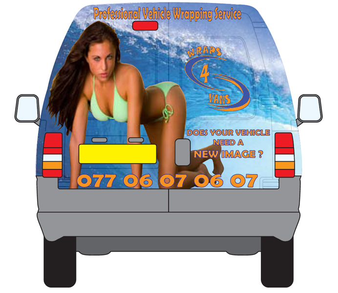
Posted by Phil McGovern on August 1, 2008 at 4:29 pmhi, i am trying to re design the rear of my own van, to try and push the vehicle wrapping. bare in mind i am not a designer. i would appreciate any thoughts or ideas.
thanks in anticipation
Phil
mod-edit :police3:
please use descriptive topic titles when posting.
this post has now been edited.Shane Drew replied 15 years, 9 months ago 12 Members · 18 Replies -
18 Replies
-

Hi Phil
I’m also not a designer but I would have to say the girl is a no no, does not portray a good image IMHO, potential woman clients won’t like it and some men will think it’s tacky, that alone should be reason enough to not have it as it is potential business lost. I have just wrapped the rear of my van and it is the hardest thing to try find something neutral but is eye catching with a bit of WOW factor.
My opinion is to keep looking on istock etc until you find something that would not offend anybody. Personally I wouldn’t mind that parked in my driveway 😉 but not good for business 😕
Warren
-

Heres a screen shot, to save downloading the PDF.
Andy
Attachments:
-

cheers warren, Ive been asking around existing customers as well and alot of comments where sex sells ! 😮
hence the nakedness.
it took me ages to make the wife stay still for the pic as well :lol1:
Phil -
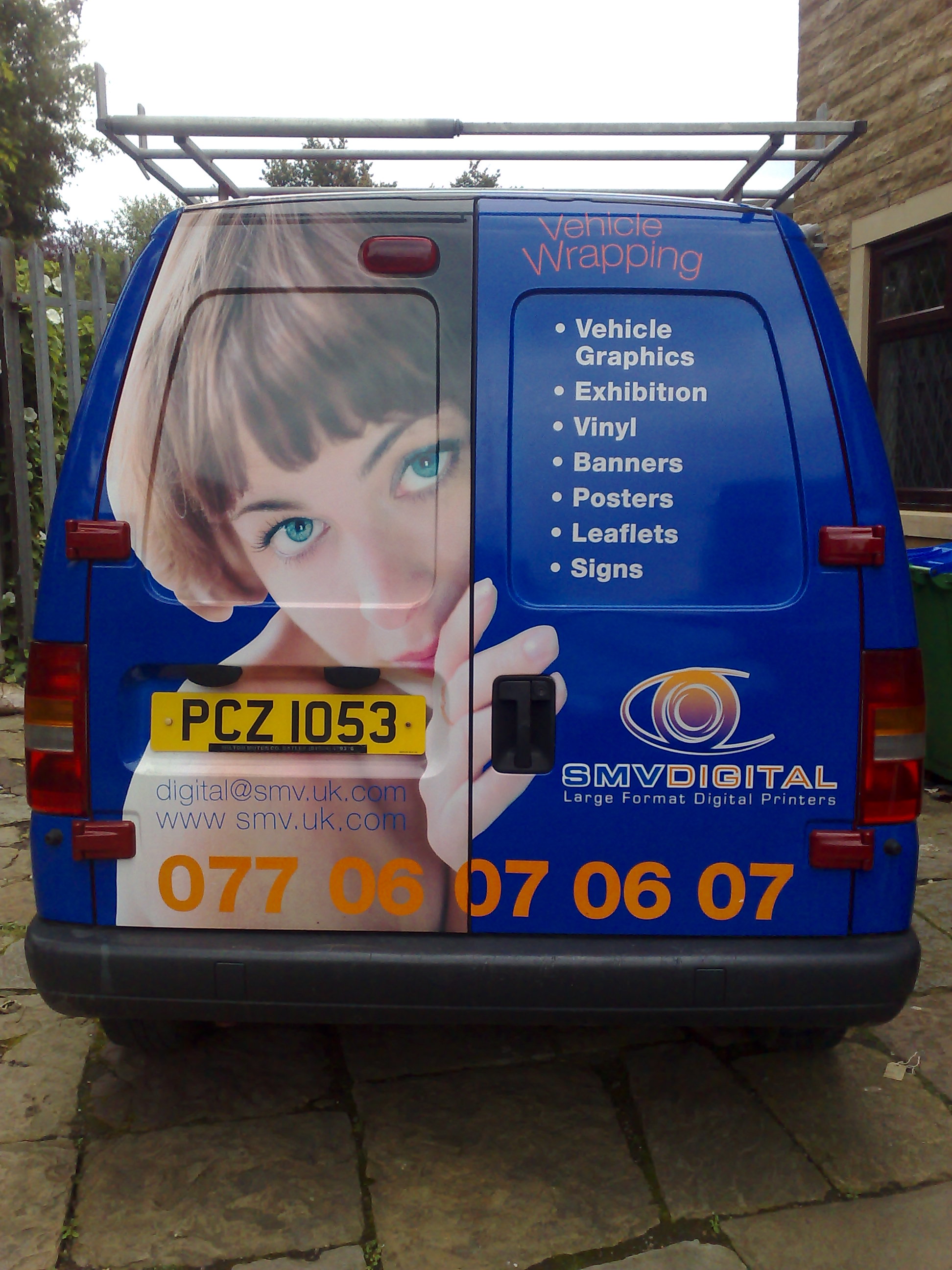
the first pic here is my existing and the next was another thought
Attachments:
-
Hi Phil, you are correct it does sell, but I don’t think it sells too well to business woman at work and some men. Remember you are selling vehicle wraps and not S3X 😉
I thought I had seen here somewhere before :lol1:
-
I like the second one, just might need a black outline around the phone number or something to help the orange stand out a bit on the left hand side.
-
i would have to try and change the full background colour as i only want to replace the rear doors if i can. that something i can mess with later
-

just a quick reply for now…
* exhibition
* vinylin the list will not mean anything to most mate… ide elaborate a bit…
* Exhibition Displays
* Vinyl Graphicsthe last one is best of the bunch… needs some tweaking though. if i get a chance later ill join in. 😀 for now… i need some wine! 😉
-

Much depend of Yours living area and Yours customers – as a target.
If You try to reach only machos – shure You will got new clients /maybe really valuable?/. But: business-woman will be automaticaly removed from Your customer-list in 95%.You should know Yours clients and maket. That’s Your market.
-

I would look at a completely different graphic along the lines of the vending machines a while back e.g. a coke machine with a picture of a guy pushing a bottle out of the front slot (when viewed from the side)
Take the back doors off and set up an artist and easel inside, then take some pics. Or something bizzare………..The cute woman has been done to death, and as Wojciech has pointed out knocks half of your customer base.
-

Problem is, when you see a picture of a good looking person on the back of a van, the copy is just ignored. The attention is all drawn to the photo.
so it does not convey the message you want to put across;
it looks like page three, or an add for a massage parlour.
just my opinion,
the surf/ waves look good, and if you deleted the girl and enlarged the message,the effect would be better.Peter
-
 quote Wojciech.Szul:business-woman will be automaticaly removed from Your customer-list in 95%.
.where can i meet the other 5%? lol
i prefer the last one, the bird peeping round the door, not overly ‘sexy’ that it would put the feminists off buying from you,
the first is ok from a blokes point of view, pretty sexy, and despite the fact you’re alienating many women customers, it’s nice enough to get drawn into and perhaps run into the back of yer van, promting a nice regular income from the odd whiplash claim!
-

I have to disagree they would all put me off even asking for a quote, Hugh how can a naked (she looks naked in the last one) not look sexy.
Phil if you are selling signs make that your priority like something like Graeham said maybe you unloading a sign or similar, sorry just my humble.Lynn
-

Just my 2c’s
I’ve got a gorgeous girl on the side of my van, and its got me a bit of attention. Not sure its got me much work, but the women berate me, and the men want her number 😳
Its coming off soon.
Seriously though, I’ve been given an earful by plenty of women for being sexist, even though I don’t think the pic is that bad, I’ve even had one bloke ask me if my wife is still talking to me 😮
That said, I’ve had plenty of women comment favorably too, but end of the day, if its going to offend just one person, that may be the very person who is looking for someone to do all their signs in future.
Peter makes a good comment. The waves would be a better option, than the pretty girl. Its not got a lot to do with wrapping tho, people will admire the pic, but not see how they could apply it to their own business, unless they sell surfboards of course.
I’d try and be more practical personally. Get some ideas here. I’ve got the 2006 book, it makes you wonder who these clients are that spend such big bucks of signage and promotions, but its good for concepts and ideas….. http://www.mactac.com/index.php?id=213
-

prefer the last ones logo, the first two logos you cant read properly, and dont look very slick. the Orange and blue together are a bit tricky and are not easy to look at. Id cringe if I saw the first one driving down the motorway, the second one looks like its advertising jewelry or makeup. The third one looks like its already been done and is not a visual.
-
i guess its back to the drawing book for me 😥 i suppose i went off on a tangent once i had the sight of a pretty woman in my mind ! and my eyes are beginning to hurt looking at all the image sites .
thanks for you comments and please keep them coming
Phil -
quote Phil McGovern:i suppose i went off on a tangent once i had the sight of a pretty woman in my mind !Phil
You’re not the first to have that problem, and you will not be the last I’m sure 😉 😉
Log in to reply.
