Activity Feed › Forums › Sign Making Discussions › Graphic Design Help › My Own Van design
-
My Own Van design
Posted by Nicholas Gormley on December 10, 2010 at 4:21 pmHi all, I bought myself a VW Caddy van. I’m trying to come up with a design that is eye catching but not too much of a plaster. I always find it hard designing for myself and would like some input from use lovely people 😀
I’m open to all comments and suggestions as this is the first van I will have and want to start of with a nice design and to catch peoples attention.
Any help would be greatly appreciated.
Nicholas
Attachments:
 Harry Cleary replied 13 years, 2 months ago 23 Members · 71 Replies
 -
71 Replies
-

Think you’re going to need to bulk the lettering up a bit before you start. I do like the ‘X’ though. Have a go at putting your phone number in two lines as well. This is not a criticism, but you know it’s not quite there yet, it won’t however take a lot to tweak it.
-

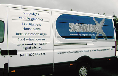
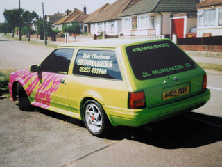
This is the old van the last sign company i worked with before going alone might provide a bit inspiration
Attachments:
-

My take on it is all the lettering is of a similar weight – a bit more contrast in the font weights would create more eye appeal. "Graphi" in the bold version of your font contrasted against "Station" in the regular version of the same font would improve it I think. As Bob said – bulk it up a bit
-
As much as I quite like that John, both the colours and the balance, I wouldn’t use it. I’ve done colourful/flashy stuff on my own vehicles before, regular customers think it’s cool, new customers can be put off by that image.
Bearing in mind I used to use a lowered RS Turbo estate with a 4" exhaust system for a work vehicle. People would often, and still do say "if we didn’t know you, we’d never use you" I always say, look at what I make for other people, not what I drive myself. I was using a race spec dune buggy this summer!
Unless you’re always busy, or very well know, don’t go too flashy. Not wanting to put my foot in it even further, David previous firms van is just too far the oposite for any real business gain specifically from it.
-
Sorry only reason i put it there as there may have been something the poster I stand corrected sorry but sometimes i gain ideas from other too not trying to turn us all into copycats as for the previous post love the idea of a cool lowered van as I find it difficult to get into the car market as people seem to assume I’m not interested in doing the smaller jobs how wrong are they?
-
I didn’t mean to sound critical David, and I apologise if I did. What I was trying to get across is the fact we have to do a vast range of work for a mass of different client groups.
If you have a slammed van, it’ll maybe get you in with the car stuff and window tinting, but you won’t be the obvious choice for a solicitor who is thinking of having his window written.
I’ll post some bits of the weirder stuff I’ve owned, but the last van I wrote for myself was done as a typical tradesman’s van, and I feel that worked far better. They knew the job they would get was going to be similar to what they could see.
-

It’s not reading Graphix straight off Nicholas because of the different colours. John Hughes treatment of ‘Graphix’ is on the money imo although I would leave ‘Station’ on it own and not in a band.
-
I’d now do the phone number in two lines so you can get it a little bolde. Lift the web address an 1" or so, then lift all the writing in the side panel so the ‘X’ is closer to the top and there’s less cramping near the door runner.
I’d be happy with that myself then, and if you are, you’ve cracked it.
-

Harry – Am not sure what you mean when you say leave Station on its own??
Bod – I dont really like the phone number on 2 lines?? I have changed it as you said, and also have made the phone number bolder.
Let me know what use think or any other ideas as I’m open to changing.
-
I know it’s only a mock-up, but the phone number isn’t central with itself, also when it’s near a door handle, you don’t do it central to the door, you’d go about 50mm or so off centre to balance it to the eye. If you don’t, the door handle becomes very prominent.
Thing is, if you don’t like the number like that, then it can’t be like that. I’d put the trademark ‘X’ inbetween the * signs * Vehicle Graphics * Banners *
as I just have with an asterix.Short of fully changing it, if you like the general effect, which personally I do, I think you’re there.
-
John, on the whole, yes I really do. I feel a signmakers van has to appeal to all people in all trades, or at least as higher percentage as possible.
I personally would do it totally different if I wanted to do it to suit me, or to get the maxium amount of work from it.
It was no knock on your design, like I said, I like it. But it’s not the way to go to get the most work in a cross section of trades.
On the occasions I have a written van, I now do it in the same vein as a plumber, builder or shop keeper etc is likely to want theirs.
A friend of mine has a paint shop, we spent over two weeks fitting a bodykit and suspension/brake mods then spraying spraying one of my vans. This was after a serious engine upgrade. With the effects etc, the whole job would have cost thousands and thousands. Stunning thing, but I got far more work from my sensibly written £900 combo van.
-

ok….. but..
The business name is Graphix and promoting that he does Vehicle Graphics surely it wants to be different from a Plumbers van!
Where’s the Graphix in that design ?
Show some………inspiration !!
John
-
100% agree with that, and "Graphics" not a word I would or have ever used on my own stuff irrespective of what I’m driving.
I call myself a signwriter when I paint, a coachliner when I do Rolls and Bentley, and a signmaker when I vinyl.
If I advertise I do it to get work and make money, not do a demonstration of what most people will probably like, but not choose for themselves.
I cannot emphasise enough the difference between inspiration and making money.
The best thing is to have a album of the range of work you can do. Then once a perspective customer has explained what type of thing they want, you can show picks proving how versatile you can be while helping them choose.
-
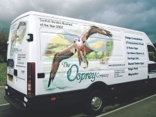
Hi Gents i agree with what Bob is saying and the van i posted you only saw from one side the other side is totally different so you could approach a business with the correct head one side was aimed at mainstream commercial work and the other at the nature interpretation signs market so here’s the other side I know it’s not really relevant here but anyway
Attachments:
-
David, what you have just posted and stated is exactly what I was hoping to get across.
As much as it’s never crossed my mind to do it, I can’t honestly say it’s a bad idea.
Out of curiosity, how did it work out on an acquiring business front, did people get asked which side had clinched the decision to use the company?
-
In all honesty the nature side seemed to create more of a general interest and people would .stop and look but the other side seemed to be used more in people gaining ideas as to what the required for there own requirements? as I said horses for courses but you would obviously never wish to alienate any potential client
-
 quote Bob Clarkson:Unless you’re always busy, or very well know, don’t go too flashy.
I disagree Bob, I think the opposite. A lot of well known established sign co’s have very low key vans, they don’t need to be flashy or need to advertise from their vans.
However new companies and companies needing work need all the help they can get and great looking well designed (flashy) vans are one of the best assets they can have.
just my opinion 😀
-
I’ve been established over 25yrs, and I’ve advertised both ways.
I’ve generally been too busy for most of my working life, but if I advertise and want work I do quality low key. If I’m busy, and can’t do more work, and just want to "show off" for want of a better word, I do a flash job on a flash car.
Signmakers, at least in my area come and go time after time, they come in with a burst of colour plastered all over everything, and it’s all gone to the wall within the year.
I see the flash stuff as the typical 80s way of advertising, and I don’t like writing vans like that anymore, I like the style and quality.
It is very unusual, if not unheard of for a reputable/dependable company to use gimmick advertising.
-

Nicholas I think you will get more help if you attach images as jpeg not pdf that way we havent got to download to look and reply
John
-
Hi Nicholas – yes (id already taken a peek but plenty of others might not) 23 replies over 1000 views.
for what its worth I quite like the original design just a little smaller on the web/
phone nos IMHO -

Not wanting to hi jack the thread here, but Bob is making some good points that has always put me off writing my own van. Do I do a modern less is more design that shows your design skills to the broader "up market customer" or do i do a mad race car inspired design that really gets noticed everywhere? Because of this ive never had any writing on my vans in 8 years of trading.
Maybe 1 different design on both sides is the way forward??I think Nicolas is creating a good balance here between the both styles, although i think it could look better if you thickened up some of the text and the web address looks too stretched.
-
quote :Bob is making some good points that has always put me off writing my own van. Do I do a modern less is more design that shows your design skills to the broader “up market customer” or do i do a mad race car inspired design that really gets noticed everywhere? Because of this ive never had any writing on my vans in 8 years of trading.
The problem here is by not making a decision you end up doing nothing and thats the worst decision of all 🙁
8 years of lost advertising potential of one sort or the other
John 😀
-
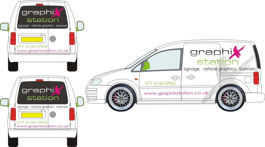
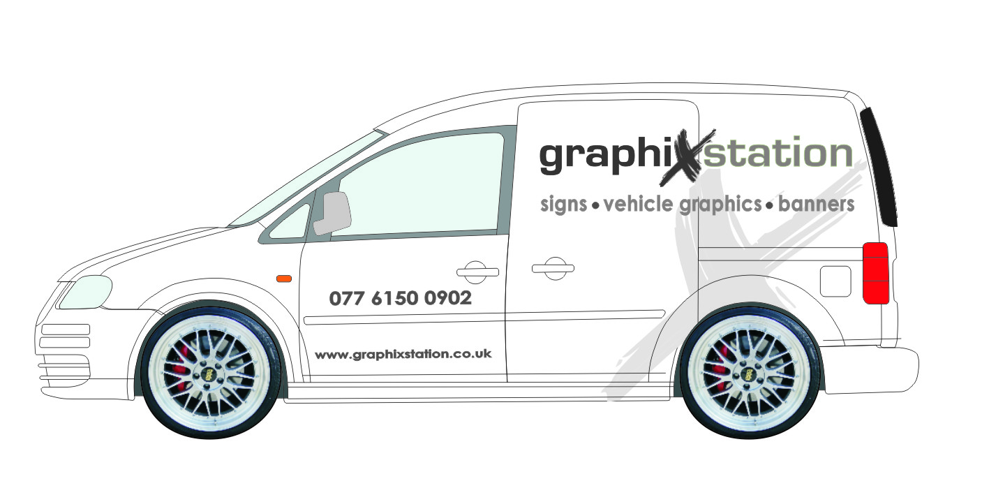
Hows this?? I changed a few things and now doing the back am not sure on the layout???
Attachments:
-
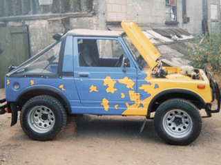
To show I can do stuff a little flashy and alternative, couple of pictures of my work vehicles in the 90’s. This is why I feel things have all moved on from them. The escort was also chipped and spec’d RS Turbo 205bhp so it sounded and went the part, wasnt just show and no go.
Attachments:

-
Nicholas
assuming the rear where black indicates glass as opposed to solid panels why not print to contravision or block out glass white first then overlay graphics – hence the back will look like the sides colour wise
John
-
The windows in the van are all tinted. I did think about covering i white vinyl but the white of the vinyl and the van are two different whites as I have learned since doing a few of these. Tho I did think about doing it with contravision but the there is a bulk head so I cant see out the back either way. I’m just looking different ideas at the minute and what would look best.
-

Not sure if this is off topic or not but I think you also need to consider your location if your not already an established business as well.
When I started I had a very flashy place in the High Street and did lots and lots of marketing, didn’t do very well at all and I ended up as a different company working from a small industrial estate where things picked up and were much better.
I lot of people who are now my customers have openly said that when I was in the high street they didn’t even bother asking for a quote because they assumed I would be expensive.Not sure if the same would be true of vehicle livery but I have always gone down the same road Bob is now on when it comes to my own livery and don’t make it to flashy or expensive looking.
-
Martin – I understand what you are saying but I want something that is unique and that stands out to be different. I quite like the side design now but not sure on the back.
-
Nicholas, it was a general comment because people had been debating what you should have.
I actually don’t think what you have at the moment is particularly flashy and certainly wouldn’t think potential customers would see it as being to expensive.If the tint on your back windows is really dark then what you have should look OK as it is, wouldn’t worry that the background colour doesn’t match the side as those colours will look OK with a dark background. I would probably centre the phone number if it were me but the rest should be OK
If you do it with contravision it would give potential customers a chance to see what the material is like first hand but it is unlikely you will ever match the white of a van with vinyl even though there are now a few different whites about.
-
Martin, fully agree but before assuming I always do subtle have a look at my pictures that are on the end of page three of this thread which I think have been overlooked.
-
Bob, I don’t make assumptions :lol1: :lol1: I did look at the pictures and also noted what you had said in previous posts which is why I said " The road that Bob is NOW on" rather than the road Bob has always been on :lol1: :lol1:
I think location as in where you are in the Country makes a big difference and what works well for one company in a busy City might not work well for someone in a more rural or less populated area.
-
If you don’t mind me asking Martin what way do you think I should go with this van?? I’m just looking some help
-
Nicholas, it doesn’t matter what I think, there are far better signmakers on the forum than me and you should be looking for what the majority think is best not just one person. It’s all down to opinion.
Like others have said I think it is OK as it is, don’t think it is over the top and also don’t think it is to reserved so perhaps a good balance between the two. The important thing is to have a portfolio of the work you have done so you can show perspective customers just what you are capable of doing.
The more varied that work is the better, often people will have already seen vans or shop fronts but just not known who did them. -

Hi Nicholas…..I haven’t read the thread thoroughly so apologies if I’ve missed the point.
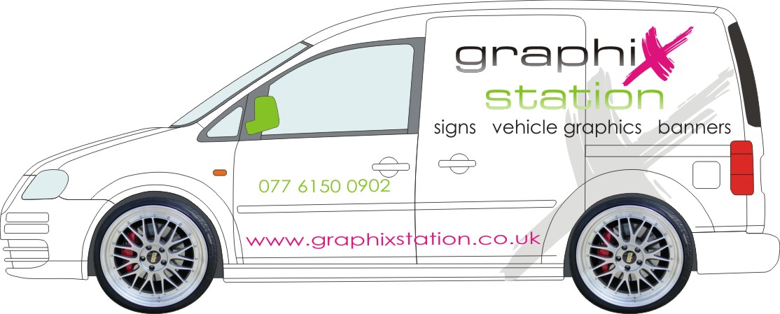
For me your’s wasn’t flowing and the ‘station’ looked a bit detached. I’m not sure I’ve achieved what I had in mind but it might give you some ideas. I’ve just done it in a grey monotone for speed
Attachments:
-
I think you hit the mark there Glenn. works and reads much better on a single line imo.
-

I think Glens Version is spot on too.
I also completely agree with Bob. We are asked fairly regularly why our own van is so simple when we have everything at our disposal. As Bob says, as a sign maker you have to appeal to every business. Flash design on your own van will alienate you from some a simple layout will never do this. Signmaking is not about flash design its about finding the right design that appeals to your clients customers.
Nigel
-
Glenn that is very nice my man.
quote Martin Cole:quote Bob Clarkson:Unless you’re always busy, or very well know, don’t go too flashy.I disagree Bob, I think the opposite. A lot of well known established sign co’s have very low key vans, they don’t need to be flashy or need to advertise from their vans.
However new companies and companies needing work need all the help they can get and great looking well designed (flashy) vans are one of the best assets they can have.
just my opinion 😀
Let me get my point across about my earlier comment, by which I still stand. The awfull word ‘flash’ I picked up from earlier in the thread, I certainly don’t mean a mass of awfull colours or a full wrap. I mean a very well designed van with correct layout and kerning and a good logo.
There is so much crap about in our industry with companies starting up that probably don’t know what the word kerning means. These are the ones liable to go for the awfull colours and rally car look.
If you know what you are doing a well deigned eye catching van is a great asset. How often do we tell our customers that and it should be the same for us signmakers and certainly shouldn’t put any type of customer off, (or only the ones that want a cheapo, dodgy job and not many of us want those).
-
Now you’ve dug yourself out the hole Martin can you fill it in so no one falls down it please :lol1: :lol1: 😉
That’s the big problem with the internet, there is no tone or body language and it is easy to say one thing and someone else reads it a completely different way. Like you say you used the word flashy because it had already been used and we read your post the wrong way 😳 😳
-
quote Martin:Now you’ve dug yourself out the hole Martin can you fill it in so no one falls down it please :lol1: :lol1: 😉
That’s the big problem with the internet, there is no tone or body language and it is easy to say one thing and someone else reads it a completely different way. Like you say you used the word flashy because it had already been used and we read your post the wrong way 😳 😳
😀 😀 😀
I had visions of everyone thinking I meant we should have rainbowed coloured vans…mind you didn’t do our John Simpson any harm
-
Nick I really hope you go with what you feel is right for you at this time that layout just posted by another member looks not far off what you original post showed well if two of you are close you can’t have went too far wrong best of luck with whatever you decide to do!!!!! (hot)
-

I think there is big difference between a good looking creative design and what Bob has showed on his previous vehicles. This is not a slating on those but more an observation that they are more boy racer than advertising and would certainly put me of using the company unless I wanted fast and furious graphics (they wouldn’t look great on my Peugeot estate though!) I agree with Bob that you shouldn’t have a design that puts people of but I think the only way to do this is to go to niche or just plain awful.
Edit: I like the look of the van by the way, Glenn’s take in particular
-
Martin, I’ve no idea how well you can do signmaking, as I’ve seen nothing you’ve done, and you’ve never praised yourself in anything I’ve read, you also play down your abilities. Based on this I’m guessing you probably know exactly what you’re doing. However, even if your not the greatest, you clearly do diplomatic very well. 😀 That’s an essential business quality in itself.
I agree, that my Escort was very "Boy Racer" but I was in my mid-twenties and I live in Essex, come on guys, what do you expect 😎
One other thing too consider is the fact that Escort was done 7yrs before the 1st "Fast and Furious" film.
When I was driving that, I was too busy to take more signwork on, so it didn’t matter, but I knew I’d never get work specifically from it, but it reminded everyone I was still about.
Most of my work over the years has been recommendation. But when I used to turn up at a job in that Escort and the customer had to hand me the keys of his brand new van, it wasn’t difficult to tell exactly what he was thinking. 😮
-
Bob, bit off topic but 20 years in the Royal Navy, most of them in Submarines where you are pretty much locked up in a tin can with a bunch of other guys that you may not like but have to work with will do wonders for your diplomacy skills :lol1: :lol1:
There is nothing to praise, made a lot of mistakes and made myself very ill so now if I can help others avoid some of those mistakes it won’t all have been for nothing.
-

Bob, bring back the rustcort! love it btw!!
im a bit of an essex boy too (before i had kids)! even though i live on the border -
I do miss the days when the most important thing in the world was how loud the dump valve was, or how low you could slam it and still have a 4" exhaust 😀
Unfortunately growing up seem to make it all fade into insignificance, which I’m really not sure is a good thing 😕
I do still build the odd car, and still have one really mad one, but the days of laying on the floor and welding till midnight take their toll. 😥
Most peculiar thing, my Mrs actually encourages me to do these things. If I joked and said I was putting a V8 in her people carrier, she’d probably just ask for it to be supercharged. 😮
-
Hi all, I have finally bought myself a VW Caddy. I’m wondering which way I should layout the drivers side of the van and want some opinions please. The top image is the passenger side which I quite like and then the other two are the drivers side. If anyone as any other ideas please share them.
Nicholas
Attachments:

-

middle one, same as the other side, looks nice.
now get started :lol1:
-
Van is getting colour coded and few things sorted so I wont have it till tomorrow evening. All going well it will be done this weekend.
-
Hi all, thanks for the comments. I have included the 2 differents way I Could do the drivers side but am not sure which one, also what your opinions on the back???
Nicholas
Attachments:

-

The grey X has to be the same way round on both sides, like the pink one. You didn’t reverse the pink one on the drivers side so leave the grey one the same 😎
-

Always a dilemma after you’ve settled on a design, how does it transpose to the other side.
I personally disagree with Dave and like the X swapped around so the longer swoosh is diagonally backwards. It just looks right with the direction of travel.
I think the pink X stays the same as that is part of the logo/name and is not so obvious as having to fit with the van shape. -

I’m with Stuart, reverse the X for the drivers side as to me it fits in better with the van shape.
The pink X has to stay the same as it’s part of the logo/name so it would look odd reversing that.Steve
-
😮 😮 The grey X is a shadow of the pink X. It just looks wrong when it doesn’t match with it. In my eyes 😀 but I do wear glasses. I wasn’t suggesting to turn the pink X, I know it is part of the logo, so is the grey X.
-
When you put it like that David I see what you mean, now I’m undecided!
I need to wear my glasses more often 🙂
steve
-
Just wondering does anyone have any wild ideas for my van?? Like half wrap or full wrap?? Am just not sure now about the design and would maybe like to show my full potential on the van???
Any ideas or views on what use would do would be appreciated.
Nicholas
-
Nicholas, no disrespect meant here but this has been going on now for a long time, you have made a few posts about your own van and had some great help and advice about it. Just get on and do it now.
As for doing something else you have already asked that in the past and it wouldn’t really be showing off your potential as others had done a lot of the work for you.
-
quote :would maybe like to show my full potential on the van???
If you want to show YOUR full potential…..
Why don’t you come up with an idea…….!!!!
If you cant…. go on a course or something. Design is a an underlying requirement for this industry.
john
-

I agree,
to show full potential, it needs to be your own design.
Peter -

Nicholas,
I reckon if I was a client, I would be upset waiting this long to see a van design. Early December this thread started. You have had loads of patient advice from many gifted and busy people. I reckon they have done their bit. Time to step up to the plate and commit to a design which may be influenced by others but is your own. You know you can do it. You need to have faith and get it moving. Whats the worst can happen? It looks wrong and you redo it. It may cost a bit of time and money, but you have had the experience of fitting it and designing it.
Just my opinion, but I am sure you can move this forward successfully.Peter
-

I’ve relettered my truck three times since this post first cropped up on two forums.
:lol1:
Love…..Jill -
Friday december 10th
quote Nicholas.Gormley:Hi all, I bought myself a VW Caddy van. I’m trying to come up with a design that is eye catching but not too much of a plaster.Tues Feb 1st
quote Nicholas.Gormley:Hi all, I have finally bought myself a VW Caddy.Are you sure you’ve really bought this van or are you still thinking about it 😕
-
Hey! we’re Irish….what the hurry man…..chill!!!!!! 😀
-
 quote Harry Cleary:Hey! we’re Irish….what the hurry man…..chill!!!!!! 😀
:lol1: :lol1: :lol1:
-
quote :Hey! we’re Irish….what the hurry man…..chill!!!
The trouble is Harry…………..
You get in a winning position and then just bottle it !!!
At some stage you got to hurry up, cross the game line and win !!
au revoir
John
-
quote John Hughes:quote :Hey! we’re Irish….what the hurry man…..chill!!!
The trouble is Harry…………..
You get in a winning position and then just bottle it !!!
At some stage you got to hurry up, cross the game line and win !!
au revoir
John
Aren’t we all getting very smart around this joint! :lol1:

Log in to reply.
