Activity Feed › Forums › Sign Making Discussions › Graphic Design Help › My own Van Design. Comments Please??
-
My own Van Design. Comments Please??
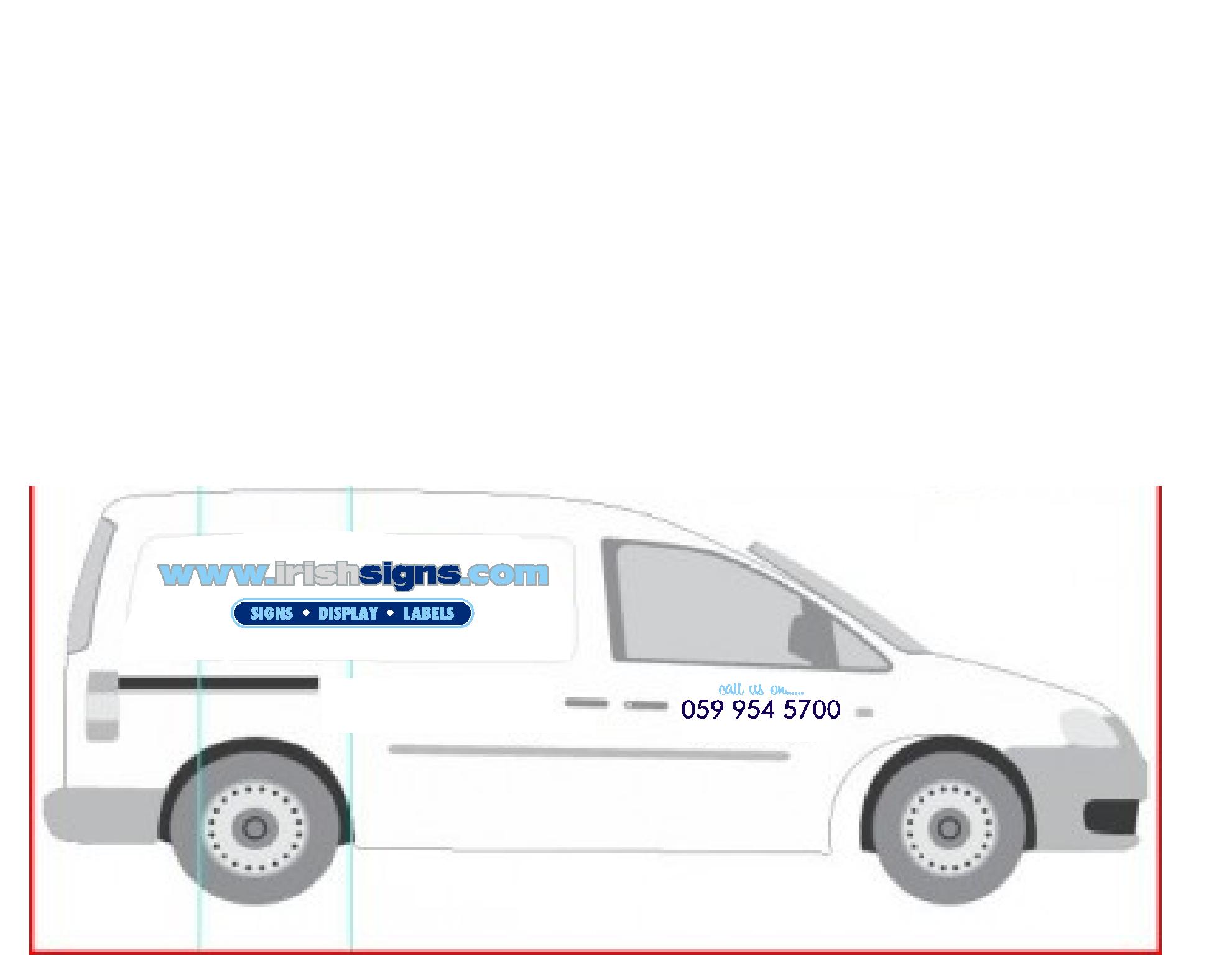
Posted by Dermot Howard on February 21, 2011 at 8:28 pmHi All.
I am cough between to different designs, I have my preference and my has another. Please let me know your opinions??:police: Mod-Edit
* Please use the "Correct Forum" when posting.
* This post has now been moved.Please take a moment to look over our Board Rules.
Attachments:
 Dermot Howard replied 13 years, 2 months ago 13 Members · 45 Replies
 -
45 Replies
-

At a pinch I would go for the top one…although I find that oval very sharp and pointy. I’d also be inclined to curve the ends on the SIGNAGE lozenge.
-

Top one.
(if I was forced to choose)
But…
Try changing signage to signs.
Make the middle bar black and the green bar blue.
(I don’t like to see red and light blue touching each other)
And yes I know that sounded perverted.
Lose the monkey business on the door and just have one phone number under the bars.
Love….Jill
PS I would also change that oval to black. -

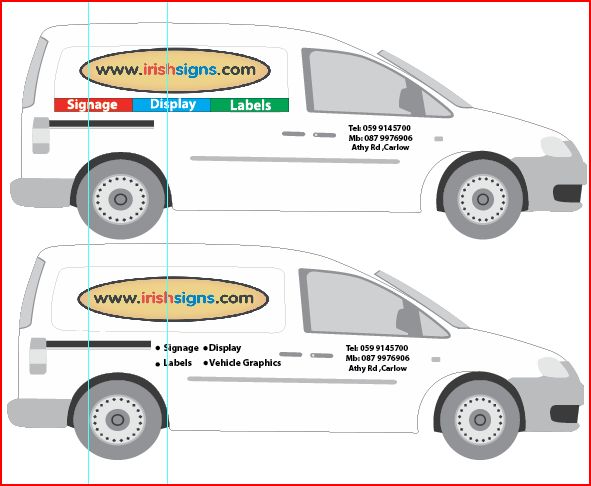
Thanks Harry.
Top one was mine, Linda had the bottom one, I have made your suggested changes, looks much better.I like simplicity, I think this idea is easily read and catchy.
Any other ideas more than welcome.
I am due to collect the van on Wednesday so will do the graphics over the weekend.
Attachments:
-
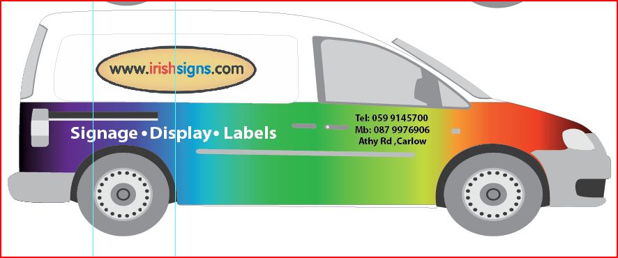
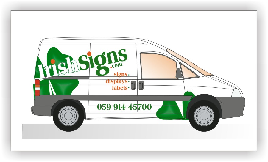
Not Sure about this one myself, but i do like the colour in it
Attachments:
-

Rainbow fades are used by schoolkids, sorry didn’t mean that to sound offensive.
John Simpson did the same, and used Algerian font, then retired to Malaysia!just looks outdated
Peter
-
I think the main problem is the name trapped inside the oval.
Attachments:

-
Harry
glad you released it, it now looks free……….Peter
-
No Offensive taken Peter, I welcome all constructive critisims. although i would like to retire to somewhere warm…
-
…now lose the oval altogether, and the www on the name unless that’s really the real name.
And only 1 phone number darnit.
:lol1: -
Hey Harry.
your hard at work, Im just seeing your suggestion now, and Gills input. give me 5 min to do up another -
well glad you released it….
it looks FREE!Peter
-
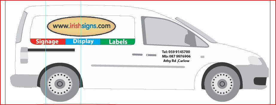
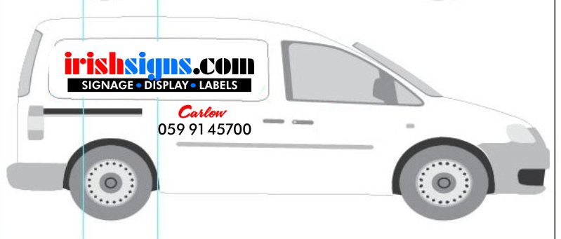
Here we go
Just my views:
Top one, Looks good, but the oval needs an outline
Bottom one, looks a bit plane
One Phone Number looks good with the address in a different col as per Harrys idea
Attachments:
-
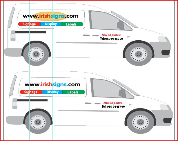
bottom one for me now Dermot. Cleaner and more distinct. Like the others I would worry about the http://www.irishsigns.com though. Is that the company name?
-
Now it’s the bottom one for me too.
But lose the address, maybe just a city name like we do here (in a nice script) -

My effort, very simple and I wondered how protective you were of your colours.
Attachments:
-
This is great, the help I am getting, Thank you all so much.
Harry: http://www.irishsigns.com is the company name, Gill had mentioned this also, so i would like to leave it like that.
Neil: I like the colours, they are crips and clean and help to separate the website name into different words.
Jill: I see what you are saying about leaving out the www. , I also like your font, its different but i really like the vag that i am currently using, again its clean and crips. and i like the address in script.
I will go do some work now and re-visit later.
Thanks again for all your help everyone
-
 quote Dermot Howard:Hi All.
I am cough between to different designs, I have my preference and my has another. Please let me know your opinions??Neither of them Dermot…sorry 🙁
Here’s a dabble from me, different van and phone no is wrong and I’m not a great lover on wording on an angle…….but apart from that 😉
Attachments:
-

like it martin…it shows a new slant on things :lol1:
-

i like Martin’s idea but writing at an angle sloping upwards from the back of the van to the front is one of my pet hates 🙄 Obviously just me as lots of people do it. I always try to slope it the other way on both sides of the van so the lowest end is towards the front of the van.
-

Traditionally it is frowned upon to write downwards, don’t suppose it really matters these days, it’s just a traditional/apprenticeship trained, and by that I don’t mean my boss told me it was ok, I mean craftsman won’t do it.
with regards to writing upwards, if you don’t like it, you don’t like it, but if the rest of the layout reflects why you’ve done it, it will balance. That is the key, and that’s why it usually looks bad, people don’t necessarily understand when you need to do it.
The craft of layout has all but been lost in my opinion. Don’t get me wrong, there’s some really beautiful work done these days, but it’s far from the majority.
-
Love it Martin….fresh as a daisy and modern. Would really stand out.
-
Sorry Martin, I dont like it, but thank you for the effort.
-
quote Dermot Howard:Sorry Martin, I dont like it, but thank you for the effort.
No problem Dermot, just always nice to see different ideas.
Incidentally this is probably the only time I have ever angled wording as I i thought it suited what I was trying to achieve and I thought it worked pretty well.
Bob C, I do agree good layout is a dying trade and there is more tat than good around, but computers and cheap vinyl cutters are the culprits whith virtually anyone who fancies a go..becoming a signmaker/designer.
The latter though being more a natural talent although correct layout is not difficult to achieve, I have been is signage in one form or another for over 25 years and design for over 30 and it still hurts when I loose jobs to the guy who has absolutely NO idea on how to layout/design all because he was cheaper…….
Anyway I’m swaying off topic, good luck with your van Dermot,
-

I like Martins layout and I think it would work straight 😀 I also don’t like slanty,
Lynn
-
 quote Harry Cleary:Love it Martin….fresh as a daisy and modern. Would really stand out.
exactly
and the eye can’t read downhill
go straight to the top of the class,
-
I wasn’t knocking how you’d angled that Martin, I rather liked it. I may have done the other bits a little different, but that would have been my style, and not because I thought you were wrong.
I’ve been doing signs 30yrs, and my apprenticeship was served with a true master, as was his.
I don’t really take this trade too seriously anymore, which is why I moved away from it as a main job around 12yrs ago. I figured I needed to move onwards and upward before the market became too flooded. So I totally agree with the feeling when you loose a job to a rank armature, but people don’t seem to know the difference anymore. Still it’s a fun hobby now, as oppose to a relatively non rewarding occupation..
-
 quote :I figured I needed to move onwards and upwards
signing off now from a
backward and downward sign maker
-
 quote Bob Clarkson:The craft of layout has all but been lost in my opinion. Don’t get me wrong, there’s some really beautiful work done these days, but it’s far from the majority.
Nonsense
Good layout was never in the majority years ago. You just need to look at old TV programs from the 60’s and 70’s to realise that there was just as many rubbish layouts back then as there are now.
Just because someone painted it with a brush doesn’t make it brilliant – a lot of the "old masters" didn’t have a clue and simply passed on their prejudices to their apprentices.
In their favour – most of them could spell… unlike nowadays 😕
quote Bob Clarkson:So I totally agree with the feeling when you loose a job to a rank armature -
quote Phill Fenton:quote Bob Clarkson:The craft of layout has all but been lost in my opinion. Don’t get me wrong, there’s some really beautiful work done these days, but it’s far from the majority.
Nonsense
Good layout was never in the majority years ago. You just need to look at old TV programs from the 60’s and 70’s to realise that there was just as many rubbish layouts back then as there are now.
Just because someone painted it with a brush doesn’t make it brilliant – a lot of the “old masters” didn’t have a clue and simply passed on their prejudices to their apprentices.
In their favour – most of them could spell… unlike nowadays 😕
quote Bob Clarkson:So I totally agree with the feeling when you loose a job to a rank armaturePhill,
That’s the most sensible thing you have said in a long time,
Peter -
I’ll post a couple of bits, then maybe you’ll get an idea what I’m meaning. You may also consider the layouts are all done with a vision and a piece of chalk.
I accept pretty much all I do other than the odd Rolls Royce coach lining these days is cut out sticky letters, so really I’m no different, but you cannot compare vinyls laid out on a screen to traditional writing with regards to being a craftsman.
Still you obviously found it necessary to attempt to rip my posting to shreds, so I obviously hit a nerve somewhere.
-
quote Phill Fenton:Just because someone painted it with a brush doesn’t make it brilliant –
Wash your filthy mouth out with soap!!
😀
-
quote Bob Clarkson:I’ll post a couple of bits, then maybe you’ll get an idea what I’m meaning. You may also consider the layouts are all done with a vision and a piece of chalk.
I accept pretty much all I do other than the odd Rolls Royce coach lining these days is cut out sticky letters, so really I’m no different, but you cannot compare vinyls laid out on a screen to traditional writing with regards to being a craftsman.
Still you obviously found it necessary to attempt to rip my posting to shreds, so I obviously hit a nerve somewhere.
Bob
Not in the slightest ripping your post to shreds, I have the utmost respect for professionals, but I think Phill was saying that even in the past there were good and bad signwriters as there were good and bad mechanics, or carpenters.btw check your email
Peter
-
quote Bob Clarkson:you cannot compare vinyls laid out on a screen to traditional writing with regards to being a craftsman.
I disagree – We all use the tools that are available of the time. The skill is in using the tools we have to create something that has value.
If Leonardo Da Vinci was alive today he would use modern day equipment to realise his vision.
There is good and bad work out there today just as there was good and bad work out there in the past. Let’s not trivialise what we do just because we use modern technology.
I know of at least one old style sign writer that hasn’t got a clue when it comes to producing decent layouts. He’s moved into vinyl now and still produces rubbish.
-
all I can say, look at Dave Smiths work, he has all the tradition, but his computer generated stuff is art..just like his hand crafted mirrors, true talent
Peter
-
quote Bob Clarkson:I obviously hit a nerve somewhere.
You did.
You are rubbishing peoples attempts to produce good signs today because they no longer use the old traditional methods. There are a lot of very talented people producing great signs using vinyl and digital print. Don’t knock them.
-
Phill I have read that post and can’t see where Bob is rubbishing anyone 🙄
Lynn
-
quote Phill Fenton:quote Bob Clarkson:you cannot compare vinyls laid out on a screen to traditional writing with regards to being a craftsman.
I disagree – We all use the tools that are available of the time. The skill is in using the tools we have to create something that has value.
If Leonardo Da Vinci was alive today he would use modern day equipment to realise his vision.
There is good and bad work out there today just as there was good and bad work out there in the past. Let’s not trivialise what we do just because we use modern technology.
I know of at least one old style sign writer that hasn’t got a clue when it comes to producing decent layouts. He’s moved into vinyl now and still produces rubbish.
I doubt it, Da vinci produced work that has already outlasted vinyl by a factor of 1000.
come on phil, you cant compare true artists with vinyl or even trad brush painters… -
quote Peter Normington:come on phil, you cant compare true artists with vinyl or even trad brush painters…
Why not? It’s simply another medium that is being used?
-
quote Phill Fenton:quote Peter Normington:come on phil, you cant compare true artists with vinyl or even trad brush painters…
Why not? It’s simply another medium that is being used?
well yes, but show me some true art, that will stand the test of time done in vinyl.
My own candidate for a vote is Andrew Boyle, as an artist, but unfortunatly his art will probalby die before he does…Peter
-
I’ve signed back in because I agree with Phil
Bob said he’s moved on and upwards from being, I can only presume, a lowly sign maker !
Bob – if you knock this trade, from which most of us earn a living from, why are you always on here ?
john
-
I didn’t mean to offend or infer anything, I’m quite happy to say what I mean.
I nearly mentioned Dave Smith, but couldn’t remember the name. If you read it or remember some of the posts with regards to that, I actually said it was amazing and that when he’d said he was one of only a few in the country who could do that, I suggested he corrected it to the only one who could.
I consider I can write and layout as well as the best of them, but I wouldn’t even dare compare myself to him. If I hadn’t seen the clip I’d have assumed it impossible.
If It was read as everyone was great then, and now they’re all rubbish, I didn’t mean it to, and it obviously wouldn’t be true.
I can coach line, I can paint, layout and I can do vinyl lettering, I’m not saying that makes me brilliant. I can’t use sign making software to save my life, I wouldn’t have a clue how to use a large format printer, I’ve never done a wrap and I have to wait for the kids to come home from school to sort my PC out.
I’ve emailed back
-
Onwards and upwards was only an expression John, I could have said as one door closes another opens etc. I’m in a small town here, there is no real opportunity for a sign company here in the way there would be in the larger towns and cities a lot of your companies are based in.
I loved the trade, writing shopfront, on site in the summer, writing vans and seeing all my work driving around. I was a kid when I first started doing this, I assumed it would be my job for life. But it couldn’t be as the area is now flooded with sign makers, double what’s possibly needed, so no one can make a decent living, I don’t mean millions, I just mean a decent living.
I am starting to read these through a bit more carefully before I post as I have to accept they can seem aggressive.
-
I got the Van now, so its make my mind up time. Watch this space….
Log in to reply.
