Activity Feed › Forums › Sign Making Discussions › Graphic Design Help › My own project
-
My own project
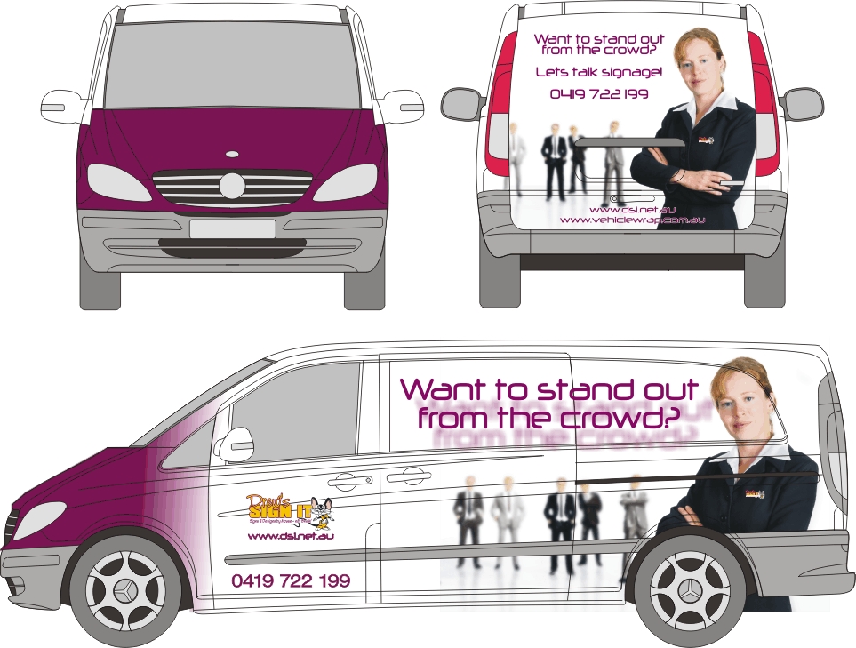
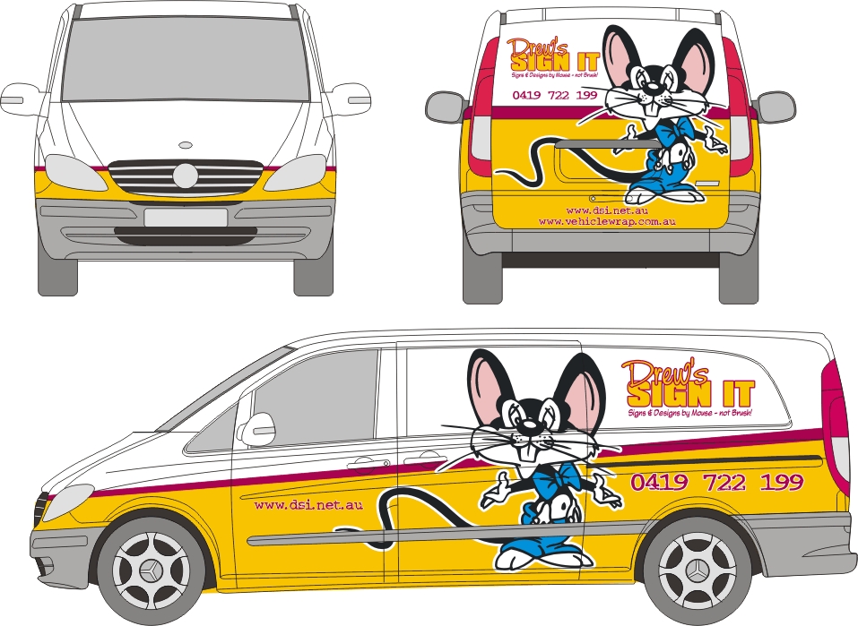
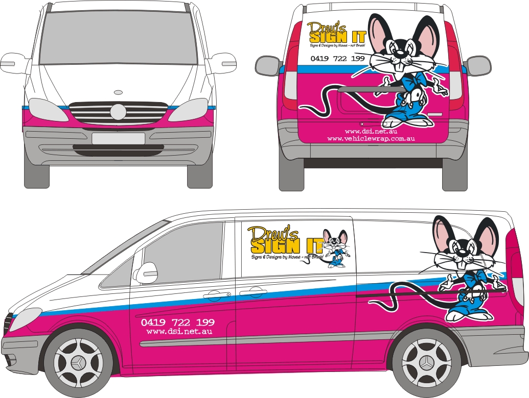
Posted by Shane Drew on September 13, 2005 at 12:39 pmI’d really appreciate some direction on this.
I have a market here that really concentrates on photographic signage, so i wanted to include something to get the message across that we do more than just free standing stuff.
The shadow on the jpg is lower than the real file.
My colours are burgundy and yellow, so trying to carry the theme if I can
thanks in advance for any suggestions
Attachments:
 Andrew Boyle replied 18 years, 7 months ago 19 Members · 62 Replies
 -
62 Replies
-

Very Nice design Shane…
I like the concept.
I’d make your Name bigger though…. -
how about a light grey shadow on the “stand out” text…. and maybe that text in yellow…
.. o.k. – i’ll shut up now
-

Looks good to me, but your name needs to be bigger as said… Think you may need the same text on the side as on back.. it don’t shout out signmaker on the side ??
Simon
-
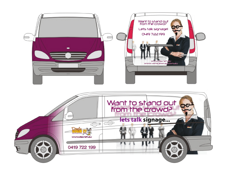
Shane , it looks great , however it looks to me like an office equipment ad at first glance – canon copiers or something like that. Aussie etc is sports mad , I would use something like a sports pic or a crowd pic in B&W with only one colourful dressed up painted face supporter quaffing a cold frostie or similar . printed in vibrant colour. I would maybe do something like clone a whole host of supportsers , all the same , little grey men much smaller than the guy standing out all sitting in a grandstand – perhaps even overlay your co name on the grey guys in a transparent burgundy or colorise the grey men with a tint to sort of have your name in the background or formed by the tinted grey figures as a subliminal thing.
As others have said , the name is too subtle and that needs a bit more prominence -

How about the girl standing out has your company clothes/colours, I would agree with Rodney, it looks more like an ad for some office supplies, but that is maybe because they are all wearing suits.
Love the idea though.
Cheers
Dave
-

Shane,
Following on from Rodney’s B&W idea…
Martin
Attachments:

-

Wow, thanks everyone. The constructive criticism is very welcome.
I agree the name needs to be bigger, thought that after I postedf the pic too.
Never thought of the office supply angle.
Must confess, I am trying to work around some photos from a community stock library (they are good value), and this one struck me as suitable for ‘standing out from the crowd’, which is the message I am trying to push.
Most of my work is corporate stuff, which is why I wanted the corporate look, but your comments are very valid and I will have to give that more thought. Rodney, I might look at your ideas a bit closer, thanks.
The text colour? Yellow may be good, but wonder if it may be hard to see from a distance, even with a burgundy keyline? I’ll go back and have another play.
Mart, I love that, thanks
Thanks again guys, really appreciate your input on this one,
-

Maybe if the girl had a few more buttons undone on her blouse……..
Ok I’ll shut up now 😳
-

:lol1: :lol1: :lol1: :lol1: :lol1:
shane i like the idea behind it too… very tasteful but before i read rodneys comment i was sitting thinking… needs something else. something doesnt feel right… was wondering should it have been a sexier girl… no… not naked sexy phill 😉 sorta made up and vibrant.
when i read rodneys comment i thought… thats possibly.. sort too it/office sorta “at a glance look”im right in same shoes as you just now mate. i have several designs i like but not picked one. its always hard when its your own. ill have a think and maybe post again tommorrow. 😀
-

Hi Shane
your name needs to be bigger and I personally do not like the font you have used in the purple I am sure you can find a nicer one 🙂 I do like the purple (maroon) and yellow though I also at first glance thought office equipment. You have had some really positive suggestions so far I am sure you will do a real good job 😎
Lynn
-
hmmm im not sure if i would increase the logo etc tooo much… ide let the overall design catch their eye. if they are intrested the name will come next. i do, however think the line “lets talk signage” should be on side also…
-
Maybe if she was wearing glasses.. yeh that’d do it …… 😳
-
 quote Phill:Maybe if she was wearing glasses.. yeh that’d do it …… 😳
im beginning to worrie about you phill 🙄 i think you have….’missing lorraine kelly syndrome’…as she is on her holidays 😀
nik
-

Shane, one word… IStockPhoto!
Looks good though,
-
Nik – how did you find out about my obsession with Lorraine Kelly? 😳 😳
-

Nice design Shane, although I do agree with others that it does make me think of office/IT solutions?
I do like the sound of Rodneys idea.
Look forward to seeing you final design on the van when its done.
😀
-
Hi SHane
Try http://www.istockphoto.com/file_search.php (type in “standing out from a crowd” – they have about 30 or so images that may be of interest)
Chris
-
As usual you guys and girls are tops.
This is an istockphoto, but never thought to search like you suggetsed Chris :sleep: Thanks for the suggestion
I have thought more about the logo rob. My little mouse is pretty well known in my market, so I suppose the logo does not have to be much bigger. I am really looking for an impact, to make someone look and form an opinion I suppose. I know what you mean tho rob, always hard to do your own.
When I first started using my mouse image, some people didn’t like it others did, but the point is everyone remembers me in one way or the other. Either I am refered to as the ‘idiot with the rat’ picture or the handsome good looking guy with the mouse logo – ok that might be in my dreams – but you get the idea. 😳
I want this image to generate that same type of comment/reaction. I have shown the image to a few really good clients and everyone said ‘great’ but then I asked them if it looked like I was selling office furniture and everyone said ‘oh yeah… thats true’.
I did actually consider a really good looking young lady in a bikini phill, but the wife put the hammer on that pretty quickly 🙄
I’ll certainly take these suggestions onboard friends, Thanks very much for taking the time to comment.
Cheers -
Looking at a couple of istock images – most of the ideas (like the egg ones on Istock) seem simply to colour one a bit different. Just chucking in an idea why dont you do similar with your mouses? I.e have a group of 5 or 6 mouses and then enlarge and colour one up blue or somthing? No idea how it would look but may be an idea.
-
quote Chris Hooper:Looking at a couple of istock images – most of the ideas (like the egg ones on Istock) seem simply to colour one a bit different. Just chucking in an idea why dont you do similar with your mouses? I.e have a group of 5 or 6 mouses and then enlarge and colour one up blue or somthing? No idea how it would look but may be an idea.
pure genius !
no wonder you guys won the cricket !
Thanks mate
-
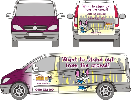
OK friends, have been pretty busy (and sick) and had no time to get back to this project, but getting a bit of flack from all and sundry for being a sign writer but having no signs 😳
Been doodling today, and taking everyones ideas on board, which gave me one humungus headache! 😮
Anyway, started again with some of the concepts that were discussed.
What about this? Be gentle….
Attachments:
-
Looking good Shane (as is your new avatar) – I think you neeed a bit more about what you “do” on the sides – you have signs on the back but nothing on the sides
Chris
-
The first proof was more coorporate
The second one is more cartoony.. but really sure if the people & the mouse work together.Shane, can’t you involve your animal sanctury in this and the colours yellow and green if i recall? (Yes I do read your newsletter… people are now saying ‘what newsletter?’)
-
quote Dave Rowland:The first proof was more coorporate
The second one is more cartoony.. but really sure if the people & the mouse work together.Shane, can’t you involve your animal sanctury in this and the colours yellow and green if i recall? (Yes I do read your newsletter… people are now saying ‘what newsletter?’)
Thanks Dave
Because my mouse is really what people know me by, I am keen to keep that prominant. I tried Martins suggestions, something like the penquins, and asking around, people thought I was a Vet 🙄
I still like the corporate feel in truth, because that is my present market. Wondering instead of trying to branch out, I’d be much better to improve on the business I already have?
The Sanctuary have asked me to promote our sponsorship on my vehicle, but once again, it may send conflicting messages.. too much info if you know what I mean.
As far as my newsletter goes, are you a subscriber? or do you just read from the archives? Just curious.
Chris, that is a fair point. Trying not to clutter it too much (easier said than done) I am hoping my Drews Sign It door sign will give people the idea 🙄
Of course this raises the question, why is it so hard to do your own, when I do not have these same issues when I do someone elses? 😥 😥
I goes without saying that I appreciate your input.
-

I think I have to agree with Dave, although I like what you have done and it is keeping with an image that you have already established and people remember I’m not convinced it is right for promoting your business to large corporate clients which was the main reason for the change in the first place.
-
Very eye catching.. I think it looks good, I would say you may need the “lets talk signage” on side..
The corporate thing, not sure, i can’t see it being a problem??Simon
-
Although I really like them both Shane I think on balance I prefer the latest version with the cartoon mouse.
Both designs will draw attention but the first version could be mistaken for a sophisticated ad campaign (not that that’s a bad thing – but people may miss the point of what is being advertised). I’m probably not explaining myself very well but for example I can think of a number of television adverts that I have seen over the years that are familiar to me – but – I can honestly say I do not know what some of them are advertising. I’m just a bit worried that your first design may fall into this category (maybe I’m over analysing things here?)
The latest more friendly design appeals to me much more and is the one I would choose. Somehow I think the reader is drawn to study the sign more and the message that you are a sign maker does come over. 😀
Either way – both have a lot of visual impact but my vote goes for the mouse
-
i am not a subscriber, I visited your website a few times over the months, always seems to be something to read on there.
how about getting the mouse spread over the doors and side-windows, try and make it look like the mouse is drving the van, that sounds like hard work to be honest, like the plumber on the toilet
-

Shane…..
It just leaves me cold.
I like your logo.
I’d make it HUGE,
slightly catty-cornered as a super graphic on the sides of the van.
Then maybe the “want to stand out…” bit on just the back.
I like the penguins….but….
Could it be a mouse of some sort tho?
(like in your logo)
You could do something crazy on one white mousie,
sorta like you did with the penguin.
Love…..Jill -

I think this should be on the side of the main side panels as HUGE!
Then perhaps come up with a funky theme with wrap vinyl to show off your skills -
Or cover it all in cheese?? with your logo big, or mouse trap, with don’t get caught out, your in safe hands with us??
Simon
-
Simon, you are bang on with that idea… Shane, cheesy van with the mouse coming out of it.
-
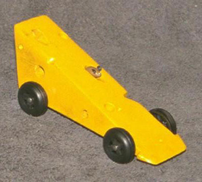
Like this cheesy car! or you could make a dibond cheese box and mount it to the roof of the van!
Attachments:
-
Oooh I like the cheese idea!
With the whole van wrapped as swiss cheese,
the mousie superimposed on the sides,
and whatever on the back…
now that would be eye-catching!
Love….Jill -
I did play around with this for a while, but everyone said I looked like a pest exterminator!
I’d suspect I would be called the pied piper with a full on cheese diesign tho
Attachments:
-

Very kewl.
Liked the first one with the big ass mouse. Should really grab attention.
Only problem I see is tying in the mouse with the logo. The Mouse doesn’t tie in with signs unless you read the slogan, but that is probably over-disecting it.
Maybe you can have the mouse looking at the Logo.
I think the bottom line is that the design really will catch peoples eye and that is what you want.
-
Like the top one.
It has real potential!
Love….Jill -
i like the top one shane… 😀 its your logo that niggles me some…might look better worked in a bit bigger? 😉
nik
-
I like the top one too. Maybe put some “holes” into the yellow section to make it look more like cheese?
(Are you planning to specialise in vehicle wraps Shane?)
-
Now thats more like it!
The purple colour doesn’t work for me, your shirt colours do.However I like both designs, but don’t like TWO mice being on the same side, on the purple side, drop the little mouse and make the Text bigger. Just look at those small JPEG previews and you cannot see your company name, you have to click and see it full size, same if I was stood on the pavement and you drove by, I would only see the mouse.
The mouse on the back is cool, you could just have one big mouse on the back and massive “Sign It”
This cheese idea, the Yellow at the bottom could have holes in it (like off-yellow moon shapes to make holes).. but solid yellow is good though.
If you worried about Mouse exterminator issue, then drop some mice and make logo bigger so u can see it from a large distance.
-
Playing the Devil’s advocate here…..
Could you make “Sign It” in the purpley color so it stands out more?
(top one)
I’d nix the cheese hole idea….like you said about the exterminator & all.
The yeller gives the suggestion of cheese.
I really like the direction that this is going,
but in the end, it’s YOUR van…even if you wanted to put a pic on it
of Rob in a kilt drinking a Breezer, it’s up to you.
(but I prefer the wee mousie)
Love…..Jill -

So any way, the elephant said to the mouse “My… arnt you small”
the mouse replied ” yes I’ve been ill” 😀
Sorry Shane, coudnt resist it.
Peter -
quote Dave Rowland:Just look at those small JPEG previews and you cannot see your company name, you have to click and see it full size, same if I was stood on the pavement and you drove by, I would only see the mouse.
I agree that the logo could be a bit bigger but not that much more or it will lessen the impact of the giant mouse. I think that if you give the logo a darker outline (even black) it would make it easier to read without having to make it too big, just a thought.
Bryan
-
Shane
we seem to have gone from print to vinyl here, if you are looking at promoting your print, I would go back a bit,
The mouse is fine and very catchy, but he could be done in vinyl. If you want to stick with mousey, do 2, (dont know if you have the skill or can get it done) but a new mouse, done as a real one with fur and textures etc. placed next to the cartoon type would REALLY STAND OUT FROM THE CROWD. Sorry I cant supply the art work but it would look great if it was done like I see it in my head.
Peter -
What about using this?? for the back, couldn’t get it on your van but put in place of the yellow..
Simon
Attachments:
-
Thanks friends, you have given me much more to digest
The big mouse on yellow was my original thought. But someone suggested I should push the photo theme which is why I went that way. The magenta one was based on my last colour scheme.
I am wanting to push the wrap side of the business, with oracal releasing the new 870? colour change wrap in OZ, I want to specialise in that area if I can. I have registered vehiclewrap.com.au for that reason.
As peter says, I can do this design in tape, but I’d probably still wrap it, given that I’ll need one way vision over the windows.
I am going to have to give this some more thought. Ypu have made some great suggestions here and as a result I am not sure what direction to take right now. My family are divided on the designs too, so I’ll sit on it for a day or so, whilst I get some major sign jobs out before friday, then I’ll hopefully have an idea what direction I’ll take.
A very sincere thanks for all the input.
Cheers
-

Ive kept very quiet on this as I wasnt keen on the first ones you posted but I really like the last two, both the yellow and purple ones. Much more punchy and eyecatching. I think I had a problem with the purple and especially the yellow fades on the first van. I would definitely veer more towards the last two designs.
-
quote Jayne Marsh:Ive kept very quiet on this as I wasnt keen on the first ones you posted but I really like the last two, both the yellow and purple ones. Much more punchy and eyecatching. I think I had a problem with the purple and especially the yellow fades on the first van. I would definitely veer more towards the last two designs.
Thanks Jayne, I value your opinion.
Cheers
-
I agree totally with jayne.
I sympathize with you Shane….. i’ve been trying to letter my new truck for six months and it sucks.
All of them look great, You have yourself, and hundreds of designers picking it apart, which is great, but you’ll be here forever. To the general public, they all would work fine.
Let your daughters pick one and do it! -
Thanks Steve.
It is good to get feedback from your peers, but, as you say, the public probably wouldn’t find any of them too bad.
-

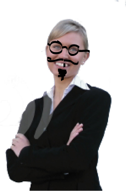
Shane,
like the way the design has developed…… it’s hard doing your own van
this would stop your initial idea looking too corporate
😀Cheers
Andrew
Attachments:
-
im doing same here… looking for new image sorta thing…. very difficult and have been doing it for a few months now on and off… 😕
andrew, i actually like that 😉 :lol1: :lol1: :lol1: :lol1:
we did a van about 5 years ago with large digital prints of a guy on it. (bought them in at the time from wm smith) back then the setup was getting exspensive for the customer so he actauly posed for the photograher in the proper workwear etc… we did 8 vans, all looked real nice. well over the top but nice 😉
he calls us the next day saying can i wash these prints down with strong cleaning chemicals robert? we said yes, they are laminated… but why? its only 24hrs later…. he said coz some kids with a black marker pen have drawn a great big wully and balls on me on the van . :lol1: :lol1: :lol1: :lol1: -
Rob, Andrew , thats brilliant. I haven’t laughed as much in ages :lol1: :lol1: :lol1:
-
Yeah, Shane…get out a marker and give the wee mousie a third leg!
That will definately make him stand out in any crowd.
(nah! Just kidding)
We have a goofy-golf place by the high school.
Every year, without fail, at graduation time, someone spraypaints a big you-know what on the sign.
Love….Jill -
quote andrewkerrb:Shane,
like the way the design has developed…… it’s hard doing your own van
this would stop your initial idea looking too corporate
😀Cheers
Andrew
:rofl:
I am really tempted to do this andrew 😛
It would certainly turn heads thats for sure
😛
-
a smiling woman would be more noticeable……
Fortune [or is it madness] favours the brave.
Attachments:

Log in to reply.
