Activity Feed › Forums › Sign Making Discussions › Graphic Design Help › my new van wrap design
-
my new van wrap design
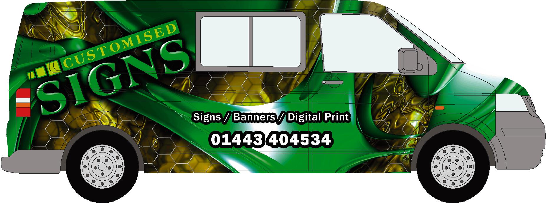
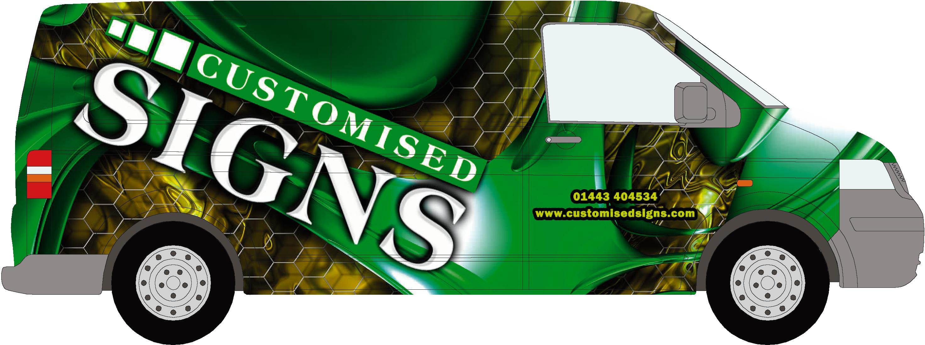
Posted by Scott.Evans on November 25, 2008 at 10:53 amiam looking to give me van a full wrap.
can any one come up with any ideas.
i want as Little as possible on it.
Attachments:
 Jason Xuereb replied 15 years, 5 months ago 14 Members · 31 Replies
 -
31 Replies
-

Seems you idea of ‘little’ is different to mine Scott…. :lol1:
I do like the overall effect, certainly draws the eye.
Reptile skin and stretchy stuff is popular at moment but I still don’t get bored with it.
Have you designed for the other side too, does it work?
Ian :lol1:
-

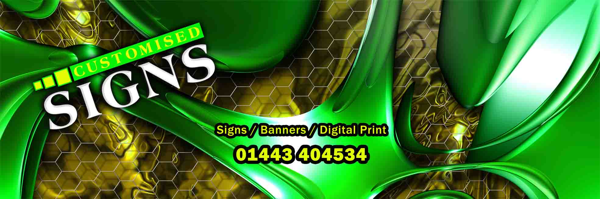
Make SIGNS white and the byline/phone number yellow.
Love….Jill -

Hi Scott
You been hiding?? Hows things?
That looks eye catching mate, think your company name needs to be different colour, design wise its nice.
You will need to drive slowly thou so it dont blow off..lol
Just remembering our rally back from Roland!!
Think Sandy was in a rush to get back.. lolAde
-

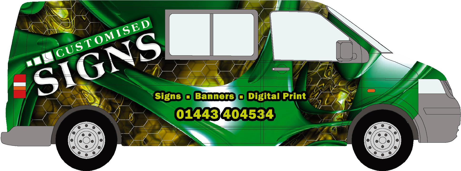
hi jill
i think it looks good in white.
what else should i have on there or take of do you think.
Attachments:

-
hi ade,
yes not posted nothing recently, will have to post some of the work we been doing.
its not been to bad to be fair, hows you???
i so pics of that rugby club you done looks grate mate.you sorted that cutting problem yet?
iam hijacking my own thread her 😕
-

I’d take out the ‘obliques’ (/) and replace them with commas or bullet points.
Also – website or an address if you want ‘walk-in’ trade. Even adding in the region you cover so people think ‘local company’ and are more inclined to use you.
Dave
-
 quote David Rogers:I’d take out the ‘obliques’ (/) and replace them with commas or bullet points.
Also – website or an address if you want ‘walk-in’ trade. Even adding in the region you cover so people think ‘local company’ and are more inclined to use you.
Dave
what him say! otherwise i like it, pretty striking!
-
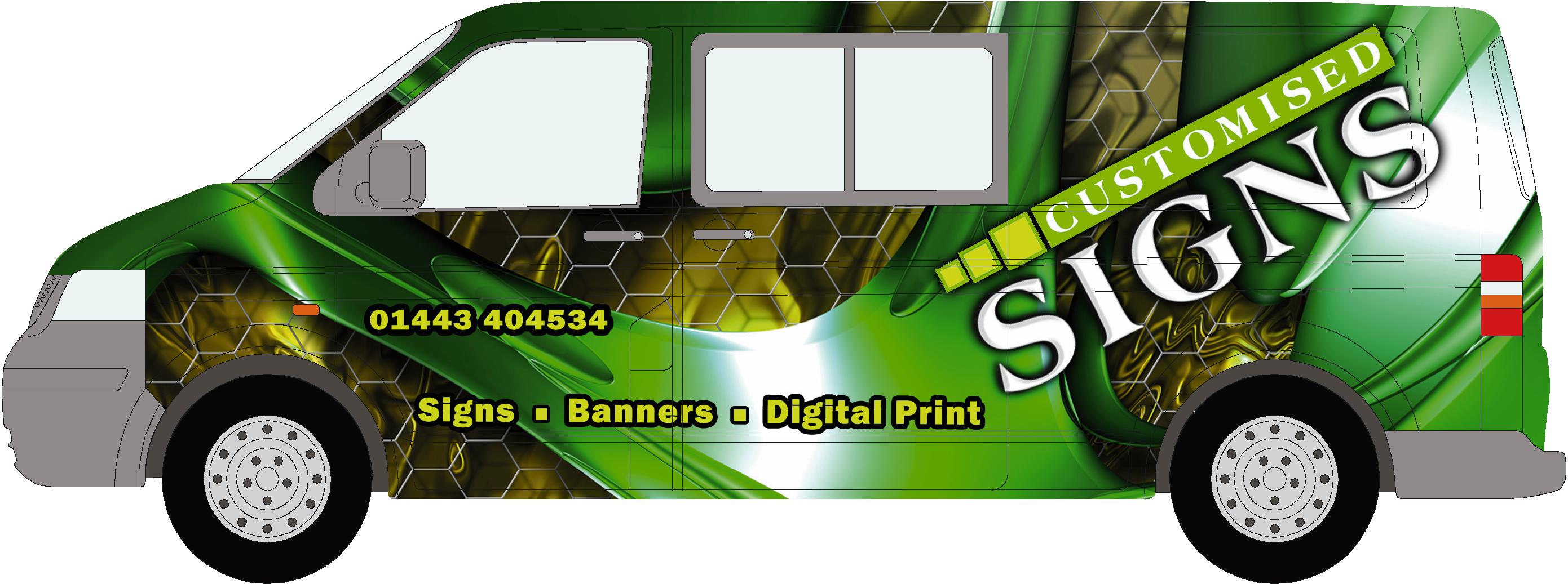
ive used squares here instead of "/" ?????
ive also changed the "customised" to white not to sure on this??
Attachments:
-
Don’t like the white ‘customised’, but the yellow doesn’t ping out either on that on your secondary line and contacts….. Maybe white outline for these and another colour might bring it out….
Ian
:lol1:
-
quote Scott Evans_21:hi ade,
yes not posted nothing recently, will have to post some of the work we been doing.
its not been to bad to be fair, hows you???
i so pics of that rugby club you done looks grate mate.you sorted that cutting problem yet?
iam hijacking my own thread her 😕
yep, versacamm is cutting better those lovely roland people sorted it, ive put hammer away for time being!! its in reach thou..lol
Ade
-
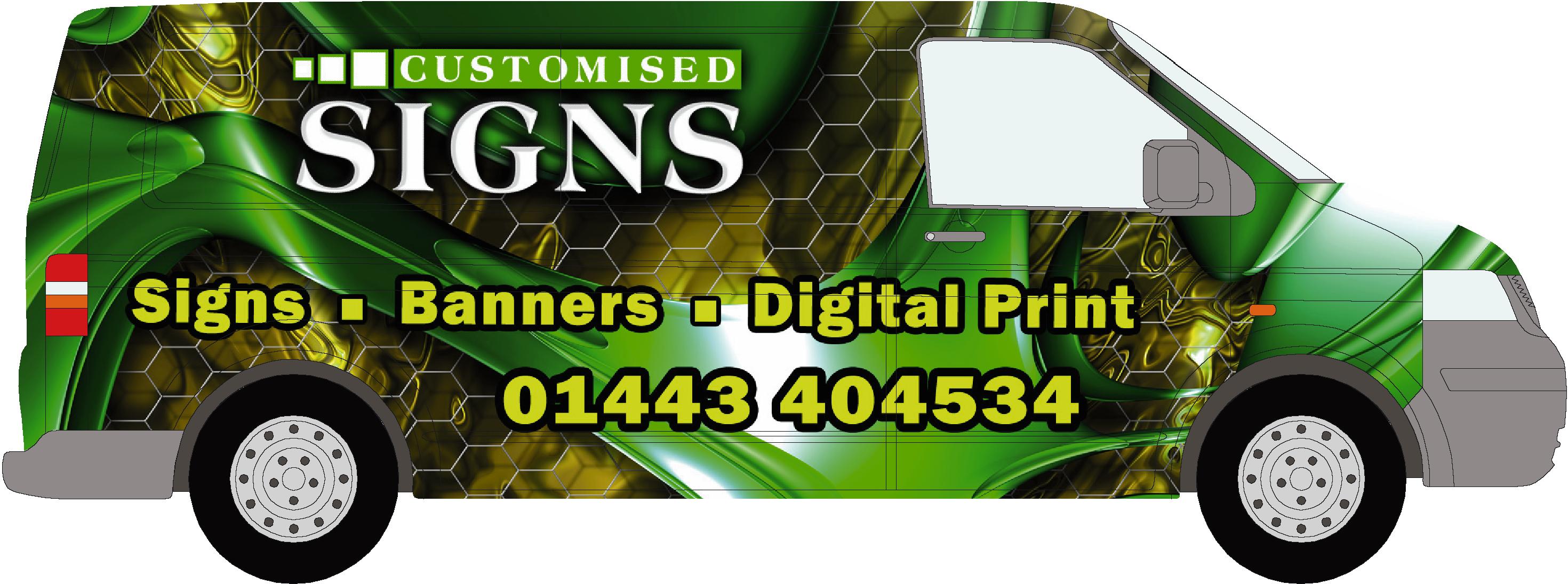
quote Scott Evans_21:heres a twist to it
that looks better, think the tel number could be bigger.
Give us a ring sometime!!
Ade
-
hey ade you any where near ely fairwater.
ive got to go there and pic some plastics up from dytec
-
I like it with the white, and I like the bullets, but I don’t like the new slant altho I like the big logo. I would take the squares by "CUSTOMISED" and make them yellow, slime green, then one shade lighter than the green panel behind customised.
-

That background really doesn’t say ‘signs’ to me. Looks like the sort of thing the Americans wrap Hummers in.
-
It’s a difficult one, the over use of wraps and digital prints, sometimes you lose the message you want to portray or be seen inside all that complexity or colour fades etc.
However, for sure the vehicle in this case will catch the attention and it does advertise ‘wraps’ which are at the higher end of profit margins in this trade.
Now I see the ‘Signs’ but tend to lose the ‘customised’; if your customers are to find you then they need to know that you are called ‘Customised signs’.
Just my thoughts wandering around, others with more experience and love of of full colour graphics might feel different.
Ian :lol1:
-

Scott,
Will your layout work on the other side of the van? Whenever you start slanting text it could look funny on the opposite side.
I like the second design though.
-
JILL
I Will try than now, not sure if the yellow works in the numbers thojason
i think on the other side ill have to put the logo running the other way, will try now.here is another go, the window would have to be done tho
Attachments:
-

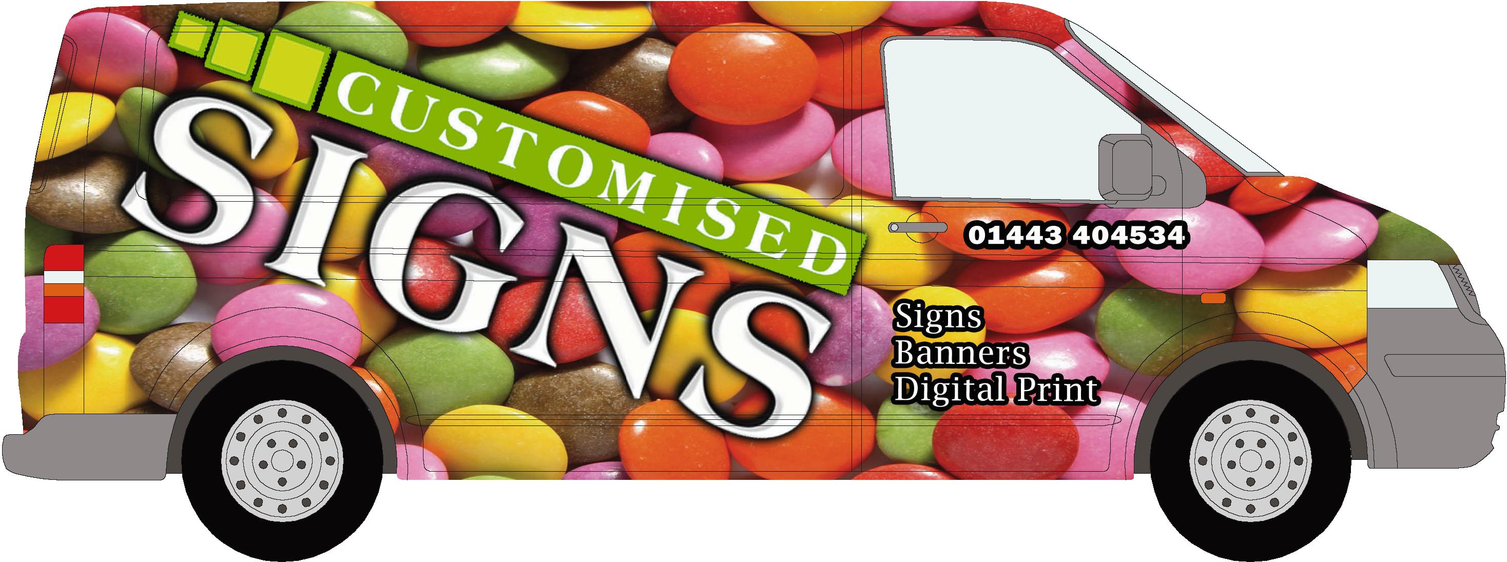
Run it straight, I think it might be better 😕
Warren
-

Hi Scott,
That’s the nicest one so far. Remember, it’s what you do that sells the job (Signs etc) not the word ‘customised’, so that being large like it is is good in my book.
Gareth.
ps ain’t you and Ade heard of ‘the phone’?
-
yes iam not really bothered about the "customised " standing out, as there i not many wraps around here i think people will remember me as the guy in the green van "he dose signs" ect.
but then when iam going to larger clients will this design affect my company image as be professional do you think?
-
hi warren
the only thing with putting it straight is that i will have to run it over the windows. i think when its on it might not look right -

Hi Scott
Am new to this, but maybe try putting your logo under the windows on the side and a list of what you do where you have your logo now.
I think your logo stands out better on the sweetie wrap than the others maybe because its a total contrast in colours?? But it makes me hungry for sweeties 😀
-
Just my own observation:
Seriously needs a bigger phone number whatever design you go for – it’s lost in a sea of colour and doesn’t draw the eye too well.
Absolutely no point in a stunning wrap if they don’t call you 🙂
Maybe it’s just me – but ‘customised signs’ seems more like a statement of a service rather than a company name. It may lead to people thinking "Great, they do customised signs….who are they?"
Maybe a little tag "Call [CUSTOMISED SIGNS LOGO] today"
Dave
-
 quote Scott Evans_21:hi warren
the only thing with putting it straight is that i will have to run it over the windows. i think when its on it might not look rightWhy not put it over the windows using Contravision, that way you promote yet another product that you do and show how it works
-

Yeh, Customised Signs straight and cover the window Drop the size of customised to de-emphasise it. Centralise the products between the wheel arches. Add a comment like Daves to the phone number and enlarge by about 100% and run it along the van in 1 line. That green is a difficult colour to play with when looking for contrasting colour, therefore larger text counts.
-
Question do you need ‘Signs’ in your laundry list when its in your name? It’s just being repeated.


Log in to reply.
