Activity Feed › Forums › Sign Making Discussions › Graphic Design Help › my new van
-
my new van
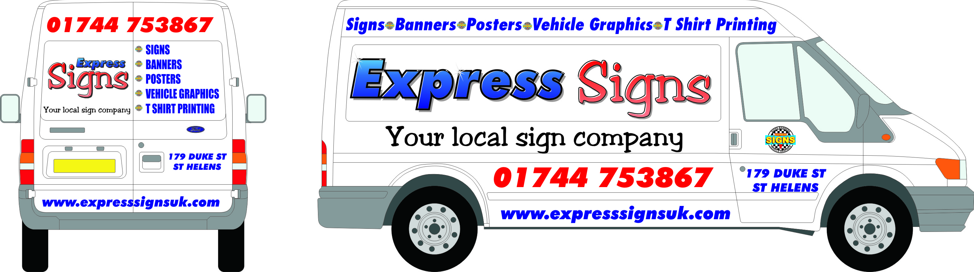
Posted by Terry Beech on November 18, 2008 at 8:07 pmi have just bought a new van and would like some feed back on the layout and design before going ahead
as most of you know its always harder doing some thing for your own company
Attachments:
 Martin Kennedy replied 15 years, 6 months ago 8 Members · 26 Replies
 -
26 Replies
-

The Express part of your name looks strong….The Signs just doesn’t look right. I’ll see if I can put something together.
-

Hi Terry, got to agree with you, doing your own logo and van layout always seems a headache.
Right, for starters, I think the kerning needs attention.
Most of the secondary copy is over big in my opinion. Scale it down so it has room to breath.
I don’t like your choice of font for ‘SIGNS’, why not take a look at Sign DNA or Letterhead Fonts and purchase some real special fonts that really stand out from the crowd.
Have you used 2 different fonts in the bullet points on the rear and side?
Personally I don’t like BIG phone numbers, why?
Use different colours in your web address as the 3 ‘s’ make it a little difficult to read. www.expresssignsuk.com
Get the feeling you’ve put the cat amongst the pigeons?
Just trying to help, honest.
Neil
-
quote Neil Davey:Hi Terry, got to agree with you, doing your own logo and van layout always seems a headache.
Right, for starters, I think the kerning needs attention.
Most of the secondary copy is over big in my opinion. Scale it down so it has room to breath.
I don’t like your choice of font for ‘SIGNS’, why not take a look at Sign DNA or Letterhead Fonts and purchase some real special fonts that really stand out from the crowd.
Have you used 2 different fonts in the bullet points on the rear and side?
Personally I don’t like BIG phone numbers, why?
Use different colours in your web address as the 3 ‘s’ make it a little difficult to read. www.expresssignsuk.com
Get the feeling you’ve put the cat amongst the pigeons?
Just trying to help, honest.
Neil
Nice shooting tex! Phew…. 😉
-

Everything Neil said is true.
Let me add in:
Why the fade on Signs? Just makes it look faded.
If you are 100% in love with the font used on Signs, switch it with the Express font and make it caps & LC and the SIGNS all caps.
Are you selling Express or Signs? Because on the side. Express is what shows up the most.
Looks like two completely separate things.
I can’t enlarge the pic so I am just going from the thumbnail.
Less is more…prioritize & organize.
Love….Jill -

thanks for the response so far i am taking it all in
i was going to sign it up tomorrow looks like its not going to get done 😕
any more suggestions will be welcome before i go back to the drawing board -
good design but i cant do wraps
that’s my 2009 project -
You don’t need to be a wrapper to do the sides Terry.
-
why don’t you think i should have my address and telephone number on the sides
-
The address, I’ve never bothered myself. Tel no……oops!
-
I usually just put a city, like Butler, PA, not the street address.
I do like putting a telephone number on the back of the van but I think you get more exposure with a website.
I never put "Tel:" by a phone number, I noticed you didn’t.
😉
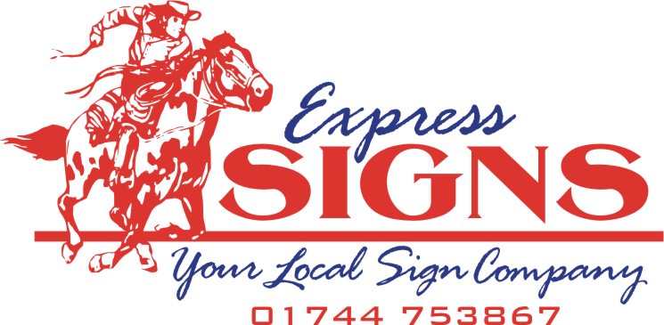
Here is my lame idea, was thinking of the Pony Express.
But I like the idea of some sort of icon, not just text.
Love….Jill
Attachments:
-
quote Jillbeans:I usually just put a city, like Butler, PA, not the street address.
I do like putting a telephone number on the back of the van but I think you get more exposure with a website.
I never put “Tel:” by a phone number, I noticed you didn’t.
😉
Here is my lame idea, was thinking of the Pony Express.
But I like the idea of some sort of icon, not just text.
Love….JillVery nice.
-

Might make them think of ‘cowboy signs’ rather than the speed aspect!
-
thanks Jill
putting a picture with name is a good idea but i don’t think i could use a cowboy (!) any other idea’s -
Whatever you choose – just never, ever use the font ‘slippery’ for a go-faster effect.
It ranks lower than comic sans & old english caps combined!
Will try to come up with some sort of ‘logo / motif’
Dave
-
Here’s one I made for my friend Ernest a long time ago, he never used it.
All I did was change the name.
Attachments:

-
My 2 penneth worth as far as a logo goes!!!
You choose the colours
Neil
Attachments:

-

I think that designing a van presents many problems and many opportunities. It is effectively an outward expression to the public and potential clients of the professionalism of the company. This is particularly relevant in this case as we expressing this belief here as sign makers. The van that we design is a mobile advertisement of our own work and as such it needs to look ‘professional’. If that means that we are not happy with our own ideas and need to employ a designer to give us some concepts then swallow your pride and do it.
For our sign company, we were going to fill the van with pictures and text, but eventually decided to be more subtle and ‘upmarket’ with a concept and I’m really glad we did as the design has won us many customers. It also gives clients the impression that we are a well established and capable firm despite only being in business for ourselves for 3 years. (We do try to match the impression by the way)
I attach a picture of our van just before completion. I know that it’s not perfect, but we really have benefited from the design element.
Finally, I want to stress that the back door is (in my humble opinion) the most important part with greatest potential for informing clients about your services etc.
Cheers
Martin
Attachments:

-
See how Neil’s use of a very simple shape creates a focal point and pulls the words together? Makes it very cohesive.
Martin, your van looks striking. Do I see my favorite font on there, Valentino? It’s understated and classy.
😉 -
Thanks for the nice comments guys – I was just showing how understated could work as well.
Jill – Yes it’s your fav font and one of mine too since you introduced me to it. I did say thanks the last time, but – Thanks again!!! :lol1:
Martin
-

Love it Martin, we also got a designer to do our van and are very glad we did!
G
Log in to reply.
