Activity Feed › Forums › Sign Making Discussions › Graphic Design Help › My new logo – critique please!
-
My new logo – critique please!
Posted by John Dorling on May 20, 2011 at 4:49 pmHi All
Any thoughts on this please?
Thanks
John
Attachments:
 Martin Cole replied 12 years, 11 months ago 8 Members · 10 Replies
 -
10 Replies
-

Hi John
It’s almost there I think, the logo needs to be "cleaner" and more flowing I think, maybe more like a knot with the colours blending in to each other, it just looks a bit rough around the edges, almost hand drawn.
Text needs some work too, can’t think of what will be better but it just doesn’t look "creative" enough or fit too well, layout is OK just maybe some nicer fonts, there are a lot of font masters on here who might be able to help.
Cheers
Warren
-

Thanks Warren
Yes the text is my main concern. I have tried lots of fonts, but I do want something plain and unfussy, and would prefer to stick to one font (or variants of). I am open to suggestions on a better font!
I tried lots of ways of bringing the colours together but have steered away from blending as I wanted to keep the colours seperate (hence the black outline).
Been messing around with it since last night on and off and was wondering when to stop! Your own logo/sign is always the hardest isn’t it!
John
-

I would lose the Ss.
I’d try a panel for the name, reversing it out for Show.
(I don’t have time to do a demo)
Fonts are fine.
I think you need a pictorial of a kid making a funny face.
Not a cartoony one but a stark black and white sketch.
Then put that to the right.
It may not need anything else if you try the panel idea.
Love….Jill -

Hi John
I have somehow managed to be a spectator for years, but felt now was the time to actually comment.
I think what you have done so far with your logo is really good. The simplicity of the icon works really well and is also versatile enough to work with different production methods.
It’s a common fault of our industry to over complicate designs with the available computer effects (gradients, bevels etc.)
The text part is a good starting point, but does need a little tweaking. Watch out for the ampersands that aren’t the stereotypical shape, they just never seem to work.
I have had a play with this part and attached my suggestion. I have used Avant Garde, which may or may not be to your liking.
The Icon also needed to be a little larger than the text. For the same reason that round letters are larger than square ones.Let me know what you think.
Andi
Attachments:

-

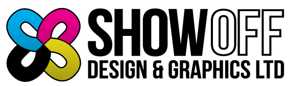
For me the logotype will never work with the clean modern type. It’s too like a celtic knot and looks more like a play on 8’s rather than S’s.
Here’s a play around with the S & O
Attachments:
-
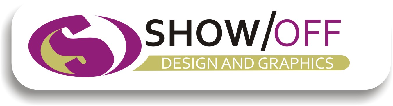
Thanks for all the input! I have been over it again at the weekend bearing your thoughts in mind and I have concluded that I do like the text, but the CMYK themed Ss have to go. I liked the idea of Jill’s about the sketch, but having searched for ages online and through my own photos couldn’t find anything suitable.
Whatever it is, it has to be bold and simple, and while I love seeing all of your designs it has to be my own idea!
Here is another go.
Attachments:

-
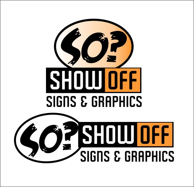
I like that better.
I get so sick of logo icons made out of letters tho.
And your initials remind me of Significant Other.
😉
I think I’d play with the word they make just for fun.
(real rough mock-up)
Attachments:
-

John,
why does it have to be ‘bold and simple’ ?
I’m sort of getting a conflicting message from your ideas…
‘Show Off Design & Graphics’ suggests to me it should be showcasing and advertising your design abilities and personally I don’t think the bold and simple, two colour one is doing that.
If I was comparing your logo to other graphic design based ones I don’t think it would stand out from the crowd
I can understand you might want to keep it simple if it is to be versatile over different medias but two spot colours and some bold text is over simplifying for me
-
 quote Andrew Charman:Hi John
I have somehow managed to be a spectator for years, but felt now was the time to actually comment.
I think what you have done so far with your logo is really good. The simplicity of the icon works really well and is also versatile enough to work with different production methods.
It’s a common fault of our industry to over complicate designs with the available computer effects (gradients, bevels etc.)
The text part is a good starting point, but does need a little tweaking. Watch out for the ampersands that aren’t the stereotypical shape, they just never seem to work.
I have had a play with this part and attached my suggestion. I have used Avant Garde, which may or may not be to your liking.
The Icon also needed to be a little larger than the text. For the same reason that round letters are larger than square ones.Let me know what you think.
Andi
Great first post Andi… :appl:
thank you !
.
-
 quote Robert Lambie:Great first post Andi… :appl:
thank you !I thought Andrew was meant to get a ticking off for not saying hello in his first post……. 😀
I very much like Jill’s ideas of funking it up a bit and also agree with Glenn’s coments as bold and simple not being associated with ‘Show Off’.
It doesn’t need all the bells and whistles design packages can produce but feel it needs to be more visualy exciting…..
always a toughy to come up with your own logo…. but I don’t think you should rule out the fact the someone could come up with something more appropriate, if your spending too much time on it.
Log in to reply.
