Activity Feed › Forums › Sign Making Discussions › Graphic Design Help › My logo Update Help Please!
-
My logo Update Help Please!
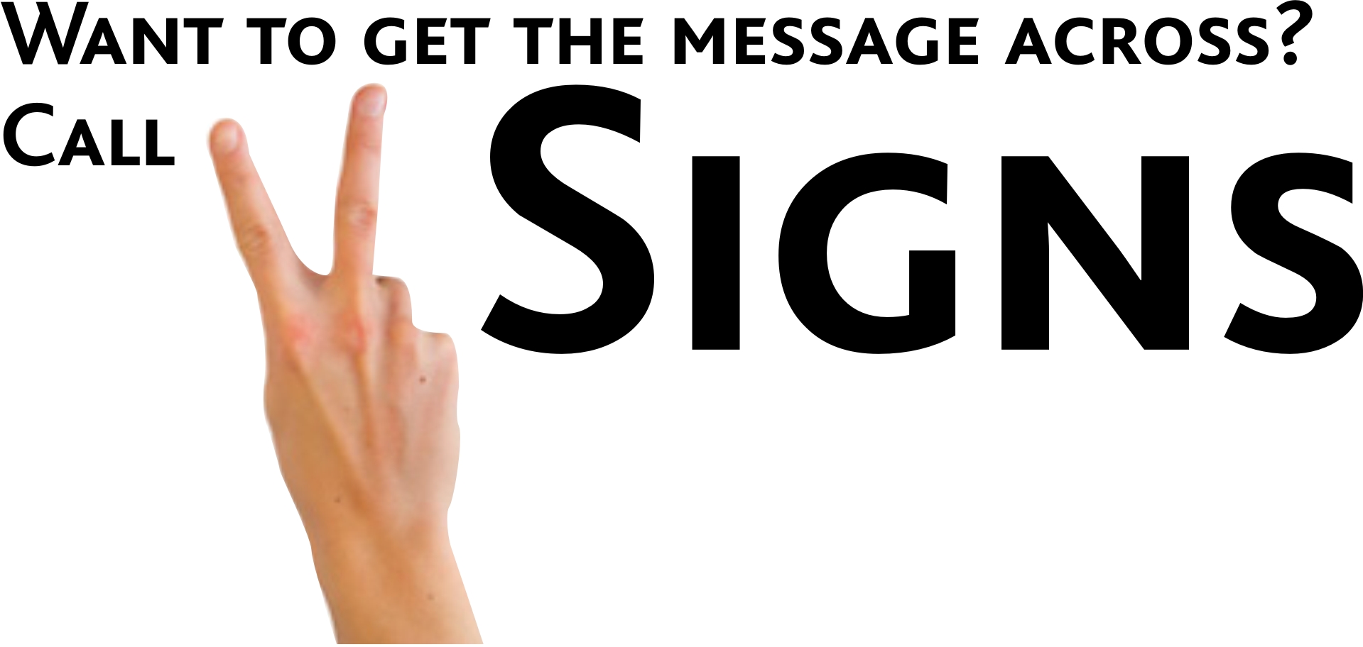
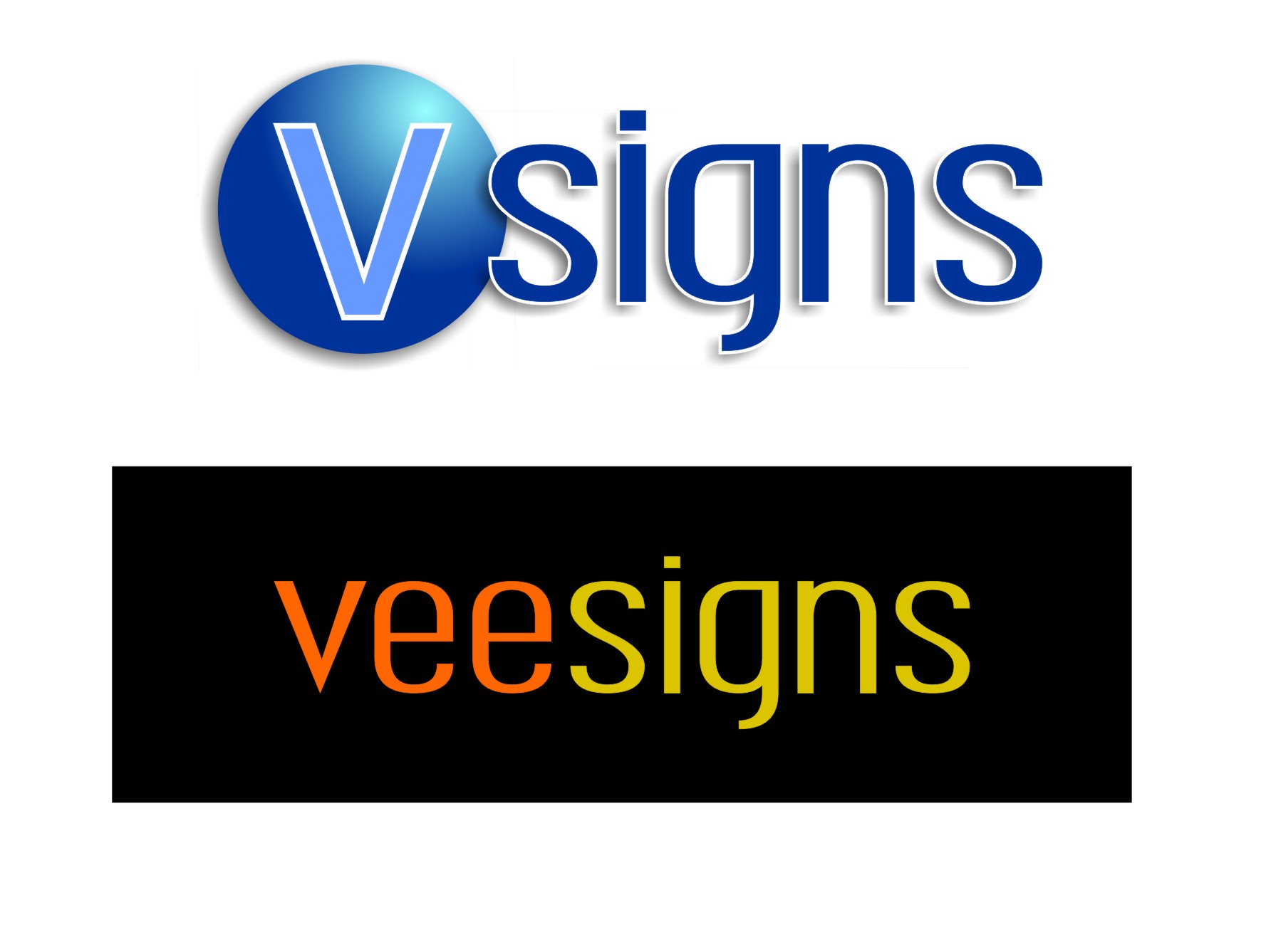
Posted by John Harding on January 9, 2009 at 5:09 pmSomeone keeps nagging me to update my logo, so thought I would turn to you guys because im stuck. I reckon its harder coming up with ideas for yourself than for clients 😕
Any how, my original logo was designed just as somthing for letterheads etc and now I need to expand the brand to vehicle/t shirts/flyers etc and I would like somthing a bit more individual I suppose.
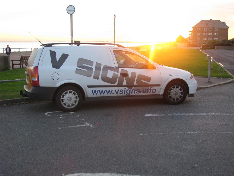
The original logo didnt work on the van so I choose the font bolt for the van which is nice and bold and prominent. Is this the way to go or has anyone got any thoughts that could start me off thinking over he weekend.
Thanks for looking and reading 😀
John
Harry Cleary replied 15 years, 4 months ago 22 Members · 58 Replies -
58 Replies
-
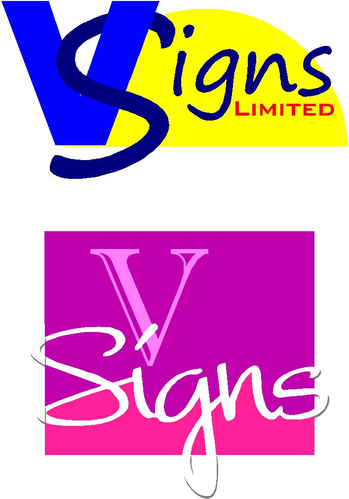
Just a quick input for your new logo options. Hope they give you some ideas/thoughts
Cheers
Attachments:
-

Hey John,
just expanding a theme which was talked about on another thread.
Cheryl
Attachments:
-

Funny I was thinking the same as Cheryl, but drop a C out of accross 😀
-

Thanks guys, some food for thought there, Cheryl I wasnt planning to be so in yer face with the strap line and imagery as it might put some people off – although that would be my prefered style 😀
keep the ideas flowing please, im off down’t pub but will look forward to developing this more tomorrow.
Thanks all really appreciate your time (inc you nigel 😀 )
John
-

I would just go with John.MacDonald pic 2, just a little style to the name.. i like that
-

I like John mcdonalds 2nd one as well kind of slinky 🙄
Lynn
-

John I really think you need a classy look !!
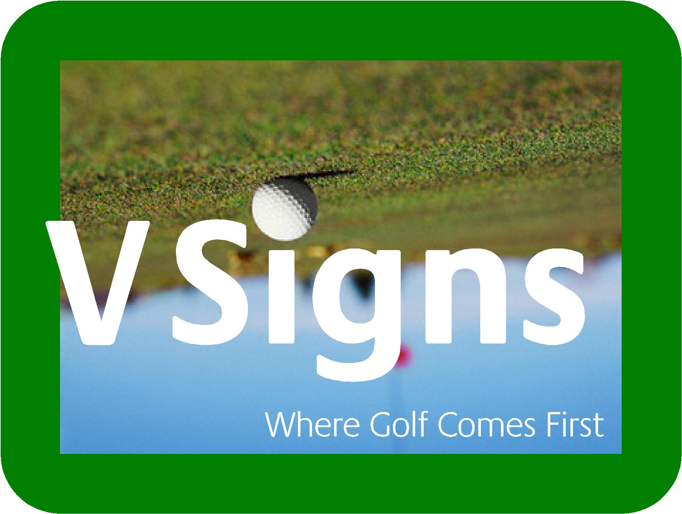
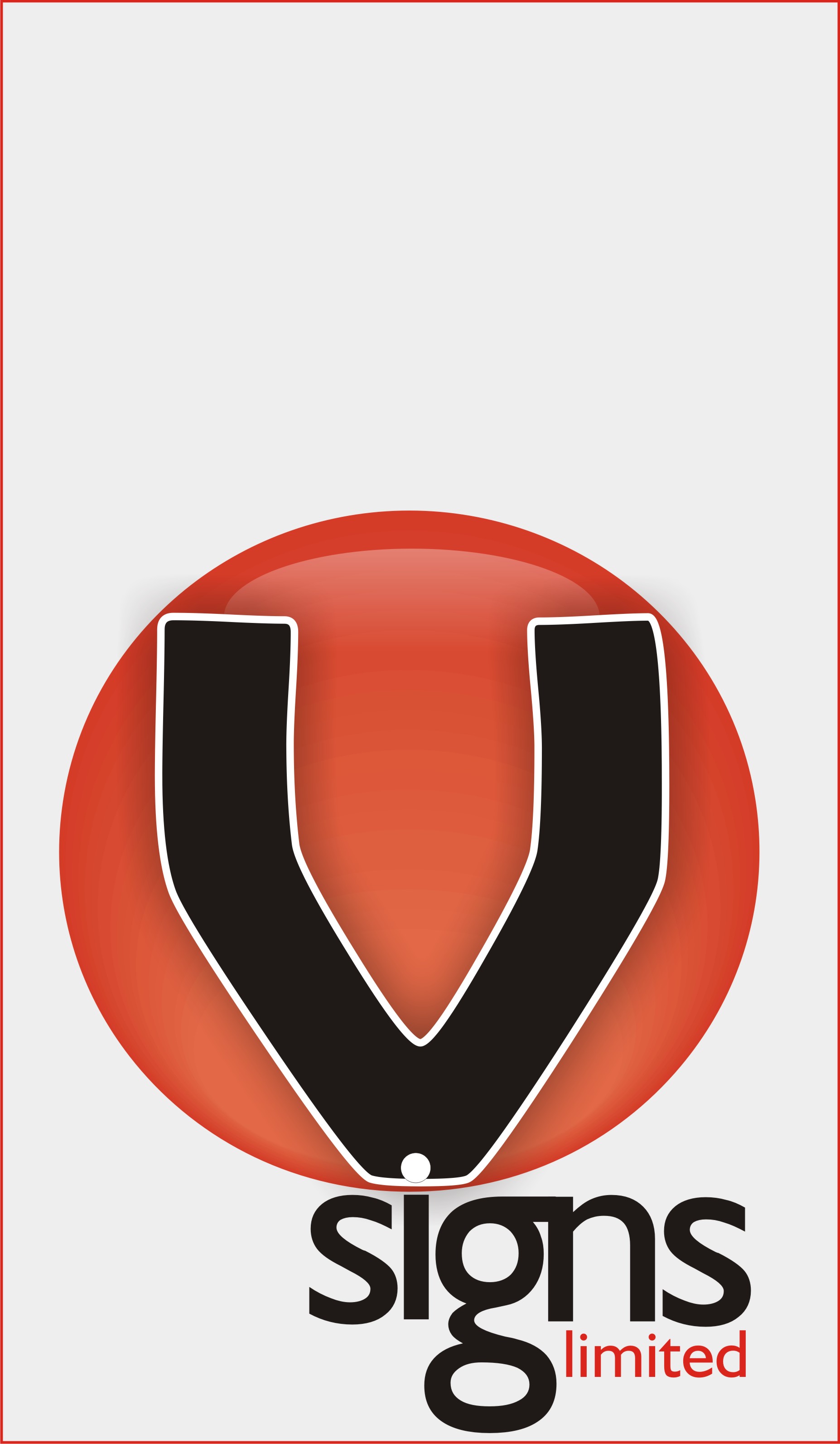
The first thing we think of when we say v sign is that of the 2 fingers this may work in some cases but as i know you and your type of work I would say get this image out of your head. Due to where you complete your work not the coast but Wimbledon any image like the printed 2 finger vsigns would be tacky. I will have a think and see if I can come up with an idea as well it may help. -
Had a think about you and your company and I think I have it !!!!! 😮
Attachments:
-

:lol1: :lol1: good one jill, somewhere for john to hang his tools 😀
nik
-
 quote Jillbeans:😉
Love….JillWinner!
classy and and and………………. 😀 😀 😀 -
 quote :classy
That’s because I didn’t add any fruit flies.
😀 -
I’m not even gonna ask what you mean!! 😀 😀 I’m a catholic! 😮
-
It would also be a problem when placed on a van.
You might hear a sound similar to applause once it picked up speed on the freeway.
😉
PS
Don’t you have fruit flies in Ireland? -
quote Jillbeans:Don’t you have fruit flies in Ireland?
Not before television! 😀 😀
-
quote Richard Urquhart:Had a think about you and your company and I think I have it !!!!! 😮
Like it Richard….really catchy!…shows the man has a life as well as work in the same message…Kewl
Jill…..Shocking!!!! lol -
Here’s a more serious suggestion, idea borrowed directly from the Dan Antonelli design in the little pack of card ads which come from SignCraft in the mail.
Attachments:

-
In order I like Jills first effort, then Rich’s but feel neither will enhance the profile 😀 Rich you know me too well :lol1:
I really like jills second, Jill if you read this can you post the word "signs" as an eps for me, what is the font BTW
Popping out for a bit so will play around and post some designs later
Thanks all
John
-

An effort from me John,
good luck it’s a toughy with your own logobtw love Jill’s 1st one
Attachments:
-
You’re a good sport John.
The font I used was valentino, here is a link:
http://www.artandsignstudio.com/fonts.html
It’s not expensive at all and Steve (the guy who makes/sells these) is great to deal with.
I edited the nodes a bit tho. -
Thanks Jill 😀
Martin wasnt sure initially but its growing on me.
heres my take on whats been posted, any comments
John
Attachments:
-
Bottom one with the V from the top. I actually used quite similar colors in my 1st one but thought it might be too girly.
-

What about a bit of 3d, didn’t have the fonts & was only playing because i was bored.
Kev
Attachments:
-
Glenn that top one is really sharp.
(I like the pink 3D one too from Kevin, just not the script) -

And advertising V signs!!!
Were did you get that hat?
Peter
-
Yup, the V was on purpose.
Got the hat in a case of Labatt Blue beer!
It’s a Pittsburgh Penguins hat.
Needed it today to shovel out our 6" of snow.
Sorry for derailing things…
Back to the V! -
Here’s another.
Like Glenn’s first one, v/nice.
Cool photo Jill.
😀
Attachments:
-

thanks for the comments….
I really like Martins last go………..a bit of the punk vibe going on 😀
-
Liking glenns blue and Martins latest – what fonts did you guys use please?
John
-
John
Ambrosia Demo…..It’s a freebie but I can’t remember which site it’s from
-
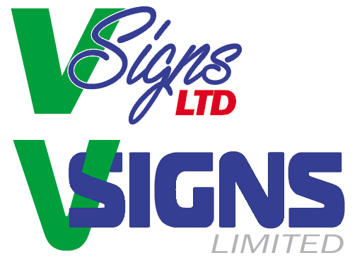
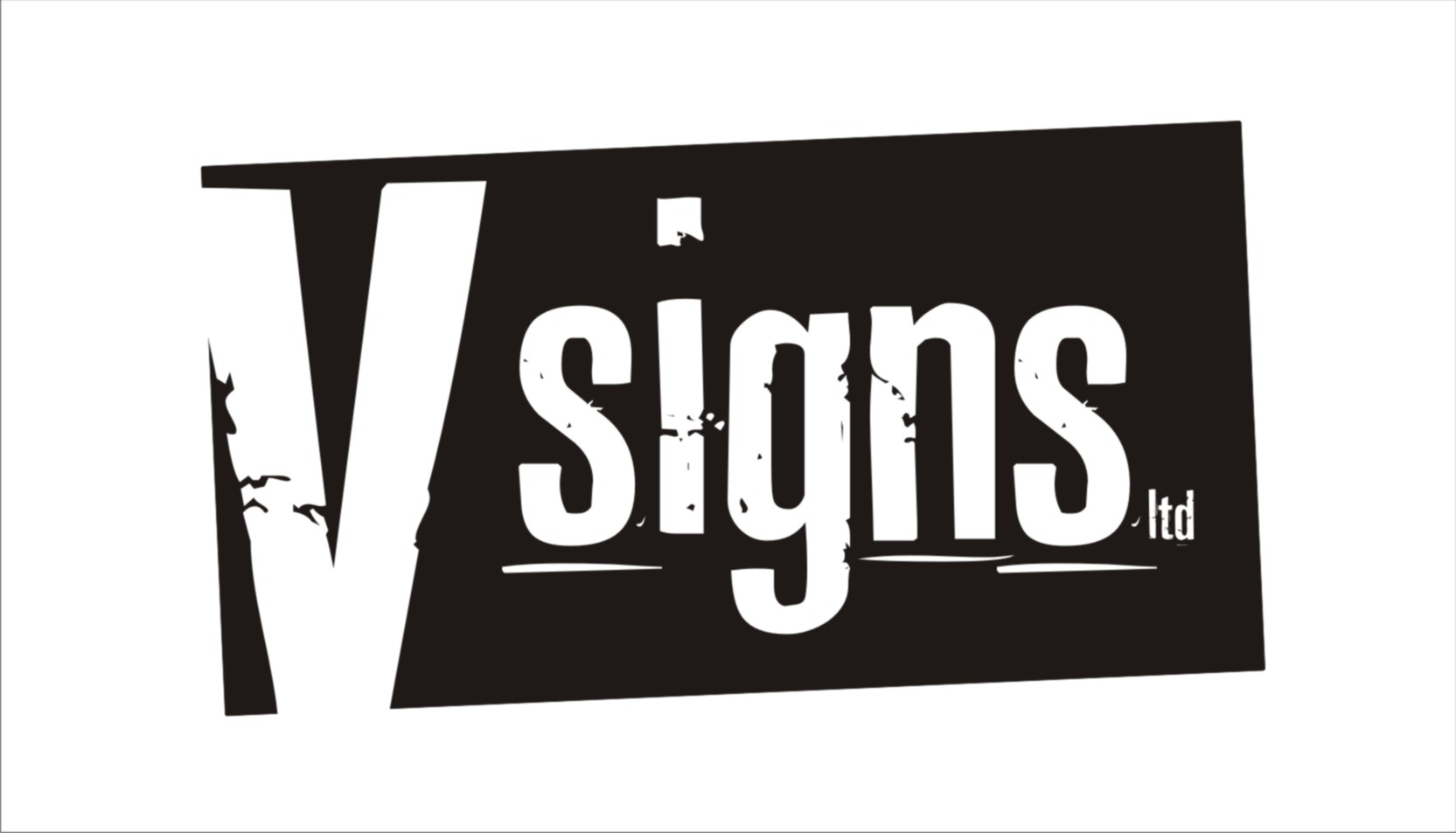
Just wanted to take time out to thank everyone again for all their help and advice. After much consideration were going to go with Martin Coles second effort which will work well across a number of advertising formats and colour changes, and im going to try and develop Jills submission for future use.
So once again thank you all so much :love:
-

Hi John…sorry I missed this…..
I think Martin’s will work well ….I would change one of the ss 😕 so it doesn’t look too much like standard font…..It annoys my when I stay at a Premier Inn and the BEEFEATER restaurant’s logo is a brand effect font and the letters remain the same [Es]… knowwhatImean 😀
-
quote :Hi John…sorry I missed this…..
so am I Andrew – youre the daddy of design on here, perhaps you can elaborate on the S’s theory, I think I understand you but then again im not certain 😳
John
-

Actually, no, I don’t know what you mean John…… are you on same wine as me perhaps?….. :lol1:
Ian :lol1:
-
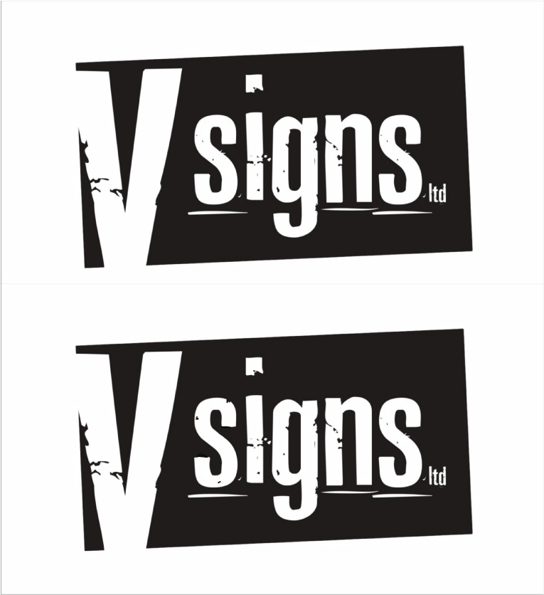
No wine…must be the co-codamol 😀 just change the s 😀
Attachments:
-
Thanks for clearing that up Andrew, i was imagining somthing more radical and out of place hence my doubt. reaching for the co codamol as we speak 😀
-
Gotcha, didn’t look at the original artwork… fully agree, good point made.
Ian :lol1:
-
New avatar – although you cant see the detail, just to show the new logo is being implemented,- ie the new logo is on my corporate wear! thanks to Rich for help with the T shirt printing.
Thanks to Martin and everyone else who contributed
Next the van and new unit signage, starting this weekend hope to have something in place asap.
John
I know I know dont mention the diet 😀
yes Rob Iwill go back to a head and shoulders avatar shortly :lol1:
-
quote Andrew Boyle:the BEEFEATER restaurant’s logo is a brand effect font and the letters remain the same [Es]… knowwhatImean 😀
god you have a critical eye Andrew,
I don’t think anyone else on the boards would have noticed the ‘S’ thing.Of course it was done on purpose to see if you’d notice..well spotted


point well made 😀
Good choice by the way John 😀
you didn’t hang about, it took me be about a year to get my first shirts done. -

I’m struggling….
is it that all 3 ‘E’ letters are the same destroying the illusion that it is all original?
If I’m right then I like how you managed to notice that and you are now elevated to super geek status – it is a good point though 😀
If the example ‘S’s were bigger it may be more obvious…. if I’m right that is!
edit: just bothered to take the time to open the thing… clear as mud now!
-
quote Gavin MacMillan:I’m struggling….
is it that all 3 ‘E’ letters are the same destroying the illusion that it is all original?
If I’m right then I like how you managed to notice that and you are now elevated to super geek status – it is a good point though 😀
If the example ‘S’s were bigger it may be more obvious…. if I’m right that is!
edit: just bothered to take the time to open the thing… clear as mud now!
I struggled aswell, I gave it to the kids to play spot the difference with the two V signs.
You know our Andrew, always thinking outside the box 😉 that’s why he produces the work he does I guess.
I don’t really get the Beefeater one, just thought put it up for people to decide,
Point well made…on the V signs I can see where Andrew is coming from…… super geek…definately not.. how dare you 😀
-

The first S is weathered different to the last S…
I am guessing Andrew means your letter/logo has more originality if duplicate letters are different in some way, eliminating the look of a standard font being used, which repeats the letter exactly each time?
BEEFEATER being a good example due to the amount of E’s
or have i got it wrong too? :lol1:
-
oops…. 😳
When you get a Beefeater Menu the letters are very large and all the E’s are the same.
I just think if you were creating a brand that has a stamped letter effect you might as well change letters that repeat…
Cheers
I have now finished the co codamol 😀
-
quote Andrew Boyle:I just think if you were creating a brand that has a stamped letter effect you might as well change letters that repeat…
we all knew that’s what you meant Andrew…. 😕
😀
-
I knew straight away what he was talking about! I understand AFW. :lol1:


Log in to reply.
