That’s fine Andy.
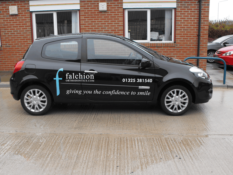
I like the way you have kept everything parallel to the bottom of the door/sill line, although you might want to consider what effect that would have if doing a lighter coloured car next time, when the angled black rubbing strip would be a more prominent feature and draw your eyes towards it.
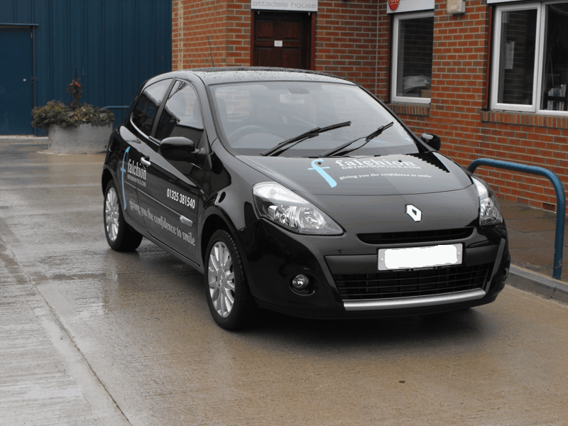
If I was to make any comment it would be to bring the bonnet graphic down a bit, more towards the middle/front of the bonnet.
Designing for bonnets is more of an art than a science. I try to avoid long thin logos or lines of text because the wider the graphic the more the curvature of the bonnet is going to make it frown. Sure, you can get around that by shaping the text to compensate, but that’s a lot of work for a one off and more suited to bulk jobs. Also, if a logo, the customer isn’t going to let you distort that.
You also need a rough idea of the angle of the bonnet so that you can gauge by how much the graphic is going to look reduced in height, compared to it’s width, when viewed from the sort of height that an oncoming driver will see it. Will it look silly/unreadable?
I’ve not really found a cast-iron answer that works in all cases, and only experience gets me out of trouble a lot of the time. 😀