Activity Feed › Forums › Sign Making Discussions › Gallery › McDonald: Signage Assortment
-
McDonald: Signage Assortment
Posted by David McDonald on November 6, 2009 at 5:32 pmI’ve had enough doing any proper work for the day so I thought I’d post some more photos of recent things.
Constructive crits always appreciated.
Cheers
Macky 🙁
Attachments:

 Mindaugas replied 14 years, 6 months ago 19 Members · 21 Replies
 -
21 Replies
-

:2thumbs:
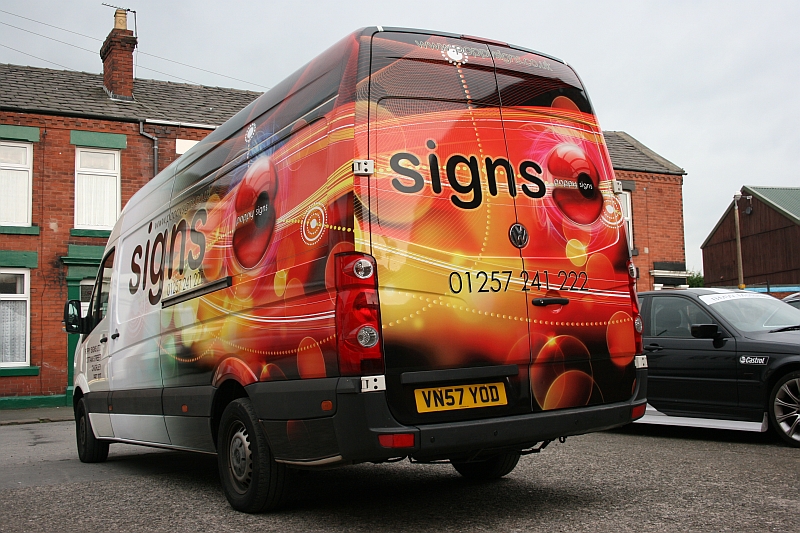
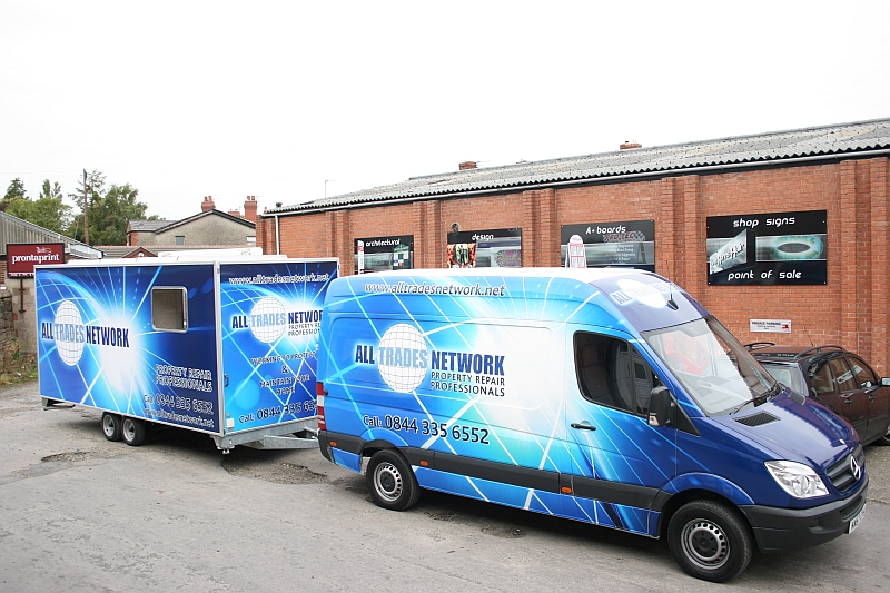
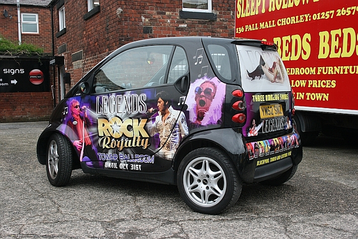
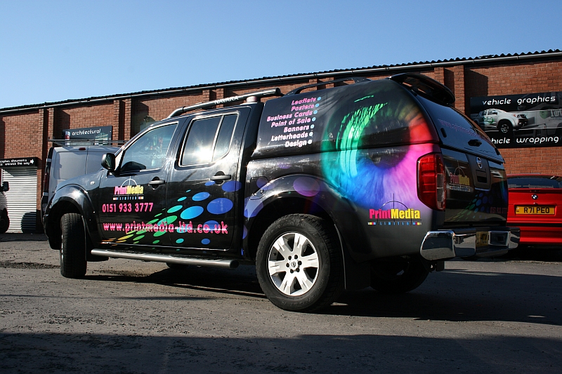
excellent work David the first two vans wow great impact.
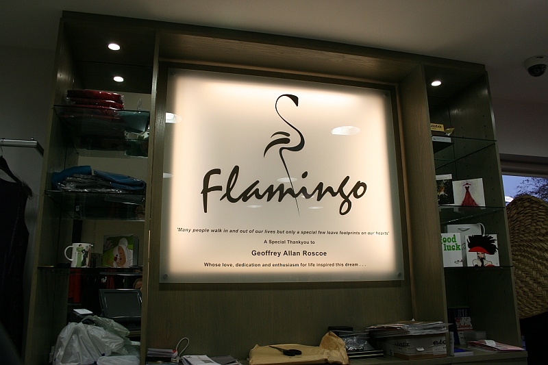
the flamingo nice and subtle
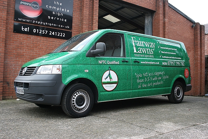
love the smart car as well
in fact love it all
well done mateDerek
-

lovely work Macky, also meant to congratulate you for the write up in sign directions, especially appearing on the front cover 😎
Lynn
-

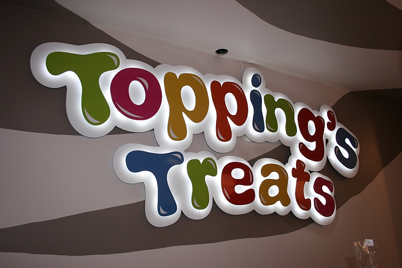
Macky, just a fantastic selection of work again, real top draw stuff…love the ‘Toppings Treats’
one small crit is the 01 kerning on the phone number on your own van 😕
What a porfolio you have….
-

Love the Topping’s Treats one and now I am hungry darn it!
Love….Jill -

You produce some awesome work Macky, certainly plenty of WOW factor.
Love the lawn van, nice and quirky, I like them all.
Neil
-

Some nice work there David, some top notch too mate. Well done! 😛
Constructive crit:
well I don’t really have any other than “self preference”.
I really like your own van, but not keen on the font. Vag round?
Same goes with the flamingo signage… great signs etc but not keen on the font…
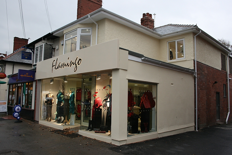
The illuminated flamingo panel looks great. But I think the fluorescent tubes create a bit too much shadowing. Still looks great but a suggestion would have been to run a constant strip of led’s around the parameter. There wouldn’t be any shadows and the whole panel should glow pretty even. Ide recon you probably could have been cheaper too using led’s to the tube method.Anyway, always a pleasure seeing your work David… even better seeing you take front cover of sign directions magazine then several pages inside. Way to go mate… hats off to you. 😉
Thank you for taking the time to post your work.
-

top notch David.
font choice for me is not an issue, its how its used,
We all have are own prefs thoughspot on work
Peter
-

100% true inspiration
we can only strive to achieve such workKev
-

Great work David, thanks for sharing it with us.
First van isn’t very good though, I take it the customer designed it himself :lol1: :lol1:
-

Morning all
Thanks very much for the feedback and comments.
Rob, good point about the Flamingos panel, thanks for that. In hindsight would have been better with LED’s. I might even go back and swap out the tubes.
Martin, the customer for the first van was indeed a pain! Wanted to sit down for 5 hours and look through all 2000 fonts we have, then insisted we gave him some prints of blank van outlines so his kids could come up with the final design in crayons! We did manage to talk them out of Brush script in all Caps for the text though.
We knew we were going to get a mention at some point for the Playtown project but had no idea that one of the characters would be on the front cover. To say we were chuffed would be an understatement.
Thanks again
Macky -

Awesome stuff David all brilliant
Agree with Rob about the flamingo panel but think the font is spot on and suits the logo and overall look of the business – the sign at the front of the shop – love it too how did you do this? Not so keen on your van mind just feel no relevance and lack of overall impact and contrast.
-
Hi Nigel
Thanks for the comments
The Flamingo fascia is an aluminium tray powder coated cream, fret cut face with opal acrylic backing with flat cut acrylic letters mounted on it. Dibond back tray with standard fluorescent gear trays / tubes. As the box projects above the flat roof we had to put some extra bracing inside to make everything nice and solid.
Cheers
Macky -
David, forgot to congratulate you on the magazine entry, not surprised you are chuffed. A great job and I am sure the magazine article will look great in your portfolio.
-

Great Work M8 😀
I like the van and trailer best looks top notch!!
When you going to finish the first van looks like you re airbrush run out half way down the van. :lol1:
Keep the good work Up.
Log in to reply.
