Activity Feed › Forums › Sign Making Discussions › Graphic Design Help › Looking opinions or advice on this vehicle design.
-
Looking opinions or advice on this vehicle design.
Posted by Nicholas Gormley on October 1, 2009 at 10:36 pmHi all
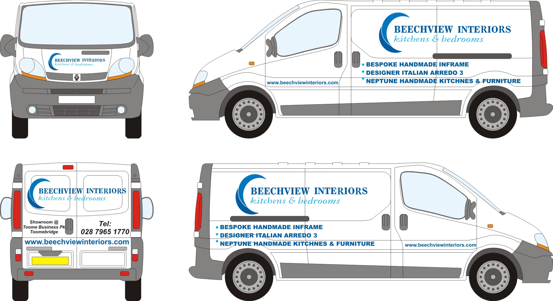
Just messing about with this layout for this van, this is all the information the customer wants on it. Whats peoples views or comments on this?? Any advice would be greatly appreciated.
Attachments:
 Ian Muir replied 14 years, 7 months ago 14 Members · 22 Replies
 -
22 Replies
-

just a quick comment,
I would make the list of services at least half the size;
and in a font the same, if not complimentary to the main text.
and you would need to spell kitchens correctly
Peter -

Hi
as Peter said, plus taking text across that wheel arch would not look right once appliedKev
-

Agreed with the above. The list of services is too big and bold and is competing for attention and overpowering the main message which is the company name/logo. Reducing the size and weight of this font would make it much more appealing to the eye.
But no doubt, if you do that, your customer will come back and tell you to make the list of services bigger and bolder 😕
-

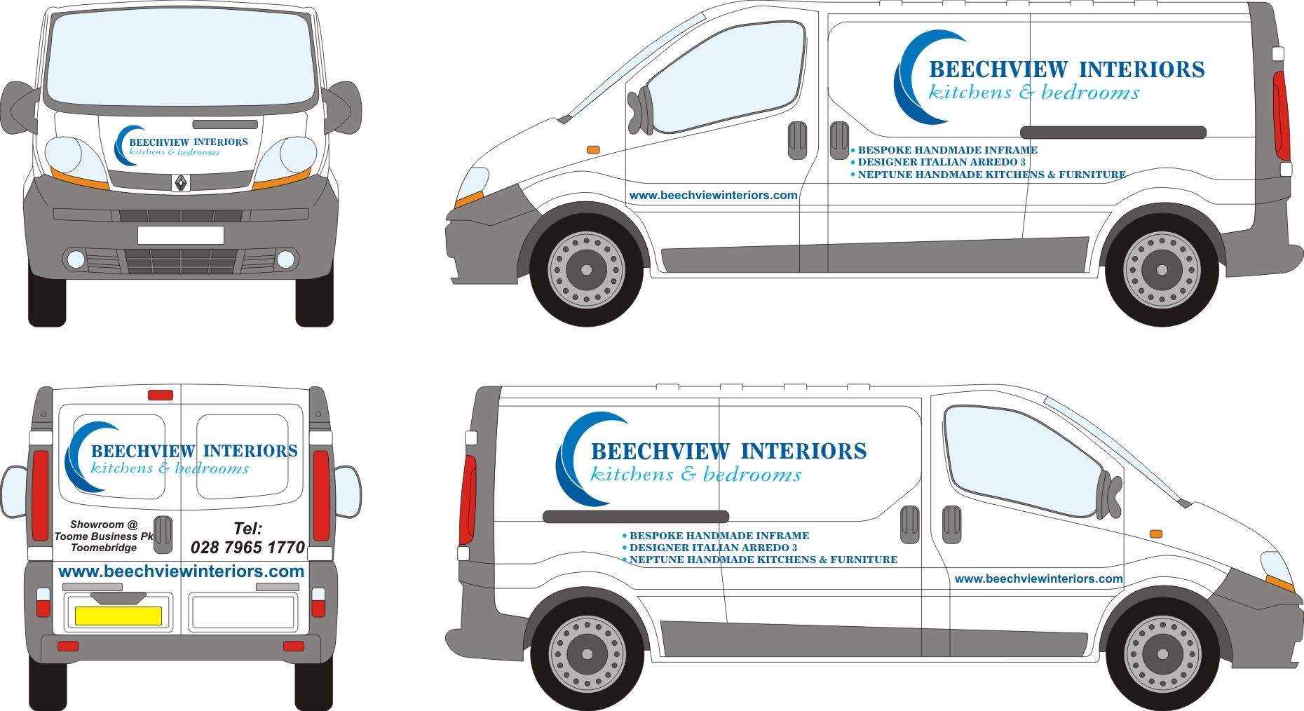
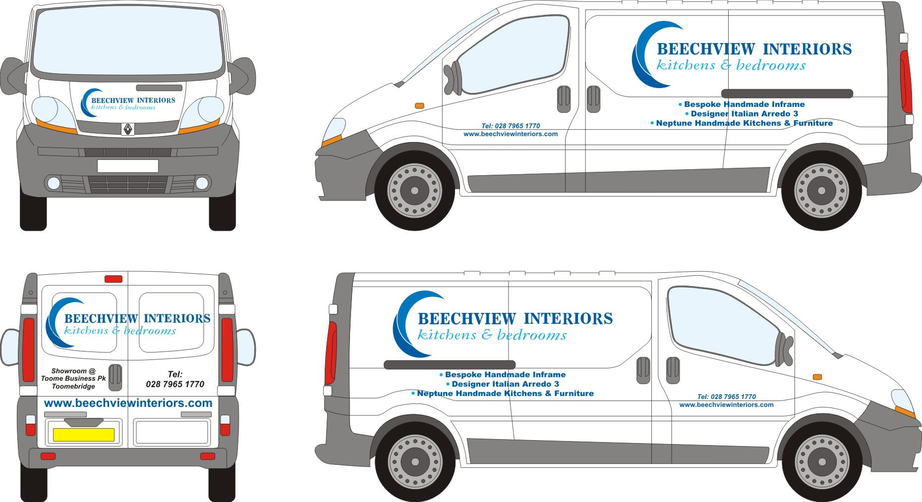
How do you think this looks any better?? Or is the list of services too far forward to the front of the van??
Attachments:
-
Try changing the font to regular instead of bold, and centre the list of services under the logo above. The list of services will also be easier to read if you use upper and lower case lettering instead of all upper.
The rear needs work too – try using the same principles suggested on the back.
-

As others have said; centre the list of stuff under the logo, I would centre justify it too. Make the web address smaller on the door and move it up, or put the Tel no. above it. Make everything on the back smaller as it is too cramped in the panels.
-
The text on the back is filling the panels right to the edge, so if the vehicle outline is slightly out in any way, it wont even fit on the van.
It may be tempting to make everything as big as you can on the drawing but the real van is much bigger, so the text may appear small on drawing but will be plenty big enough in real life.
If you are designing and you are unsure that the text will be big enough in real life, try cutting it out of some some offcut to see how it looks in reality.
You need to have some kind of border of negative space around your text so it’s kind of framed in the panel.
Liam
-

I agree with what has already been said – you need to have more negative space on the back. Reduce the size of web address and also the telephone number in particular, they are both way too big. It will get noticed if the layout is right anyway without them having to be really big.
On a plus point I like the logo, it’s nice. Nice colours too. 🙂 -
Hi
centre the list under the text of the logo & you should miss going on to the wheel arch plus everything will look more centralized, you may have to shrink it slightly. Also keep the above the swage line on the front doors & in line with the base of the list so that reading it follows through. Hope that makes senseKev
-
I still think you need to reduce the web address on the back…….. it’s overpowering.
Bring it all in a bit from the sides, still not enough negative space. -

Is it just me or does the interiors text not look straight ?
Plus Jill not going to like that Tel! 😀
Martin
-
 quote Martin Gray:Is it just me or does the interiors text not look straight ?
Noticed that myself and blamed my computer. ‘Sorry computer, guess I will have to buy it a drink tonight’ 😀
-

I would still make the list smaller and would justify left on passenger side and right on drivers side,and use upper and lower case,I think the web on the back needs to be much smaller it’s the first thing that catches the eye, I also like the logo and colours.
Lynn
-

I’m not a keen to alter peoples logos at all but in this case for a van I might be inclined to reduce the size of the graphic slightly to allow me to increase the size of the company’s name.
Agree with other comments especially with regards to the back where everything is a bit on the large size and needs to be reduced a bit. -
I have recently done a Renault Traffic van & got caught out with the rear doors. Not sure if the year of the van makes a difference but the badges are not in the same place as shown on the vehicle outline. They were actually where your phone number & address are going to be placed. I would double check with the customer before you cut anything.
-
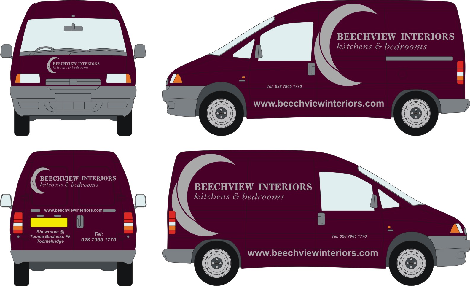
Customer now changed his mind on the van he wants done, he wants the logo and web address bigger and wants the whole thing to be a bit catchier. Anyone any ideas?? Help is greatly appreciated.
Attachments:
-
What colour van does this customer have as last one was a white van. Web address down that low will get dirty and unreadable very quickly.
Buy Mike Stevns book "Mastering Layout" will be the best money you ever spend.
-
I agree with Martin about the web addy it will soon become unreadable,
maybe make it smaller and move it up to underneath the panel, I imagine it’s going to be a black van? if he want’s eye catching maybe use yellow orange or light blue or apple green.Lynn
-
This van is burgundy and the last one was white which he is leaving for now. Where can i buy this book at??
Looking something eye catching.
-
 quote Nicholas.Gormley:Customer now changed his mind on the van he wants done, he wants the logo and web address bigger and wants the whole thing to be a bit catchier. Anyone any ideas?? Help is greatly appreciated.
Probably easier in the long run to just shoot the customer…….
Ian :lol1:

Log in to reply.
