Activity Feed › Forums › Sign Making Discussions › Neon, LED, Lighting › Looking for reviews on Kestrel Signs lightboxes please?
-
Looking for reviews on Kestrel Signs lightboxes please?
Posted by Ben.Hall on October 18, 2011 at 5:17 pmHi new to the forum,
I have spent over a day looking through the forum for a supplier for a illuminated exterior shop light box (first light box job for me). I came across a few company’s who I have asked for quotes.. Kestrel being one of the cheapest.
With some of the posts being as old as 2006.I was looking for a more recent review on the lightboxes from Kestrel? For some reason I wasn’t sold on the look of the lightbox picture on Kestrel’s website- looks like a weak interior light box and not a external one. I also had concerns that the customer might think I brought a cheap light box.
Any information would be greatly appreciated. As I have had some very expensive quotes for lightboxes and now what seems a fairly cheap quote.
Thanks in advance,
BenBen.Hall replied 12 years, 7 months ago 11 Members · 35 Replies -
35 Replies
-

Ben, Introduce yourself first in the hello forum mate. You’ll get more help that way.
-

I thought Kestrel were pretty good, although never used them.
I always got mine from Universal.I’m sure Georgio uses Kestrel 😕
Someone who’s used them will pop up Ben.
-

i have only used Kestrel on occasion, haven’t for a while but what we bought from them was always decent/good.
I cant compare fair unless seen like for like against whoever else your buying from, but they have been around a long time now and normally offer good products. -
I am getting a sign box 4200 x 600 and Universal quoted close to £100 more then Kestrel.
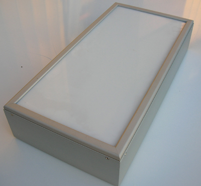
The thing that bothered me most about Kestrel was the picture on there site…
Board Rules.[/size]
Maybe it is me being way to picky … but the picture makes it look like a internal light box and not external.
Attachments:
-

Kestrel boxes are ok and service good too
Just be sure to order the correct depth of box they do slimline and normal sections
Have fun
Colin
-
what makes it look internal from the picture?
as i said, havent used kestral much lately so cannot comment on price. however, i have found Insight sign services to be much cheaper than universal at times. insights systems are good also…
-
 quote Ben.Hall:I am getting a sign box 4200 x 600 and Universal quoted close to £100 more then Kestrel.
The thing that bothered me most about Kestrel was the picture on there site…
Maybe it is me being way to picky … but the picture makes it look like a internal light box and not external.
surely it’s an either/or affair…at say 600mm deep at using 5mm panels the trim depth will make little or no difference.
I’ve used kestrel many times and the boxes are ‘average’ and worth what you pay for them. I used to be a die-hard Universal fan as their boxes do have probably the best build out there that I’ve come across, but then they started taking the mick with the carriage charges.
Dave
-
quote Robert Lambie:what makes it look internal from the picture?
as i said, havent used kestral much lately so cannot comment on price. however, i have found Insight sign services to be much cheaper than universal at times. insights systems are good also…
Maybe its just me? It could possibly be because it looks small, doesn’t have many pop riverts and not much profiling/grooves around the shell?
In response to Insight – I called them then emailed with details for a quote and they didn’t get back to me- so there loss.
I think my main concern was it would look cheap, as no one has mentioned that I think I will give them a try.
-
quote Ben.Hall:In response to Insight – I called them then emailed with details for a quote and they didn’t get back to me- so there loss.[/b]
well i never have problems getting quotes, unless i am looking for them super fast. you have to "give people time to quote you though" 😕 or it could be "your loss" 😉 :lol1:
the box in the picture looks no real difference from what i see all over the place. different extrusions are used by different companies. that one in the picture doesnt look like a slim-line type one, but than that, looks like a standard sign box. the inside maybe built like a tank, you will never know till you look inside.
-
quote Robert Lambie:quote Ben.Hall:In response to Insight – I called them then emailed with details for a quote and they didn’t get back to me- so there loss.[/b]
well i never have problems getting quotes, unless i am looking for them super fast. you have to “give people time to quote you though” 😕 or it could be “your loss” 😉 :lol1:
the box in the picture looks no real difference from what i see all over the place. different extrusions are used by different companies. that one in the picture doesnt look like a slim-line type one, but than that, looks like a standard sign box. the inside maybe built like a tank, you will never know till you look inside.
Ok cheers, I’m probably just showing my lack of experience in questioning how good a light box looks.
I should be focusing on my other problem of predicting the perspex sheets would be grey and not white. The sign I was going to print was to have a white print.
Any one have any comments on how good the lights are- if I should look into having more fluorescent tubes? etc
P.s Thanks for all your time/help
-

I haven’t used their light boxes for a while (not had an order for one) but I always use their signframes which I have found to be good quality, I like the extrusion and they are strong. I tend not to buy the panel from them because the couriers can’t ship it without damaging it in transit. If you are concerned about the suitability, speak to them – Stuart or Paul.
Alan D -
quote Robert Lambie:quote Ben.Hall:In response to Insight – I called them then emailed with details for a quote and they didn’t get back to me- so there loss.[/b]
well i never have problems getting quotes, unless i am looking for them super fast. you have to “give people time to quote you though” 😕 or it could be “your loss” 😉 :lol1:
Emailed for a quote on the 17th and still haven’t heard anything back. :shake:
-
do you mean you haven’t called, or followed up the email?
your email could well be in a spam folder. 😀 -
I called and then emailed them. They didn’t get back so I have gone with Kestral.
With a light box do you guys use standard vinyl or translucent films?
Does it depend on artwork?
Thanks,
Ben -
Not like them at all…
yes, translucent if you are using colours. but mixing say black with a coloured translucent and you will have gloss vinyl and matt type finish.
-
quote Robert Lambie:yes, translucent if you are using colours. but mixing say black with a coloured translucent and you will have gloss vinyl and matt type finish.
Thank you for swift reply, gloss vinyl having a matt type finish sounds insane!
Artwork attached, The white part is meant to be the opal acyrlic of the light box.
Whats your impressions if I use standard sign vinyl-will it be okay? Will the lights show up on the blue part and will the parts with no vinyl have an awesome effect?Thanks in advance 😛
Attachments:

-

I overprint vinyl (print twice) for lightboxes gives the colours a bit more depth.
Steve
-
By Gloss i mean… you asked if regular vinyl can be used on a light box.
It can, but i would only use it with black or where no bright colours need to show as regular vinyl is too dense.
e.g.
bright red will become dull tomato redhowever, black is fine… as it doesn’t need the light to penetrate.
but, if you use black regular vinyl it will be GLoss.
if you couple that with translucent vinyl, the black will be gloss finish as will the acrylic. but the colours will be a sort of semi-silk / matt finish.
its no big deal, just pointing it out.as for your design…
everything white must be the acrylic.
maybe my screen, but looks like you have a blend on the grey/silver?
this being the case you will need to print the blend onto clear digital vinyl.
or… print onto a white adhesive back digital white. i say that because many digital vinyls are grey backed adhesive and will not allow the light to penetrate the white. white vinyl will defuse a bit of light though, so maybe clear digital is way to go for the sign to be as bright as possible.personally, ide do the navy in a translucent. solid colour will still allow "some" light thru but will look patchy.
i would ditch the grey hairline around the parimetre. just giving yourself extra work for no real eefect. maybe make that part white too.
-
Nice tip Steve, I will def keep that in mind. However I’m using solid colours/straight cad cut vinyl.
Robert- your giving me lots to think about- thanks.
I should have explained the boarder around the sign was meant to show the lip of the tray.
I’m glad we are both thinking along the same lines of the white part being the arcylic.
The grey/silver is meant to be showing silver vinyl.
With there only being two colours I’m not sure its worth paying for printed vinyl.
When you say solid colour- I’m guessing you mean standard- normal sign vinyl. Which I’m wondering if not used -will it spoil the look/ strength of the lights shining threw the white part -the title / "city of cash" part.
Cheers
-
i haven’t bought translucent vinyls in god knows how long. there maybe silver translucents and the like avilable these days.
i only mentioned the digital vinyl because it looks like a gradient blend thru the grey, but i could be wrong.
what does the company do? "City of Cash"
-
he he
quote :i only mentioned the digital vinyl because it looks like a gradient blend thru the grey, but i could be wrong.Spot on! I just applied a gradient in illustrator to try best show the effect of silver vinyl.
The company does "Pay day loans, Cash Cheques and Money Transfer".
I want to use standard vinyl, but I will think about the translucent.
-
quote Ben.Hall:I want to use standard vinyl, but I will think about the translucent.
I would use a translucent blue background you would still get the good effect with the wording at night as mainly white… imo,
silver translucent is nice but can look very pale against the white in day time so may be best suited to a shade of grey -

Proper translucent vinyl in my view is the only option, it’s what it’s designed for.
Standard vinyl will look crap – I hope you have priced this for translucent as it’s more expensive.
also I would never show artwork to a client like this as it’s misleading – why didn’t you just use a shade of grey to represent the silver.
Also you need to make sure the blue outline on the text is wide enough, I would reduce the white on the outside of the blue text outline, you need to consider how it will look lit, I feel the blue text outline could get a little lost.
Just my 2p’s worth.
-
To get the effect you are after with the wording you would need the blue in a total blockout vinyl and I’m not sure it comes in blue 😕
Otherwise use black blockout with your blue on top, this will emit no light at all when illuminatedBut as advised don’t use standard vinyl and as Tim says price accordingly
-
hmmmm…
Interesting… alot more thought is needed then originally planned.
I was treating this like a normal sign but thank you Martin and Tim for bringing it to my attention.
Tim – I messed up a little not pricing for translucent vinyl ; (
I also will bear in mind that the gradient could be seen as misleading – I did add a description in the email explaining the colour would be silver. I also did have the sign constructed on the computer above the shop. What I have shown on here is just a quick image grab.Martin – I wasn’t to concerned about blocking out the light completely. However as this is my first light box job I’m might as well try my best to get it perfect.
So think I will try with placing black sign vinyl down and then blue transparent and silver over the top.
Thanks to Robert I guess I will avoid the normal mistake of just laying translucent vinyl down and not getting a great vivid colour or patchy light look when the lights are on? Not completely sure if I have understood correctly?
-
Hi Ben
If you want to block light you need to use total block which is designed for the job – it’s not just standard black vinyl.
-
quote Tim Painter:Hi Ben
If you want to block light you need to use total block which is designed for the job – it’s not just standard black vinyl.
From looking at the design would you think it would look better with total block? Or should I just use blue translucent vinyl?
Thanks,
-

Ben, Martin was only talking about using a blockout vinyl for the Blue in the name, the majority of the blue should be done with a translucent blue vinyl. Unfortunately a lack of knowledge means that you have got the pricing wrong on this job (what a lucky customer) so if nothing else it should serve as a reminder for you in the future.
As has already been said the gradient on the grey/silver is something I wouldn’t have done if it is to be a solid colour. Trying to show how an effect might look can get you into a lot of bother so I wouldn’t do it personally.
Always difficult when you are asked to do something you haven’t done before but in future ask questions and find out the answers before you give the customer a price. May take a little longer but worth it to ensure you do the job correctly and more importantly get paid the right money for the job :lol1:
-
I feel this thread has all become a bit confusing for you Ben.
This is what to do: ignore normal and block out vinyls.
You just need a blue and and a silver/grey transluscent, as simple as that.
It’s an easy job.Grafityp are good and very reasonable for this type of vinyl with a reasonable colour range.
(for the record, I thought you wanted the blue background in blockout which would make the wording really stand out, when illuminated)
Good luck -
quote :(for the record, I thought you wanted the blue background in blockout which would make the wording really stand out, when illuminated)
That was my initial plan. As the lights would be used to really bring out the name and not look patchy in parts.
However i’m wondering if it will still look good/stand out if I just used translucent vinyl (no block out vinyl underneath)
-
quote Ben.Hall:However i’m wondering if it will still look good/stand out if I just used translucent vinyl (no block out vinyl underneath)
Of course it would, that’s what the process of translucent vinyl on light boxes is designed to do..
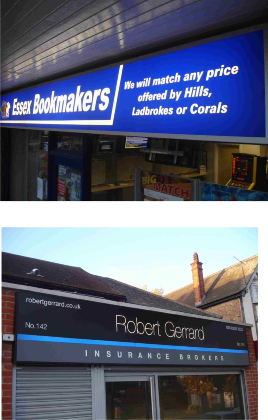
Below are a couple I did some years back.
The top one is near what you are doing, using blue translucent background.
The second is a light box using total blockout vinyl except for the blue.
Not a night pic alas but just the lettering and the blue strip become illuminated when dark.
Attachments:
-

On a separate issue Ben, I think the name would look better if the word "of" is not capitalised, and would be more "correct".
-
(for the record, I thought you wanted the blue background in blockout which would make the wording really stand out, when illuminated)
I know I’m getting old Martin but I can still read small lettering :lol1:
Fair enough I got what you were saying wrong, didn’t think you would be talking about the main background colour Martin as with a blockout vinyl behind it I doubt the blue would show up as blue at night and even during the day would probably be darker.
Best of luck with what ever you decide to do Ben.
-
Hi,
If I didn’t take any of the advice on board – I would be a mug.
Thank you Martin for posting the pic of your previous work- I will def be using translucent vinyl.
I will also be changing the spelling and have a lowercase ‘o’ instead of a capital. (cheers Peter)
I will also post up picture once I’m finished.
Thanks for all your messages.
Log in to reply.
