Activity Feed › Forums › Sign Making Discussions › Graphic Design Help › Looking for design advice on a Mini Wrap?
-
Looking for design advice on a Mini Wrap?
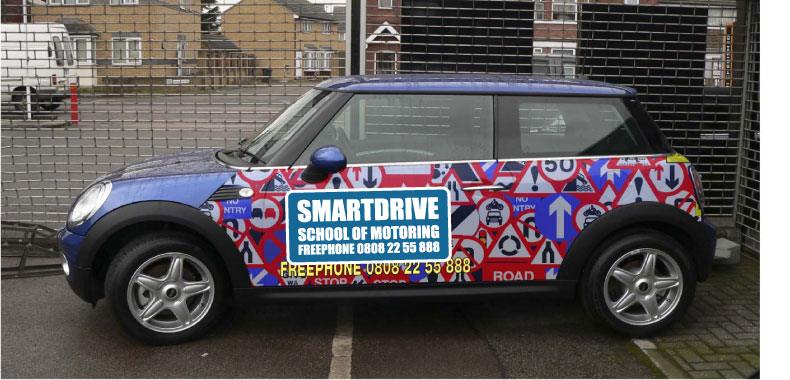
Posted by Peter Normington on February 19, 2009 at 7:22 pmIm going to do this next week, but I am a bit unsure about the style and lettering layout, and how to get it to look right on top of the background. so any suggestions would be appreciated, the customer only wants a partial wrap as he has a budget to work to
Peter
MOD-EDIT
please use descriptive topic titles when posting.
this post has now been edited.
Attachments:
 Martin Cole replied 15 years, 2 months ago 20 Members · 58 Replies
 -
58 Replies
-

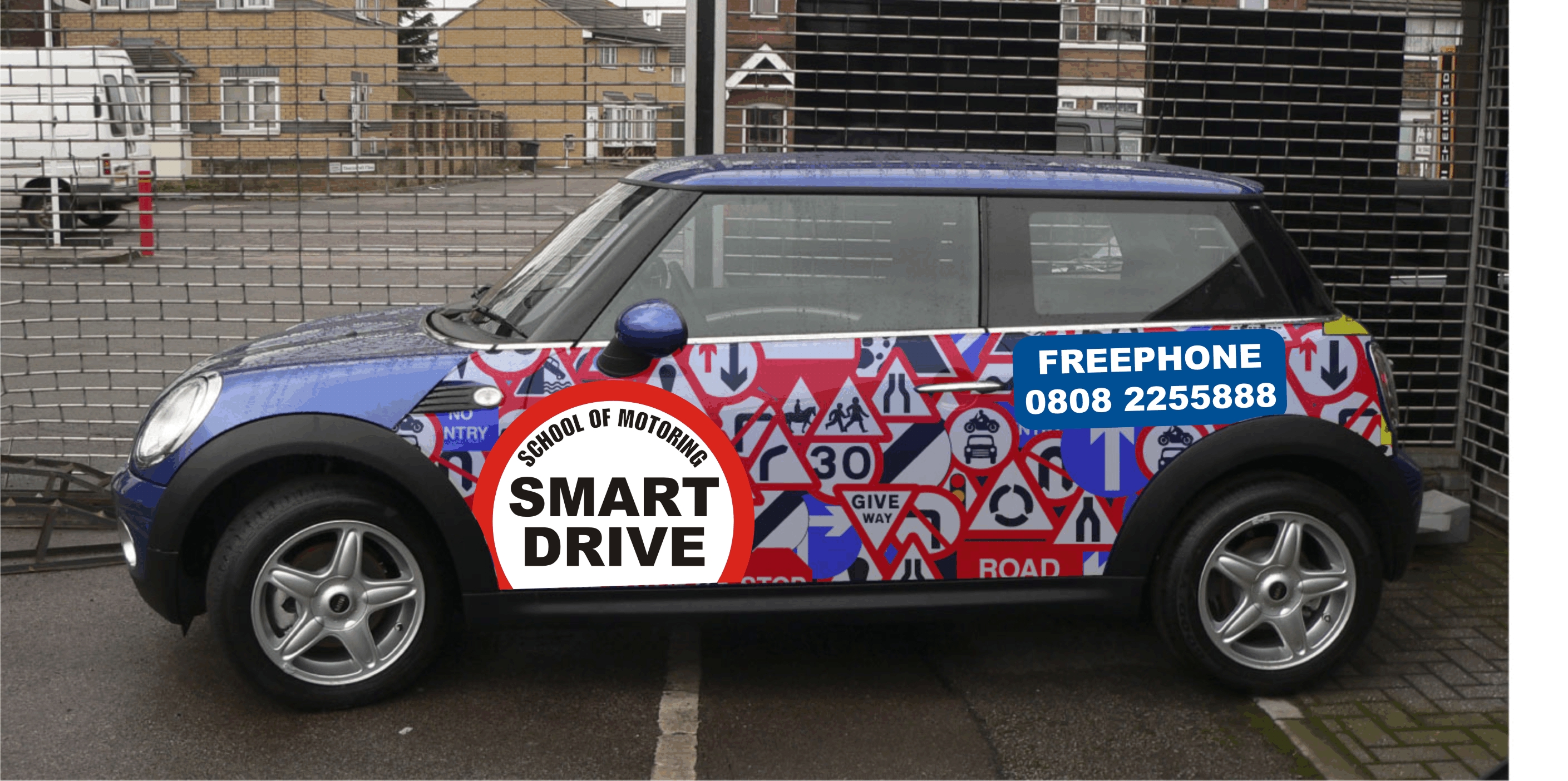
The phone number looks a little lost Peter. What about a thick yellow contour around the main lettering instead of a rectangle?
It would be a pity to make the lettering too big and hide all the road signs.
Id also consider not having the Freephone text as most people know 0800 is free in UK anyway.
Just an opinion from a newbie though.
-

Peter is that his logo?
Because I would make the name BIG, in white with a thick black outline.
And the phone # in white lettering inside of a blue panel.
Love….Jill -

I too love the background but the phone number does get lost a bit in it.
-

How about "blurring" the background so that the company name and tel. no. can stand out in sharp focus.
-
I think that’s harder to read! Apart from the phone number which is better. It’s a toughie Peter because the background is really nice …… difficult to get the right balance with the text without losing the background completely.
I’d love to have a wee go at this but I’m not on my own pc so got no software here. 🙁
-

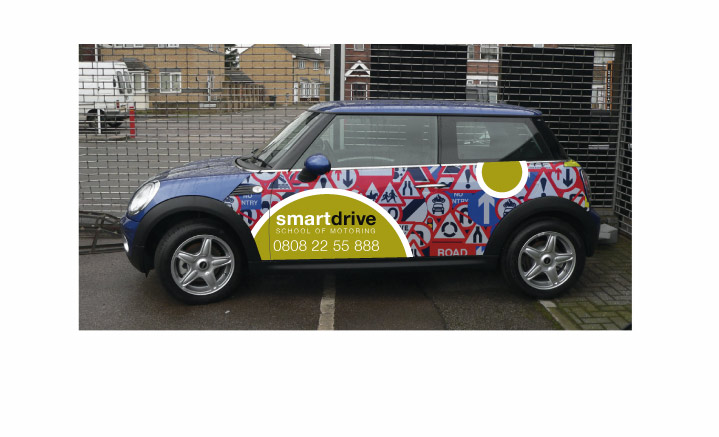
I came up with the background as a concept and I have messed with it all day to get a balance, the font is not the best but its been on their cars for 5 years and I cant convince them to change, but I am working on it!
Peter
-
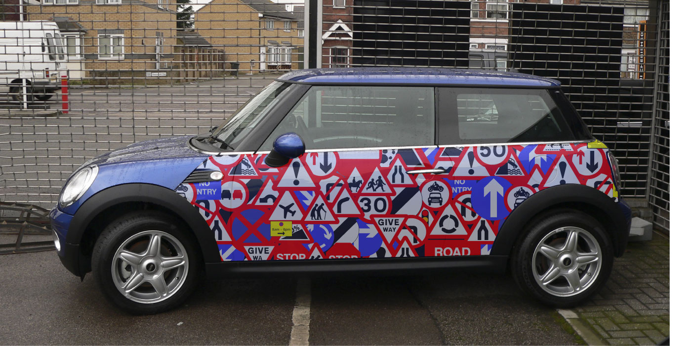
If you post up a plain car pic I’ll show you my idea.
Background only I mean, I don’t want to fiddle around trying to cover it up.
😉 -

Hi Peter
How about if the main wrap was a bit lighter so that the info text stands out better 🙄
Might be better
Paul 🙂
-
The yellow looks good. Finally after months of taking from the site I give something back!!! lol
-

What about a signboard on all those signs Print the background then print a signboard on reflective. Hope that makes sense
Kev
Attachments:
-
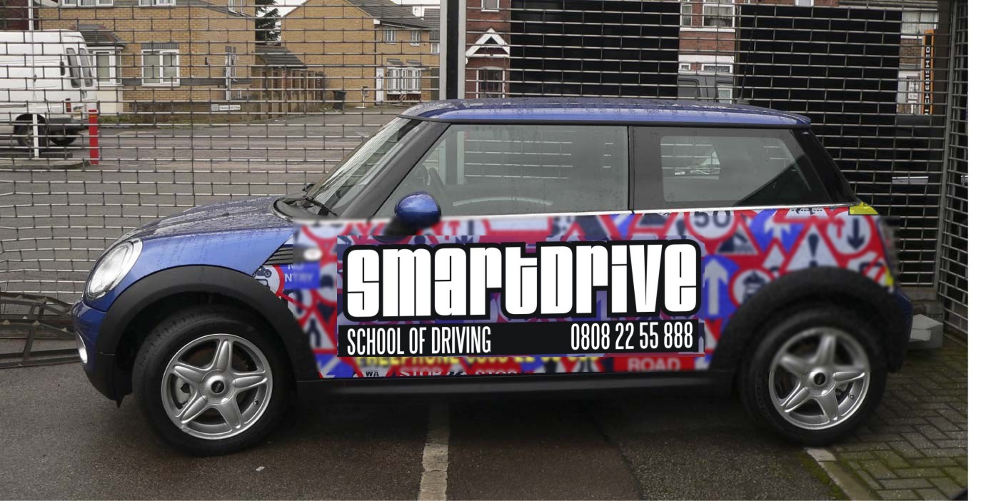
Jills layout with the background "blurred" to create a "depth of field" effect which prevents the background from competing as much as the foreground for attention
Attachments:
-
I like where you are coming from Kev, I’ll have a play with that
Pic for Jill, or any one that fancies a playPeter
Attachments:
-
I’m not sure about the bluur Phil, it may make the car look like its going to fast!
Peter
-
Peter
just a thought maybe bland it in with the background signs as in some of the back ground signs overlapping the main signboard but still leaving enough negative space showing to make the name readableKev
-
quote Kevin Flowers:Peter
just a thought maybe bland it in with the background signs as in some of the back ground signs overlapping the main signboard but still leaving enough negative space showing to make the name readableKev
that sounds like a good idea. 😀
-
Obviously easier with vector file, but hopefully you get the idea
Kev
Attachments:

-
I think that makes it look yucky, kind of piecey.
Thanks for posting up a plain pic.
But now my order has come in and I don’t have time to mock up another one!
You get my drift from the one I posted tho.
I sort of liked the blurred background but could see how some wouldn’t. -

more grist for thy mill Mr. Normington
Attachments:
-
😉
I like that one.
They yellow (to me) is not needed, why add more colors on a busy background? -
I think the white is getting lost, even with the contour , needs another colour….maybe not yellow but something to make it pop.
-

my little contribution 😳
I used this style once before on a busy background and thought it worked quiet nicely, I felt in order to bring the lettering out of the busy background it needed a big fat border to create some clear area around it.
that’s my theory and I’m sticking to it 🙄 :lol1:
cheers
Warren
Attachments:
-
quote Warren Beard:that’s my theory and I’m sticking to it 🙄 :lol1:
cheers
Warren
I’ll see your theory and raise it with a blurred background 😕
-
I can’t see your theory and eveyrthing is blurred, (Thursday is wine night…….. in honour of The Normingtons) 😀 😀
-
Great ideas so far, but I need to point out that my picture is not that good (I’m a photoshop novice) the road signs in the background have a fair bit of white in them already even if they appear a bit off white, so not sure if white in either the text or an outline will work as good as on the mock ups, but I will certainly redraw and compare. Thanks all, for taking the time to input your ideas, so far, much appreciated,
Peter
-
That has potential, Phill.
I’d like to see it looking like a dog tag (not relevant) or some sort of a 3D metallic tag with a realistic shadow underneath.
I’m not sure what FREEPHONE means, is that similar to our 1-800 numbers? Does FREEPHONE need to be on there?
When I see 1-800 here I know it’s a toll-free call. -
Phill, thanks for that, I have printed the background already, this morning,
so blurr is out but, I will let the client see your version, I like the simplicityJill, because we have many variants of "freephone" numbers its a bit confusing, so most of my clients insist on the words being there, a pain I know…
Peter -
make sure you post a pic of the finished job Peter. 😀
-
I like the metalic idea.
I had a play but maybe this does not have enough contrast for this job?Peter
Attachments:
-

Peter, that’s really well done, not sure it’s right for this particular job as you say just lacks in contrast.
It’s a toughy, difficult to make anything look really good.
Phil’s is well on the way
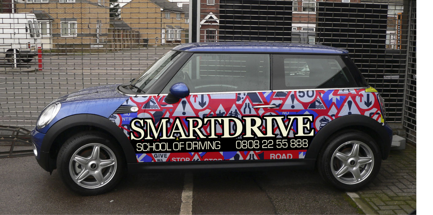
Here’s another take on it,
Attachments:

-
I like that as well Martin, I wonder if I could dome something that large?
if it was possible it would look the dogs,Peter
-
 quote Martin Cole:Peter, that’s really well done, not sure it’s right for this particular job as you say just lacks in contrast.
It’s a toughy, difficult to make anything look really good.
Phil’s is well on the way
Here’s another take on it,
Having just read through this thread from start to finish, I love the evolution of the design………..Martin, thats the muts nuts……….like it alot………
-
quote Peter Normington:I like that as well Martin, I wonder if I could dome something that large?
if it was possible it would look the dogs,Peter
You wouldn’t need to dome it Peter – just print the design that Martin has done for a domed looking effect
-

Lot’s of lovely designs but have these gone away from the brief, i.e. customers 5 year old use of particular font and ‘freefone’ word on as Peter mentions on page 1..
although perhaps if Peter shows customer these designs it will convince them to move from their crappy font anyway.
Ian :lol1:
-
Ian yes, the customer is a franchisee, in a loose sense of the word,
and although the owner of the car has a bit of free choice, it would be nice to try and give them a new image. so change could be possible.Phill can I refer you to my earlier comment, the road signs contain pure white, so even though I like Martins design very much, in real life, the overlap would not work, (I dont think it would) I did think about using a light grey background in any of the mock ups that used white so as to differentiate from the background colours. if you see what I mean,
Yes a print would resemble a dome, as in Martin’s design, but just suggesting how cool it would look as a real dome.
I am holding off printing or cutting the final wording as I want to show the client the examples you have been good enough to post.
all of which have been excellentPeter
Peter
-
With your experience – I’m sure you’ll arrive at a very satisfactory solution Peter
I’m looking forward to seeing the finished work. 😀
-
Phill,
the client was actually happy with the first idea I posted, but I thought we could come up with something better (uksb)
at the end of the day, I have put far more time into this, and all of you have also, than the budget allows for. but if the customer chooses any variation that has been suggested, I will be happy to do it, just because
it has been a joint effort and I appreciate your help,I will certainly post a pic of the finished car
Peter
-
I think we all often do work that is well beyond the budget.. just for the love of it and because it allows us to experiment and develop new skills yet still get paid for our trouble.
-

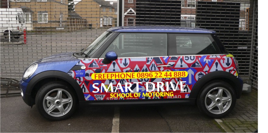
Maybe bleed a shape a circle or triangle !!
would maybe need to put the shape elsewhere?Cheers 😀
Attachments:
-

not the right font – but keeping with the sign theme?
on second thoughts the white is too white
Attachments:

-
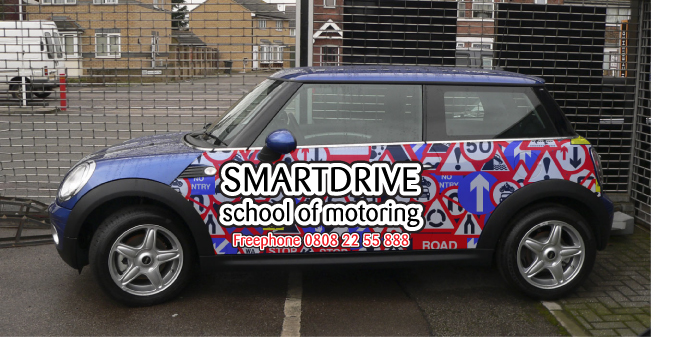
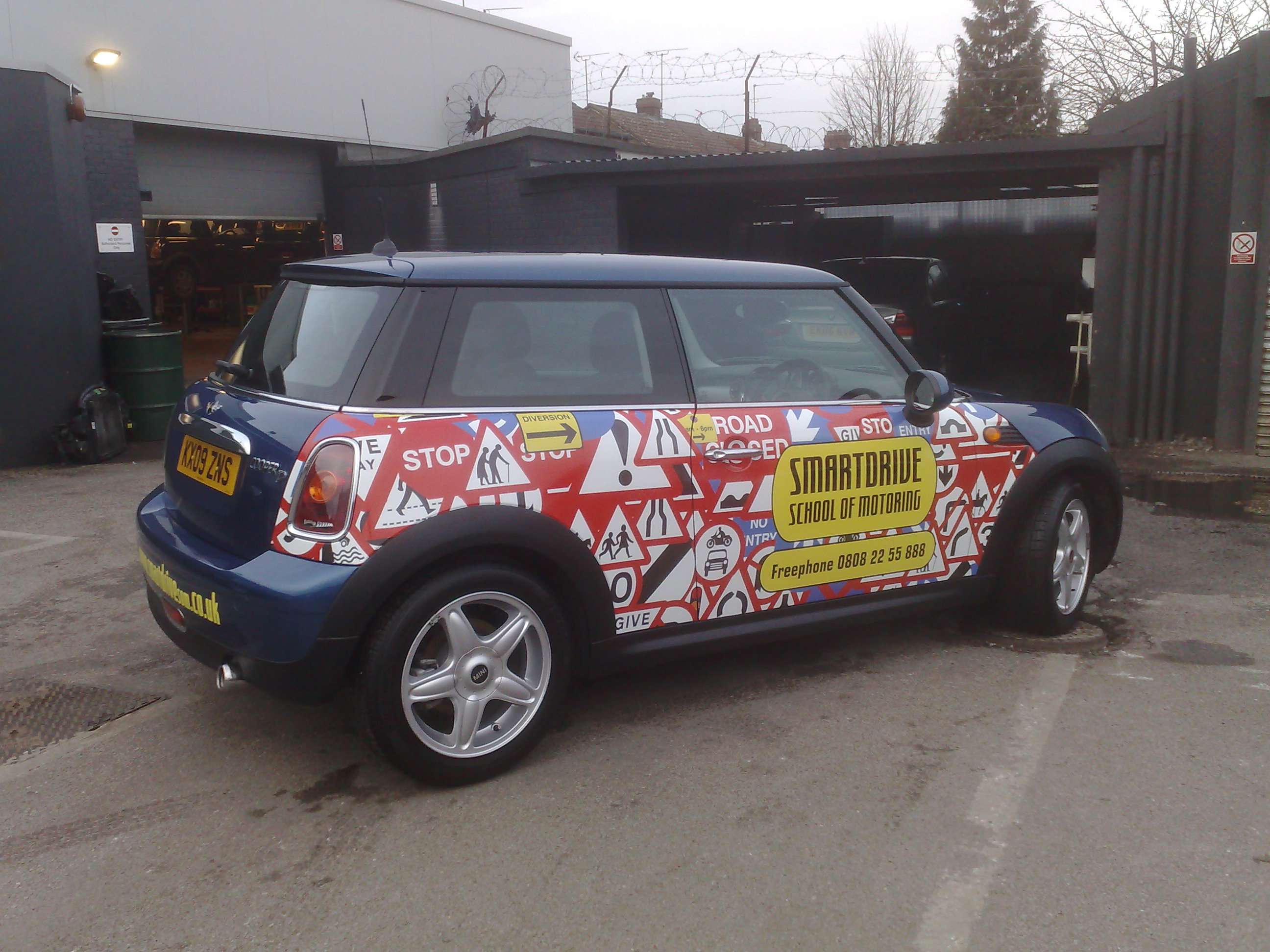
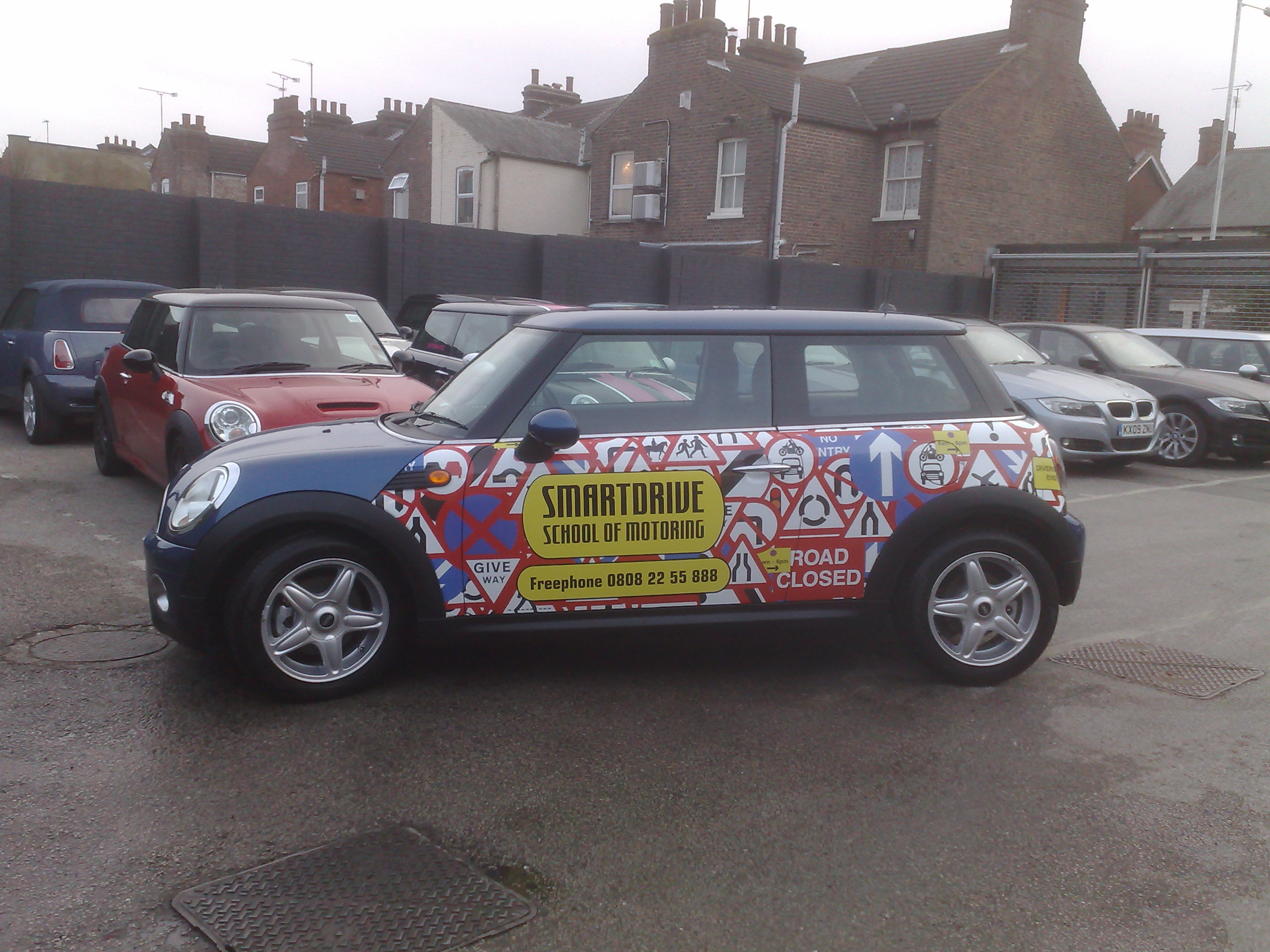
Thanks for all the ideas, customer chose this design in the end,
Peter
Attachments:

-
Looks good Peter – turned out well in the end. :appl:
How long did it take to fit?
-
looks good Peter, turned out really nice in the end :thumbup2:
-
quote Phill:Looks good Peter – turned out well in the end. :appl:
How long did it take to fit?
Thanks Phill, it took longer than I thought, about seven hours total, but I did it single handed, and as mentioned in another thread, wrapping is very physical, if I were a young whipersnapper, then I reckon 4 hours would be more of a reasonable time,
I would have prefered to have had the door handles removed, which would have saved quite a bit of time, but the manual states 3 hours for the workshop to do, which would have been chargeable to the customer.Peter
-
That looks really good Peter,
fitted on your own aswell I take my hat off to you.Always nice to see the finished article,


Log in to reply.
