Activity Feed › Forums › Sign Making Discussions › Graphic Design Help › Logo design help
-
Logo design help
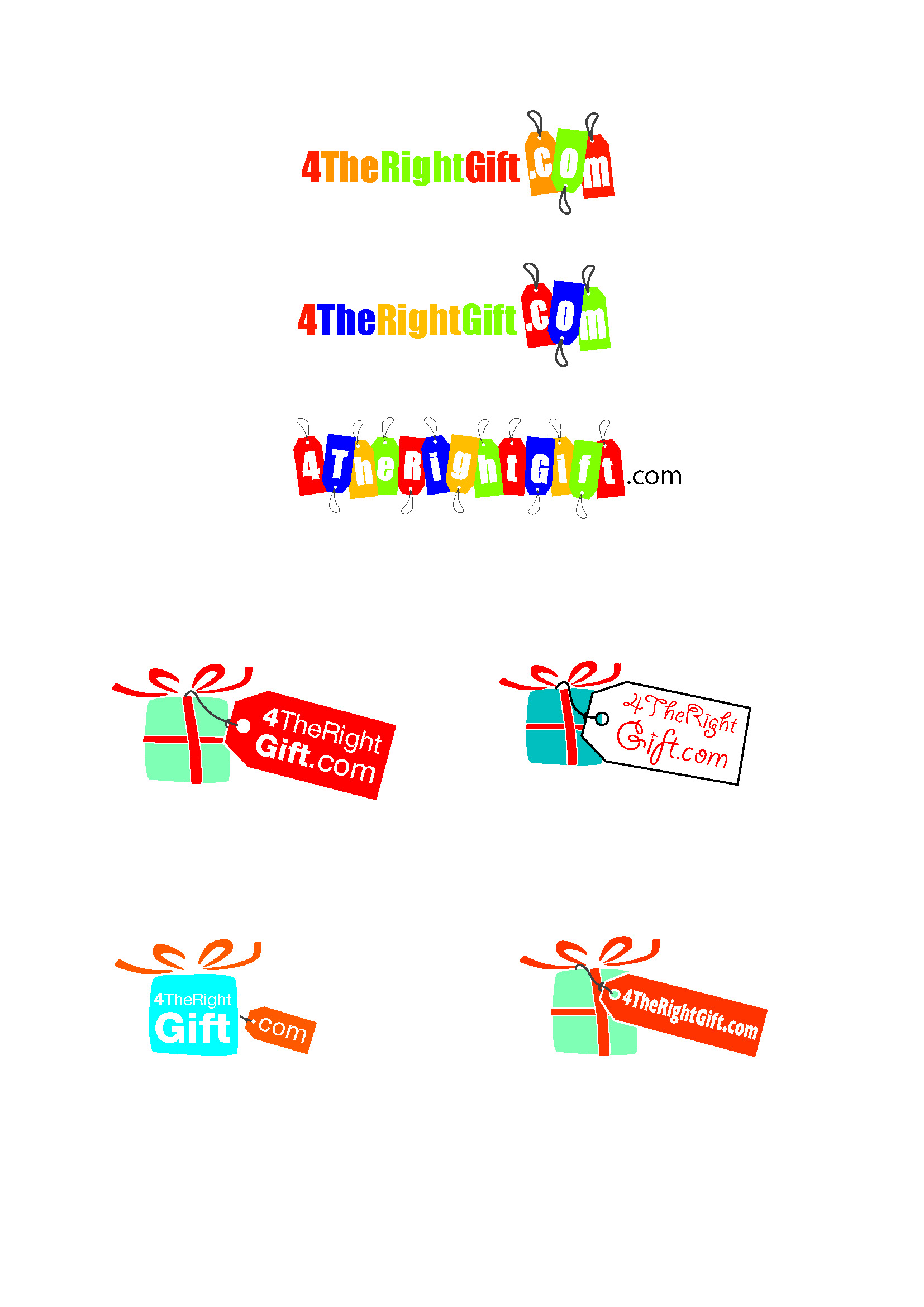
Posted by Richard Urquhart on November 20, 2008 at 12:59 pmhi all
can any one help with these need another view
thanks rich
Attachments:
 Gavin MacMillan replied 15 years, 6 months ago 9 Members · 19 Replies
 -
19 Replies
-

bottom right parcel seems the most legible, and therefore probably the way i’d go. i like the idea of the gift tags etc, but they look like a caterpillar from a distance, not very legible.
Hugh
-

Customer didnt like any very much was just after another suggestion please
rich -
ah right, i’ll see about having a play with it morro, just off out now!
Hugh
-
Chris I like the top idea, yes can be printed 😀 😀
-

out the box again andrew ever thought of making a career out of doing this 😉
chris
-

Hi Nik….been a while since you called me that x …..cheers 😀
-

that’s me not attempting anything then 🙁
Brilliant Andrew…..oh for a fraction of the imagination
-
quote Glenn Sharp:that’s me not attempting anything then 🙁
Brilliant Andrew…..oh for a fraction of the imagination
me too!! 🙁
-
How about missing the 4 off the web addyand making the ribbon more 4 like
still reads 4therightgift.com ?????
Attachments:

-
That’s the way I read it now Rich…knowing what it is meant to be
I don’t think it would be that obvious on first seeing it though
-

I would also leave it wrapping over the side instead of the curved version, looks more like a ribbon that way
G


Log in to reply.
