Activity Feed › Forums › Sign Making Discussions › Graphic Design Help › Logo design help please?
-
Logo design help please?
Posted by Liam Pattison on July 19, 2010 at 8:36 pmHi there
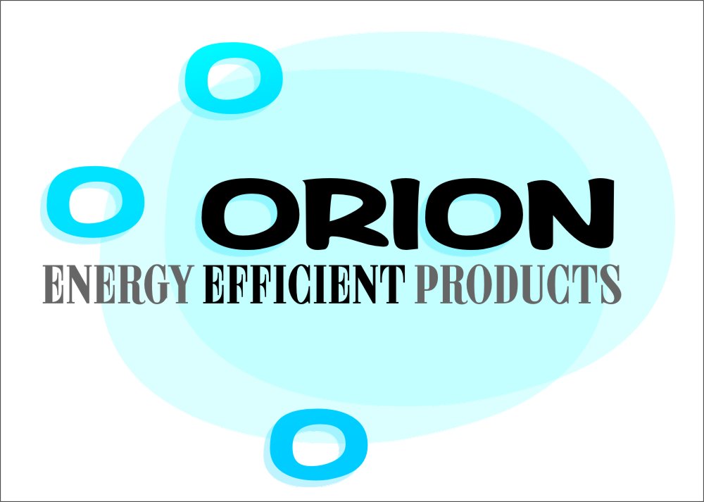
i don’t usually ask for design help, but i’d really like to get some other ideas on this one if anyone has a spare minute please.It’s for a company who specialise in supplying and installing all kinds of Energy efficient products such as air conditioning, refrigeration, solar panels etc.
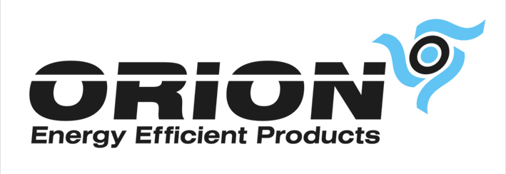
I have attached an eps of a basic idea i had, but i think the text looks a bit like an 80’s film company and the logo thing isn’t really communicating anything about the type of products they do.
The colours should loosely match the one i’ve allready done, but other than that i’m open to any help you could offer.
Many thanks in advance if anyone fancies having a go.
Liam
Liam Pattison replied 13 years, 9 months ago 7 Members · 16 Replies -
16 Replies
-

Liam that is a toughie.
Look at all the logos that use the name Orion:
ORION
I tried to use the constellation for the Os but it’s not too swift.
It’s also really tricky to tell what they do.
I wish it was possible to use other colors.
😉
My attempt has taken yours from the 80s to the 60s I think.
Love….Jill -

Thanks for the help Jill, a little too 60’s American, which i definately like, but not sure he will. I wanted to change the colours as well to maybe include green as it obviously communicates energy efficiency/environmentally friendly, but he definately wants blue.
just saw your Birthday post, hope you had a good day, must be cool to have such a large family.
What they do is sell all these type of products online, such as air con units, wind turbines, all sorts and they also install them world wide. They also have a showroom and vans, so i need something which will translate to everything.
At the moment he has a different logo on everything so i want to put this forward as a suggestion.
I just did this one but now the sub heading is too far down!
-

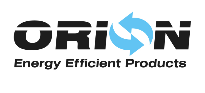
I think the line through the word Orion is giving it that 80’s feel. Try using a more dynamic font, one that looks clean and modern. The circulating arrows remind me of a recycling sign, but I can understand where the thought came from (turbines, air conditioning etc).
Sorry all criticism and not much help I know. I will have a crack at a few logos when I finish what I’m working on just now.
-
quote OwenTaylor:I think the line through the word Orion is giving it that 80’s feel. Try using a more dynamic font, one that looks clean and modern. The circulating arrows remind me of a recycling sign, but I can understand where the thought came from (turbines, air conditioning etc).
Sorry all criticism and not much help I know. I will have a crack at a few logos when I finish what I’m working on just now.
Thanks Owen, you’re definitely right, the line through the text is making me think of Schwarzenegger films from the late 80’s early 90’s!
I had added it to kind of cheat due to the lack of a ‘dynamic’ font as you mentioned.
Look forward to seeing any ideas if you get chance
cheers
Liam
-

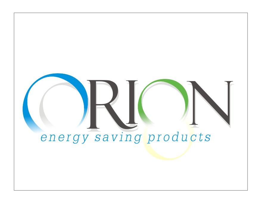
Difficult one 😕 …..but an effort from me Liam…also just realised I put saving instead of efficient 😳
Attachments:
-
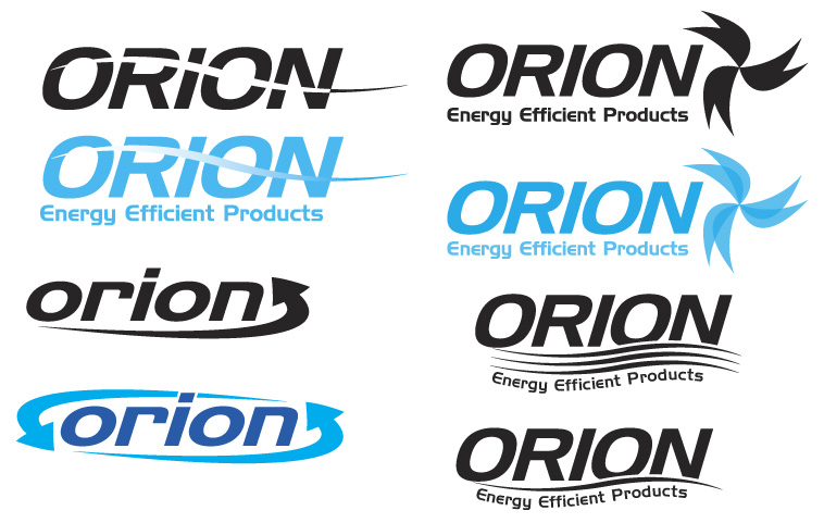
Well here are a few examples. I don’t think any of them are quite there but at least it’s food for thought!
Good luck!
Attachments:
-
Liam I like that second one a lot.
Try losing the line, and can one arrow be made a different color?
Like bright light green.
Maybe a different font, all caps, for tagline.And hey I am myself a 1960s American hahaha
-
Thanks Martin, i like the use of green AND blue there, i also like that you have used the same font that Trojan records do, as i am a massive reggae fan! Looks nice with a thinner font.
Owen, i really like the top left hand corner design with the wavy line, great idea.
And thanks Jill for your great input as usual. I will try to incorporate your suggestions and see how i get on
thanks again
Liam
-

Just a quick option based roughly on your original
-
quote John Enright:Just a quick option based roughly on your original
Thanks John for taking the time on your suggestion, i like the way you have used two lines instead of one and altered the first ‘o’.
I am currently showing some suggestions to the customer, but i now get the impression he is just going to want it as simple as possible!
thanks again
Liam
-
Thats really nice Glenn, very minimalistic and effective, get’s rid of the 80’s effect i had. That’s a good lesson for me in design, thanks 😉
Liam
-

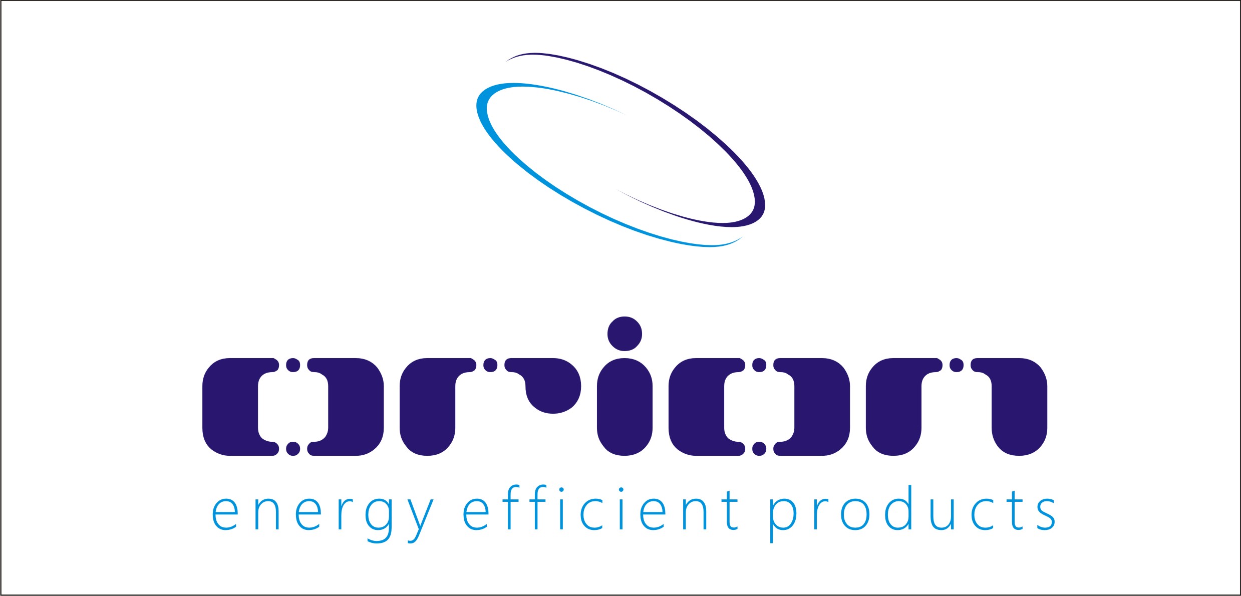
Hi Liam,
I did this one a couple of years ago, though in green, for a company that does the same type of thing.
Nigel
Attachments:
-
quote Nigel Hindley:Hi Liam,
I did this one a couple of years ago, though in green, for a company that does the same type of thing.
Nigel
I like the swirl thing you have used there Nigel, the text has a digital feel to it. Thanks very much for sharing
Did they not go for this design i the end?Cheers
Liam
-
Cheers Liam,
I did 2 logos they went for the other though this was my favourite!
Nigel
-
quote Nigel Hindley:Cheers Liam,
I did 2 logos they went for the other though this was my favourite!
Nigel
Always seems to be the way mate! Thanks again for sharing this one,
Liam


Log in to reply.
