-
Logo design help please!!! BCP
Hi All
Really strugling with this and as usual its somone who is a friend as well as a client which always makes it seem harder to get right
The designs 1 & 2 below are drawn up by me as instructed by the client which are really 1970’s in my opinion the third was a quick thought of my own which I was designing with a roll over button style in mind Fading to be added later and thought a jumping man ie fit and well being the sort of figure that might work for a phsyio practice.
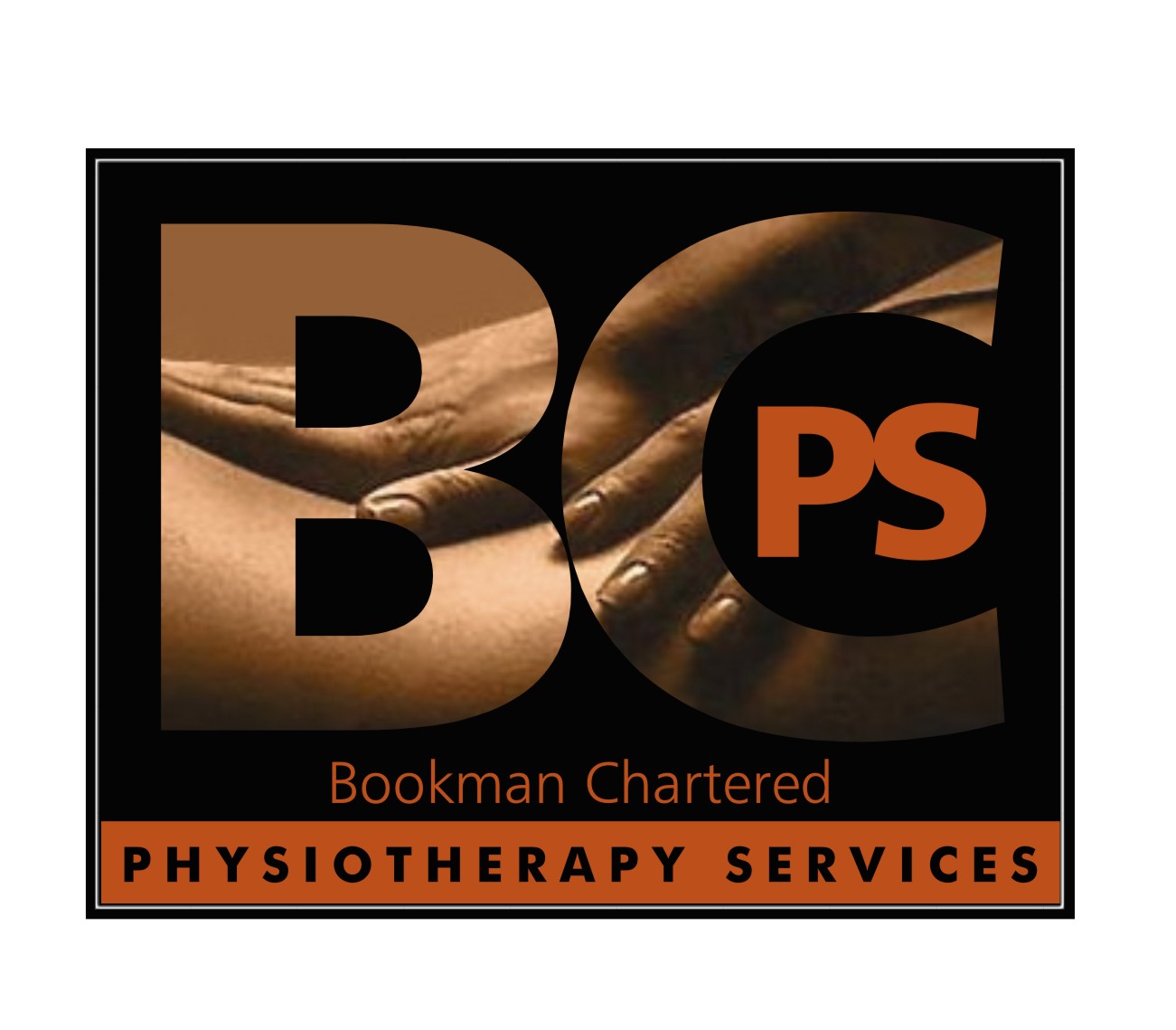
However the clients brief now for want of a better word is like image 4 ie to use the idea of the hand but forming it into a B shape as well with a person in it although not necessarily a jumping man with the remaining letters after and maybe forming the letter s into a spine sort of shape.
Now forgive me for being dense but I cant see this morphing into a crisp and tidy logo hence I really welcome your thoughts and ideas
Thanks in advance for any input
John 😕
Attachments:

Log in to reply.
