Activity Feed › Forums › Sign Making Discussions › Graphic Design Help › Logo design help – Indigo Redd
-
Logo design help – Indigo Redd
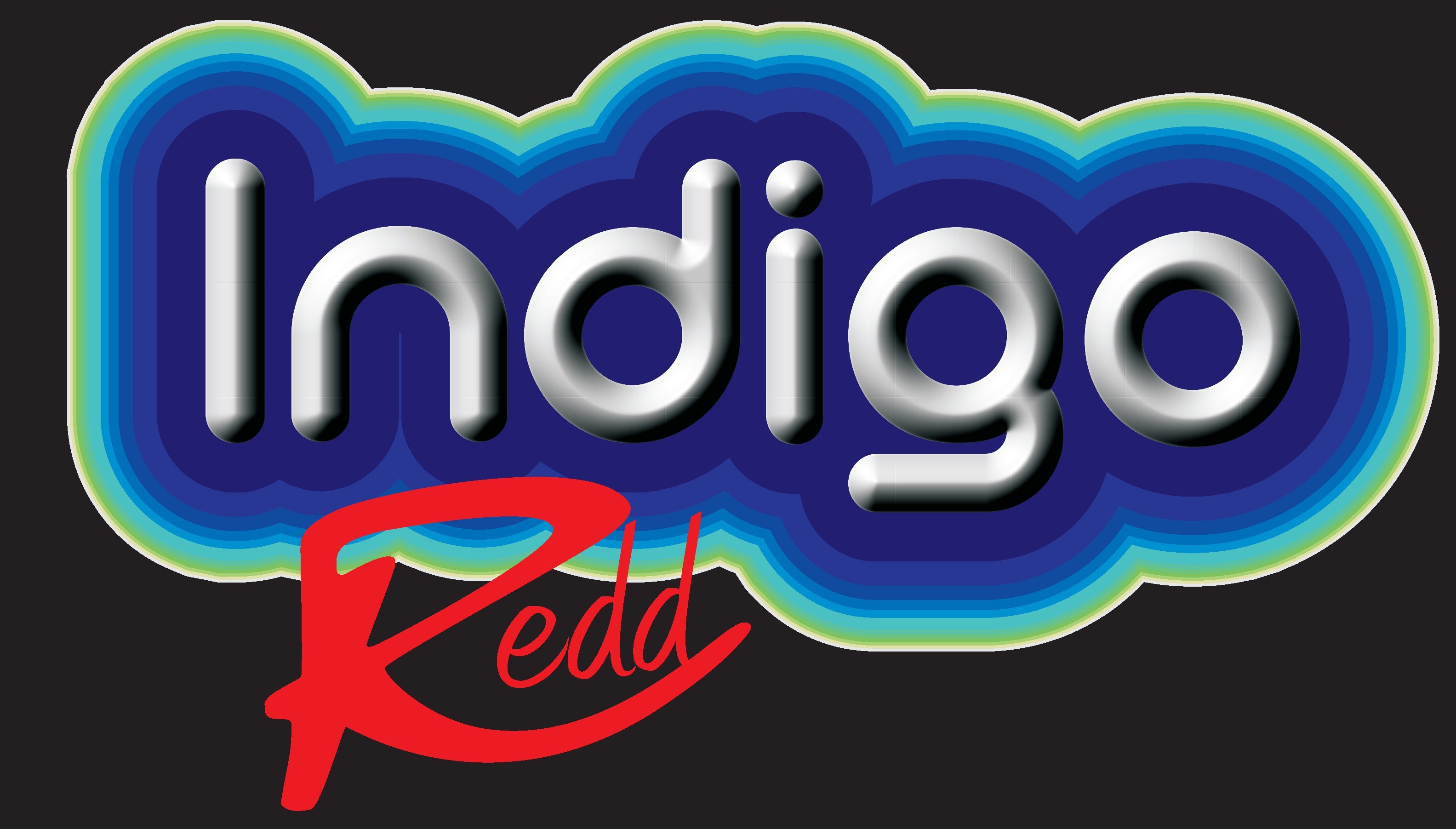
Posted by Richard Urquhart on September 29, 2008 at 2:12 pmHi all need some fast help with a logo I’m helping create
the attached logo is to be printed and need to look 3d, the font used for redd make the dd of redd look like to want for another way to describe balls hanging down , sorry my customers words not mine !!!!
any way if you have some time please play
thanks rich
p.s it was my birthday yesterday and my head hurts somewhat xxxxsorry the redd needs to be flat and smaller
thanks richRichard Urquhart replied 15 years, 7 months ago 6 Members · 20 Replies -
20 Replies

-

Does the Redd have to be located where it is in the image?
I think if you moved it, it would read easier.
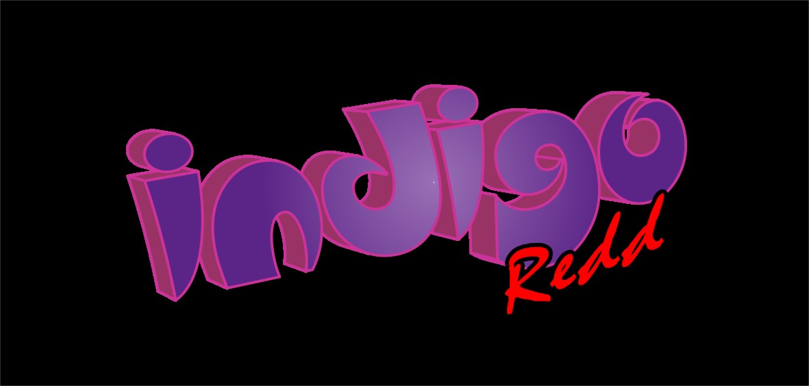
Here’s a quickie. Don’t have the same fonts.
Love…..Jill -

hi Jill thanks for your help on this, the redd is not important in that it needs to be small. I think anywhere would be acceptable customer just wants a very funky moden image
Rich -

Rich…just to clarify
The Indigo has to be 3D but the Redd has to be flat and smaller?
-
Move the "R" in Redd down just a tad, nestle the "e" into its belly, then nudge over the "dd"s and weld ’em.
Make the leg of the "e" connect into the 1st "d".
Love….Jill -
one more, didnt say but it will b a black background
Attachments:
-
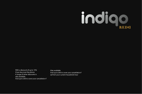
I’m not 100% sure of the colour scheme but…….
Attachments:
-
Glenn thats the idea but need to keep the font in indigo please
thanks rich -

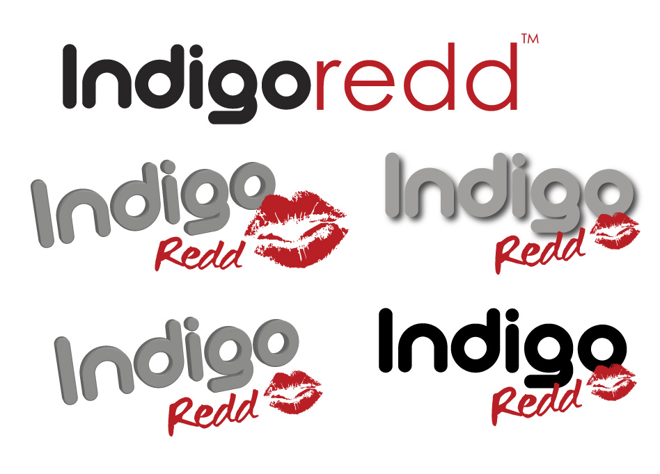
If I was going for a funky modern image I would prefer not to use the 3D effect !
Also think it would be better without the g g 😕
Using only one stylised font would probably look more corporate…dunno 😀 overworked with the double d 😀
Attachments:
-
Andrew I like the idea behind the DD Back to back didn’t think of that, re 3d need this to pop this is for a lap dancing club and the customer a tricky one !!!
would really like a few more ideas please please -
Andrew has just handed you a real winner!
(now I finally get the meaning of the double dds, assuming UK bra sizes are the same as US ones)
Love….Jill -

Richard, I love Andrews idea, but to get some ‘attention’ I’d use one of the new chromes from Rtape (Coburn) that looks like shattered Ice – I think its called hammered silver leaf. Very effective for signs that need some impact with only a few words.
Just a thought
-
Hi all guys and girls
I would have chosen something classy like Andrews design and I agree it looks modern,thing is I think the customer is wanting more and I have run out of suggestions, think lap dancing club !
rich -
no worries if this is no good Rich…..I’ve enjoyed meself having a play with this one and learned one or two things along the way…
Attachments:

-
I like it mate very nice any chance of the face of the letters having the same colour, any chance of the file please many thanks mate.
Rich the cross dresser :lol1: :lol1: :lol1: :lol1: -

Ok I dunno if it’s too late but I thought I would throw some examples together. Might just help your thought process a little…
Attachments:
-
Hi mate thanks for the input, its not to late going down to this job on Wednesday but the logos are still not sorted !!!! working on customer now
thanks and to the point I like
thanks rich


Log in to reply.
