Activity Feed › Forums › Sign Making Discussions › Graphic Design Help › Logo design help
-
Logo design help
Posted by Warren Beard on November 13, 2009 at 5:35 pmHi Guys n gals
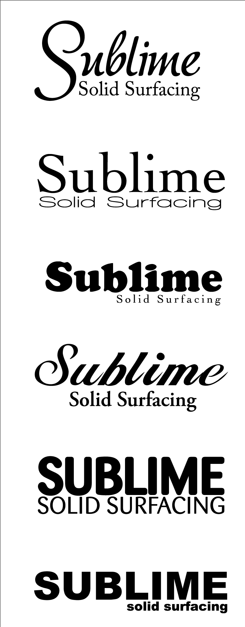
Anybody feeling creative and feels like a break to play with a logo. Customer has given me freedom and only supplied a name to work on. Just working in B&W at the moment and have tried to cover a range of font styles, he did say he does NOT want old fashioned.
Name of business is Sublime Solid Surfacing, they do solid work tops for kitchens, bathrooms, dental practices etc. I couldn’t think of any icon sort of logos to represent solid work tops 🙄 so kept it simply text but again totally open to any ideas at all.
Cheers
Warren
Attachments:
 John Harding replied 14 years, 5 months ago 13 Members · 18 Replies
 -
18 Replies
-
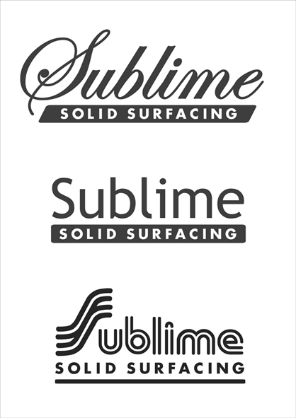
solid surfacing to me should be in a solid band, to represent the worktop??
Attachments:
-

hi Warren, I like the top one, nice fonts. Not got software on my laptop here to have a play unfortunately, but looks like you’ve got a reasonable start there. 😀
-

I like the 2nd one down. Maybe try it with Ian’s suggestion?
-

From the Sublime to the Ridiculous
john
Attachments:

-

I had that Ian but just thought a bit plain as I liked the top option as well and didn’t work as nicely.
These were my attempts at a shaped logo 😕
Attachments:
-

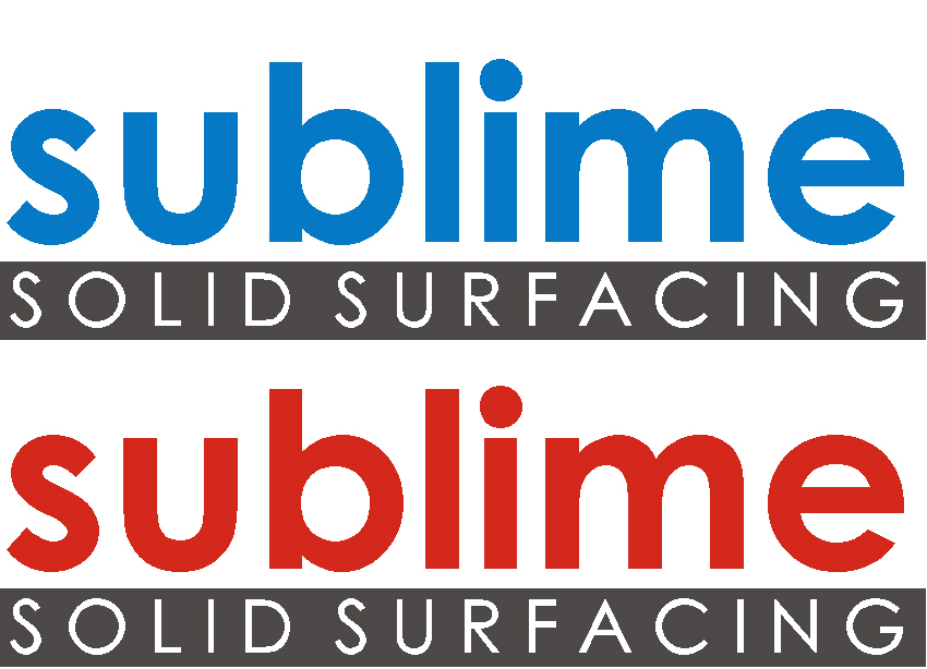
my go….I don’t particularly like the font I’ve used but I’m limited to modern fonts on me lappy…
Attachments:
-
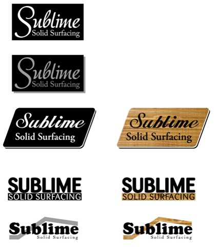
Here you go, i probably spelt something wrong as i’m half asleep,
Liam
Attachments:
-
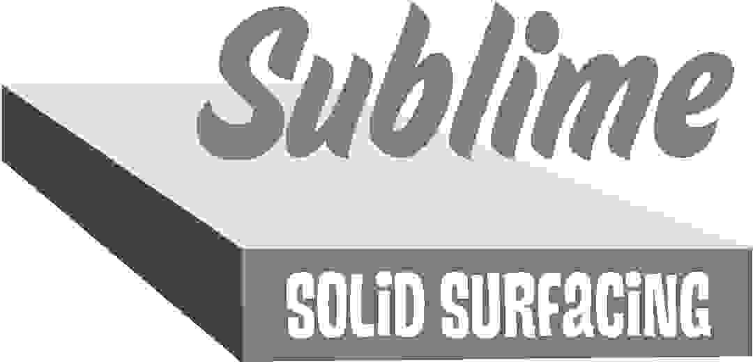
I really like Glenn’s one, at first I thought it wouldn’t go with the solid "wood" surfaces but to be 100% honest I lost the plot on this one right from the beginning, it’s not wood surfaces he does it’s what I presume to be other polished sort of stuff and not wood, I had another enquiry mixed up with this one 😳
So the logo’s are still good but forget the wood part of it, this is why I like Glenn’s as it shows a nice glossy surface image.
Woopsy, lucky I picked it up, imagine my customers thoughts when I sent him a whole bunch of ideas with wood effects in them :lol1: :lol1: :lol1:
Any more appreciated.
cheers
Warren
-

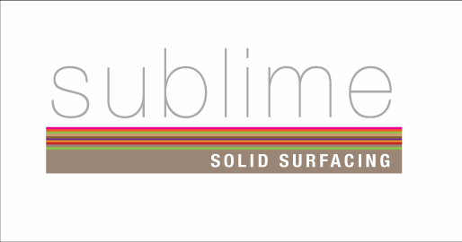
maybe if he does a variety of surfaces…Cheers
Attachments:
-

ohhh and in comes a cheeky wee late entry… 😀
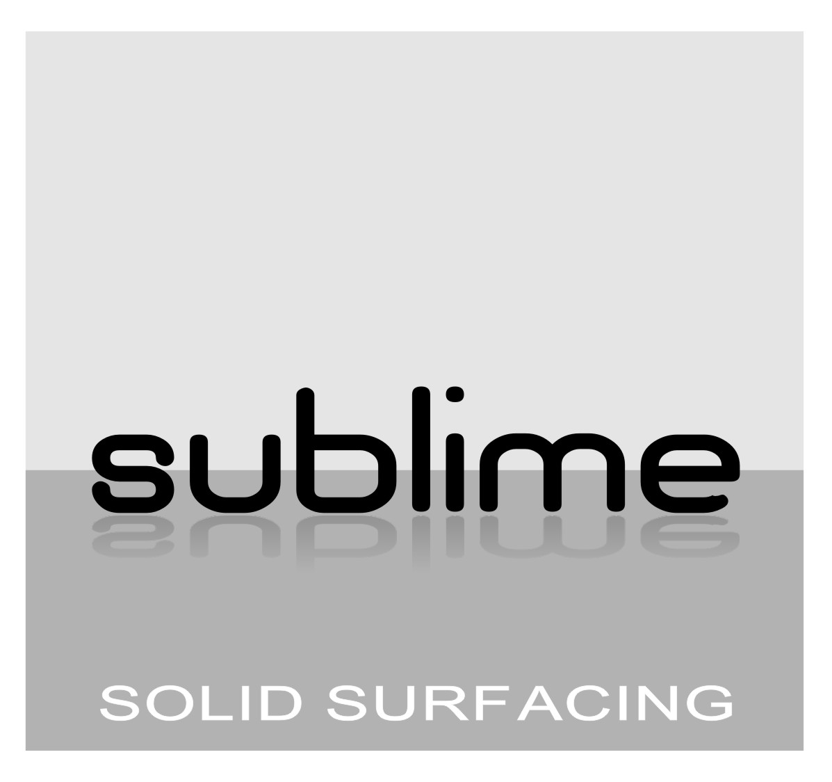
nice main font andrew, whats that called?
-
Rob it’s Helvetica Neue UltraLight….Cheers 😀 with Helvetica Neue Condensed Bold [increased letter spacing].. 😉
-
i thought i had the full helvetica font family… but not that one… 😕 😀
i have a thing for thin fonts just now, not sure why because ive tried using them in several designs the past few weeks and bottled out using them at the last minute and went for a heavier font. 🙄 i guess it just needs to fit in with the rest of the design to make it work… obviously mine didnt work. :lol1: -
nah, no charge… takes the fun out of closing the deal. 😀
-

a quick effort from me, prefer glenns tho so long as the fade isnt an issue
Attachments:

Log in to reply.
