Activity Feed › Forums › Sign Making Discussions › Gallery › Logo Design: Butchers
-
Logo Design: Butchers
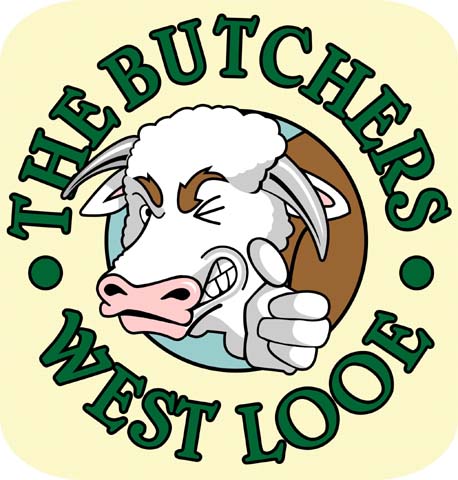
Posted by Paul Rollason on February 7, 2006 at 1:17 pmJules Drew it and I vectorfacated it
let us know whatcha think good and bad
dreckly
paul r
Attachments:
 Paul Rollason replied 18 years, 2 months ago 12 Members · 28 Replies
 -
28 Replies
-

It’s very clever, particularly the cow (bull?)
but I fear your kerning needs tweaking my dear.
Maybe a white inline between the green and black too.
Love….Jill -

Hi Paul & Jules
I really like the overall design, but 2 things hit me immediately, 1/ some of the letters are too tight, maybe need to be individually opened up, and 2/ the cow looks almost as if it’s ‘snarling’, I think it’s right nostril is too low, overall too level, if you can understand what I mean? Good work though, look forward to seeing more of it.
-

Looking Good Paul!
I think Jill’s Suggestions are spot on.
Or maybe replace the black outline with a brown or copper.. orange if you want it louder. That’s assuming you need to keep the copy green. Or white copy with a green outline….
I’ll shut up now…
I really like the Bull just the way it is.. Nice illustration! -

yeah…. what they said about the kerning (wish i’d never heard of that word !!)
first thing i noticed though …. looks like his thuumb fallen off !
that said dude, its a damned good drawing, now just take the bull by the horns and STEER that thing home !!
sorry, i’ll get me coat !
-

Nice one!
I need to marry a talented lady that can do my drawings for me, but first I need to learn to vectorize like you Paul.
-Marek -
 quote Marekdlux:Nice one!
I need to marry a talented lady that can do my drawings for me, but first I need to learn to vectorize like you Paul.
-MarekAnd I need to learn to concentrate on text layout (I am sorting out the kerning jill)
Thanks for all of your comments guys and gals, it’s a fantastic way to learn the art of design,layout and signmaking in general.
I will post the revised logo once it is finished so you can see if I got it right.
Dreckly
paul r
-
Any better?
If not please give advice
dreckly
paul r
Attachments:
-

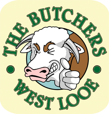
I love the overall concept of it Paul but as has been said – I’m not sure what look the cow/bull is trying to achieve…. It looks more angry than winking 😕
-

looking good
still dont like the black lettering outline as it makes the dark lettering merge in to a larger letter rather than enhancing the visual appeal.
dreckly
chris
ringing you soon on the job we spoke about
-
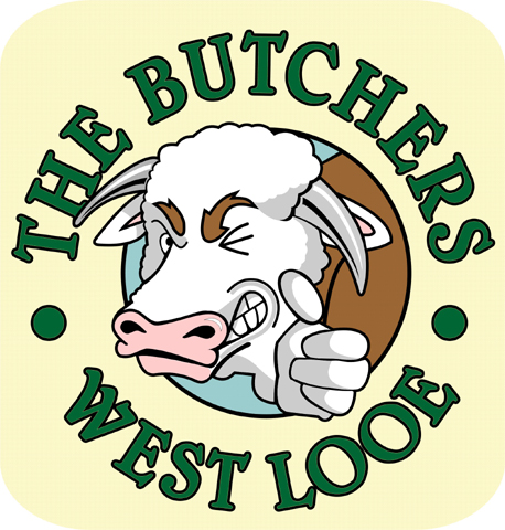
How about this Chris
I have put a lighter coloured inline around the letters.
dreckly
paul r
Attachments:
-
i think that the jpg has spoiled it a bit but on you screen does it show off more. i prefere this anyway
chris
-
I like the last one best, but I am gonna come over and beat you with my kerning stick. 😉
The inline helped A LOT but please adjust those OOs.
Love…..Jill -
Thanks all
So Jill is The Butchers bit right yet?
and is it just the OOs in looe that you feel need tweeking
I appreciate your input and I am learning a lot from this
Thank you again
paul r
-
Paul,
The two O’s need opening up a little bit & the T in The, – C & H in Butchers, – & the E in west could just do with rotating a touch to follow the curve better 😛
-

Is this for the butchers in West Looe Cornwall?
I thought he was closing at the end of January, or has another one opened up? -
Hi Steve
A new couple have taken over the shop and saved it from closure
dreckly
paul r
-
would raising the eyebrows a little make it less ‘angry’ ?
-

I thought we had overcome the “MAD COW” problem. Great design – I don’t think I’d look pleased if someone was about to cut me up into little pieces and I think it adds a touch of humour which is sadly lacking on the high street. (Thumb definately needs re-attaching though).
-
If its less angry you need I would close his mouth and narrow his eye, I just had a little play in photoshop and it did the trick. Hope you dont mind I just wanted to see if it worked. It gave him a bit of a sly grin.
Delete the lines around the bottom of the thumb and rotate it to the right too, Itll look attached then -
Latest design for the Butchers West Looe
This is going to be a 1220mm high freestanding double sided pavement sign with blackboard etc.
Might be my first project with the cnc router (hot)
Let me know what you think
dreckly
paul r
Attachments:

-
Nothing beats a 3 fingered butcher. You know he’s dedicated.
Looking good Paul, have fun with the router!
-Marek -

looks great paul
Nothing beats a 3 fingered butcher. You know he’s dedicated
:lol1:
DEEK
-
Yeah I know he has only got three fingers
Gees You guys are obsessed with digits
three fingers on this one,:wave: the thumb’s falling off on the bull :thumbdown:
You lot are a tough crowd 😀
dreckly
paul r
-
I walked past the other sign today, the one fixed up on the wall.
Looks good -

Paul,
the bull is out of place, it would be ok on its own, but not on the butchers apron, just mhoPeter
-
Yeah I Know what you mean peter
The client wants it on the apron but I may try to talk her into having a simpler version of it.
I Steve, Thanks, I have only seen a photo of it on the clients phone but I think they have fitted it too high.
I sugested they fit it just above the windows but they seem to have gone a good 18″ above that.
Have they put the swing sign up yet?
The freestanding butcher above is to go on the other side of the river I think, to try and tempt the tourists over in the summer.
Dreckly
paul r
Log in to reply.
