Activity Feed › Forums › Sign Making Discussions › Graphic Design Help › Logo assistance required
-
Logo assistance required
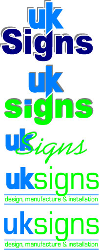
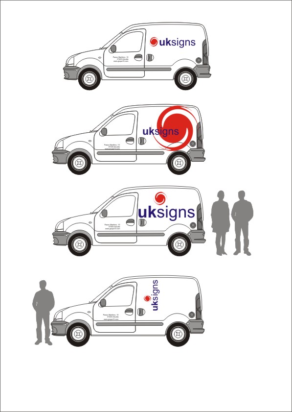
Posted by Kevin Flowers on January 15, 2009 at 6:32 pmHave avoided sorting this for far too long – had different designs, different colours. Just can never seem to get something i’m happy with keeping. Don’t know if these need tweaking or a new concept completely. Just come up with a new van advertising promotion idea & now need to get a logo to go with it, will post the completed project when finished.
So if you feel up to the challenge feel free wide & wacky or reserved & corporate. No union jacks or red & navy blue combos please.
Kev
Attachments:
 Kevin Flowers replied 15 years, 1 month ago 16 Members · 19 Replies
 -
19 Replies
-

4th on as well. Keep it simple and it looks modern too.
-

4th one here too….although the colours look very cold together, maybe just my monitor though.
-

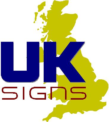
kevin, does the Uk imply you travel all the country? just somthing quick to get thoughts going
John
Attachments:
-

ditto..your 4th Kevin but colours need darkening as Harry says
heres a go from me
Attachments:
-

Hi Guys
thanks for taking time to help, my thing is i have pretty much tried all mine & they don’t really do it for me.John
will do jobs anywhere but mostly local although have customers in Slough & Luton but normally more local to Dagenham now days. Been there with the map in fact one of my customers use it for there logo so don’t think they would be to pleased. But thanks for the idea.Martin
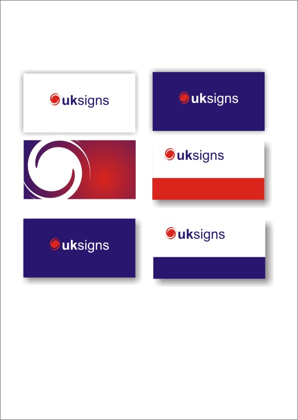
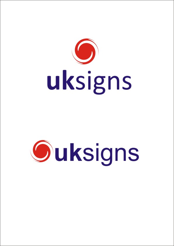
i like that, the stumbling block for me as always been the "UK". I also like to see a graphic content as well as text to hopefully show colour as we digital print as well.One thing i forgot to say & that was for the time being this will end up on a Red van & also a white van, but i can always white pin line it
Kev
-

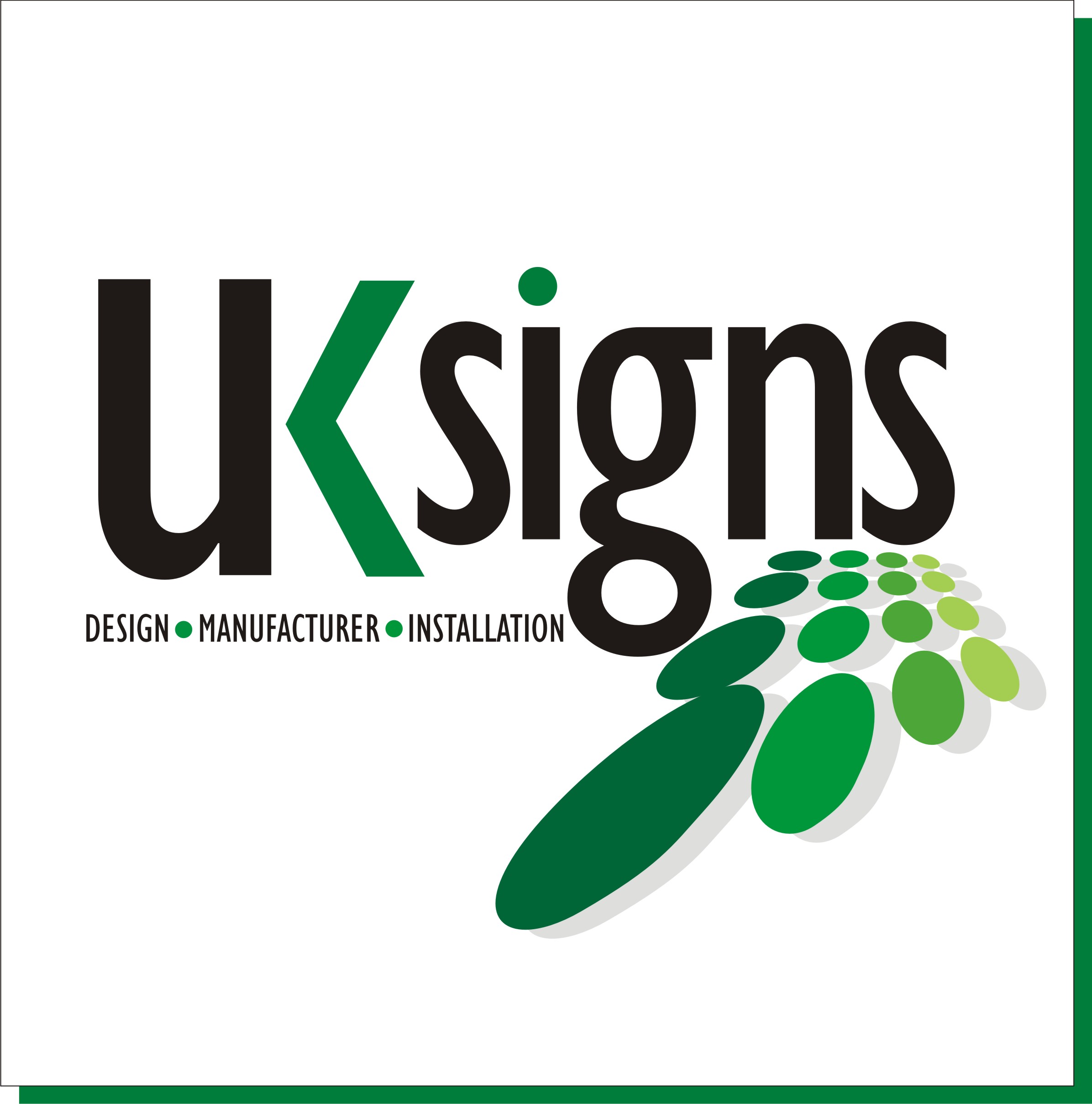
I really like the idea of Martins one but I think it could look even better if the dots formed the shape of the Uk map
-

I agree about keeping away from the cliche’ of using the flag, colours or map. I really like the way Martin has done his and with the colour breaks too. Could maybe do something slightly more with the fill of the circle effect to show digital printing capabilities as Kevin mentioned but averall the best option here so far.
I’ll try have a play later but can’t usually compete with the likes of Martin and Andrew 😳
good luck, it’s the hardest thing to do.
cheers
Warren
-
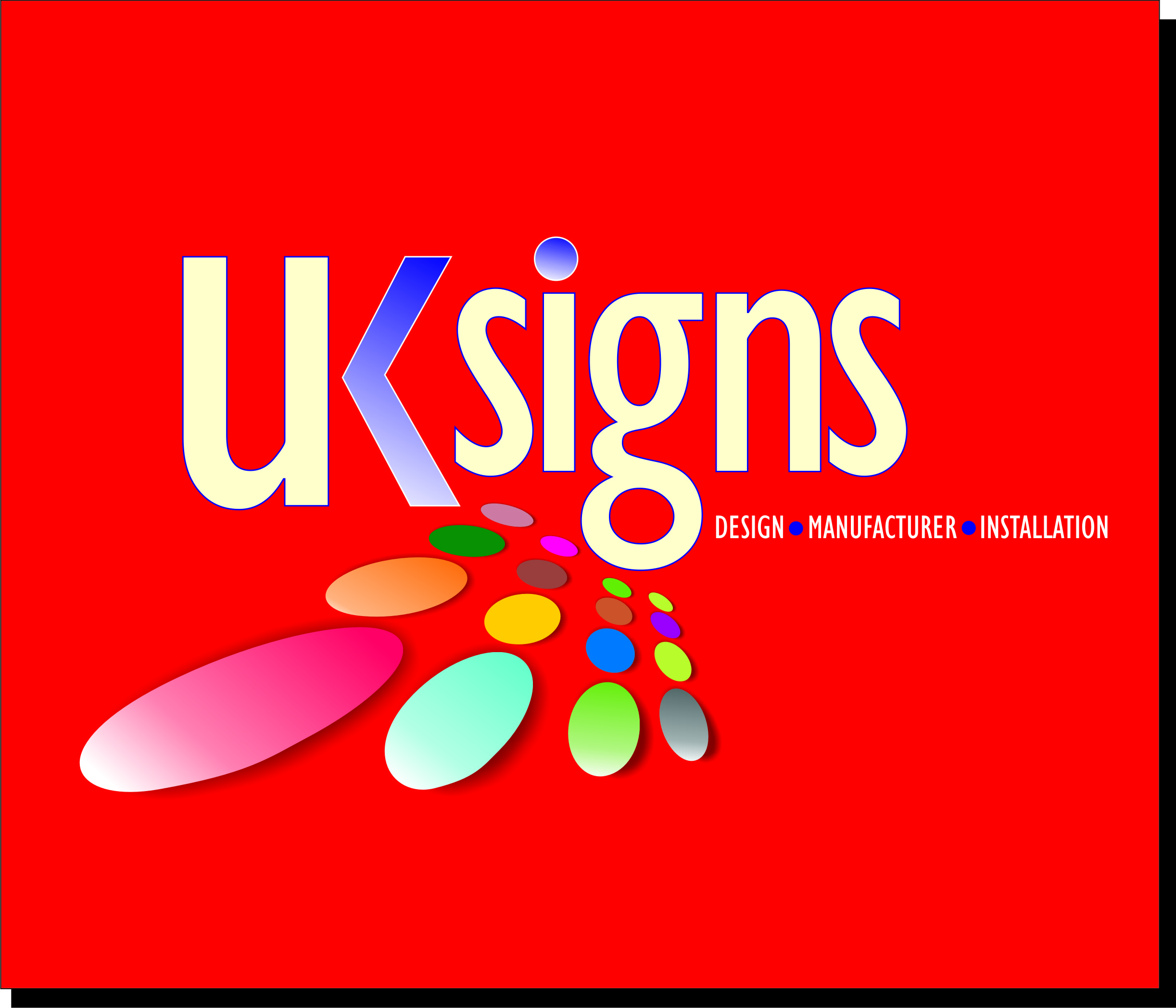
quote Kevin Flowers:One thing i forgot to say & that was for the time being this will end up on a Red van & also a white van,
Kev
What the hell you doing using a red van Kev 😀 always a toughy a red canvas.
Attachments:
-
quote George Elsmore:MMMM smarties
Hmmmm…..smartie 😀
-

Martin, i think that logo, esp in white and green, is a cracking effort.
But, i dont know, its sort of magazine header-y, if that makes sense??
-

I don’t think you need to include a map or anything….just get something you like the look of …….maybe something that will combine digital and plotter cut vinyl……..
kind of copy design a lot of people using the shape….but gives the idea….
Cheers
Attachments:

-

When I create logo’s I find it very beneficial to work with just straight black and white to start with, like you would if it where to be just plotted out of one colour vinyl.
This helps you focus more on the shapes / concept before adding colour and effects. Creating a logo with this method also allows it to be applied to a variety of media and still look good (cut vinyl, B&W printer, Stationary, then moving up to full colour print and web)
-

i was asked to upload these files on behalf of:-
Arslan.M

I did not do this initially because i felt i was being sent a random email asking me to open the attachments. it was only tonight did i realise who was sending me the files! so i do apologise for this ARSLAN… 😕 😀
images are attached, can be increased in size if you click on them.
Attachments:

-

I like Arslan’s overall design. It’s clean and modern. No offense though, but I think maybe the mark is a little to similar to the Typhoon / Hurricane symbol. Although that might work in your favor if you position it as if your signs can stand up to that kind of abuse. (not that I suppose you ever get hurricanes in the UK like we do here in the Southeast US.)
-
Hi Guys
sorry for the delay in getting back to this, really busy at the moment. I am going to try & settle on a design has i have just got myself a new or rather nearly new white Vauxhall Movano lwb which is a massive advertising space so hopefully watch this spaceKev
Log in to reply.
