-
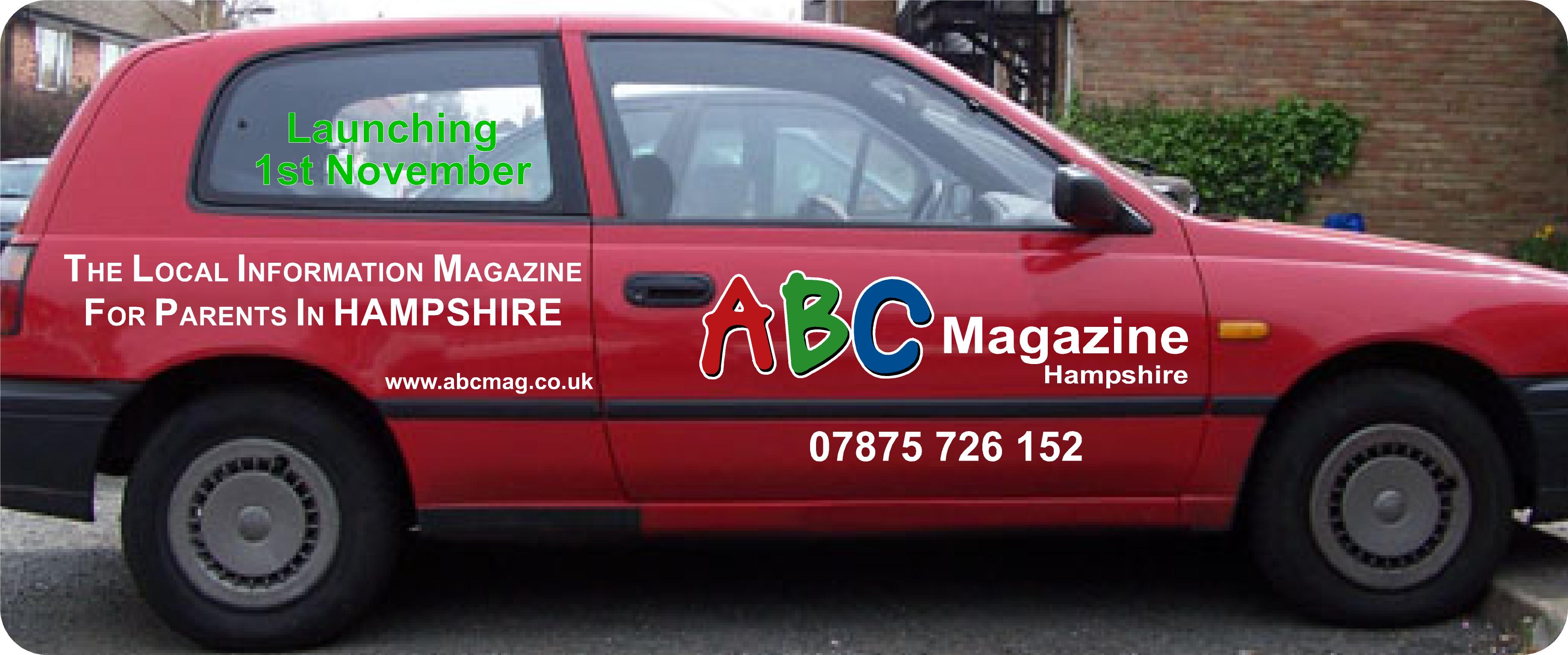
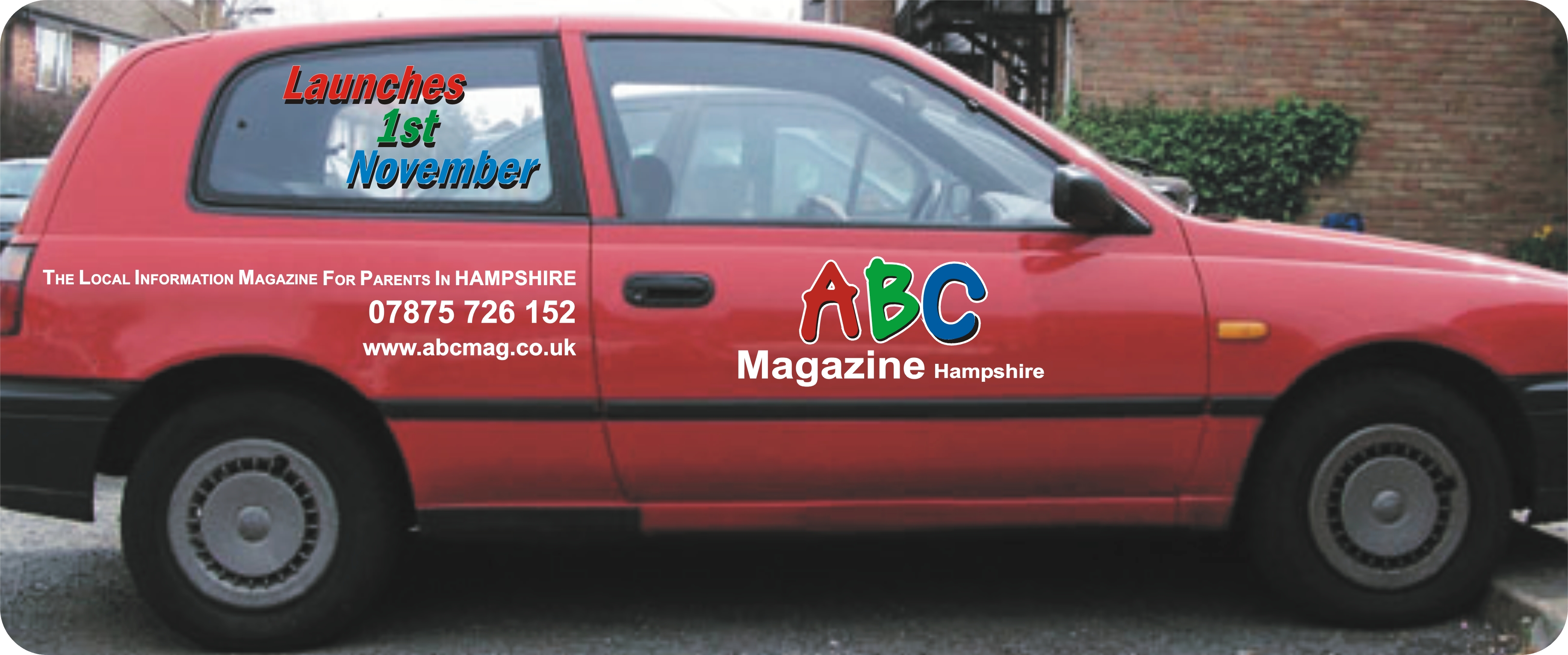
layout help please with this car design?
Hi Guys & Gals
My wife has recently bought in to a franchise for a magazine and so obviously I have been drafted in to supply her vehicle graphics and ofcourse at no charge (damn woman 😉 )
As some of you might know with franchises they are very fussy with deviating from corporate identity, so what I have done is made up the logo (ABC Magazine Hampshire) as it needs to be as well as the (The local information magazine for parents in Hampshire) must stay as they are 😥 (bold and uppercase letters are part of the corporate design 😕 )
Is there anything that you think can be done to improve on the layout of this. I know you don’t have much room to move but any tweaks that might help will be great.
Obviously the "launching 1st November" will eventually be taken off.
Thanks to one and all.
Cheers
Warren
Log in to reply.
