• Layout help please

    Posted by Mike Grant on February 8, 2010 at 7:33 am

    I’m struggling with this layout.
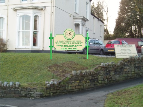
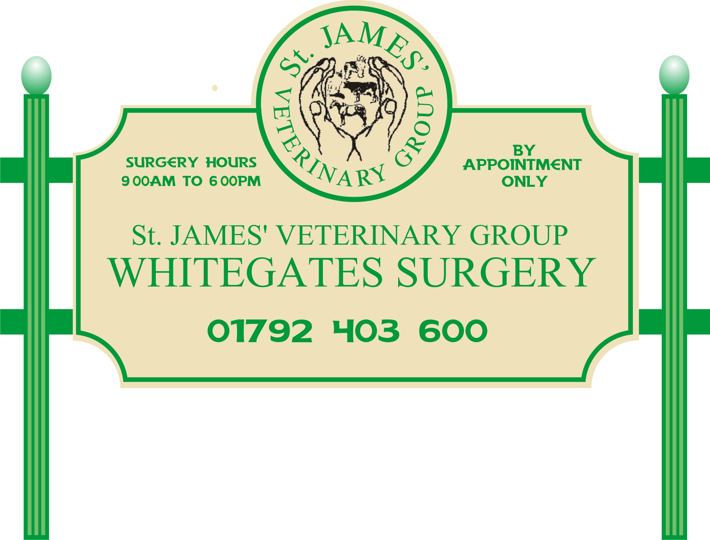
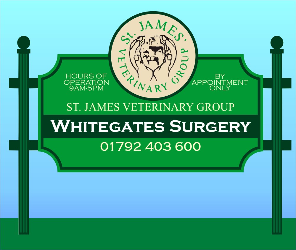
    I want a rustic look framework with a dibond sign. I have come up with this layout but to be honest I cant get rid of the two large areas of negative space. I have to stick with the round logo and can’t change that, so it is this element that is causing me grief. The Roman lettering has to stay as well, but the lower lettering I had in Copperplate Gothic but my computer at home does not have this font so it decided to change it on my behalf 👿
    If anyone has a bit of spare time today all help would be appreciated.

    Cheers
    Mike

    Mike Grant replied 14 years, 2 months ago 3 Members · 3 Replies
  • 3 Replies
  • Martin Cole

    Member
    February 8, 2010 at 9:25 am

    Only way I can see of doing it Mike


    Attachments:

  • Jill Marie Welsh

    Member
    February 8, 2010 at 12:02 pm

    And maybe try making the bottom panel have a green background with the cream lettering
    (that’s the colors I see here)
    That way the circular logo will stand out if you keep it in the colors they are.
    Love….Jill
    edited to throw this in


    Attachments:

  • Mike Grant

    Member
    February 8, 2010 at 7:13 pm

    Thanks for the help guys. Again I am stuck with the background colour being cream as the colours is a consistent theme through all their branches so a bit tied there.
    I don’t personally like the hours up top but it may grow on me. 🙄
    I have had another idea, let me work on it! 😀

Log in to reply.