-
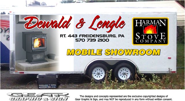
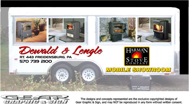
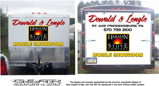
layout help needed please with design for trailer?
Doing this one soon, and here are my first drafts.
the customer loves it, but i’d like this job to be the best it can be, so any suggestions are appreciated.
Criteria:
All the copy has to stay, but can use any fonts or colors
The harmon logo can’t be changed color wise.
The images are on the top on the right side because it will be used at fairs with those doors open, and they still wanted to see their name..
Budget is about $2k, and that’s what i quoted for what is shown, using a combination of laminated prints and cut cast vinyl.The job is on hold for a week or so, so it’s no rush.. Just would appreciate any thoughts you might have.
cheers
steve
Attachments:
Log in to reply.
